[PYTHON] Visualize data with Streamlit
Overview
――I want to create a web application that can visualize data interactively ――It's a little heavy to use D3.js etc. live (technically) ――In the first place, knowledge of Web system is almost 0 without humility (Vue? React? What is it delicious?) --Then, let's use Streamlit
Environment
Let's read Official Document without reading such an article.
Installation
Install with pip.
$ pip install streamlit
Operation check
$ streamlit hello
This will set up a web server locally on port 8063 (default setting).
So, you can check the sample page by accessing http: // localhost: 8063 / with your browser.
By the way, if you want to launch a web application with a python file that imports streamlit, specify the python file after run as shown below.
$ streamlit run [python-file]
Basic format
The official documentation is extensive, so it's quick to refer to it.
Only the atmosphere here.
text
Headings can be specified with streamlit.header or subheader.
Sentences can be written in streamlit.text or streamlit.write.
You can also use Markdown (streamlit.markdown).
For example
st.title('Sample page')
st.markdown('''
Contents of chocolate ball

-Peanuts
  - 28g
''')
Data frame (table)
You can draw a table using pandas.DataFrame.
Use streamlit.table or streamlit.dataframe. st.dataframe is highly functional, such as being able to highlight and sort cells under specific conditions.
For example
def rand_df(r=10, c=5):
    df = pd.DataFrame(
        np.random.randn(r, c),
        columns=('col %d' % i for i in range(c)))
    return df
dataframe = rand_df(c=3, r=2)
st.dataframe(dataframe)
Graph
There are two ways to draw charts, one is to draw a chart with streamlit and the other is to draw a figure object of matplotlib.
For example
dataframe = ...
st.line_chart(dataframe)
By default, a line graph for each column is drawn. You can also zoom in/out by operating the mouse wheel, and move the position by dragging. (Interactive!)
Also, if you are familiar with matplotlib, you can also draw figure objects with streamlit.pyplot. Of course, you can also use seaborn.
fig = plt.Figure(figsize=(6,2))
ax = fig.subplots(1,1)
dataframe.plot(ax=ax)
st.pyplot(fig)
However, with this, it is not possible to enlarge/reduce (naturally). Besides, you can draw the chart of bokeh, and since it is supported in various ways, the official document is omitted below.
Widget Various widgets are available that allow you to select data.
For example
lst_flavors = ['Peanuts', 'Strawberry']
select_taste = st.selectbox('Flavor', lst_flavors)
Select items will appear in the pull-down menu. Check the Documentation as various items are available.
Side bar
If you specify st.sidebar.xxx, the sidebar will appear on the far left. The above command can be used as it is for xxx.
For example
st.sidebar.header('Side bar')
p = st.sidebar.slider('Probability setting', min_value=0.0, max_value=1.0, value=0.8)
st.sidebar.write(f'The set value is{p}is')
Like this.
cache
streamlit will re-execute all python files in order from the top when there is a change in the element with Widget etc. Therefore, even if it is not related to the changed element, the process will be executed every time you do a little heavy calculation.
Therefore, I would like to use the cache if there is no change in the related elements.
streamlit uses the @ st.cache decorator.
For example
@st.cache
def rand_df(r=10, c=5):
    df = pd.DataFrame(
        np.random.randn(r, c),
        columns=('col %d' % i for i in range(c)))
    return df
dataframe = rand_df(c=7)
This way, dataframe will not be updated even if there is a change in the widget etc.
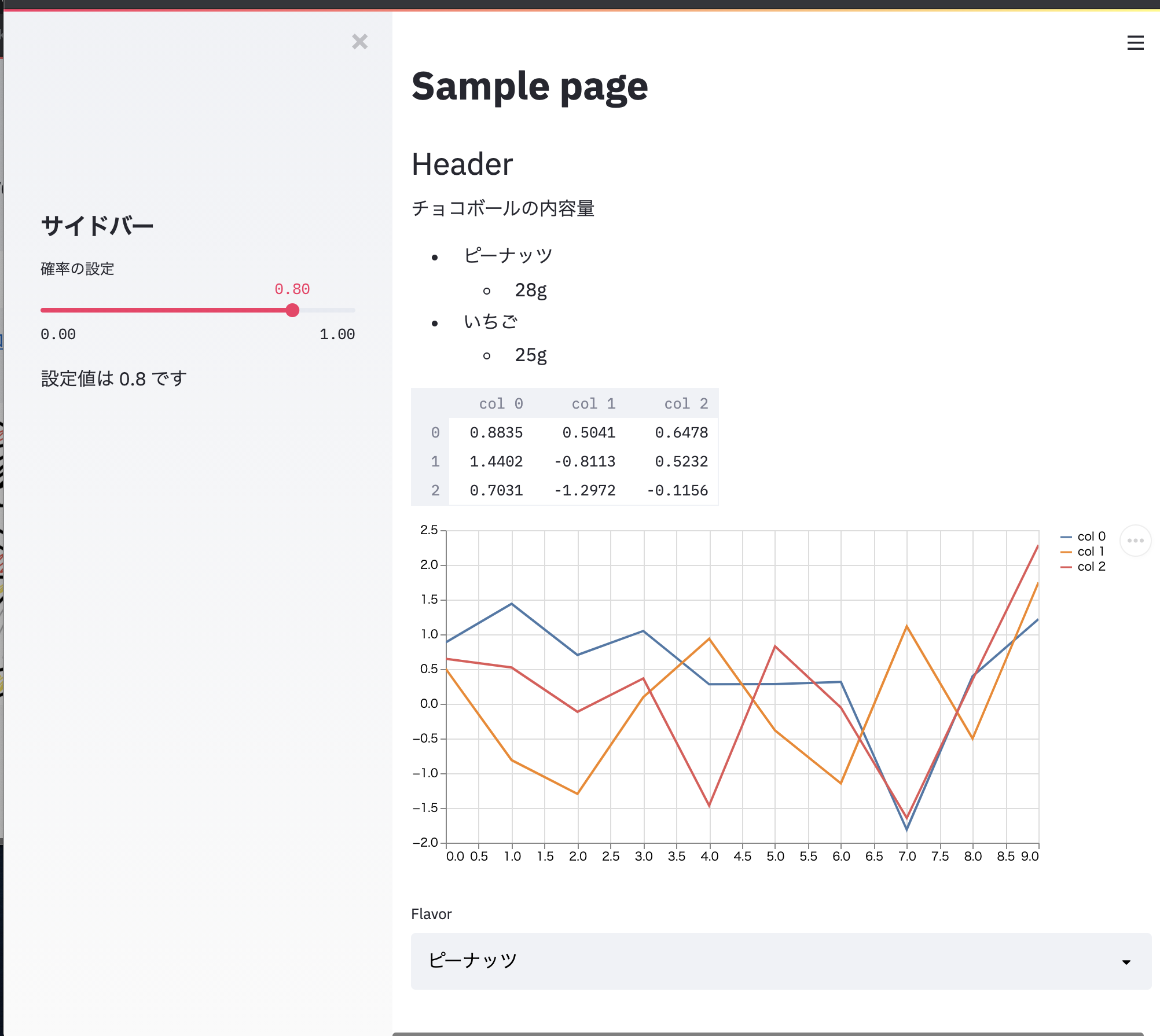
Sample source code
Let's create just a sample web application using the example described above as it is.
e.g. sample.py
import numpy as np
import pandas as pd
import streamlit as st
import matplotlib.pyplot as plt

#Drawing text
st.title('Sample page')
st.header('Header')
st.markdown('''
Contents of chocolate ball

-Peanuts
  - 28g
-Strawberry
  - 25g
''')

@st.cache
def rand_df(r=10, c=5):
    df = pd.DataFrame(
        np.random.randn(r, c),
        columns=('col %d' % i for i in range(c)))
    return df
dataframe = rand_df(c=3, r=10)

#Table drawing
st.dataframe(dataframe.head(n=3))
#Chart drawing
st.line_chart(dataframe)
# widget
lst_flavors = ['Peanuts', 'Strawberry']
select_taste = st.selectbox('Flavor', lst_flavors)
# Sidebar
st.sidebar.header('Side bar')
p = st.sidebar.slider('Probability setting', min_value=0.0, max_value=1.0, value=0.8)
st.sidebar.write(f'The set value is{p}is')
Set up a test server locally and check it with a browser.
streamlit run src/sample2.py
Now you can create an app like this
The end
reference
- https://www.streamlit.io/
- https://docs.streamlit.io/en/stable/
- https://share.streamlit.io/daniellewisdl/streamlit-cheat-sheet/app.py
Recommended Posts