Easy data visualization with Python seaborn.
Matplotlib introduced in the garbled elimination method, but to be honest, I don't feel like using it at all.
I wonder if there are more than 30 arguments that can be specified with just the plot function. http://matplotlib.org/api/pyplot_api.html#matplotlib.pyplot.plot
Property	Description
agg_filter	unknown
alpha		float (0.0 transparent through 1.0 opaque)
animated	[True | False]
antialiased or aa	[True | False]
axes		an Axes instance
clip_box	a matplotlib.transforms.Bbox instance
clip_on		[True | False]
...
Even so, the result is such a ~~ crappy ~~ graph.
It seems that if you do your best, you can draw beautiful graphs, but you don't have much motivation to learn.
That's where seaborn comes into play.
Seaborn is a Python visualization library based on matplotlib. It provides a high-level interface for drawing attractive statistical graphics.
In other words, it provides a higher level (abstracted) interface as a wrapper for matplotlib.
It's like a requests package for urllib.
The interface is also important, but if you can draw such a heatmap with about 10 lines of code, you will be motivated to learn.
However, I don't have the data that seems to draw a heatmap suddenly, so I will try to draw a basic graph using the power consumption data of my home appliances.
$cat refrigerator.csv
No.,DateTime,Watt,kWh
    1,2015/03/02-23:25:44,58.9,0
    2,2015/03/02-23:35:44,50.6,0.01
    3,2015/03/02-23:45:44,50.3,0.02
    4,2015/03/02-23:55:44,61.7,0.02
    5,2015/03/03-00:05:44,72.4,0.03
    6,2015/03/03-00:15:44,51.3,0.04
    7,2015/03/03-00:25:44,47.7,0.05
    8,2015/03/03-00:35:44,47.6,0.06
    9,2015/03/03-00:45:44,20.2,0.06
   10,2015/03/03-00:55:44,40.5,0.06
This is the log acquired by TAP-TST10 manufactured by Sanwa Supply. The downside is that you can't log in real time, but ... well, it's cheap.
If you convert this to DataFrame with pandas, it will be like this.
import pandas as pd

data = pd.read_csv("refrigerator.csv")
print(data)

       No.             DateTime  Watt    kWh
0        1  2015/03/02-23:25:44  58.9   0.00
1        2  2015/03/02-23:35:44  50.6   0.01
2        3  2015/03/02-23:45:44  50.3   0.02
3        4  2015/03/02-23:55:44  61.7   0.02
4        5  2015/03/03-00:05:44  72.4   0.03
5        6  2015/03/03-00:15:44  51.3   0.04
6        7  2015/03/03-00:25:44  47.7   0.05
7        8  2015/03/03-00:35:44  47.6   0.06
8        9  2015/03/03-00:45:44  20.2   0.06
9       10  2015/03/03-00:55:44  40.5   0.06
10      11  2015/03/03-01:05:44  59.4   0.07
...
[1441 rows x 4 columns]

print(data.DateTime)
0       2015/03/02-23:25:44
1       2015/03/02-23:35:44
2       2015/03/02-23:45:44
3       2015/03/02-23:55:44
4       2015/03/03-00:05:44
5       2015/03/03-00:15:44
6       2015/03/03-00:25:44
7       2015/03/03-00:35:44
8       2015/03/03-00:45:44
9       2015/03/03-00:55:44
10      2015/03/03-01:05:44
...
Name: DateTime, dtype: object

print(data['Watt'])
0       58.9
1       50.6
2       50.3
3       61.7
4       72.4
5       51.3
6       47.7
7       47.6
8       20.2
9       40.5
10      59.4
Name: Watt, dtype: float64
The code to visualize this with seaborn is as follows.
import seaborn as sns
import pandas as pd

data = pd.read_csv("refrigerator.csv")

#Use a relatively simple point plot
ax = sns.pointplot(
    x='DateTime',   #DateTime on x-axis
    y='Watt',       #Watt on y axis
    data=data,      #Specify DataFrame
    markers=[''])   #Hide markers to plot data

#Since there is too much data in the x-axis direction, labels are thinned out every day (data is not thinned out)
xlabels = [datetime.split('-')[0]
    if list(data.DateTime).index(datetime) % 144 is 0 else ''
    for datetime in data.DateTime]

#Set x-axis label & rotate label display 90 degrees
ax.set_xticklabels(xlabels, rotation='vertical')

#Export to png file
sns.plt.savefig('refrigerator.png')
The data is too clogged ...
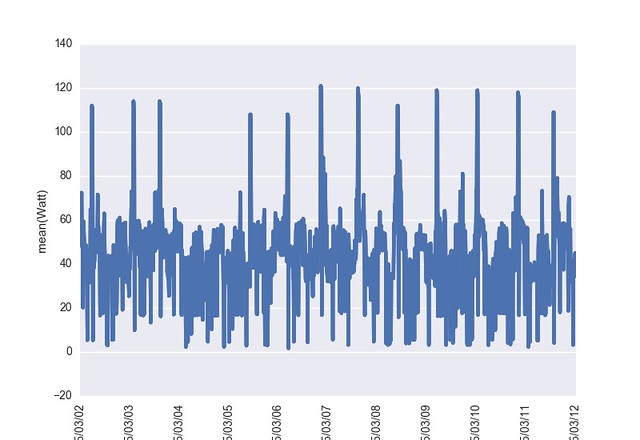
Thin out a little as follows.
data = pd.read_csv("refrigerator.csv")[:360]
This time it feels good.
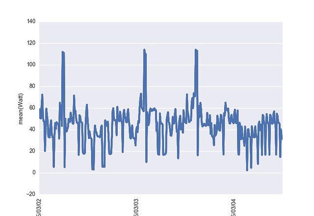
The rated power consumption of the refrigerator is stated as about 110W, so when you see that the peak value is 114.0W, it is almost as specified.
data.Watt.mean()
44.557499999999997

data.Watt.min()
2.2999999999999998

data.Watt.max()
114.0
What is the power consumption?
import seaborn as sns
import pandas as pd

data = pd.read_csv("refrigerator.csv")

#Use a relatively simple point plot
ax = sns.pointplot(
    x='DateTime',   #DateTime on x-axis
    y='kWh',        #kWh on the y-axis (integrated power consumption)
    data=data,      #Specify DataFrame
    markers=[''])   #Hide markers to plot data

#Since there is too much data in the x-axis direction, labels are thinned out every day (data is not thinned out)
xlabels = [datetime.split('-')[0]
    if list(data.DateTime).index(datetime) % 144 is 0 else ''
    for datetime in data.DateTime]

#Set x-axis label & rotate label display 90 degrees
ax.set_xticklabels(xlabels, rotation='vertical')

#Export to png file
sns.plt.savefig('Refrigerator kWh.png')
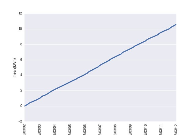
You can see that the power consumption is about 1kWh / day.
data.kWh.max() / 10.0
1.0589999999999999
seaborn API reference and [gallery](http://stanford.edu/~mwaskom/software/seaborn/examples/index. Looking at html), the tension is high.
First of all, I have to be able to master the tools.
Recommended Posts