[PYTHON] Data visualization with pandas
There is already a preceding article, but pandas has a data visualization function. It's a thin wrapper for matplotlib, but it breaks the basic graph code quite a bit.
Data visualization with Pandas
With the visualization of iris introduced here, it can be visualized with the same amount of code as R.
Python for R Users [Differences between Python and R (data visualization / graph creation)](http://pythondatascience.plavox.info/python%E3%81%A8r%E3%81%AE%E9%81%95%E3%81% 84 /% E3% 83% 87% E3% 83% BC% E3% 82% BF% E5% 8F% AF% E8% A6% 96% E5% 8C% 96% E3% 83% BB% E3% 82% B0 % E3% 83% A9% E3% 83% 95% E4% BD% 9C% E6% 88% 90 /)
Most of the imports are python specifications, but I feel that the productivity of data analysis with python is quite high now. R studio / dplyr has become popular and productivity has improved, but I think that python has changed from 5 years ago with Jupyter / Pandas becoming popular. (It's completely different from when numpy + matplotlib was the main.)
Required packages, loading data
import seaborn as sns
import pandas as pd
iris=sns.load_dataset("iris")
%%matplotlib inline
Import seaborn to make it look fashionable. In addition, seaborn also contains toy data, so iris can be loaded from here.
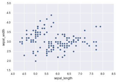
Scatter plot
iris.plot.scatter(x="sepal_length",y="sepal_width")
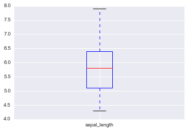
Box plot
iris.sepal_length.plot.box()
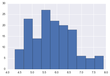
histogram
iris.sepal_length.hist()
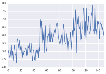
Line chart
iris.sepal_length.plot.line()
Pie chart
pd.crosstab(iris.species,columns="species").plot.pie(y="species")
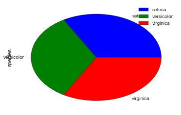
This has some challenges by default. --The default value is horizontally long, so it collapses. --Labels overlap --The color map is not made because seaborn does not have a pie chart.
It is subtle to change the settings for this purpose, but if you add settings, it will be fine.
from matplotlib import pylab
default_size=pylab.rcParams["figure.figsize"]
pylab.rcParams["figure.figsize"]=12,12
pd.crosstab(iris.species,columns="species").plot.pie(y="species",colors=sns.color_palette())
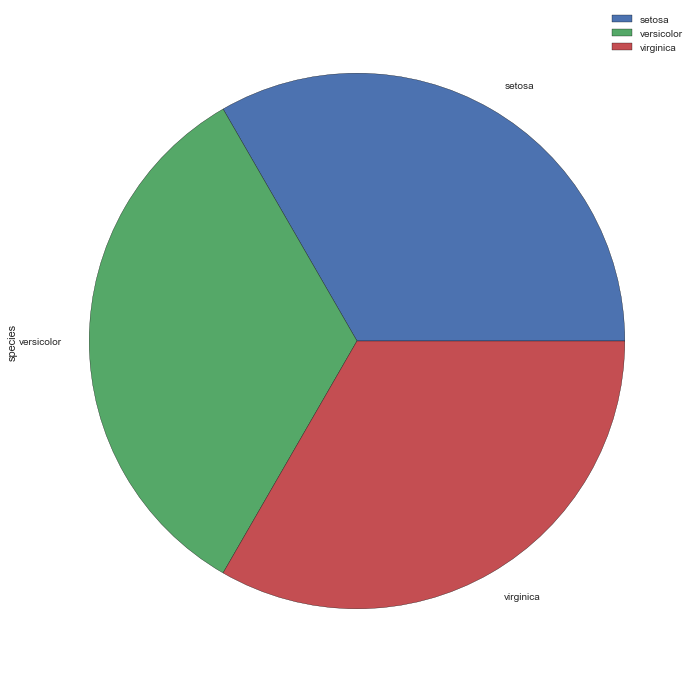
If you change the size, put it back.
pylab.rcParams["figure.figsize"]=default_size
Bar chart
iris.sepal_length.plot.bar()
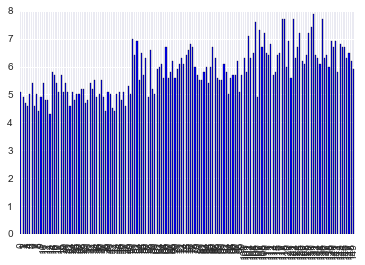
Perhaps because the bar chart assumes categorical variables, it didn't thin out the axis labels by default.
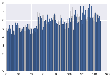
If you call matplotlib directly, it will be thinned out. (Since seaborn has been imported, the color is seaborn.)
from matplotlib import pyplot as plt
plt.bar(iris.index,iris.sepal_length)
Summary
The original slide was explained by Pandas in the first half, but the visualization in the second half does not use Pandas, so the code is redundant. If you want to do complicated things, you have to touch the API of matplotlib directly, Basic diagrams can be coded simply with the Pandas API.
Recommended Posts