[PYTHON] Graph Excel data with matplotlib (2)
I want to extract data from an arbitrary position (range) on an Excel sheet and graph it with matplotlib
I want to create a data frame from a data frame
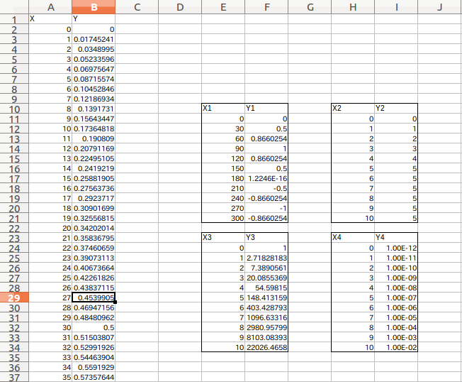
Only the parts (X1, Y1) to (X4, Y4) of the Excel data (shown below) read by pandas Do you want to make a data frame separately? I often do. (Because I create Excel data without thinking ahead ...)
(Figure below) The X and Y parts can be read quickly by the method described in (1) above.
It is very convenient because you can enjoy it later if it is a data frame. With such an Excel data sheet, creating a data frame is troublesome in the first place ...
This time, it is a memo to create a child data frame from this data frame. There seems to be some code that can be solved with just one line, which is easier than this, While I was playing around with it, I was able to understand the data frame structure in various ways, so I would like to make a note of it.
Read parent data frame
Excel files can be read in one shot with pandas and it's easy to win, but in most cases my fucking Excel data does not have a proper index or column.
So, I would like to create a new data frame (child) by specifying the range of the read data (parent).
At the beginning, specify the same import settings and file path as usual.
# coding: utf-8

import numpy as np
import pandas as pd
import matplotlib.pyplot as plt
from matplotlib.font_manager import FontProperties

#Specify the location of the font file ubuntu(C:\Windows\Fonts\Any Font)
fp = FontProperties(fname="/usr/share/fonts/truetype/fonts-japanese-gothic.ttf")

####################################################################
filepath='~/Desktop/sample2.xls' #Xls file location
Read parent data frame
#Parent data frame
df=pd.read_excel(filepath) #Load into Pandas DataFrame
Create a child data frame
Ranged reading by iloc
Immediately, specify the range of the parent df and extract the data. Here, it is specified using iloc.
#Specify the cell range you want to graph
df1=df.iloc[8:20,4:6] #[Line start: end,Column start:End]Specify with
df1=df1.reset_index(drop=True) #Re-roll the index
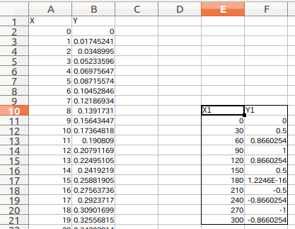
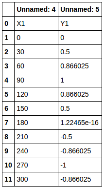
The entire label including the X1 and Y1 labels in the figure below (rows 10 to 21, columns E-F) is specified. Maybe because of the header and the rule of starting from zero Reading the specified position directly from the cell of the sheet is a little sensuously off. Therefore, it is good to specify the range while adding a hit and printing (df1).
Range specification read result by iloc
Here, if you look at df1 read from the specified range, In this way (shown below), it is read based on the column data (Unnamed :) of the parent df, and X1 and Y1 are also data. These X1 and Y1 will be used as labels for the next "child data frame" to be created.
Extract column data from range specification read result by iloc
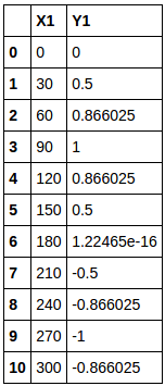
Therefore, let's extract the column data (X1, Y1) of df1.
#List the columns in the first row → Use in the columns of the child data frame
COL_LIST1=df1[0:1].values.flatten()
Then COL_LIST1 will return `['X1''Y1']`.
I got the column data I wanted.
Create an empty child data frame using column data
Create a child data frame (co_df1) based on the extracted column data. At this point, there is only column data and no contents.
#Child data frame(empty)Create, the column is the COL created earlier_LIST
co_df1=pd.DataFrame({},columns=COL_LIST1,index=[])
Put data in a child data frame
Using the for statement, each column data (COL_LIST1) is hung in each column of the specified range data frame (df1). Move the data to a child data frame.
#Write data to each column of the child data frame(〜[1:]Get the data after the column label by)
#Graph1
for i,col in enumerate(COL_LIST1):
    #Read the data in each column
    co_df1[col]=df1[[i]][1:].reset_index(drop=True)
With df1 [[i]], the data in the first and second columns of df1 that was specified and read by iloc is read. However, it also contains the label data X1 and Y1. Therefore df1[[i]][1:] By doing so, you can retrieve only the numerical data excluding the label data.
However, if this is left as it is, the original index information remains and it will be troublesome later. df1[[i]][1:].reset_index(drop=True) Reset the index with.
If you put this in the empty child data frame co_df1 sequentially (only in COL_LIST1), the target child data frame will be completed.
Extract as graph data
After that, for x and y axis data for plot Just throw it in.
x1=co_df1[[0]]
y1=co_df1[[1]]
Try to make 4 graphs redundantly
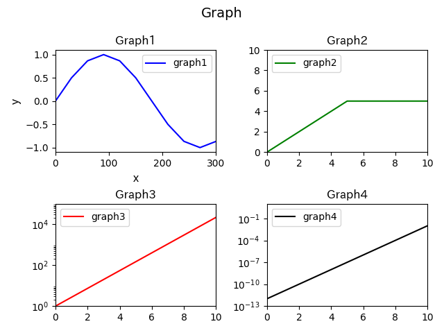
I made a graph of all the Excel data X1, Y1 to X4, Y4 shown at the beginning as child data frames.
code
Paste the graph with 4 child data and the one with only one.
Graph 4 version
# coding: utf-8

import numpy as np
import pandas as pd
import matplotlib.pyplot as plt
from matplotlib.font_manager import FontProperties

#Specify the location of the font file ubuntu(C:\Windows\Fonts\Any Font)
fp = FontProperties(fname="/usr/share/fonts/truetype/fonts-japanese-gothic.ttf")

####################################################################
filepath='~/Desktop/sample2.xls' #Xls file location

#Parent data frame
df=pd.read_excel(filepath) #Load into Pandas DataFrame

#Create a child data frame from a parent data frame

#Specify the cell range you want to graph
df1=df.iloc[8:20,4:6] #[Line start: end,Column start:End]Specify with
df1=df1.reset_index(drop=True) #Re-roll the index


df2=df.iloc[8:20,7:9]
df2=df2.reset_index(drop=True)

df3=df.iloc[21:33,4:6]
df3=df3.reset_index(drop=True)

df4=df.iloc[21:33,7:9]
df4=df4.reset_index(drop=True)

#Column(Name)Read
COL_LIST1=df1[0:1].values.flatten() #List the columns in the first row → Use in the columns of the child data frame
COL_LIST2=df2[0:1].values.flatten()
COL_LIST3=df3[0:1].values.flatten()
COL_LIST4=df4[0:1].values.flatten()

#Child data frame(empty)Create, the column is the COL created earlier_LIST
co_df1=pd.DataFrame({},columns=COL_LIST1,index=[])
co_df2=pd.DataFrame({},columns=COL_LIST2,index=[])
co_df3=pd.DataFrame({},columns=COL_LIST3,index=[])
co_df4=pd.DataFrame({},columns=COL_LIST4,index=[])

#Write data to each column of the child data frame

#Graph1
for i,col in enumerate(COL_LIST1):
    #Read the data in each column
    co_df1[col]=df1[[i]][1:].reset_index(drop=True)

#Graph2
for i,col in enumerate(COL_LIST2):
    #Read the data in each column
    co_df2[col]=df2[[i]][1:].reset_index(drop=True)

#Graph3
for i,col in enumerate(COL_LIST3):
    #Read the data in each column
    co_df3[col]=df3[[i]][1:].reset_index(drop=True)

#Graph4
for i,col in enumerate(COL_LIST4):
    #Read the data in each column
    co_df4[col]=df4[[i]][1:].reset_index(drop=True)


#X in the graph,Extraction of Y data


#Parent data frame
x=df[[0]]
y=df[[1]]

#Child data frame
x1=co_df1[[0]]
y1=co_df1[[1]]

x2=co_df2[[0]]
y2=co_df2[[1]]

x3=co_df3[[0]]
y3=co_df3[[1]]

x4=co_df4[[0]]
y4=co_df4[[1]]


####################################################################
#Graph
####################################################################
fig = plt.figure()

#Multiple graph settings
ax1 = fig.add_subplot(221) #Graph1
ax2 = fig.add_subplot(222)
ax3 = fig.add_subplot(223)
ax4 = fig.add_subplot(224)

#y-axis scale setting
ax1.set_yscale('linear')
ax2.set_yscale('linear')
ax3.set_yscale('log')
ax4.set_yscale('log')

#Axis range
ax1.set_ylim(-1.1, 1.1)
ax1.set_xlim(0,300)

ax2.set_ylim(0,10)
ax2.set_xlim(0,10)

ax3.set_ylim(1E+0,1E+5)
ax3.set_xlim(0,10)

ax4.set_ylim(1E-13,1E+1)
ax4.set_xlim(0,10)

#Individual title
ax1.set_title("Graph1",fontdict = {"fontproperties": fp},fontsize=12)
ax2.set_title("Graph2",fontdict = {"fontproperties": fp},fontsize=12)
ax3.set_title("Graph3",fontdict = {"fontproperties": fp},fontsize=12)
ax4.set_title("Graph4",fontdict = {"fontproperties": fp},fontsize=12)

#axis
ax1.set_xlabel("x",fontdict = {"fontproperties": fp},fontsize=12)
ax1.set_ylabel("y",fontdict = {"fontproperties": fp},fontsize=12)

#plot
ax1.plot(x1, y1,'blue',label='graph1')
ax2.plot(x2, y2,'green',label='graph2')
ax3.plot(x3, y3,'red',label='graph3')
ax4.plot(x4, y4,'black',label='graph4')

#Legend position
ax1.legend(loc="upper right")
ax2.legend(loc="upper left")
ax3.legend(loc="upper left")
ax4.legend(loc="upper left")

#Layout adjustment
plt.tight_layout()

#The title of the entire graph
fig.suptitle('Graph', fontsize=14)

plt.subplots_adjust(top=0.85)

#Save file Save as both png and eps
plt.savefig("sample.png ")
plt.savefig("sample.eps")

plt.show()
Graph 1 version
# coding: utf-8

import numpy as np
import pandas as pd
import matplotlib.pyplot as plt
from matplotlib.font_manager import FontProperties

#Specify the location of the font file ubuntu(C:\Windows\Fonts\Any Font)
fp = FontProperties(fname="/usr/share/fonts/truetype/fonts-japanese-gothic.ttf")

####################################################################
filepath='~/Desktop/sample2.xls' #Xls file location

#Parent data frame
df=pd.read_excel(filepath) #Load into Pandas DataFrame

#Create a child data frame from a parent data frame

#Specify the cell range you want to graph
df1=df.iloc[8:20,4:6] #[Line start: end,Column start:End]Specify with
df1=df1.reset_index(drop=True) #Re-roll the index

#Column(Name)Read
COL_LIST1=df1[0:1].values.flatten() #List the columns in the first row → Use in the columns of the child data frame

#Child data frame(empty)Create, the column is the COL created earlier_LIST
co_df1=pd.DataFrame({},columns=COL_LIST1,index=[])

#Write data to each column of the child data frame(〜[1:]Get the data after the column label by)

#Graph1
for i,col in enumerate(COL_LIST1):
    #Read the data in each column
    co_df1[col]=df1[[i]][1:].reset_index(drop=True)


#X in the graph,Extraction of Y data

#Parent data frame
x=df[[0]]
y=df[[1]]

#Child data frame
x1=co_df1[[0]]
y1=co_df1[[1]]


####################################################################
#Graph
####################################################################
fig = plt.figure()

#Multiple graph settings
ax1 = fig.add_subplot(111) #Graph1


#y-axis scale setting
ax1.set_yscale('linear')

#Axis range
ax1.set_ylim(-1.1, 1.1)
ax1.set_xlim(0,300)


#Individual title
ax1.set_title("Graph1",fontdict = {"fontproperties": fp},fontsize=12)

#axis
ax1.set_xlabel("x",fontdict = {"fontproperties": fp},fontsize=12)
ax1.set_ylabel("y",fontdict = {"fontproperties": fp},fontsize=12)

#plot
ax1.plot(x1, y1,'blue',label='graph1')

#Legend position
ax1.legend(loc="upper right")


#Layout adjustment
plt.tight_layout()

#The title of the entire graph
fig.suptitle('Graph', fontsize=14)

plt.subplots_adjust(top=0.85)

#Save file Save as both png and eps
plt.savefig("sample.png ")
plt.savefig("sample.eps")

plt.show()
Recommended Posts