[PYTHON] Graph Excel data with matplotlib (1)
Graph Excel data with matplotlib
This is the basic code (for myself) to graph Excel data with matplot. I usually expand it as I like based on this.
environment ・ Ubuntu 16.04 ・ Python3.5.2 ・ Matplotlib 2.0.0 ・ Pandas0.19.2, numpy1.11.3 ・ Inkscape (used for eps → emf conversion)
First, simply
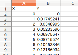
A case where graph data (X-axis, Y-axis) is copied and used in the upper left (A1 cell) of the Excel sheet. It is assumed that the X-axis and Y-axis data you want to graph already exist. ・ I want to paste it in a report (Word), but I'm not happy with the Excel graph. ・ I'm dissatisfied with Excel's exponential notation Only in such a short time, I completely forget the plotting method.
I would like to describe the graphing with the data of any cell range of the existing Excel sheet in (2).
Convert eps files to emf (extended metafile) using Inkscape
The output graph is saved as eps and png. The emf file is convenient when pasting it in a word document, so how to do it.
Inkscape is available from the command line, so use option -M
$ inkscape sample.eps -M sample.emf
I'd like to say, but it doesn't work with the following error ...
parser error : Start tag expected, '<' not found
%!PS-Adobe-3.0 EPSF-3.0
^
** (inkscape:5467): WARNING **: Specified document sample.eps cannot be opened (does not exist or not a valid SVG file)
I'll put this area off I have to make an emf file and put it on the report. It is a method to open inkscape and convert it normally.
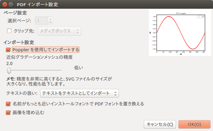
(Added 2017.2.21) ↓ I wrote the solution (using Inkscape) here Convert matplotlib graph to emf file format
-Open the eps file in Inkscape and select emf in "Save As".
If you are using Japanese for the graph Characters are garbled if Import using Poppler in [Import Settings] is not checked. (I don't know what Poppler is ...)
I wish I could save emf directly, but I'm not sure.
Postscript (2017.2.21) According to Piyopiyo no Hibi, the output function of emf has been deleted. What ...
matplotlib-1.3.In 1 document"change point"There was an explanation.
It was written like this.
"By organizing the features, the emf output feature has been removed from this version."
What's that...
The current version of matplotlib is 2.0.0, so just in case I checked it by the method below.
import matplotlib.pyplot as plt
fig = plt.figure()
print(fig.canvas.get_supported_filetypes())
If you look it up in
'pdf': 'Portable Document Format',
'ps': 'Postscript',
'rgba': 'Raw RGBA bitmap',
'pgf': 'PGF code for LaTeX',
'svgz': 'Scalable Vector Graphics',
'svg': 'Scalable Vector Graphics',
'raw': 'Raw RGBA bitmap',
'eps': 'Encapsulated Postscript',
'png': 'Portable Network Graphics'
This seems to be the outputable file type in the current environment.
code
So here is the code: From DataFrame of Excel file (xls, xlsx) read by pandas All you have to do is extract the x-axis and y-axis data and throw it into the plot.
There are two ways to extract, such as specifying by column or by label name.
graph.py
# coding: utf-8

import numpy as np
import pandas as pd
import matplotlib.pyplot as plt
from matplotlib.font_manager import FontProperties

#Specify the location of the font file ubuntu(C:\Windows\Fonts\Any Font)
fp = FontProperties(fname="/usr/share/fonts/truetype/fonts-japanese-gothic.ttf")

####################################################################
filepath='~/Desktop/sample.xls' #Xls file location

df=pd.read_excel(filepath) #Load into Pandas DataFrame

#Read x-axis and Y-axis data from the data frame

#Specified by column
x=df[[0]]
y=df[[1]]

#When specifying by label
#x=df['X']
#y=df['Y']

####################################################################
#Graph
####################################################################
fig = plt.figure()
ax1 = fig.add_subplot(111)

ax1.set_yscale('linear')
#ax1.set_yscale('log')

ax1.set_ylim(-1.1, 1.1)
ax1.set_xlim(0,360)

ax1.set_title("Graph sample",fontdict = {"fontproperties": fp},fontsize=12)
ax1.set_xlabel("x axis",fontdict = {"fontproperties": fp},fontsize=12)
ax1.set_ylabel("y axis",fontdict = {"fontproperties": fp},fontsize=12)

#ax1.plot(x, y,'red',label='sin')
ax1.scatter(x, y,s=1,c='r',label='sin')
ax1.legend(loc="upper right")

#Save file Save as both png and eps
plt.savefig("sample.png ")
plt.savefig("sample.eps")
plt.show()
Recommended Posts