[PYTHON] Versatile data plotting with pandas + matplotlib
Python as a language for scientific computing
Why do scientific and technological calculations such as data analysis be done in Python in the first place? It mainly depends on the following two points.
- Extensive libraries such as NumPy, pandas, matplotlib are available
- Can be used as a versatile glue language
R may be easier if you only do calculations using data frames and plotting them. However, completing statistical analysis with the versatile Python enables a wider range of applications in various fields.
NumPy
Most statistical analyzes involve vector operations. NumPy features ndarray, which is a fast, memory-efficient implementation of multidimensional arrays. It enables high-dimensional vector operations that cannot be achieved with arrays and hash objects that are inherent in programming languages. You can also do fancy index references (= use an integer array for index references).
Vector scalar operation
Since scientific and technological calculations are complicated, it would be difficult to write a loop for each vector element. Therefore, it can be said that vector operation is almost indispensable. In NumPy, you can also write ndarray and scalar operations as follows:
arr = np.array ( [[1., 2., 3.], [4., 5., 6.]] ) #ndarray object

arr * arr #Vector integration
# => array([[  1.,   4.,   9.],
#       [ 16.,  25.,  36.]])

arr - arr #Vector subtraction
# => array([[ 0.,  0.,  0.],
#       [ 0.,  0.,  0.]])

1 / arr #Scalar and ndarray arithmetic operations
# => array([[ 1.        ,  0.5       ,  0.33333333],
#        [ 0.25      ,  0.2       ,  0.16666667]])

arr2d = np.array ([[1,2,3],[4,5,6],[7,8,9]])

arr2d[:2] #Index reference by slice
# => array([[1, 2, 3],
#        [4, 5, 6]])

arrf = np.arange(32).reshape((8,4))
arrf # => array([[ 0,  1,  2,  3],
#        [ 4,  5,  6,  7],
#        [ 8,  9, 10, 11],
#        [12, 13, 14, 15],
#        [16, 17, 18, 19],
#        [20, 21, 22, 23],
#        [24, 25, 26, 27],
#        [28, 29, 30, 31]])
arrf[[1,5,7,2]][:,[0,3,1,2]] #See fancy index
# => array([[ 4,  7,  5,  6],
#        [20, 23, 21, 22],
#        [28, 31, 29, 30],
#        [ 8, 11,  9, 10]])
Redefining data structures with pandas
While NumPy alone is very useful, pandas offers an even more R-like data structure. These are Series and DataFrame. The term data frame is often used in R, so those who have used R will be familiar with it. A series is a one-dimensional array-like object, and a data frame has a data structure with tabular rows and columns.
Plotting with pandas + matplotlib
Matplotlib, often mentioned in articles up to yesterday, is a powerful library for data visualization. By combining this with pandas, you can draw and visualize various data analysis results. Let's move our hands immediately as we will give detailed explanations to textbooks and official websites.
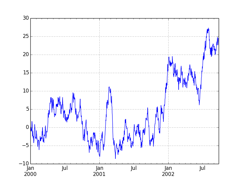
Series plotting
from pylab import *
from pandas import *
import matplotlib.pyplot as plt
import numpy as np
ts = Series(randn(1000), index=date_range('1/1/2000', periods=1000))
ts = ts.cumsum()
ts.plot()
plt.show()
plt.savefig("image.png ")
Data frame plotting
In order to handle Japanese with matplotlib, it is necessary to specify the font. Let's try using Japanese.
# -*- coding: utf-8 -*-
from pylab import *
from pandas import *
import matplotlib.pyplot as plt
import numpy as np
from matplotlib import font_manager #Required to use Japanese
fontprop = matplotlib.font_manager.FontProperties(fname="/usr/share/fonts/truetype/fonts-japanese-gothic.ttf") #Specify the location of the font file
df = DataFrame(randn(1000, 4), index=ts.index, columns=list('ABCD'))
df = df.cumsum()
plt.figure()
df.plot()
plt.legend(loc='best')
ax = df.plot(secondary_y=['A', 'B'])
ax.set_ylabel('CD sales', fontdict = {"fontproperties": fontprop})
ax.right_ax.set_ylabel('AB scale', fontdict = {"fontproperties": fontprop})
plt.show()
plt.savefig("image2.png ")
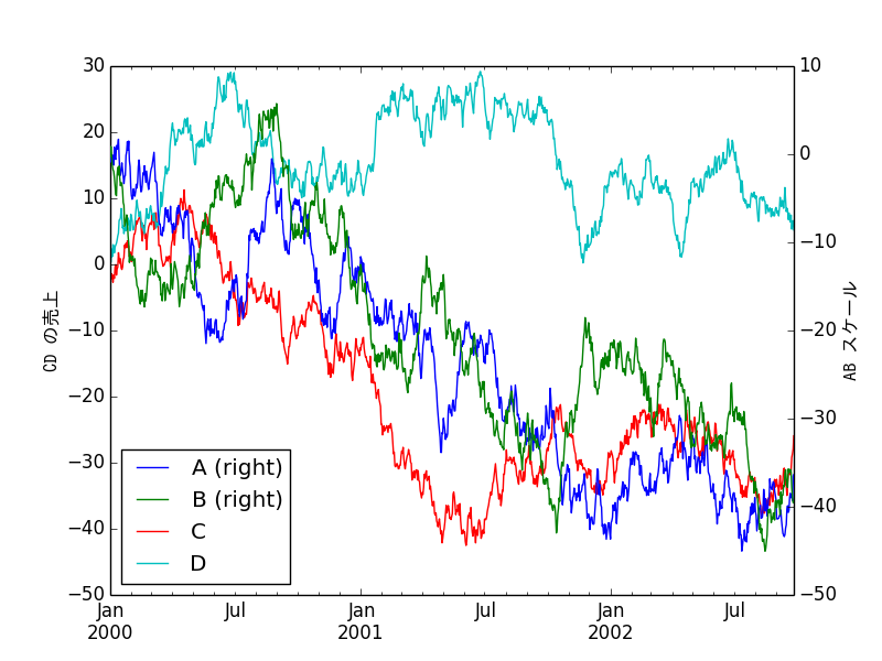
Japanese is displayed. Actually, you should adjust the font parameters a little more.
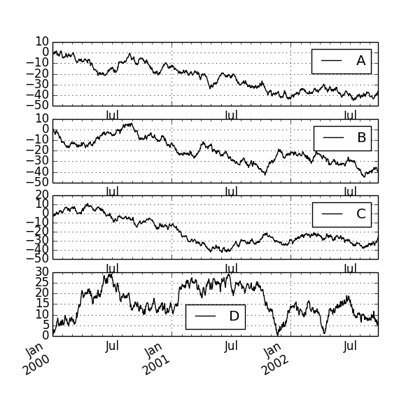
Subprotting
matplotlib also allows subplotting to draw plots within plots.
df.plot(subplots=True, figsize=(6, 6)); plt.legend(loc='best')
plt.show()
plt.savefig("image3.png ")
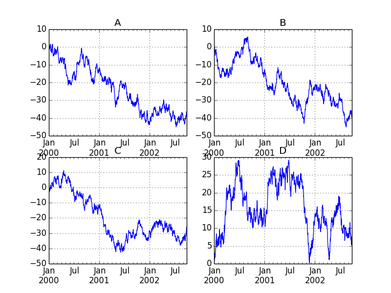
fig, axes = plt.subplots(nrows=2, ncols=2)
df['A'].plot(ax=axes[0,0]); axes[0,0].set_title('A')
df['B'].plot(ax=axes[0,1]); axes[0,1].set_title('B')
df['C'].plot(ax=axes[1,0]); axes[1,0].set_title('C')
df['D'].plot(ax=axes[1,1]); axes[1,1].set_title('D')
plt.show()
plt.savefig("image4.png ")
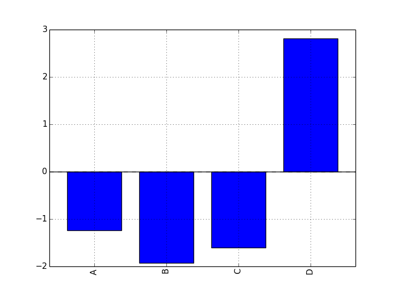
Bar chart plotting
plt.figure();
df.ix[5].plot(kind='bar'); plt.axhline(0, color='k')
plt.show()
plt.savefig("image5.png ")
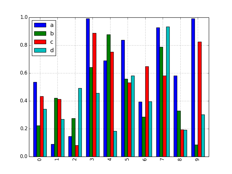
df2 = DataFrame(rand(10, 4), columns=['a', 'b', 'c', 'd'])
df2.plot(kind='bar');
plt.show()
plt.savefig("image6.png ")
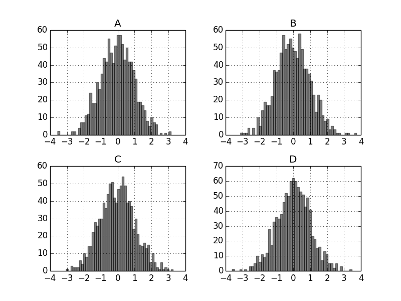
Bar chart subprotting
Of course, bar charts (any other) can also be subproted.
df.diff().hist(color='k', alpha=0.5, bins=50)
plt.show()
plt.savefig("image8.png ")
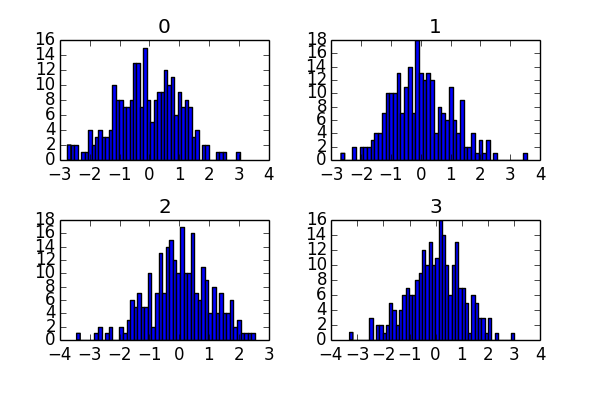
data = Series(randn(1000))
data.hist(by=randint(0, 4, 1000), figsize=(6, 4))
plt.show()
plt.savefig("image9.png ")
Various data visualization
matplotlib can plot a wide variety of other graphs, but here are some of them.
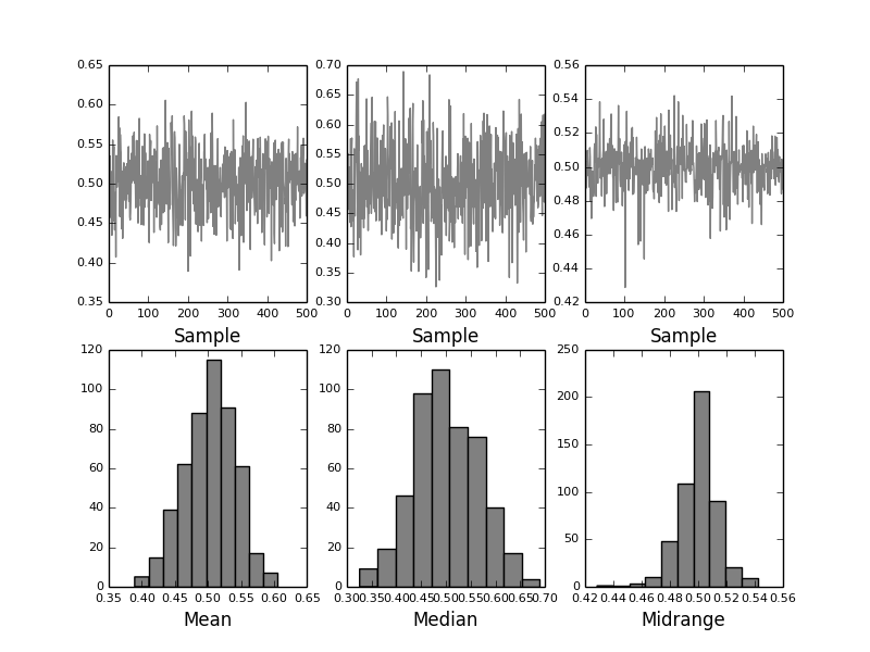
from pandas.tools.plotting import bootstrap_plot
data = Series(rand(1000))
bootstrap_plot(data, size=50, samples=500, color='grey')
plt.show()
plt.savefig("image12.png ")
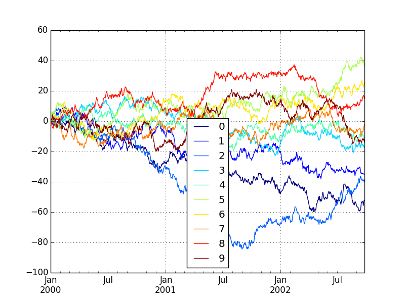
df = DataFrame(randn(1000, 10), index=ts.index)
df = df.cumsum()
plt.figure()
df.plot(colormap='jet')
plt.show()
plt.savefig("image13.png ")
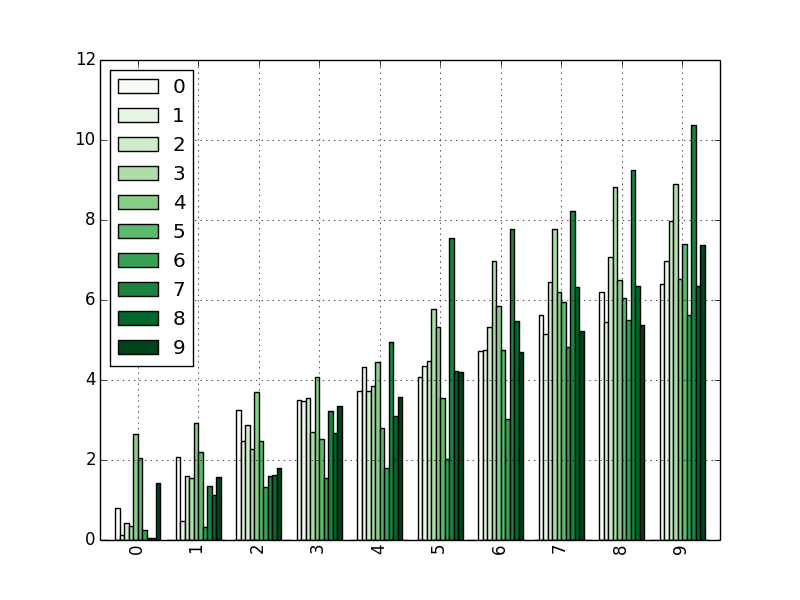
dd = DataFrame(randn(10, 10)).applymap(abs)
dd = dd.cumsum()
plt.figure()
dd.plot(kind='bar', colormap='Greens')
plt.show()
plt.savefig("image14.png ")
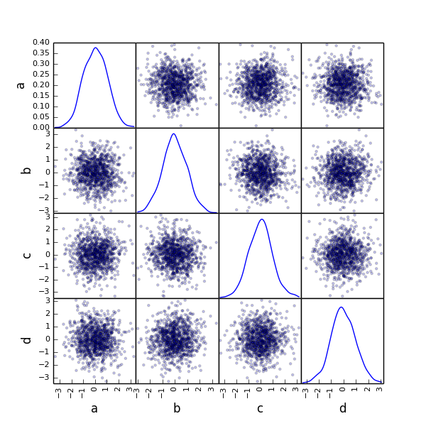
from pandas.tools.plotting import scatter_matrix
df = DataFrame(randn(1000, 4), columns=['a', 'b', 'c', 'd'])
scatter_matrix(df, alpha=0.2, figsize=(6, 6), diagonal='kde')
plt.show()
plt.savefig("image11.png ")
Consideration
We found that NumPy provides advanced vector operations, pandas provides R-like data structures, and matplotlib provides easy-to-understand visualization of their calculations. With such a powerful tool, it would be very encouraging for data analysis. Calculations related to linear algebra are almost indispensable in statistics and machine learning, but it is important to familiarize yourself with these libraries first with such knowledge.
reference
For detailed explanation, please refer to the information on each official website.
NumPy http://www.numpy.org/
pandas http://pandas.pydata.org/
matplotlib http://matplotlib.org/#
Recommended Posts