[PYTHON] Visualize railway line data as a graph with Cytoscape 2
Introduction
This series uses Cytoscape, IPython Notebook, Pandas This is an article for visualization practitioners that introduces the process of actual graph visualization based on public data using open source tools such as .pydata.org/).
Change log
- 8/17/2014 (Sun): Some figures and sentences have been updated.
- 9/8/2014: It was completed for the time being in the 4th session.
Data processing in an interactive environment
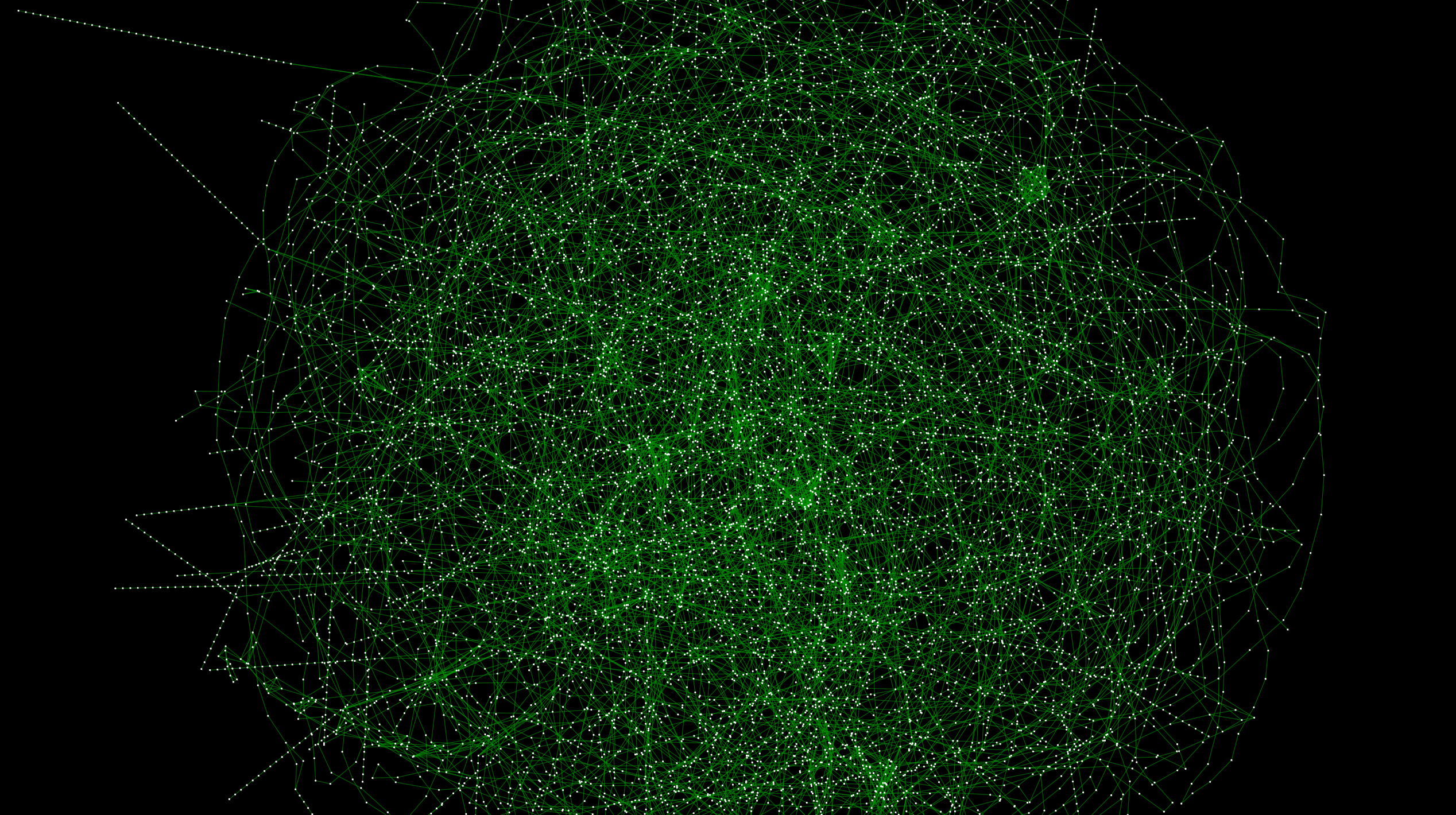 __ Figure 1__: A graph connecting railway systems all over Japan. High resolution version is here
Introduction
Last time processed the file downloaded from the data source using IPython Notebook. I've even loaded it into Cytoscape. However, in the previous state, there is no problem in arranging nodes (stations) using latitude and longitude, but the actual route data itself is not a graph. The figure below shows another automatic layout algorithm of the previous data. % 87% E3% 83% AB_ (% E3% 82% B0% E3% 83% A9% E3% 83% 95% E6% 8F% 8F% E7% 94% BB% E3% 82% A2% E3% 83% Visualized using AB% E3% 82% B4% E3% 83% AA% E3% 82% BA% E3% 83% A0)):
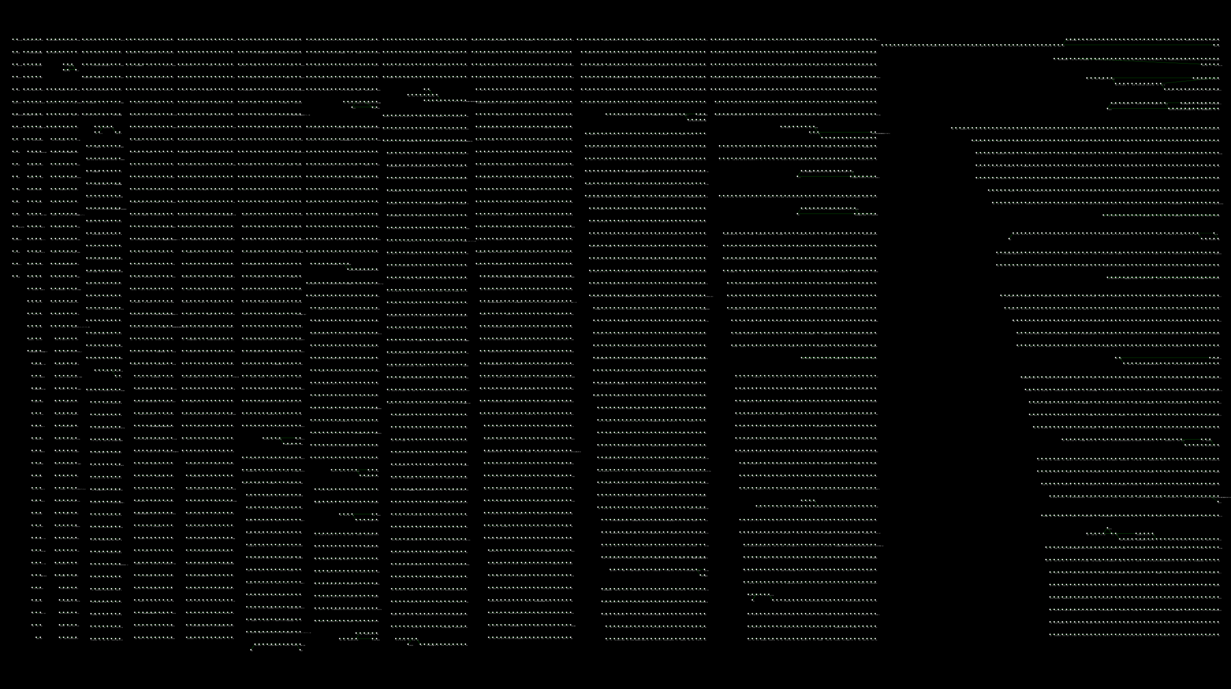 (High resolution version is here)
If you zoom in, you can see that there are connections for each line, but each one exists independently:
With this, the automatic layout, path search, and other functions will not work well. First of all, I would like to solve this problem by interactively programming with IPython Notebook as before, and then integrate and visualize the data provided by public institutions.
This goal
- Connect connected routes with different types of edges to convert the divided route data into nationwide graph data.
- Obtain data related to the number of passengers getting on and off the station from public institutions and process it into a form that can be read by Cytoscape.
- Obtain the theme color of each line from Wikipedia and process it into CSV
- Integrate all data on Cytoscape and create a visualization sample
A notebook that records the actual work
I will add it from time to time, but you can see the record of the actual work here:
This can be done on your machine as long as you have the libraries used in your notebook installed. Even if you're not a Python programmer, you're not doing anything complicated, so you can understand it by following the instructions in the notes. The data pre-processing performed in the notebook is as follows.
About environment construction when working with Python
Basically I'm working on a UNIX-like operating system, but in that case it's convenient to build an environment with Anaconda:
This kind of data cleansing includes Pandas, NumPy I often use libraries such as .numpy.org/) and SciPy, but they take good care of the library dependencies around here. Besides, it works well with the pip command. Library installation
conda install LIBRARY_NAME
You don't have to think about anything because you can almost solve it with the command.
Details of data preparation work
Now let's see what is going on in the notebook. If possible, it will be easier to understand if you read while actually executing the notes.
Connect disjointed route data for each station group
Make a connection using the information called Station Group in the original data. Being in the same group means that you can transfer as is, or that those stations are within walking distance. Therefore, it can be considered that the stations in the group are practically connected to other lines. In the actual work, we will connect those stations in the same group with a new edge, and [Creek](http://ja.wikipedia.org/wiki/%E3%82%AF%E3%83%AA % E3% 83% BC% E3% 82% AF_ (% E3% 82% B0% E3% 83% A9% E3% 83% 95% E7% 90% 86% E8% AB% 96)) Masu:
 __ Figure 2 __: Part of the created creek
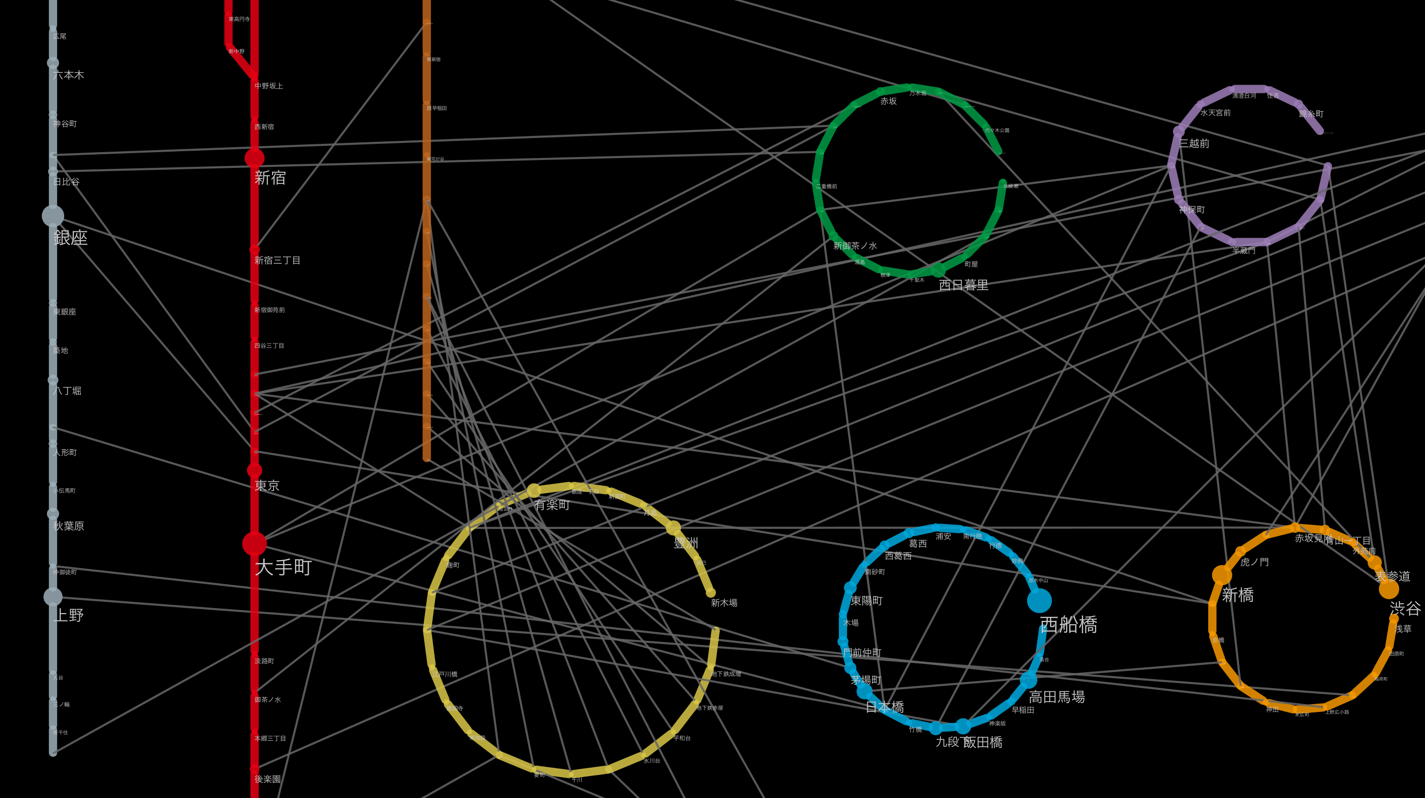
By merging these creeks into the original route data, a railway network connecting routes nationwide is formed as shown in Fig. 1.
Check the state of the connected graph
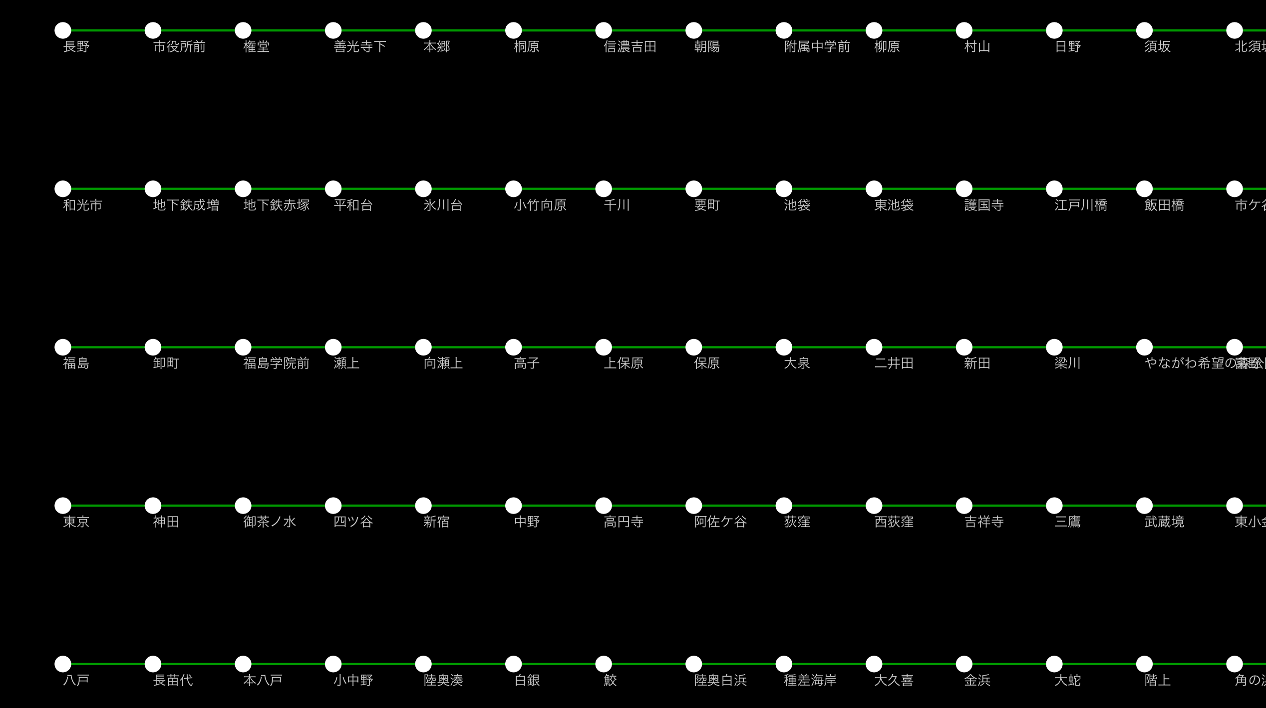
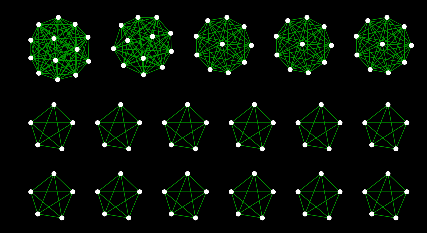
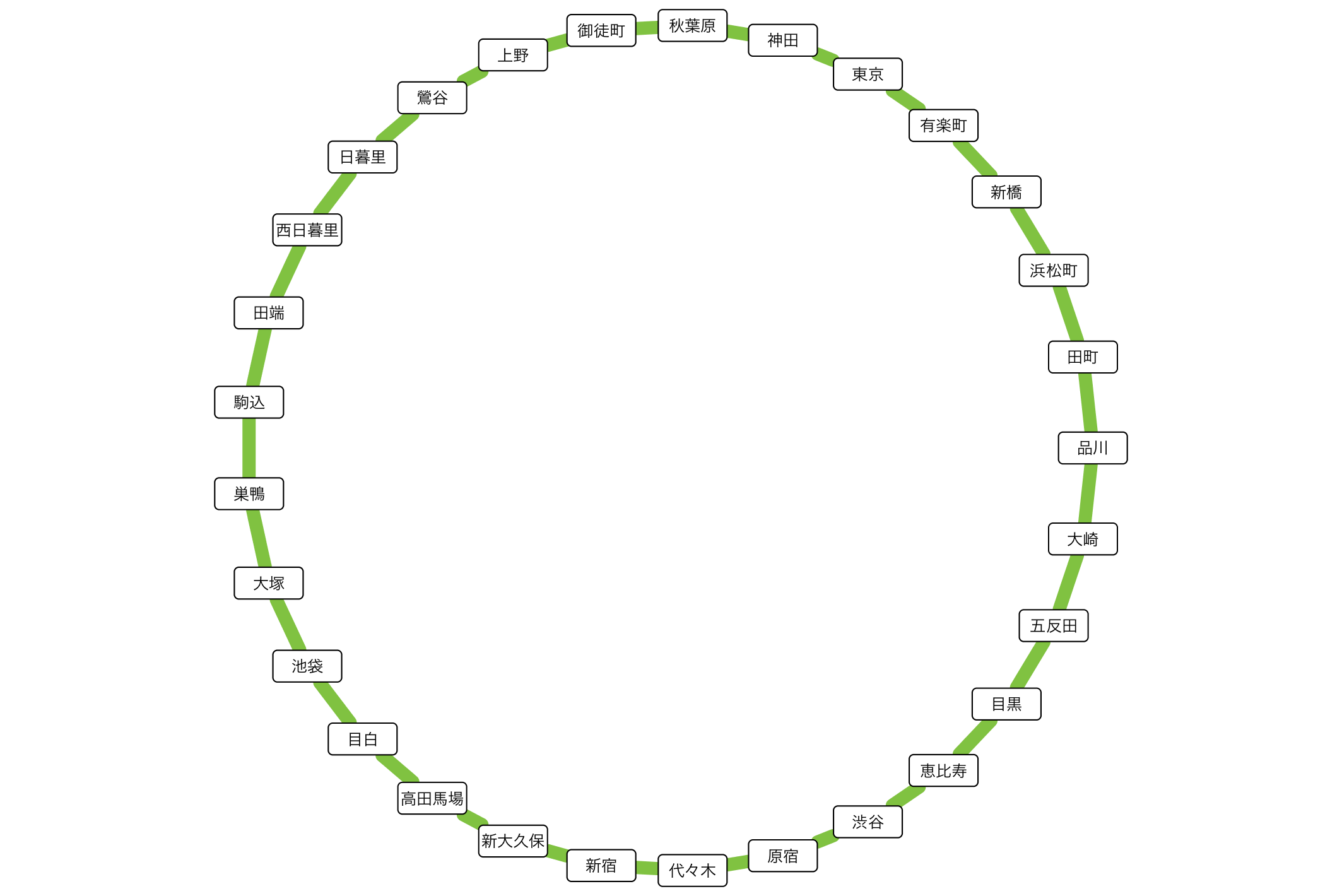
Here, a little off the side road, how the creek was actually incorporated is the largest station in Japan [Shinjuku](http://ja.wikipedia.org/wiki/%E6%96%B0%E5%AE Let's take% BF% E9% A7% 85) as an example. Shinjuku Station is a huge hub for the railway network, with each railway line on board. __ If you visualize this, you should be able to see the creeks made up of stations belonging to the same group and each line extending radially from there __. I actually tried it for confirmation. I will omit the part to be read into Cytoscape (for now), but the basic operation to make the following figure is
- Select Shinjuku Station Group from the national route map
- Extract stations that exist within 1 hop from there (CTR-6 on Windows / Linux Command + 6 on Mac)
- Create a new network from the washed subgraph (CTR + N on Windows / Linux, Command + N on Mac)
- Apply the ring layout algorithm to the Shinjuku station group and others
- Create a simple Style to distinguish edges within a group from others
If you do this, you can draw a diagram like the one below:
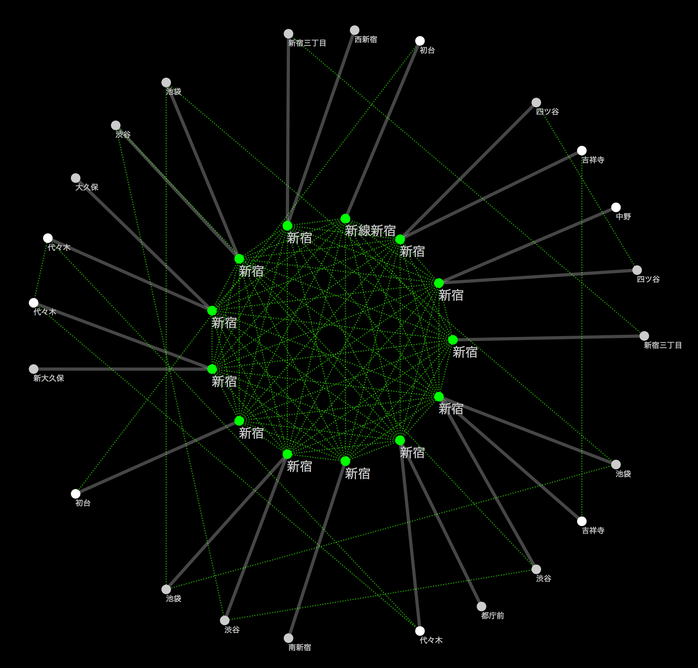 (
(The green dotted line indicates the transferable route (within walking distance), and the solid line indicates each route. As far as I can see this, it seems that the connection was successful.
Map other publicly available datasets on the rail network
Now you have a "railroad blank map" that you can use on Cytoscape. There is a reason to call this data a blank map. That's because __ you can freely map other datasets on this network to create your own visualizations __. This is the advantage of dropping geographic data into a conceptual graph structure and the point of using it in Cytoscape. There are a myriad of possible mappings, but a simple example is:
- Cut out the route you are interested in as a subgraph and visually map the number of passengers per day to it.
- Calculate the number of people that can be moved per route (number of trains per day x train capacity) and map the approximate passenger flow rate to the edge thickness.
- Cut out a certain line, extract the facilities along the line from other geographical data, and connect to the nearest station using a new edge. Give them a new layout and [Infographic](http://en.wikipedia.org/wiki/%E3%82%A4%E3%83%B3%E3%83%95%E3%82%A9% E3% 82% B0% E3% 83% A9% E3% 83% 95% E3% 82% A3% E3% 83% 83% E3% 82% AF)
These are all simple examples, but the more data you can map, the greater the possibilities for further visualization. First of all, I thought that there might be some simple data so that I could experience the basic functions, but I thought that it would be easy to understand the "number of passengers per day", so I searched for publicly available data. started.
Obtaining and cleaning public data
To tell the truth, I have never seen Japanese public data sets seriously. I found out when I actually started looking for it, but the statistics that each ministry and agency knows are published for the time being, but there is still a strong tendency to publish it as a sentence that __ people read __. Although it is a very simple data set called "Number of passengers per station", the table is not published as a pair of station name-number of passengers. It was this data that I "excavated" this time:
Since it is published as an XML file, I thought that it should be relatively easy to process, so I started work, but suddenly the parser broke. The cause was a simple mistake of closing the tag,
cat S12-13.xml | sed -e "s/ksj:ailroad/ksj:railroad/" > fixed.xml
It can be repaired with.
Problems when actually using
When I actually moved my hand and scrutinized the contents, I realized that it could not be as simple as I expected. Some of the issues are:
- The number of passengers is not always the data for each station
- Some data is combined with other stations
- Data loss-Some stations have no data in the first place
- ID of the total destination of the total data
- The total method when totaling is written in natural language in the __ remarks column __
- There is no ID of the total destination
At this point, I was a little less motivated, but I decided to do only the part that I could do as a demonstration of the method, and proceeded without seeing such part (I think that this will not be done at work ...) .. After doing some ridiculous work like the one in the notebook, I got a table like this:

I wrote in the notebook the reason why I purposely converted the coded information into redundant character string information, but it is easier to work with visualization software by saving it as a human readable character string. .. __ This kind of work is rather harmful for large-scale analysis and visualization, so determine the size of the data set and compare the convenience with the weight for the computer and use an appropriate method. Let's choose __.
Obtaining route theme color information by scraping
Since the WWW started with the idea of linking human-readable texts, there is a huge amount of data published as tables designed to be read by humans without assuming that they will be processed by machines. And such data is surprisingly useful and the information you want to use is buried.
When visualizing the network with Cytoscape, you can freely create a customized color map for all the elements on the screen. For this dataset, it's easier to understand and more effective to use something that people are familiar with than to set the color coding yourself. For Tokyo Metro, the following colors are standard:
 ([Wikimedia Commons](http://commons.wikimedia.org/wiki/File:Tokyo_metro_map.png#mediaviewer/%E3%83%95%E3%82%A1%E3%82%A4%E3%83%AB : From Tokyo_metro_map.png))
I wondered if I could get this color information in a file format that could be easily read by a machine, but unfortunately I couldn't find it (please let me know if anyone knows it). However, it was well published as a human-readable sentence:
- [List of Japanese railway line colors](http://ja.wikipedia.org/wiki/%E6%97%A5%E6%9C%AC%E3%81%AE%E9%89%84%E9%81] % 93% E3% 83% A9% E3% 82% A4% E3% 83% B3% E3% 82% AB% E3% 83% A9% E3% 83% BC% E4% B8% 80% E8% A6% A7 )
So I decided to forcibly cut it out from this page. There are various exceptions to the data buried in this text, but in many cases there are some patterns, so it's easy to just take a quick look:
<tr style="height:20px;">
<td>Line 3</td>
<td>
<a href="/wiki/%E6%9D%B1%E4%BA%AC%E3%83%A1%E3%83%88%E3%83%AD%E9%8A%80%E5%BA%A7%E7%B7%9A" title="Tokyo Metro Ginza Line">
Ginza line
</a>
</td>
<td>G</td>
<td style="background:#f39700; width:20px;"> </td>
<td><b>Orange</b></td>
</tr>
If you combine the data __ # f39700__ in this with the key __ Tokyo Metro Ginza Line __, it will be read by Cytoscape, and the color data will be _ Passthrough Mapping. You can use it as it is with .org / Cytoscape_3 / UserManual # Cytoscape_3.2BAC8-UserManual.2BAC8-Styles.How_Mappings_Work) _. Fortunately, Python has a lot of libraries to do this kind of scraping work, so I used them to make a rough cutout. This work can be improved as much as you like, but for demonstration purposes, it can be dirty, so I've kept the results to a minimum.
Check scraping results
This time, we will visualize the subject of Tokyo Metro, so make sure that the data of that part is taken properly. Let's do it with one liner.
grep tokyo metro line_colors.csv | awk -F ',' '{print "<span style=\"color:" $3 "\">" $2 "</span><br />"}' > metro_colors.html
The result looks like this, and you can see that there is no problem comparing it with the original data:
(Generated HTML)

(Original Table)

As mentioned above, including the previous part, All work is recorded in IPython Notebook. , The execution itself will take tens of seconds. If you are interested, please take a look at the generated text file (CSV). All of these can be easily loaded into Cytoscape.
Integration and mapping on Cytoscape
Now it's finally visualization with Cytoscape. But it's getting pretty long, so I'll carry over the details of this part next time. As the next preview, I will briefly introduce what kind of processing is possible once it is loaded into Cytoscape.
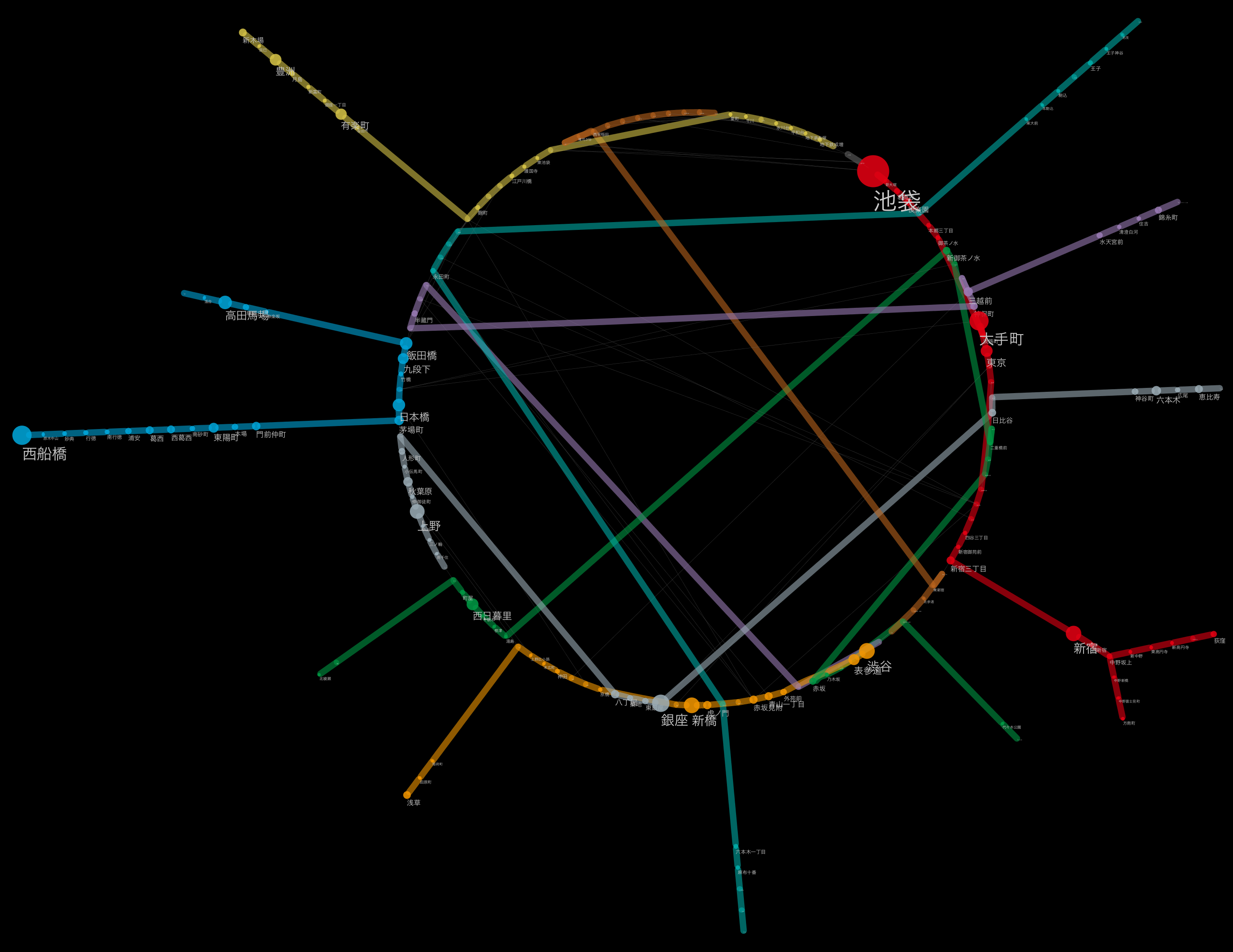
The desktop you are working on with everything loaded
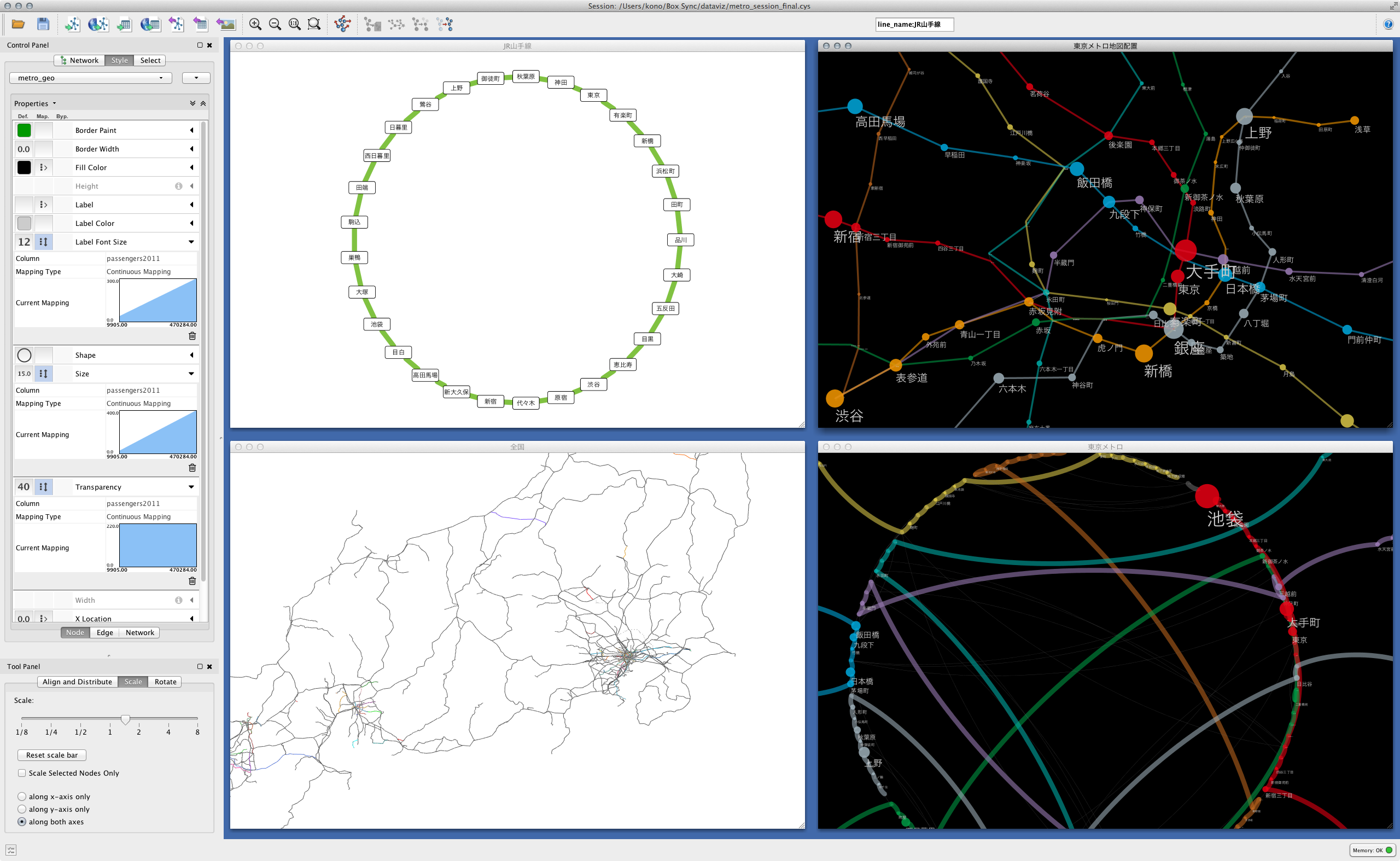 (
(Each station of Tokyo Metro showing the relative positional relationship using the position on the map
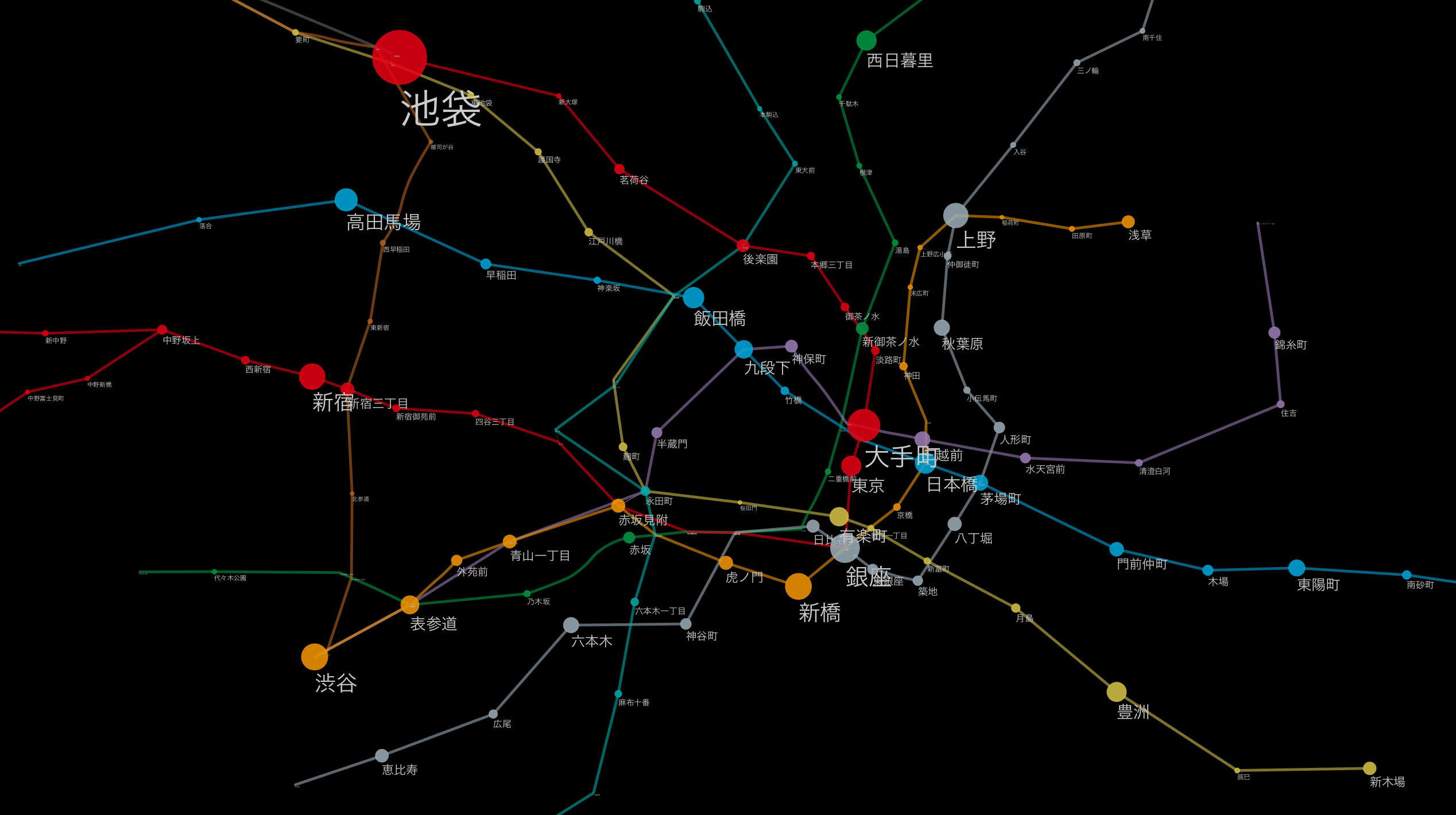 (
(An example of applying another layout algorithm.
Label size maps to number of passengers per day
 (
(Yamanote line as a simple connection diagram
 (
(Combine automatic and manual layout (layout applied to each route)
 (
(At the end
__ "All public statistics are published in a Machine-Readable form, code-writing humans can use them to create new value-creating applications, and statisticians gain new insights from the results of their integration."
Such a world may come someday. But at least for now this is the reality. Excavating "dirty data", cleaning it, and putting it together in a usable form is a very steady and boring process, but it is an unavoidable process at present. The tools are ready. If you can write code, move your hand and list what's wrong. And let's tell the provider. In the long run, that's probably the only solution.
As you can see from the Notebook, it's a general click. Unlike programming, when preparing data for a particular visualization, I have a policy of __ that you can read back what you did rather than __efficiency or elegance. It still takes some trial and error in terms of workflow reusability, but rather than doing more elaborate things than necessary, a visualization app (Cytoscape, of course, D3.js It may be necessary for people working in the field of visualization to focus on creating an easy-to-use data set that can be used in) (including custom visualization applications created in) and proceed with work while making some compromises. not. Now it is possible to combine tools such as Git, IPython Notebook, and RStudio to automatically save records including the process of thinking without stress. I think it's a good idea to use these to gradually find a workflow that suits you.
I'm sorry for those who are not members because it is an FB group, but if you are interested in such visualization, please join this group. We plan to share problems and know-how. A group for people who move their hands in the field of visualization.
Continued from the 3rd
Recommended Posts