[PYTHON] Visualization of data by prefecture
what is this
I have created a library (japanmap) for ** Python3 ** that color-codes Japanese maps by prefecture. The execution example is confirmed on Jupyter Notebook.
Installation
You can do it with pip. numpy [^ 1], OpenCV and Pillow are also installed. xlrd is used to read Excel files.
bash
pip install -U japanmap jupyter matplotlib pandas xlrd
What is a prefecture code?
Prefecture code (hereinafter abbreviated as prefecture code) is 01 for each prefecture defined by JIS X 0401. From 47 codes. The program treats it as an integer (ignoring leading zeros).
Prefecture name confirmation
You can find the prefecture name for each prefecture code with pref_names.
python3
from japanmap import pref_names
pref_names[1]
>>>
'Hokkaido'
You can find the prefecture code for the prefecture name with pref_code.
python3
from japanmap import pref_code
pref_code('Kyoto'), pref_code('Kyoto府')
>>>
(26, 26)
You can find the prefecture code for each of the eight regional divisions in groups.
python3
from japanmap import groups
groups['Kanto']
>>>
[8, 9, 10, 11, 12, 13, 14]
Blank map
You can get a blank map (raster data) with picture.
python3
%config InlineBackend.figure_formats = {'png', 'retina'}
%matplotlib inline
import matplotlib.pyplot as plt
from japanmap import picture
plt.rcParams['figure.figsize'] = 6, 6
plt.imshow(picture());

You can also paint the prefecture with colors.
python3
plt.imshow(picture({'Hokkaido': 'blue'}));

Save to PNG file
You can save it to a file with savefig.
python3
plt.imshow(picture({'Hokkaido': 'blue'}))
plt.savefig('japan.png')
Adjacent information
With is_faced2sea, you can see if the area including the office location faces the sea for the prefecture code.
python3
from japanmap import is_faced2sea
for i in [11, 26]:
    print(pref_names[i], is_faced2sea(i))
>>>
Saitama Prefecture False
Kyoto Prefecture True
With is_sandwiched2sea, you can see if the area including the office location is sandwiched between the sea for the prefecture code. (Are there two or more non-continuous beaches?)
python3
from japanmap import is_sandwiched2sea
for i in [2, 28]:
    print(pref_names[i], is_sandwiched2sea(i))
>>>
Aomori Prefecture False
Hyogo Prefecture True
With adjacent, you can see the prefecture code where the area including the agency location is adjacent to the prefecture code.
python3
from japanmap import adjacent
for i in [2, 20]:
    print(pref_names[i], ':', ' '.join([pref_names[j] for j in adjacent(i)]))
>>>
Aomori Prefecture:Iwate prefecture Akita prefecture
Nagano Prefecture:Gunma prefecture Saitama prefecture Niigata prefecture Toyama prefecture Yamanashi prefecture Gifu prefecture Shizuoka prefecture Aichi prefecture
Boundary vector data
You can get the point list and point index list of each prefecture with get_data. You can use this to get a list of prefecture boundaries (index list) with pref_points.
python3
from japanmap import get_data, pref_points
qpqo = get_data()
pnts = pref_points(qpqo)
pnts[0]  #Boundary coordinates of Hokkaido(Longitude latitude)list
>>>
[[140.47133887410146, 43.08302992960164],
 [140.43751046098984, 43.13755540826223],
 [140.3625317793531, 43.18162745988813],
...
You can visualize the border data with pref_map.
python3
from japanmap import pref_map
svg = pref_map(range(1,48), qpqo=qpqo, width=2.5)
svg

Save to SVG file
pref_map is in SVG format. You can save it to a file as follows.
python3
with open('japan.svg', 'w') as fp:
    fp.write(svg.data)
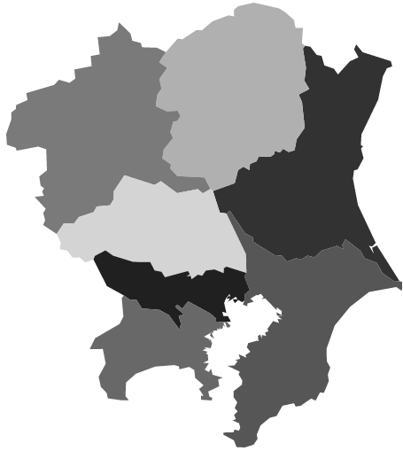
An example of grayscale only in Kanto.
python3
pref_map(groups['Kanto'], cols='gray', qpqo=qpqo, width=2.5)
Convert prefecture area ratio using prefecture data (population)
Let's convert the area ratio on the map by the population ratio. Population data of "I see, Statistics Academy" of the Statistics Bureau of the Ministry of Internal Affairs and Communications Press "Source Statistics Table" at the bottom of the screen in 2017 Let's download the file (a00400.xls) of the population [^ 2] by prefecture.
python3
import pandas as pd
df = pd.read_excel('a00400.xls', usecols=[9, 12, 13, 14], skiprows=18, skipfooter=3,
                   names='Prefectures Male and female total male and female'.split()).set_index('Prefectures')
df[:3]
| Gender total | Man | woman | |
|---|---|---|---|
| Prefectures | |||
| Hokkaido | 5320 | 2506 | 2814 |
| Aomori Prefecture | 1278 | 600 | 678 |
| Iwate Prefecture | 1255 | 604 | 651 |
Let's display them in descending order of population ratio. The ratio of Tokyo, 5.09, represents 5.09 times the prefecture average.
python3
df['ratio'] = df.Gender total/ df.Gender total.mean()
df.sort_values('ratio', ascending=False)[:10]
| Gender total | Man | woman | ratio | |
|---|---|---|---|---|
| Prefectures | ||||
| Tokyo | 13724 | 6760 | 6964 | 5.090665 |
| Kanagawa Prefecture | 9159 | 4569 | 4590 | 3.397362 |
| Osaka | 8823 | 4241 | 4583 | 3.272729 |
| Aichi prefecture | 7525 | 3764 | 3761 | 2.791260 |
| Saitama | 7310 | 3648 | 3662 | 2.711510 |
| Chiba | 6246 | 3103 | 3143 | 2.316839 |
| Hyogo prefecture | 5503 | 2624 | 2879 | 2.041237 |
| Hokkaido | 5320 | 2506 | 2814 | 1.973356 |
| Fukuoka Prefecture | 5107 | 2415 | 2692 | 1.894348 |
| Shizuoka Prefecture | 3675 | 1810 | 1866 | 1.363174 |
Let's visualize it.
You can convert the area of the prefecture to the specified ratio with trans_area.
For example, if the conversion ratio for each prefecture is [2, 1, 1, 1, ...], Hokkaido will have twice the original area and other prefectures will have the same ratio as the original area.
In the following, if the population is twice the average, the area will be doubled.
python3
from japanmap import trans_area
qpqo = get_data(True, True, True)
pref_map(range(1,48), qpqo=trans_area(df.Gender total, qpqo), width=2.5)

I made it as rough as possible to reduce distortion, but it's quite severe.
Visualize population on a blank map
By doing the following, you can visualize the prefectures with a large population in dark red.
python3
cmap = plt.get_cmap('Reds')
norm = plt.Normalize(vmin=df.Gender total.min(), vmax=df.Gender total.max())
fcol = lambda x: '#' + bytes(cmap(norm(x), bytes=True)[:3]).hex()
plt.colorbar(plt.cm.ScalarMappable(norm, cmap))
plt.imshow(picture(df.Gender total.apply(fcol)));

4 color problem
Solve the 4 color problem using adjacency information Let's go.
Let's paint one prefecture with one color and paint the whole of Japan with four colors so that neighboring prefectures are different. The problem of assigning different colors to adjacent objects in this way is called the vertex coloring problem. The vertex coloring problem is a problem of assigning colors to vertices with the minimum number of colors so that adjacent vertices on the graph have different colors. As an application of this, for example, there is a problem of determining the frequency for each base station of a mobile phone. (Different colors → different frequencies → radio waves do not interfere, so you can talk)

Solve the 4-color problem
It has been mathematically proven that any flat map can be painted in up to 4 colors with different adjacent areas. However, it is not obvious how to paint them separately. Here, let's solve the mathematical optimization.
Mathematical optimization is used to solve problems such as cost minimization, but it can also solve problems with only constraints without an objective function. For the package PuLP used for mathematical optimization, see Python in optimization.
--There are three things that must be decided in the mathematical model (1): variable representation, objective function, and constraints. --Variable expression: Prepare 188 variables that take only 0 or 1 in 47 prefectures x 4 colors. Such variables are called binary variables. Variables are managed in a table in package pandas. Constraints can be written in an easy-to-understand manner by using this variable table (2). --Objective function: This time, we will not maximize it, so we will not set it. In PuLP, it can be executed without setting the objective function. --Constraints: One color for each prefecture (3). Adjacent prefectures should have different colors (4). --Once you have a mathematical model, you can find the solution just by executing the solver (5). The solver is software that solves mathematical models and is installed when you install pulp. --The result can be confirmed by calling value for the variable. Here, a new column "Val" is added to the variable table and the result is set (6). By getting the row where this new column is non-zero, you know the color to paint for the prefecture.

It requires additional PuLP and ortoolpy to run (pip install pulp ortoolpy).
python3
import pandas as pd
from ortoolpy import model_min, addbinvars, addvals
from pulp import lpSum
from japanmap import pref_names, adjacent, pref_map
m = model_min()  #Mathematical model(1)
df = pd.DataFrame([(i, pref_names[i], j) for i in range(1, 48) for j in range(4)],
                  columns=['Code', 'Prefecture', 'color'])
addbinvars(df)  #Variable table(2)
for i in range(1, 48):
    m += lpSum(df[df.Code == i].Var) == 1  #1 prefecture 1 color(3)
    for j in adjacent(i):
        for k in range(4):  #Different colors for neighboring prefectures(4)
            m += lpSum(df.query('Code.isin([@i, @j])and color== @k').Var) <= 1
m.solve()  #Solution(5)
addvals(df)  #Result setting(6)
Four colors= ['red', 'blue', 'green', 'yellow']
cols = df[df.Val > 0].color.apply(四color.__getitem__).reset_index(drop=True)
pref_map(range(1, 48), cols=cols, width=2.5)

[^ 1]: numpy is a library of linear algebra such as matrix calculations. As similar software, MATLAB was often used. Since numpy and MATLAB are on the same base, there is no big difference in performance. However, although MATLAB is charged, Python and numpy have the advantage of being free to use. [^ 2]: Table 2 Prefecture, Gender Population and Population Sex Ratio-Total Population, Japanese Population (as of October 1, 2014) (Excel: 41KB)
Recommended Posts