[PYTHON] Overlay and visualize Geo data and statistical data
This article wrote the December 23rd article of Data Visualization Advent Calendar on the 30th. Well there is.
In this article, I would like to display the estimated future population of each prefecture on a map of Japan. If you use e-stats, you can get the estimated population of each prefecture from 2020 to 2045, and plot it on the map with animation.
Use folium and plotly to plot the map.
environment
Google Colaboratory
plotly
geopandas
shapely
folium
First, get the data of prefectures
First, to plot the prefecture, get the position data. I was wondering if there was data on the location of the prefectural office of each prefecture, so let's create and plot the data for the center of each prefecture using Administrative Area Data of National Land Numerical Information of the Ministry of Land, Infrastructure, Transport and Tourism. I think.
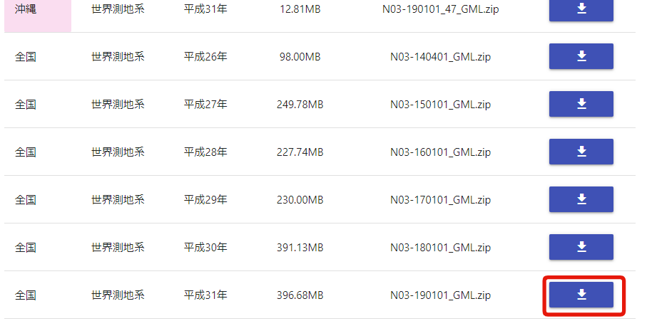
First, download the zip file at the bottom to get the national data.
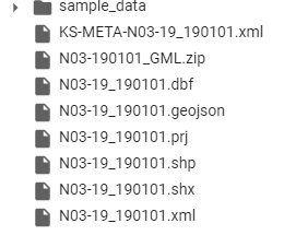
Then, when you unzip the file, 7 data will appear as follows.
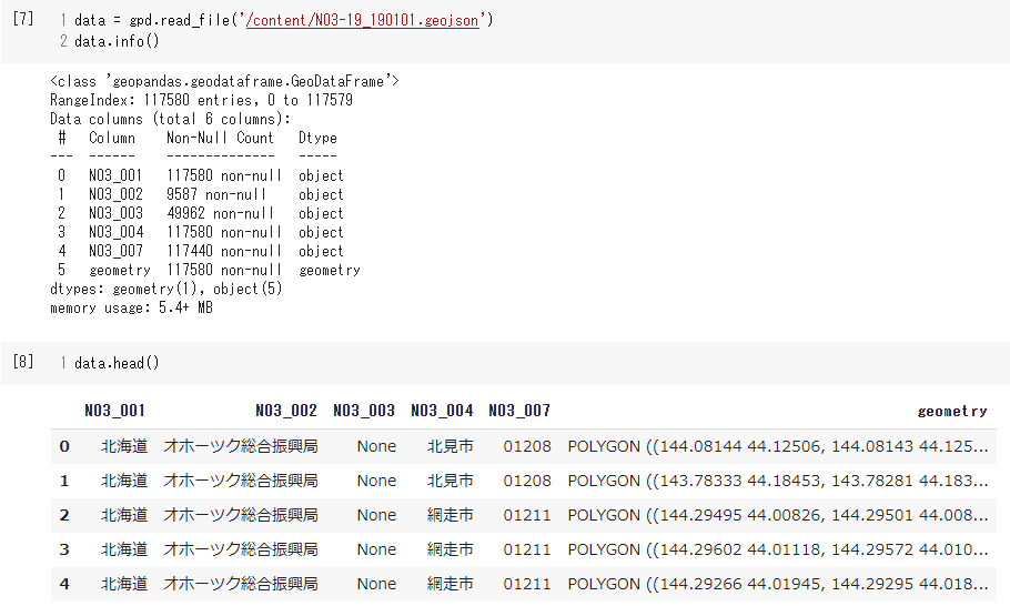
Then load the geojson file with the geopandas read_file method. As you can see next, the data has 115,000 lines of prefecture names, location data, etc.
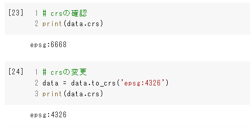
Next, check the coordinate reference system. EPSG: 6668. According to Linked data, it seems to be called Japan Geodetic System 2011. It seems that western Japan and eastern Japan are different. I want to use "World Geodetic System 1984" for data visualization, so I will change the CRS.
By the way, the data you want to create is the center data of the prefecture, so roughly combine all the polygons of the prefecture and take the center point there. Use shapely for that. The following code is an example using data from Hokkaido.
#Create a data frame only for Hokkaido
hokkaido = data[data['N03_001'] == 'Hokkaido']
#Create a MultiPolygon with all the geometry values of Hokkaido and take the center point
center_hokkaido = shapely.geometry.MultiPolygon(hokkaido.geometry.values).centroid
Next, visualize the center point using folium.
#Create a map object and place the center point you created earlier on the center point
m = folium.Map([center_hokkaido.y, center_hokkaido.x], zoom_start=8)
#Place a marker at the specified point
folium.Marker([center_hokkaido.y, center_hokkaido.x]).add_to(m)
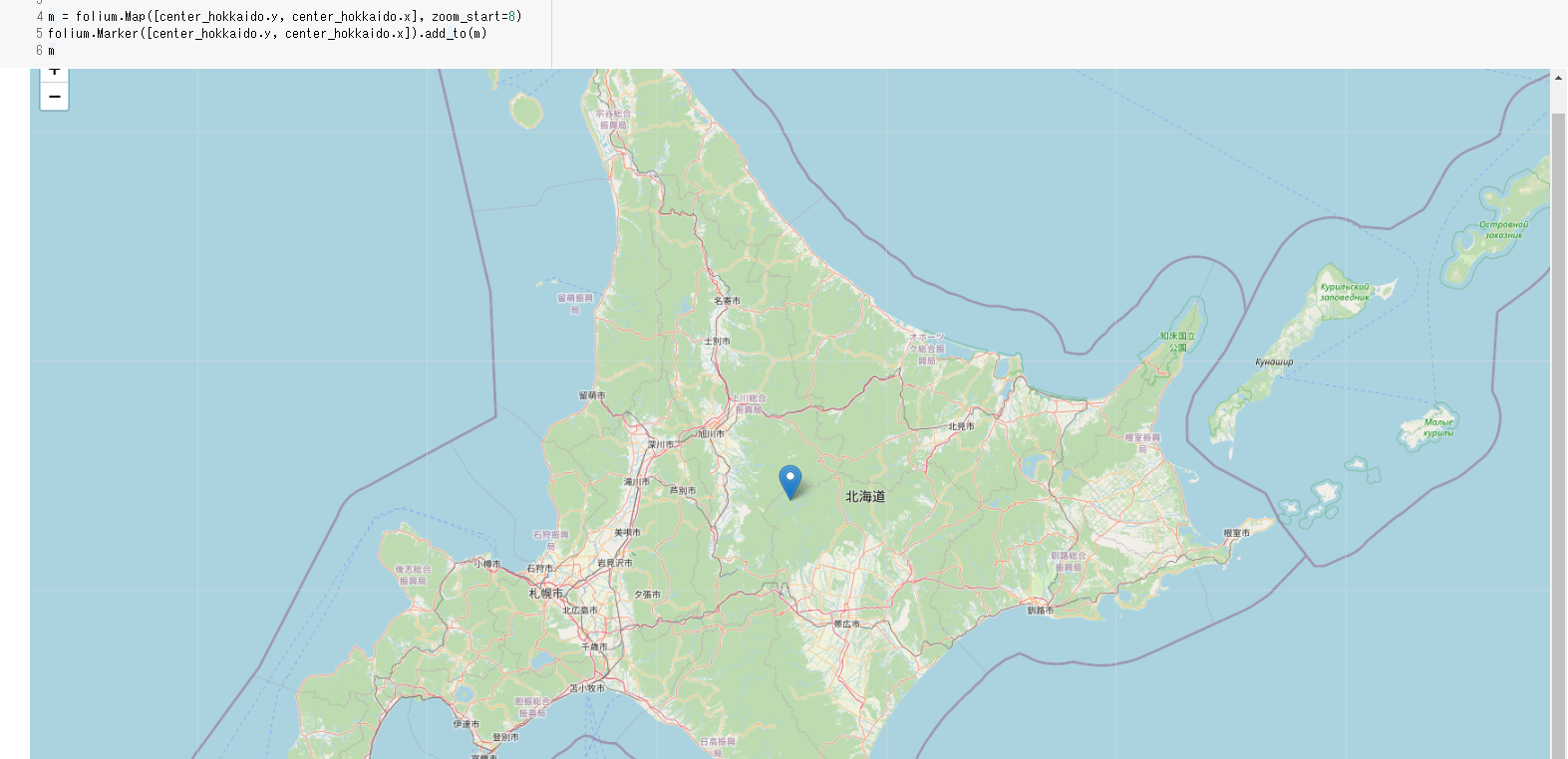
Well, I can make something that looks like a center point, so for the time being, I will create position data for each prefecture using this method. Here, we will loop around to store the prefecture name, longitude and latitude in the list, and create a GeoDataFrame.
ken_list = list()
center_list = list()
for ken in data['N03_001'].unique():
ken_data = data[data['N03_001'] == ken]
ken_center = shapely.geometry.MultiPolygon(ken_data.geometry.values).centroid
ken_list.append(ken)
center_list.append(ken_center)
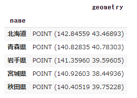
ken_data = gpd.GeoDataFrame()
ken_data['name'] = ken_list
ken_data['geometry'] = center_list
ken_data = ken_data.set_index('name')
Created data
Acquisition of future estimated population data
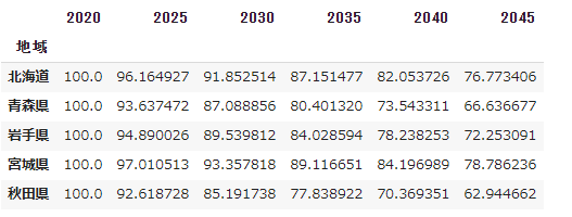
Obtain future estimated population data for each prefecture from e-stats. Download from the same page, delete unnecessary columns and simply recreate the column name.
jinko = pd.read_csv('/content/FEI_PREF_201230204425.csv', encoding='shift_jis')
jinko = jinko.drop(['Survey year', '/item'], axis=1)
jinko.columns = ['area', 2020, 2025, 2030, 2035, 2040, 2045]
jinko = jinko.set_index('area')
jinko_t = jinko.T
jinko_t = jinko_t / jinko_t.loc[2020] * 100
jinko = jinko_t.T
Data that can be done.
Location data and estimated population data
Stick the two data together. It's easy with the merge method. Below, after joining the two data based on the index, we create columns for longitude and latitude and delete the geometry column.
merge_data = jinko.merge(ken_data, left_index=True, right_index=True)
merge_data['x'] = merge_data.geometry.map(lambda x: x.x)
merge_data['y'] = merge_data.geometry.map(lambda x: x.y)
merge_data = merge_data.drop('geometry', axis=1)
merge_data = merge_data.reset_index()
merge_data.head()
Create portrait data
Use melt to transform long-form data that is easy to visualize. Specify the element you want to attach to each data with id_vars. Long forms are often referred to as orderly data (What is orderly data). Also, I will make the year data into a character string.
merged_melt = pd.melt(merge_data, id_vars=['index', 'x', 'y'])
merged_melt['variable'] = merged_melt['variable'].astype('int')
merged_melt.info()
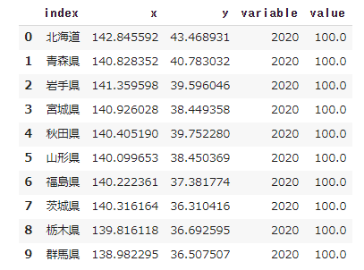
This completes the data with longitude and latitude information with the population of each prefecture in 2020 as 100.
Visualize using plotly.express
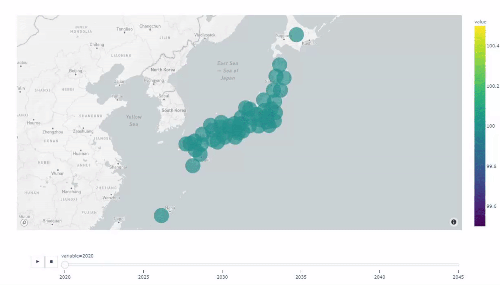
Now, let's visualize the last created data using plotly.express. Use the scatter_mapbox function to represent the population index as a circle. By the way, this function uses mapbox to display a map, so a mapbox token is required.
import plotly.express as px
#Mapbox token settings
px.set_mapbox_access_token('your token')
#Drawing a graph
px.scatter_mapbox(
    merged_melt,
    lat="y",
    lon="x",
    size="value",
    hover_name="index",
    animation_frame="variable",
    height=800,
    color="value",
    color_continuous_scale=px.colors.sequential.Viridis,
    size_max=30,
    zoom=4,
)
Then, as shown in the video below, a graph with a play button is displayed, and when you click the play button, the data moves in chronological order. For such an animation graph, if you pass the column name you want to move ('variable' in this case) to the argument animation_frame, the graph will move with the specified character string (the numerical value is converted to a character string and passed). I will.
Summary
In this post, after creating the location data of each prefecture, the estimated values of the population of each prefecture were attached and visualized with a dynamic graph. With plotly, you can easily create graphs with complex movements.
Now we can see how the population of each region will change. However, on the other hand, I am dissatisfied with not being able to see the transition over time. I'll solve that in the next post (more tomorrow)! !!
If you are interested, I would appreciate it if you could do LGTM.
Notebook: https://colab.research.google.com/drive/1q-bgBGNYiqdBbNWv_fcgxA3oyACnksYc?usp=sharing (Maybe I'm stuck with enough data so I'll fix it soon)
Recommended Posts