Python data analysis template
Python data analysis template
When working on kaggle, you need to analyze the data and create your own features. At that time, the data is analyzed using the graph. In this article, I will post a template to create a graph for the purpose of data analysis.
Library used
import numpy as np
import pandas as pd

import matplotlib.pyplot as plt
import matplotlib as mpl
import seaborn as sns
Observation of correlation
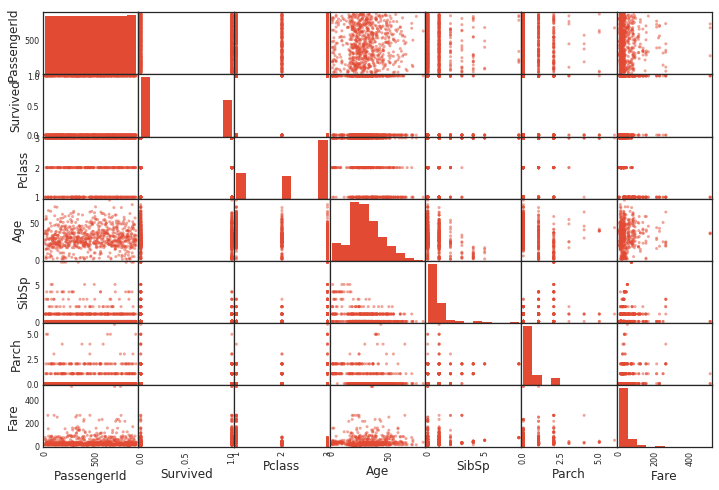
Scatter plot between all variables
If you use pandas, you can get a scatter plot in one shot. A histogram is drawn between the same variables. (Because the same variables are just straight lines)
from pandas.plotting import scatter_matrix
scatter_matrix(df)
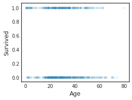
Scatter plot
In addition, a scatter plot between specific variables can be easily created as follows.
df.plot(kind='scatter',x='Age',y='Survived',alpha=0.1,figsize=(4,3))
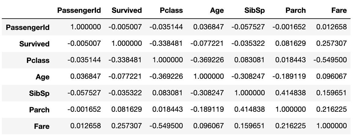
Calculation of correlation coefficient
Correlation coefficient
Pearson's correlation coefficient can be displayed in one shot with corr (). Very convenient.
data1.corr()
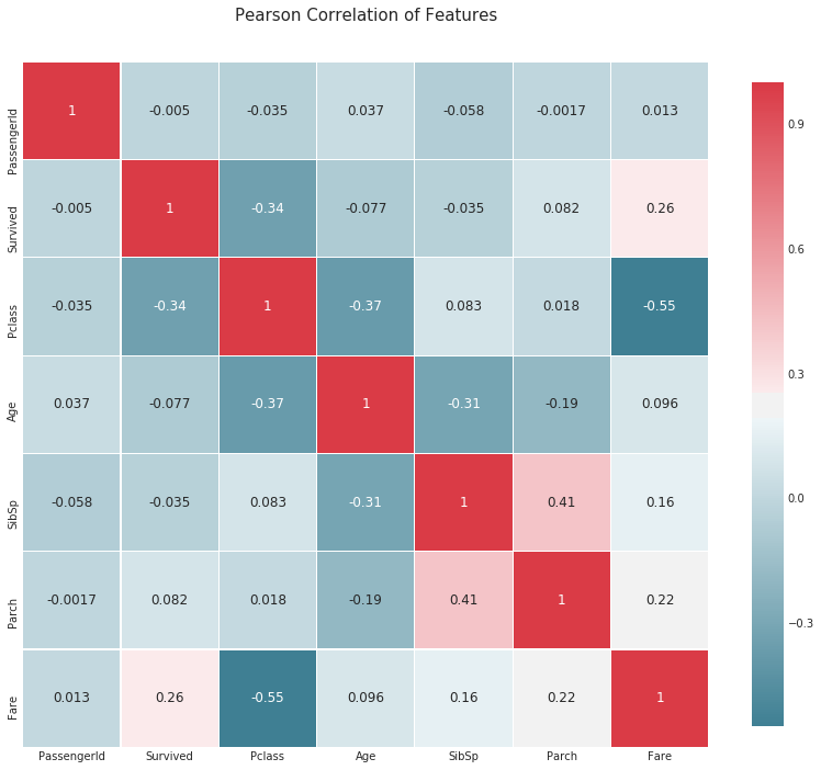
Correlation coefficient heat map
def correlation_heatmap(df):
    _ , ax = plt.subplots(figsize =(14, 12))
    colormap = sns.diverging_palette(220, 10, as_cmap = True)

    _ = sns.heatmap(
        df.corr(),
        cmap = colormap,
        square=True,
        cbar_kws={'shrink':.9 },
        ax=ax,
        annot=True,
        linewidths=0.1,vmax=1.0, linecolor='white',
        annot_kws={'fontsize':12 }
    )

    plt.title('Pearson Correlation of Features', y=1.05, size=15)

correlation_heatmap(data1)
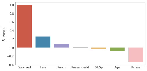
Correlation coefficient for the objective variable
corr_matrix = data1.corr()
fig,ax=plt.subplots(figsize=(15,6))
y=pd.DataFrame(corr_matrix['Survived'].sort_values(ascending=False))
sns.barplot(x = y.index,y='Survived',data=y)
plt.tick_params(labelsize=10)
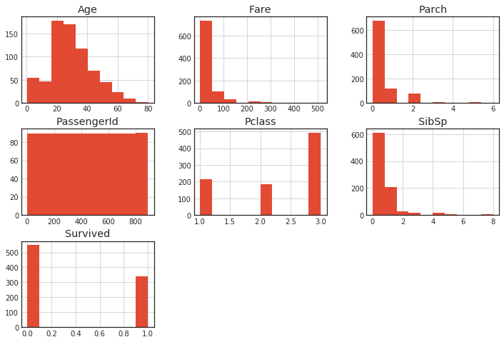
histogram
Histogram of all variables
You can get it in one shot with hist ().
df.hist()
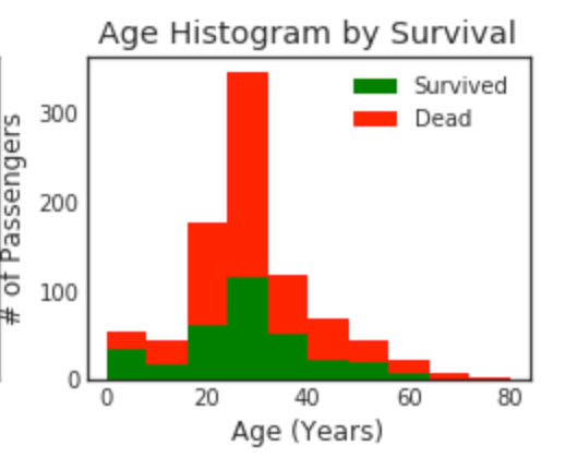
Overlay the histogram
plt.figure(figsize=[8,6])

plt.subplot(222)
plt.hist(x = [data1[data1['Survived']==1]['Age'], data1[data1['Survived']==0]['Age']], stacked=True, color = ['g','r'],label = ['Survived','Dead'])
plt.title('Age Histogram by Survival')
plt.xlabel('Age (Years)')
plt.ylabel('# of Passengers')
plt.legend()
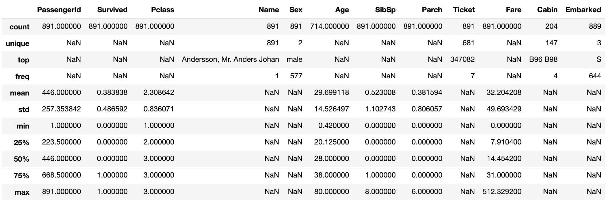
Explanation of variable distribution
If include ='all', features that are not numerical values are also displayed.
data1.describe(include = 'all')
Quartile
plt.figure(figsize=[8,6])

"""
o is treated as a Outlier.
minimun
25th percentile first quartile
50th percentile second quartile (median)
75th percentile third quartile
maximum
"""

plt.subplot(221)
plt.boxplot(data1['Age'], showmeans = True, meanline = True)
plt.title('Age Boxplot')
plt.ylabel('Age (Years)')
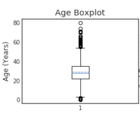
You can look at Boxplot to see if there are any outliers. This can also be used to fill in missing values. When the outliers match or the distribution is biased, it is better to use the median rather than the mean. On the other hand, if the distribution is symmetrical on the left and right, it may be better to use the average value.
Recommended Posts