Beautiful graph drawing with python -seaborn makes data analysis and visualization easier Part 1

Graph drawing in Python

The standard for drawing Python charts is "matplotlib", but it has been pointed out that its appearance is a little unfashionable and the notation is complicated. Therefore, in this article, I will discuss how to use "Seaborn", which is a wrapper to realize the functions of Matplotlib more beautifully and more easily.

◆ Overview of Python Visualization Tools http://pbpython.com/visualization-tools-1.html

In the above article, Matplotlib and Seaborn are written as follows.

About matplotlib

Matplotlib is the grandfather of python visualization packages. It is extremely powerful but with that power comes complexity. You can typically do anything you need using matplotlib but it is not always so easy to figure out.

About Seaborn

Seaborn is a visualization library based on matplotlib. It seeks to make default data visualizations much more visually appealing. It also has the goal of making more complicated plots simpler to create. It does integrate well with pandas.

In short

Matplotlib can do many things, but it is complicated to handle and Mendo (´ ・ ω ・ `) seaborn is based on matplotlib, but it looks better and is easier to apply, so it's great (; ´∀ `)

That's right. (suitable)

Setting

install seaborn (If you don't have matplotlib, include matplotlib)

pip install seaborn

Package preparation and data preparation Seaborn comes bundled with some well-known data by default, so I'll use it for analysis.

setup.py


import numpy as np
import pandas as pd
import seaborn as sns

x = np.random.normal(size=100) #Create random data as numpy array

titanic = sns.load_dataset("titanic") ##Life and death data for the Titanic, famous for kaggle
tips = sns.load_dataset("tips")  ##Data on the relationship between restaurant meal time, total accounting amount, and tips
iris = sns.load_dataset("iris")  ##Statistical data of iris familiar in R
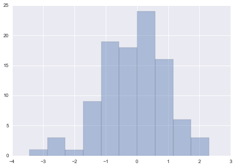
histogram

In Seaborn, histograms can be drawn with a method called "distplot".

kde is a drawing option for the density approximation function, and bins is the x-axis notch specification. For rugs, try what happens when you set it to True.

distplot.py


sns.distplot(x, kde=False, rug=False, bins=10) 

distplot.png

Scatter plot

In Seaborn, scatter plots can be drawn with a method called "joint plot". Let's try with the iris data read above.

jointplot.py


sns.jointplot('sepal_width', 'petal_length', data=iris)

Well, the distribution of the x-axis and y-axis values can be seen at the same time in the histogram, which is beautiful.

jointplot.png

Scatter plot festival

In addition, this scatter plot can be easily seen for all the numerical variables included in the data. Use a method called "pair plot".

pairplot.py


sns.pairplot(iris)

You can immediately see which variables are highly correlated.

pairplot.png

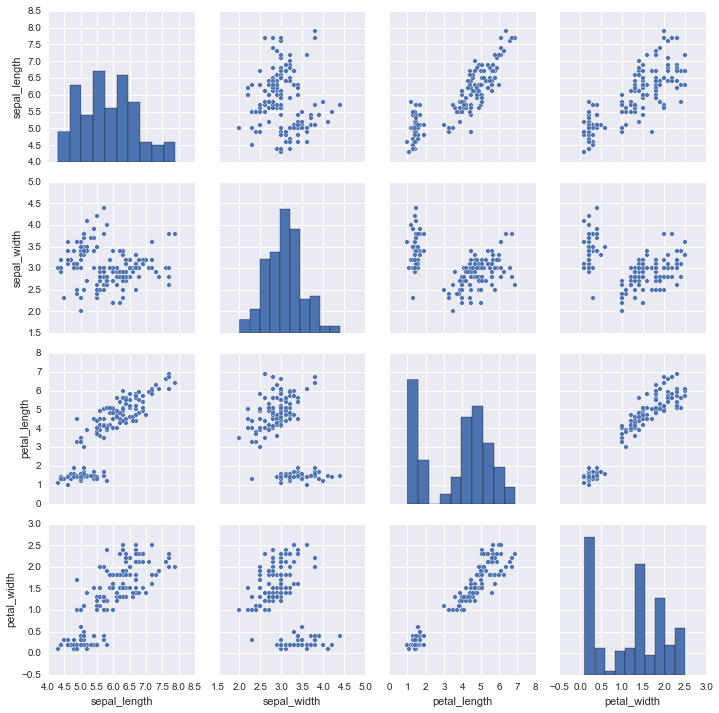
It is also possible to color-code categorical variables. Use the option called hue.

According to weblio, http://ejje.weblio.jp/content/hue

[Uncountable nouns] [Specifically, [Countable nouns]] a shade, color tone. example a change in hue. b color. example a cold [warm] hue cold [warm] color.

It seems that the word "hue" has the meaning. It's the first word I heard when I was born

pairplot2.py


sns.pairplot(iris, hue="species")

pairplot2.png

Continue to Part 2

Part 2 will cover barplot, boxplot, stripplot, etc. http://qiita.com/hik0107/items/7233ca334b2a5e1ca924

Beautiful heatmap with Seaborn http://qiita.com/hik0107/items/67ad4cfbc9e84032fc6b

How to draw multiple graphs at once with Seaborn is super convenient http://qiita.com/hik0107/items/865b75ae486728cb0006

Other articles

If you are interested in data scientists, first look around here, a summary of literature and videos http://qiita.com/hik0107/items/ef5e044d2f47940ba712

It's time to seriously think about the definition and skill set of data scientists http://qiita.com/hik0107/items/f9bf14a7575d5c885a16

Recommended Posts

Beautiful graph drawing with python -seaborn makes data analysis and visualization easier Part 1
Beautiful graph drawing with python -seaborn makes data analysis and visualization easier Part 2
Easy data visualization with Python seaborn.
Data analysis starting with python (data visualization 1)
Data analysis starting with python (data visualization 2)
[In-Database Python Analysis Tutorial with SQL Server 2017] Step 3: Data Exploration and Visualization
Data analysis with python 2
Data analysis with Python
Overview and tips of seaborn with statistical data visualization
Easy analysis sharing with re: dash, an open source data visualization tool Part 2 ~ Graph
Get a large amount of Starbucks Twitter data with python and try data analysis Part 1
Easy analysis and sharing with re: dash, an open source data visualization tool Part 1-Installation
Scraping with Python and Beautiful Soup
Python application: data visualization part 1: basic
Starbucks Twitter Data Location Visualization and Analysis
Python Application: Data Visualization Part 3: Various Graphs
Python visualization tool for data analysis work
FM modulation and demodulation with Python Part 3
Process Pubmed .xml data with python [Part 2]
Sensor data acquisition and visualization for plant growth with Intel Edison and Python
Easily graph data in shell and Python
Tweet analysis with Python, Mecab and CaboCha
FM modulation and demodulation with Python Part 2
Recommendation of Altair! Data visualization with Python
Data analysis starting with python (data preprocessing-machine learning)
Graph analysis and visualization on IPython Notebook using Cytoscape / cyREST and py2cytoscape Part 1
Draw a graph with PyQtGraph Part 1-Drawing
[Python] From morphological analysis of CSV data to CSV output and graph display [GiNZA]
Create test data like that with Python (Part 1)
Read Python csv data with Pandas ⇒ Graph with Matplotlib
[Various image analysis with plotly] Dynamic visualization with plotly [python, image]
Implement "Data Visualization Design # 3" with pandas and matplotlib
Data analysis planning collection processing and judgment (Part 1)
Data analysis planning collection processing and judgment (Part 2)
Data analysis python
I created a stacked bar graph with matplotlib in Python and added a data label
Quickly create a Python data analysis dashboard with Streamlit and deploy it to AWS
I tried various things with Python: scraping (Beautiful Soup + Selenium + PhantomJS) and morphological analysis.
Analysis of financial data by pandas and its visualization (1)
[# 2] Make Minecraft with Python. ~ Model drawing and player implementation ~
Reading Note: An Introduction to Data Analysis with Python
Data analysis environment construction with Python (IPython notebook + Pandas)
Challenge principal component analysis of text data with Python
Investigate Java and python data exchange with Apache Arrow
Easy analysis sharing with re: dash, an open source data visualization tool Part 4 ~ pivot table
Create a decision tree from 0 with Python and understand it (3. Data analysis library Pandas edition)
I tried the same data analysis with kaggle notebook (python) and Power BI at the same time ②
Easy analysis sharing with re: dash, an open source data visualization tool Part 3 ~ Google Spreadsheets
"Measurement Time Series Analysis of Economic and Finance Data" Solving Chapter End Problems with Python
I tried the same data analysis with kaggle notebook (python) and Power BI at the same time ①
[Python Seaborn Graph Library] About User Warning of axes.color_cycle is deprecated and replaced with axes.prop_cycle
[Graph drawing] I tried to write a bar graph of multiple series with matplotlib and seaborn
Python Data Visualization Libraries
Data analysis using Python 0
Data analysis overview python
Graph drawing in python
Voice analysis with python
Data visualization with pandas
Python data analysis template
Drawing with Python Tinker
Voice analysis with python