[PYTHON] Data analysis planning collection processing and judgment (Part 2)
Finally previous, this time is the second part.
Now, let's all go back to the origin again. Why collect and analyze data? That's because we want to maximize profits. In order to make a profit, you collect the materials (data) that are the basis of your judgment, organize the contents, look at them, and connect them to your actions to make a profit.
In other words, data analysis has a clear motive (purpose) that leads to profit, and value is created only when the results of analysis are linked to actions.
Games and investment
Let's talk about investment here.
There is no right investment law for everyone, but there are some prerequisites for gaining a market advantage in equities, for example.
- Investing is a game of probability
- The market is generally efficient, but there is a slight distortion
- Capitalism is self-propagating, so the market will expand in the long run and stock prices will converge to economic growth.
I think this has something to do with classic in-game social games. That is, 1. It is a game of probability, 2. There is distortion (bias), and 3. Inflation occurs. Whether or not you can get the desired item by charging is a probability. In other words, even if the same amount of "charge" is made, there is a bias in the strength of the resulting connection with the "item" obtained. Also, sooner or later all players will become stronger, causing inflation, and if strong new items are introduced, the value of past items will decline relatively. That's right. However, there are differences depending on the system and management policy.
In any case, there are strategies to increase the odds without relying on accidental jackpots. For example, take a strategy to increase the number of trials. Even if there are a few hits or a few hits, if you continue for a long time, it will converge to the average value. This is similar to a long-term holding strategy in terms of stocks. By holding one stock in the stock for a long period of time, the valuation will increase as a result, even if there is a temporary rise or fall. [Warren Buffett](http://d.hatena.ne.jp/keyword/%A5%A6%A5%A9%A1%BC%A5%EC%A5%F3%A1%A6%A5%D0%A5 I think% D5% A5% A7% A5% C3% A5% C8) is famous. However, this is a story of "Let's hold a good stock for a long time", and I think that it is a major premise that the company will "develop in the long term" by carefully examining the stock. Since scrutiny is important, for example, it is a bad idea to hold long-term stocks in a fast-changing, ups and downs industry. Even if that is not the case, I think that the number of companies that can be confident that they will develop in the long term in this uncertain era will be quite limited.
Save money to maximize the number of trials
By the way, even if you take a strategy to increase the number of trials, it costs money each time you turn the gacha, and there is room for ingenuity in how to charge efficiently. The easiest way to understand this is to limit the investment of various resources to the limit of achieving borders in rankings, etc., so that the investment is kept to the minimum necessary. Instead of investing blindly, it is important to identify borders.
Let's recall the previous graph. This is the increase in the score of each month's event up to last month. The purpose is to determine trends from this and predict the score for the February event.
Grab the trend
Looking at the visualized data, we can see that there are some points.
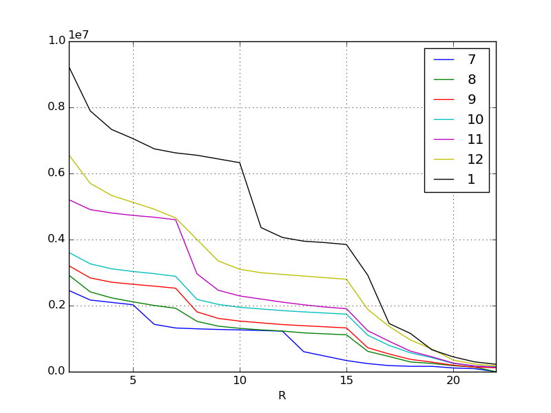
For example, in November there is a vertically bent cliff at the top reward ranks. Also, in January, there is a cliff at the lower reward. Some hypotheses can be made by adding this and the content of the event. Of course, this hypothesis must be considered by humans. If it's a consumer-oriented world event, you can use information on social media and bulletin boards to get people's opinions.
For example, in November
- Added attractive new characters (top rewards are popular to ensure you get them)
Or in January
- Immediately before this, a new system was introduced to improve score earning efficiency.
- Since the commercial was broadcast in winter, many new billers entered the market.
And so on.
In any case, it can be read that there is a large difference in score at the breaks where the content of the reward changes, but if such a remarkable change appears due to qualitative factors, the regression equation cannot be derived well.
So, this time, after the event started, we will aggregate the daily scores for the current month (February) and examine how they were compared to the past three months.
Exploratory data analysis
Exploratory data analysis is to look at data from various angles with the purpose of "acquiring appropriate purposes and hypotheses."
Originally, I have repeatedly emphasized that data analysis requires a clear purpose and hypothesis, but in the first place, in the situation where the analysis target does not have the prerequisite knowledge or the actual condition of the target is not well understood, in the first place. It is necessary to take a look at the data in order to obtain the purpose and hypothesis of. This is an approach called exploratory data analysis in the statistical world.
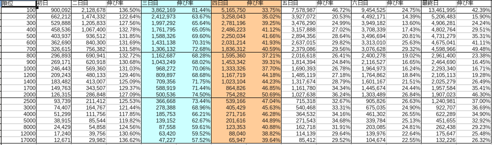
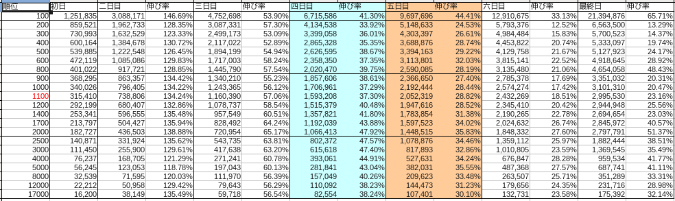
The breakdown of each month was as follows.
November
December
January
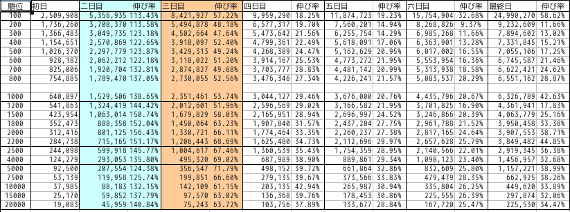
Blue represents Saturday and red represents Sunday.
First of all, let's narrow down the target to the top reward as an aim. We will use the transition of the border score, which is the top reward for each month, as a data set. IPython is still useful for advancing exploratory data analysis.
Here, February is assumed to have passed until the middle of the event (4th day).
#Cut out the top reward data for each month
df201411 = pd.read_csv("201411.csv", index_col=0)
df201412 = pd.read_csv("201412.csv", index_col=0)
df201501 = pd.read_csv("201501.csv", index_col=0)
df201502 = pd.read_csv("201502.csv", index_col=0)

#Extract the top reward lines into a series
s201411 = df201411.ix[700, :]
s201412 = df201412.ix[800, :]
s201501 = df201501.ix[1000, :]
s201502 = df201502.ix[1000, :]

#Index to numbers for simplicity
s201411.index = np.arange(1, len(s201411) + 1)
s201412.index = np.arange(1, len(s201412) + 1)
s201501.index = np.arange(1, len(s201501) + 1)
s201502.index = np.arange(1, len(s201502) + 1)

#Concatenate each month's series into a data frame
df = pd.concat([s201411, s201412, s201501, s201502], axis=1)

#Make columns numbers
df.columns = [11, 12, 1, 2]

#Visualize
df.plot()
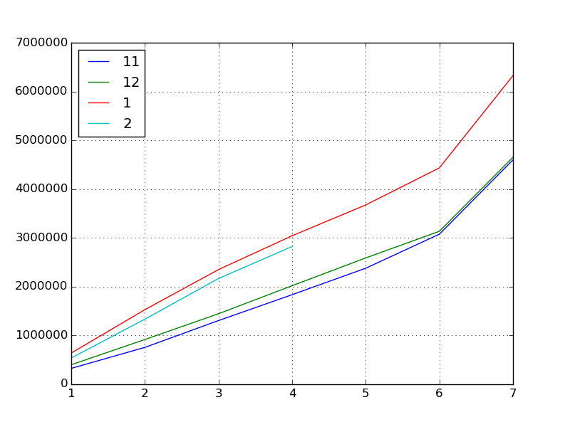
Next, let's find the basic statistics.
#Basic statistics
df.describe()
#=>
#                    11              12              1               2
# count        7.000000        7.000000        7.000000        4.000000
# mean   2040017.285714  2166375.142857  3143510.857143  1716607.750000
# std    1466361.613186  1444726.064645  1897020.173703   993678.007807
# min     326615.000000   401022.000000   640897.000000   539337.000000
# 25%    1031257.000000  1181755.500000  1940483.500000  1136160.000000
# 50%    1836312.000000  2020470.000000  3044127.000000  1751315.500000
# 75%    2727857.000000  2862782.500000  4055898.000000  2331763.250000
# max    4598966.000000  4654058.000000  6326789.000000  2824463.000000

#Correlation coefficient
df.corr()
#=>
#           11        12        1         2
# 11  1.000000  0.999157  0.996224  0.996431
# 12  0.999157  1.000000  0.998266  0.997345
# 1   0.996224  0.998266  1.000000  0.999704
# 2   0.996431  0.997345  0.999704  1.000000

#Covariance
df.cov()
#=>
#               11            12            1             2
# 11  2.150216e+12  2.116705e+12  2.771215e+12  6.500842e+11
# 12  2.116705e+12  2.087233e+12  2.735923e+12  6.893663e+11
# 1   2.771215e+12  2.735923e+12  3.598686e+12  1.031584e+12
# 2   6.500842e+11  6.893663e+11  1.031584e+12  9.873960e+11
What can we learn from here?
- Score "inflation" is accelerating steadily in November, December, and January.
- Especially in January (which can be read from the correlation coefficient)
- Maybe it will inflate in February as it has been inflating all the past months.
However, four days after the event in February actually started, when I opened the lid ... the score dropped.
This is something that has never been done, including the data that was released last time. It has been rising (inflation) for a long time, but it has fallen, and since this is the first phenomenon, it has finally become difficult to predict.
Again, we will set some hypotheses.
- There were many so-called collection events such as special gachas this month.
- Winter CM New entrants participated in the event in January without having enough strength and fought an unreasonable battle and burned out.
- Industry declining sales every February
- Ten months have passed since the service was launched, and many people have 10 reward items, and the competition has slowed down as they have filled 10 decks.
- Everyone started saving because last month was overinflated
There are many possibilities.
However, since every growth in each month has a high correlation coefficient, it can be judged that it seems good to predict the score at the end of the event by referring to the daily growth in the past 3 months.
Capture the increase and decrease of the score
Therefore, we can capture the growth of this score by ** percentage change **.
Rise and fall rate is an investment term, and is an indicator of price fluctuations. Compare the two points in time to see what percentage the value of the fund is up or down. Here, we will calculate the rate of increase / decrease by regarding the increase in score as a pattern of fund price changes.
#Growth rate from the previous day
df.pct_change()
#=>
#          11        12        1         2
# 1       NaN       NaN       NaN       NaN
# 2  1.315821  1.288455  1.386508  1.475449
# 3  0.726815  0.575413  0.537399  0.623495
# 4  0.405916  0.397485  0.294568  0.303079
# 5  0.295578  0.281922  0.207571       NaN
# 6  0.293197  0.210570  0.206691       NaN
# 7  0.494807  0.484321  0.426303       NaN

#When transposed, the rate of increase compared to the previous month
df.T.pct_change()
#=>
#            1         2         3         4         5         6         7
# 11       NaN       NaN       NaN       NaN       NaN       NaN       NaN
# 12  0.227813  0.213304  0.106925  0.100287  0.088689  0.019129  0.011979
# 1   0.598159  0.666635  0.626419  0.506643  0.419258  0.414710  0.359413
# 2  -0.158465 -0.127103 -0.078220 -0.072160       NaN       NaN       NaN
The growth rate from the previous day tends to be the same in every month. We can see that the growth rate varies slightly depending on whether it is a holiday or a weekday, but the growth rate is the highest on the second day, then slows down, and grows by 40 to 50 percent on the last day's spurt.
Next, looking at the growth from the previous month on the same day, February has turned negative.
pct_change = df.T.pct_change() #Growth rate from the previous month
def estimated_from_reference(day):
    return df.ix[7, 1] * (1 + df.T.pct_change().ix[2, day])
estimated = [estimated_from_reference(x) for x in range(1, 7)]
print(estimated)
#=>
[5324211.8451061565, 5522634.3150592418, 5831908.3162212763, 5870248.3304103278, nan, nan]
#Expected final border score based on day 1, day 2, day 3, and day 4
I got it like this.
Or you can ask for the scores for the 5th, 6th, and final days that will come.
def estimated_from_perchange(criteria, day):
    return df.ix[criteria, 2] * (1 + df.pct_change().ix[day, 1])

#The score on the 5th day of February is calculated from the rate of increase / decrease on the 4th to 5th days of January.
df.ix[5, 2] = estimated_from_perchange(4, 5)
#=> 3410740.086731

#Also on the 6th day
df.ix[6, 2] = estimated_from_perchange(5, 6)
#=> 4115709.258368

#Last day
df.ix[7, 2] = estimated_from_perchange(6, 7)
#=> 5870248.330410
This fills in the missing values in the data frame. From this, it was possible to predict that 5.87 million points would be the border of the top compensation as of the 4th day.
Use as a basis for judgment
By the way, the correct answer data was 3487426 points on the 5th day (102.2% of the predicted value on the 4th day), 4094411 points (99.5%) on the 6th day, and 5728959 points (97.5%) on the final day, so 5.87 million points should be affordable. The result is that you have earned a higher reward.
| Days | Forecast | result | difference |
|---|---|---|---|
| Day 5 | 3410740 | 3487426 | 102.2% |
| Day 6 | 4115709 | 4094411 | 99.5% |
| Last day | 5870248 | 5728959 | 97.5% |
The results of exploratory data analysis can be programmed and saved in Powerful Features of IPython, so it is calculated daily while following the progress of the event. It has been demonstrated that borders can be predicted with extremely high accuracy.
at the end
In the world of investment [Rise and fall ratio](http://ja.wikipedia.org/wiki/%E9%A8%B0%E8%90%BD%E3%83%AC%E3%82%B7%E3%82 There is an index called% AA). This is a short-term indicator of the ratio of the rate of increase / decrease to all stocks. You can read from this technical indicator whether the stock is overbought or not.
Let's take a look at the Nikkei 225 on March 4, 2015 as a result.
Rise and fall ratio Nikkei average comparison chart http://nikkei225jp.com/data/touraku.html
On this day, sales preceded and the Nikkei average fell by 200 yen in the morning. In fact, if you look at the ups and downs ratio just before this, you can see a very high number from 130 to 140. This, in essence, points to the market being bullish and overbought, and is a sign that the Nikkei average will plummet after that. After the actual drop of 200 yen, the ratio value returned to the normal range, and repurchases occurred and rebounded.
In this way, it can be said that common methods can be applied to the basic parts of both numerical analysis of a small world such as a game and analysis of a large world of financial economy. Of course, there may be unforeseen circumstances due to sudden cataclysms, but the attitude of trying to analyze things scientifically on a daily basis is very important.
Recommended Posts