[PYTHON] Data analysis planning collection processing and judgment (Part 1)
So far, I have written about practical methods of statistics, but if you acquire statistics and econometrics, can you predict the future one after another by data analysis and make a lot of money by investing in stocks and the like? No, then statisticians and economists should be devoted to investing in research and getting rich by this time.
Random Walker on Wall Street says that many professional fund managers have not beaten the investment method of buying the entire listed stock at random. Scientific empirical data is written. The unpredictability of the future is very difficult to predict because of the complex mix of factors.
For example, medical statistics can be used to find out the correlation between a certain nutrition or lifestyle and a certain disease. So does this allow you to accurately predict when you will die of illness? Of course not. Data analysis cannot accurately predict when you will die.
That is, causal insights are very important.
For example, if you are a person in charge of purchasing and sales, what are the points of products that are likely to lead to sales, if you are a sales person, what are the decisive factors that lead to contracts, and if you are a human resource, to develop human resources that will lead to your company's profits What is the key, it is important to clarify these points from the analysis of data.
And it is not a superman who calls himself a data scientist or a person like a witch who appears dashingly and solves the problem and leaves, but it is a problem due to steady daily efforts and some statistical analysis on the front line. It is a clue to discover and solve.
For example, when it becomes clear that a particular product is selling at a certain time of the season, computer analysis can only conclude that we should purchase more of that product. However, if you are a person who has been involved in stores and products, the "something" behind it, for example, the customer must actually be looking for ~ ~, and so on. Ultimately, human insight and judgment are needed, which is very important.
Data analysis target and analysis plan
This time, let's take a case as an example and consider the flow of actually analyzing data and making use of it.
I made a gacha emulator with Flask in previously, but this time the subject is also a social game. Social games are familiar and convenient as materials because they can be accessed by everyone and can actually collect real data.
Of course, it doesn't matter if it's actually store sales, salesperson performance, or social network statements.
The outline is as follows.
- Some social games have monthly events.
- At this event, participants will compete for scores and will be rewarded according to their ranking.
- Ranking rewards and border rankings change every month.
The procedure for analysis is as follows.
- Clarify the purpose
- Collect data
- Organize and process data
- Grasp trends
- Use as a basis for judgment
Clarify the purpose
Why do you analyze this event? Before we can analyze the data, we first need to clarify the purpose.
- Participate in this month's event
- Predict the border of this month to some extent from past data
- If you can predict the border, you can keep the investment amount to the minimum necessary
Ranking is an effective way to fuel billing in social games. For example, let's say you have 10,000 more points to get the desired reward. You only need to pay 1,000 yen for 10 items. Therefore, we charge 1,000 yen, but rivals naturally think in the same way and charge 1,000 yen. This will increase the border score, so the ranking will not increase after all.
It's supposed to be a little more, a little more, but it is a mechanism that you will be charged a large amount of money by repeating it.
This kind of incites gambling spirit that makes you want to charge jerky Event charge Border of the ranking that will eventually land in order to avoid the bottomless swamp Predict your score to some extent and invest as much money as you need to earn the final score, regardless of your current ranking. The purpose of this analysis is to estimate this score as accurately as possible.
Collect data
In any case, we have to collect data, but in data analysis, this collection process is often a heavy burden.
Here is some sample data.
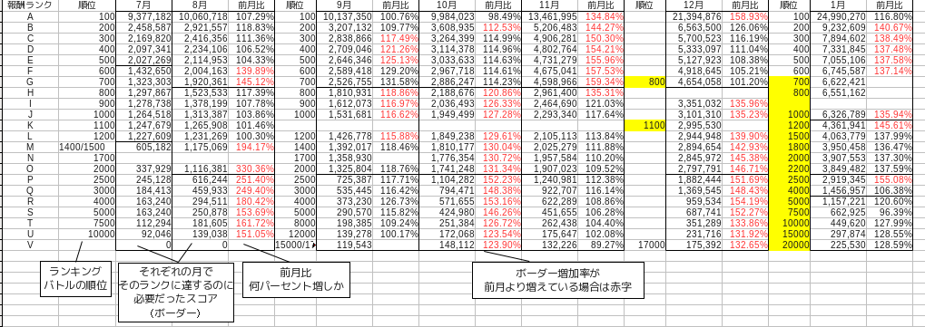
This is data that collects only the final score of the event for about half a year, that is, from July last year to January this year.
The border score fluctuates a little every month, but basically the top reward = 100th place = rank A, the top reward = 700 to 800th place = rank G, and the bottom reward = 2000 to 2200th place = rank O. The table is separated by a black line. The rank is for convenience, which is assigned as A, B, C from the top of the ranking at the author's discretion. Since the order of dividing borders is different every month, think of it as the rank from the top.
In addition, the month-on-month rate is a ratio that indicates how much the score that became the border that divides the ranking has increased from the previous month. This can be calculated by dividing the current month by the previous month.
Organize and process data
Even just collecting data in this way is quite a burden. However, some collection processes can be automated.
However, there is still a need for a process to organize the data, even after it has been collected in a database, for example through sensors or automated tools. Since this is a phase of processing by human hands, it cannot be fully automated.
First, visualize and see the overall trend. For the time being, visualizing data is a basic process in the basics. As for the method, this is the basis of pandas, so I don't think it needs to be explained anymore.
df = pd.read_csv("data.csv", index_col=0) #Read the data
lines = df.interpolate(method="linear") #Fill in the missing data
plt.figure()
lines.plot() #Plot the line chart
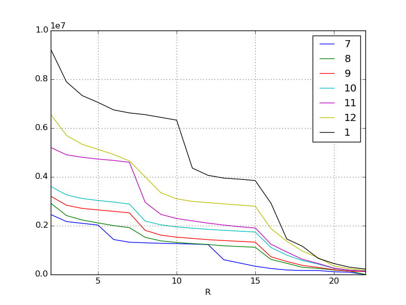
The X-axis is the border of the ranking, so the higher it goes to the left. The Y axis is the score. Each line represents the month, but as you can see at a glance from the original data, the required score is increasing every month. Inflation, especially in the most recent January and November, is amazing.
As people spend more and more money and become stronger, naturally the scores they earn will also inflate more and more every month. I think this kind of phenomenon can be seen in most social games. The phenomenon has been visualized again.
In the above example, the missing values were linearly interpolated. pandas.DataFrame.interpolate allows you to interpolate and fill in missing values on a variety of criteria. It's one of the powerful features of pandas.
Continue to the second part.
Recommended Posts