[PYTHON] Tips for data analysis ・ Notes
Introduction
For writing down notes for data analysis by yourself
-** Tips for analysis ** -** Notes on analysis **
Previous information
This time, I will explain using the data used in the Kaggle competition.
Kaggle House Prices DataSet
Kaggle House Prices Kernel
Make a note using.
Please note that we do not care about model accuracy etc. as we keep it for Memo`
Data contents
There are 81 features in all, of which SalePrices is used as the objective variable (target) for analysis.
The explanatory variables are other than SalePrices.
Tips First of all, it is better to do this for the data
Preprocessing
First of all, read the data (DataFrame-> df) and do ʻEDA (exploratory data analysis) `.
--.head (): Display the beginning of data, extract 5 lines if (5), defalt value is 5 --.info (): Data summary (number of rows, number of columns, column name of each column, type of data stored in each column etc ....) --.describe (): Basic statistics of data (min, max, 25% etc .....) --.shape [0], .shape [1]: Check the number of rows and columns of data --.columns: Get column names of data --.isnull (). sum (): Check the number of missing areas in each column --.dtypes: Check the type type of each column
# import
import pandas as pd
import matplotlib.pyplot as plt    ## for drawing graph

## load Data
df = pd.read~~~~(csv , json etc...)

#Top display of data
df.head()

#Summary display of data
df.info()

#Number of dimensions of data (how many rows and columns)
print('There are {} rows and {} columns in df'.format(df.shape[0], df.shape[1]))

#Get column of data
df.columns

#Count the number of missing values in each column data
df.isnull().sum()

#Type type confirmation of each column data
df.dtypes
You can get the column names with df.columns, but if you keep a list of column names according to the type type, you may be able to use it if you think about it later. Describe the code. It is also possible to change ʻinclude to type type (float64 etc ...)`.
obj_columns = df.select_dtypes(include=['object']).columns
numb_columns = df.select_dtypes(include=['number']).columns
plot example
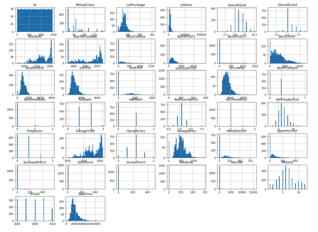
Histogram of each column (feature)
Histogram the features of each column. However, this can only handle numerical data. Since it cannot be applied to character string data, it will be described later.
- .hist(bins=**, figsize=(,))
bins is the setting of the fineness of the class value for analyzing the frequency, and figsize is the setting of the size of the figure. You can make many other arguments, so please refer to the following. official pyplot.hist document
df.hist(bins=50, figsize=(20,15))
plt.show()
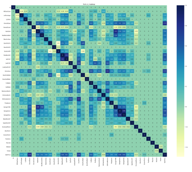
Correlation matrix heat map
In machine learning, it is important to find the correlation matrix for each feature. Visualize with a heat map to visualize the correlation matrix.
- .heatmap(corr, annot=bool(True or False), cmap='***')
corr is the correlation matrix, annot sets the value in the cell, cmap specifies the color of the figure You can make many other arguments, so please refer to the following. official seaborn.heatmap document
import seaborn as sns  ## for drawing graph
corr = train_df.corr()
corr[np.abs(corr) < 0.1] = 0  ## corr<0.1  =>  corr=0
sns.heatmap(corr, annot=True, cmap='YlGnBu')
plt.show()
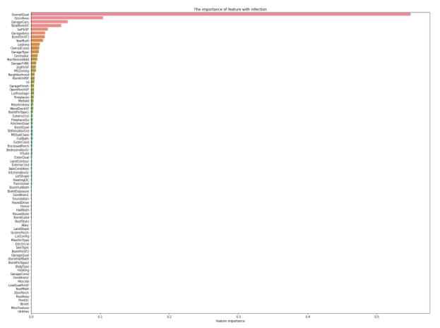
Estimating the importance of features
Random Forest is used to calculate which features are important for the target SalePrices.
In order to perform RandomForest, it is first necessary to divide it into explanatory variable and objective variable.
** This time, all variables other than target (SalePsices) are used as explanatory variables. ** **
--.drop ("***", axis = (0 or 1)): Specify a column that is not used for ***, row if axis = 0, column if 1. --RandomForestRegressor (n_estimators = **): n_estimators is the number of learnings
from sklearn.ensemble import RandomForestRegressor
X_train = df.drop("SalePrices", axis=1)
y_train = df[["SalePrices"]]
rf = RandomForestRegressor(n_estimators=80, max_features='auto')
rf.fit(X_train, y_train)

ranking = np.argsort(-rf.feature_importances_)  ##To draw in descending order of importance
sns.barplot(x=rf.feature_importances_[ranking], y=X_train.columns.values[ranking], orient='h')
plt.show()
Distribution of each feature (for checking outliers, etc.)
It is said that when features include outliers when performing regression analysis, it tends to affect the accuracy of the model. Therefore, it is considered that outlier processing is indispensable for improving the accuracy of the model. Therefore, it is easy to visualize and confirm how many outliers are included in each feature.
Here, plots of the top 30 features are performed.
--.iloc [:,:]: Extract value by specifying row or column --sns.regplot: Plot the 2D data and the result of the linear regression model
X_train = X_train.iloc[:,ranking[:30]]

fig = plt.figure(figsize=(12,7))
for i in np.arange(30):
    ax = fig.add_subplot(5,6,i+1)
    sns.regplot(x=X_train.iloc[:,i], y=y_train)

plt.tight_layout()
plt.show()
important point
Check if the target (objective variable) follows a normal distribution
In this data, target is SalePrices. In machine learning, whether the objective variable follows a normal distribution is important because it affects the model. So let's look at the distribution of SalePrices. In this figure, the vertical axis shows the percentage and the horizontal axis shows the SalePrices.
sns.distplot(y_train, color="red", label="real_value")
plt.legend()
plt.show()
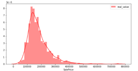
From the above figure, it can be seen that the distribution is slightly biased to the left. It is not a normal distribution (data in which most of the numbers are concentrated in the center when graphed and are "distributed" in a symmetrical bell shape). Therefore, the commonly used ** logarithmic conversion and difference conversion ** are shown below so that the objective variable follows a normal distribution.
y_train2 = np.log(y_train)
y_train2 = y_train2.replace([np.inf, -np.inf], np.nan)
y_train2 = y_train2.fillna(0)
sns.distplot(y_train2, color="blue", label="log_value")
plt.legend()
plt.show()
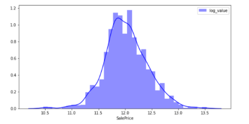
By performing logarithmic conversion, the figure is close to the normal distribution.
y_train3 = y_train.diff(periods = 1)
y_train3 = y_train3.fillna(0)
sns.distplot(y_train3, color="green", label="diff_value")
plt.legend()
plt.show()
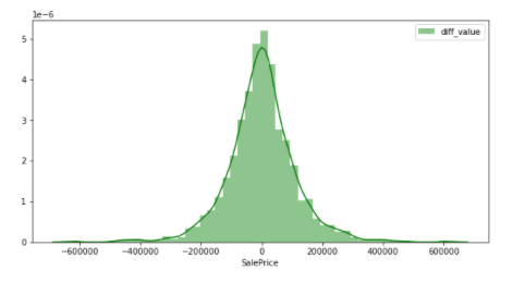
It is a figure that can be said to be a normal distribution by performing difference conversion. In other words, it can be inferred that the objective variable that does not easily affect the accuracy of the model is SalePrices that has undergone differential conversion. In this way, ** When dealing with any data, it is better to check whether the values are biased. ** ** I would like to write a future article comparing the accuracy of the model when it actually follows the normal distribution and when it does not.
Summary
The above is a summary of what to do first when analyzing data. In the future, I would like to write articles about the handling of character string data and the handling of time series data mentioned earlier when analyzing data.
Recommended Posts