[PYTHON] Creating a data analysis application using Streamlit
What is Streamlit
This article explains how to use Streamlit. Streamlit is a python framework that allows you to create front-end applications. Graphs created with Pandas DataFrame and drawing libraries such as plotly and altair can be embedded, and can be applied to data analysis depending on the device.
environment
- macOS Catalina (ver.10.15.6)
Installation
It can be installed in several ways.
- Install with pip. Official HP Recommended
Terminal
pip install streamlit
- Build a virtual environment with conda. Refer to the official forum
Terminal
conda create -y -n streamlit python=3.7
conda activate streamlit
pip install streamlit
File execution
Execute the Python file as follows.
Terminal
streamlit run filename.py
Streamlit features
The official HP API reference summarizes the features of streamlit. Among them, the functions that can be used for data analysis are summarized.
Display title
st_app.py
import streamlit as st
st.title('My app')

View document
st_app.py
import streamlit as st
st.write("Good morning")

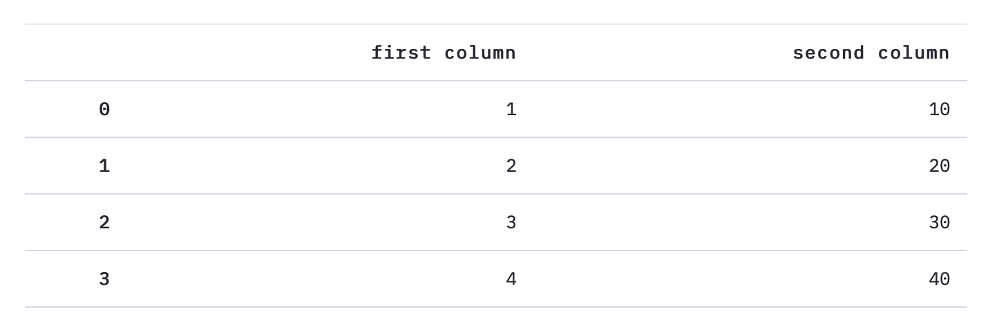
Displaying DataFrame
st_app.py
import streamlit as st
import pandas as pd
st.table(pd.DataFrame({
    'first column': [1, 2, 3, 4],
    'second column': [10, 20, 30, 40]
}))
Markdown display
st_app.py
import streamlit as st
st.markdown('# Markdown documents')
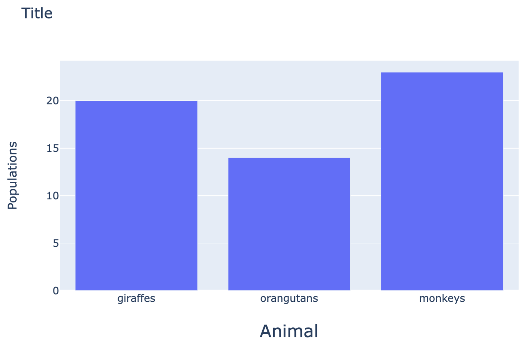
View Plotly
Plotly is one of the python drawing libraries that can create various types of graphs.
st_app.py
import streamlit as st
import plotly.graph_objs as go

animals = ['giraffes', 'orangutans', 'monkeys']
populations = [20, 14, 23]

fig = go.Figure(data=[go.Bar(x=animals, y=populations)])

fig.update_layout(
    xaxis = dict(
        tickangle = 0,
        title_text = "Animal",
        title_font = {"size": 20},
        title_standoff = 25),
    yaxis = dict(
        title_text = "Populations",
        title_standoff = 25),
    title ='Title')


st.plotly_chart(fig, use_container_width=True)
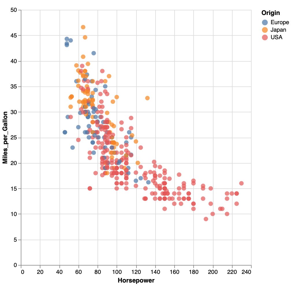
Display of Altair
Altair is one of the python drawing libraries that can create various types of graphs. It is characterized by inputting data with Pandas DataFrame. Reference
st_app.py
import streamlit as st
import altair as alt
from vega_datasets import data

source = data.cars()

fig = alt.Chart(source).mark_circle(size=60).encode(
    x='Horsepower',
    y='Miles_per_Gallon',
    color='Origin',
    tooltip=['Name', 'Origin', 'Horsepower', 'Miles_per_Gallon']
).properties(
    width=500,
    height=500
).interactive()

st.write(fig)
Button display
Altair can display a button that returns a bool type.
st_app.py
import streamlit as st
answer = st.button('Say hello')

if answer == True:
     st.write('Why hello there')
else:
     st.write('Goodbye')
[Before pressing]

[After pressing]

Check button display
It is also possible to display a check button that returns a bool type.
st_app.py
import streamlit as st
answer = st.button('Say hello')

if answer == True:
     st.write('Why hello there')
else:
     st.write('Goodbye')
【no check】

[Checked]

Radio button display
It is also possible to select an element with a radio button.
st_app.py
import streamlit as st
genre = st.radio(
     "What's your favorite movie genre",
     ('Comedy', 'Drama', 'Documentary'))

if genre == 'Comedy':
     st.write('You selected comedy.')
else:
     st.write("You didn't select comedy.")

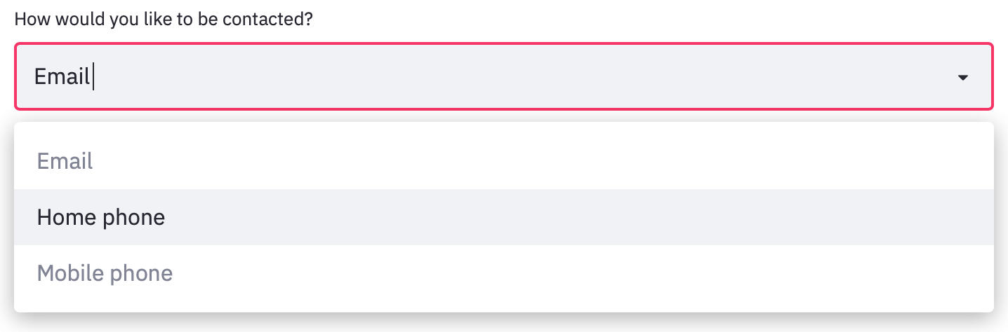
Dropdown display
If you want to select only one from the dropdown:
st_app.py
import streamlit as st
agree = st.checkbox('I agree')

if agree == True :
     st.write('Great!')
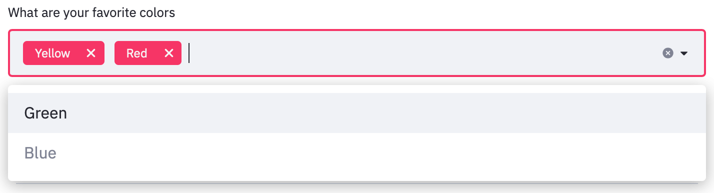
To select two or more from the dropdown at the same time:
st_app.py
import streamlit as st
options = st.multiselect(
    'What are your favorite colors',
    ['Green', 'Yellow', 'Red', 'Blue'],
    ['Yellow', 'Red'])

st.table(options)
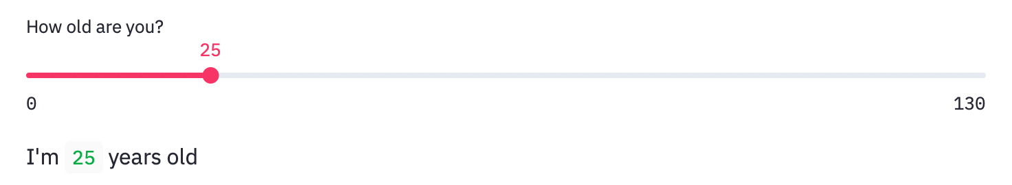
Slider display
To select one value: In the following example, a slider that moves with a minimum value of 0, a maximum value of 130, an interval of 1, and an initial value of 25 is displayed.
st_app.py
import streamlit as st
age = st.slider('How old are you?',  min_value=0, max_value=130, step=1, value=25)
st.write("I'm ", age, 'years old')
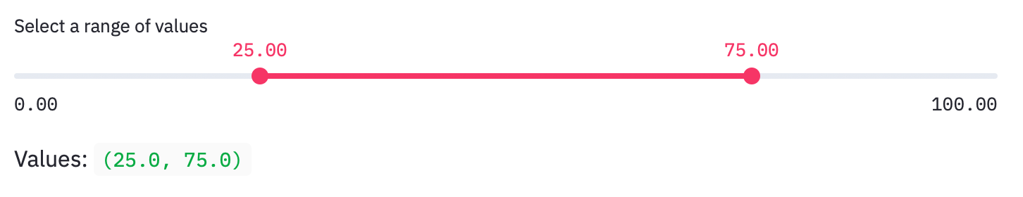
To select two values:
In the following example, a slider that moves with a minimum value of 0.0, a maximum value of 100.0, and an initial value of (25.0, 75.0) is displayed.
st_app.py
import streamlit as st
values = st.slider(
    'Select a range of values',
   0.0, 100.0, (25.0, 75.0))
st.write('Values:', values)
Application example
Recommended Posts