Practical exercise of data analysis with Python ~ 2016 New Coder Survey Edition ~
Introduction
Practice working with data using libraries such as python and libraries such as numpy, pandas, and seaborn. The data used is from kaggle. This time, we will use the data from 2016 New Coder Survey. The contents of the data are as follows. Simply put, it's data about who is learning to code.
Free Code Camp is an open source community where you learn to code and build projects for nonprofits.
CodeNewbie.org is the most supportive community of people learning to code.
Together, we surveyed more than 15,000 people who are actively learning to code. We reached them through the twitter accounts and email lists of various organizations that help people learn to code.
Our goal was to understand these people's motivations in learning to code, how they're learning to code, their demographics, and their socioeconomic background.
Also, as a premise, it is executed on ipython notebook. The version is pyenv: anaconda3-2.4.0 (Python 3.5.2 :: Anaconda 2.4.0) is.
If you are familiar with this field, we would appreciate it if you could take a warm look at the content and give us some advice if you notice anything. I would be grateful if you could comment on something like "I would do this kind of analysis if I used this data"! (It will be helpful if you can use the code base!)
Library import
I will load the ones that I think I will use.
import numpy as np
from numpy.random import randn
import pandas as pd
from pandas import Series, DataFrame
import matplotlib.pyplot as plt
import seaborn as sns
%matplotlib inline
Data reading
I downloaded the data from 2016 New Coder Survey and put it in the same folder with the name "code_survey.csv".
survey_df = pd.read_csv('corder_survey.csv')
Data overview
shape
survey_df.shape
(15620, 113)
I see. There are quite a few items. The number of rows is 15620 (the number of people targeted for data), and the number of columns (answer items) is 113.
info You may also want to use info.
survey_df.info()
<class 'pandas.core.frame.DataFrame'>
RangeIndex: 15620 entries, 0 to 15619
Columns: 113 entries, Age to StudentDebtOwe
dtypes: float64(85), object(28)
memory usage: 13.5+ MB
describe
survey_df.describe()
You can see information such as'count',' mean',' std',' min', '25%', '50%', '75%', and'max' in each column. Data is omitted because there is too much data.
Column check
for col in survey_df.columns:
    print(col)
Now I have displayed all 113 items. Since this is a practice, I will pick up the columns to be used first.
Gender:sex
HasChildren:With or without children
EmploymentStatus:Current employment form
Age:age
Income:income
HoursLearning:Learning time
SchoolMajor:Major
Overview of each item
Gender
countplot
Let's start with the gender data. Let's make a histogram. seaborn count plot is useful.
sns.countplot('Gender', data=survey_df)

In Japan, it seems that men and women are divided, but there is diversity and it seems to be overseas.
By the way, for a simple histogram, there is plt.hist in matplotlib.
(There is also plt.bar that makes a bar graph, but plt.hist is easier when making a histogram from the frequency distribution of data.
dataset = randn(100)
plt.hist(dataset)
(Randn will generate random numbers according to the normal distribution)

There are also various options.
# normed:Normalization, alpha:Transparency, color:color, bins:Number of bins
plt.hist(dataset, normed=True, alpha=0.8, color='indianred', bins=15)
HasChildren
Similarly, try drawing with or without children using count plot.
sns.countplot('HasChildren', data=survey_df)
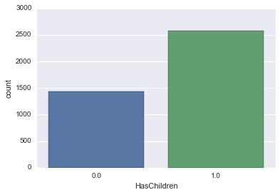
If it is 0 or 1, it is difficult to understand, so let's say No without children and Yes with children.
survey_df['HasChildren'].loc[survey_df['HasChildren'] == 0] = 'No'
survey_df['HasChildren'].loc[survey_df['HasChildren'] == 1] = 'Yes'
You can now convert.
df.map
Conversion using map seems to be good.
survey_df['HasChildren'] = survey_df['HasChildren'].map({0: 'No', 1: 'Yes'})
sns.countplot('HasChildren', data=survey_df)
sns.countplot('HasChildren', data=survey_df)

It's a little easier to understand!
EmploymentStatus
The current employment form is also represented by count plot.
sns.countplot('EmploymentStatus', data=survey_df)

It's kind of messy and hard to understand. ..
So let's change the axis.
countplot Axis change
sns.countplot(y='EmploymentStatus', data=survey_df)
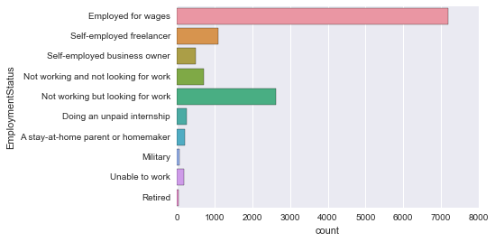
Easy to see!
Age
Again, try using count plot.
sns.countplot('Age', data=survey_df)

It's colorful and beautiful, but it's hard to see as a graph.
So let's smooth the graph.
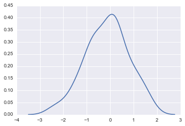
kde plot
Use kernel density estimation (kde: kernel density plot). The method itself is easy.
sns.kdeplot(survey_df['Age'])

There are many people in their 20s and 30s. Is it just as you would expect? However, the hem is widening even if you get older to some extent.
Kernel density estimation
Now let's consider a little kernel density estimation. (If you look at Wikipedia and other sites, you can see a proper explanation.) [Kernel Density Estimate](https://ja.wikipedia.org/wiki/%E3%82%AB%E3%83%BC%E3%83%8D%E3%83%AB%E5%AF%86%E5 % BA% A6% E6% 8E% A8% E5% AE% 9A)
dataset = randn(30)
plt.hist(dataset, alpha=0.5)
sns.rugplot(dataset)
The rug plot shows each sample point with a bar.

This is an image of creating a kernel function (which is easy to understand if you consider a normal distribution as an example) for each sample point in this graph and adding them together.
sns.kdeplot(dataset)
In estimating kernel density
--Kernel function: How to spread the influence of each sample point --Bandwidth: Width of kernel function spread
You need to decide on two things.
Kernel function
You can also use various kernel functions. The default is gau (Gaussian distribution, normal distribution).
kernel_options = ["gau", "biw", "cos", "epa", "tri", "triw"]
for kernel in kernel_options:
    sns.kdeplot(dataset, kernel=kernel, label=kernel)

Bandwidth
Bandwidth can also be changed.
for bw in np.arange(0.5, 2, 0.25):
  sns.kdeplot(dataset, bw=bw, label=bw)

So far, the explanation of kernel density estimation has been separated, and then we will continue.
Income
Again, use kdeplot.
sns.kdeplot(survey_df['Income'])

The unit is dollars, so it's an annual income.
Let's take a closer look at the data.
describe
survey_df['Income'].describe()
RuntimeWarning: Invalid value encountered in median
count      7329.000000
mean      44930.010506
std       35582.783216
min        6000.000000
25%                NaN
50%                NaN
75%                NaN
max      200000.000000
Name: Income, dtype: float64
It seems that the problem that the quartile becomes NaN has already been solved at the time of writing the article, but it seems to be waiting for merge. Wait for the version upgrade without worrying about it. describe() returns RuntimeWarning: Invalid value encountered in median RuntimeWarning #13146
boxplot
I would like to create a boxplot (boxplot).
sns.boxplot(survey['Income'])

From the vertical line on the left, the minimum boxplot, the first quartile (Q1), the median, the third quartile (Q3), and the maximum boxplot are shown. Those that deviate from (minimum value --IQR1.5) ~ (maximum value + IQR1.5) as IQR = Q3-Q1 are represented by black dots as outliers that deviate from the boxplot.
It is also possible to express outliers without them.
sns.boxplot(survey['Income'], whips=np.inf)

violinplot
There is also a Vaviolin plot that gives boxplot information about kde.
sns.violinplot(survey_df['Income'])

The distribution is easier to understand!
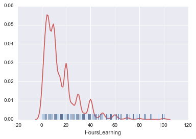
HoursLearning
Let's take a look at the study time. First, let's do a kde plot.
sns.kdeplot(survey_df['HoursLearning'])

It's the amount of learning per week in terms of time. Also, the extremum is noticeable, but this is happening with a clear number. Normally, I answer the questionnaire with good numbers, so this happens.
I also have a violin plot.
sns.violinplot(survey_df['HoursLearning'])

It reflects the characteristics of the kde plot.
There is also a distplot that can generate both countplot and kdeplot together.
nan is deleted and used.
hours_learning = survey_df['HoursLearning']
hours_learning = hours_learning.dropna()
sns.distplot(hours_learning)
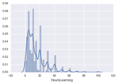
You can turn the histogram into a lag plot and add options. Convenient!
sns.distplot(hours_learning, rug=True, hist=False, kde_kws={'color':'indianred'})
SchoolMajor
If it is a continuous value, kdeplot will be useful, but since this is a categorization, use countplot.
sns.countplot(y='SchoolMajor' , data=survey_df)
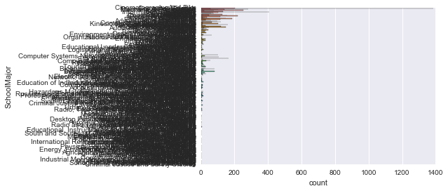
It's hard to see. .. There are too many categories. I want to see the top 10 or so.
collections.Counter
from collections import Counter
major_count = Counter(survey_df['SchoolMajor'])
major_count.most_common(10)
Count by using the standard library collections.
Furthermore, by setting most_common (10), you can get the top 10 of them.
[(nan, 7170),
 ('Computer Science', 1387),
 ('Information Technology', 408),
 ('Business Administration', 284),
 ('Economics', 252),
 ('Electrical Engineering', 220),
 ('English', 204),
 ('Psychology', 187),
 ('Electrical and Electronics Engineering', 164),
 ('Software Engineering', 159)]
Let's display it on the graph.
X = []
Y = []
major_count_top10 = major_count.most_common(10)
for record in major_count_top10:
    X.append(record[0])
    Y.append(record[1])

# [nan, 'Computer Science', 'Information Technology', 'Business Administration', 'Economics', 'Electrical Engineering', 'English', 'Psychology', 'Electrical and Electronics Engineering', 'Software Engineering']
# [7170, 1387, 408, 284, 252, 220, 204, 187, 164, 159]

plt.barh(np.arange(10), Y)
plt.yticks(np.arange(10), X)
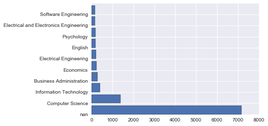
I referred to here. Bar Graph -Introduction to matplotlib
You can use plt.barh to change the axis of plt.bar. I also labeled it with yticks.
Well, I don't want nan to be displayed and I want to sort it in reverse order.
X = []
Y = []
major_count_top10 = major_count.most_common(10)
major_count_top10.reverse()
for record in major_count_top10:
    # record[0] == record[0]There is a supplement below
    if record[0] == record[0]:
        X.append(record[0])
        Y.append(record[1])

# ['Software Engineering', 'Electrical and Electronics Engineering', 'Psychology', 'English', 'Electrical Engineering', 'Economics', 'Business Administration', 'Information Technology', 'Computer Science']
# [159, 164, 187, 204, 220, 252, 284, 408, 1387]

plt.barh(np.arange(9), Y)
plt.yticks(np.arange(9), X)

The graph I was thinking of was created!
[Addition] about if record [0] == record [0]:
Here, False is returned only when comparing between NaN, so I implemented this. (See also the URL below)
However, it is difficult to understand The implementation method introduced by @shiracamus is easier to understand. I will use this in the future as well.
if record[0] == record[0]:
Changed the part as follows.
if pd.notnull(record[0]):
Data association
Gender and HasChildren
First, Gender is for men and women only for simplicity.
male_female_df = survey_df.where((survey_df['Gender'] == 'male') + (survey_df['Gender'] == 'female') )
You can count by layer by using hue of count plot.
countplot(hue)
sns.countplot('Gender', data=male_female_df, hue='HasChildren')
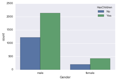
It seems that both men and women have the same proportion of children.
Gender and Age
Graphs other than count plot can also be represented by layers. Use FacetGrid.
sns.FacetGrid
fig = sns.FacetGrid(male_female_df, hue='Gender', aspect=4)
fig.map(sns.kdeplot, 'Age', shade=True)
oldest = male_female_df['Age'].max()
fig.set(xlim=(0, oldest))
fig.add_legend()

Men are a little younger, aren't they?
EmploymentStatus and Gender
Since there are multiple Employment Status, I would like to use only the top few.
# male_female_df is survey_Gender of df narrowed down to men and women
#Get the top 5 Employment Status
from collections import Counter
employ_count = Counter(male_female_df['EmploymentStatus'])
employ_count_top = employ_count.most_common(5)
print(employ_count_top)
employ_list =[]
for record in employ_count_top:
if record[0] == record[0]:
employ_list.append(record[0])
def top_employ(status):
return status in employ_list
#employ using apply_Get only the rows of items in list
new_survey_df = male_female_df.loc[male_female_df['EmploymentStatus'].apply(top_employ)]
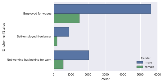
sns.countplot(y='EmploymentStatus', data=new_survey_df)

Now there are only the top 3 items.
Let's look at the gender stratification using the count plot hue.
sns.countplot(y='EmploymentStatus', data=employ_df, hue='Gender')
EmploymentStatus and HasChildren
First, convert HasChildren to No-> 0, Yes-> 1.
new_survey_df['HasChildren'] = new_survey_df['HasChildren'].map({'No': 0, 'Yes': 1})
Use factor plot here. Let's see how the Employment Status` is related to the presence or absence of children.
factorplot
sns.factorplot('EmploymentStatus', 'HasChildren', data=new_survey_df, aspect=2)

ʻEmloyed for wages` is a little high. This is convincing.
You can also see the factor plots by layer, so let's see if there is any difference between men and women.
sns.factorplot('EmploymentStatus', 'HasChildren', data=new_survey_df, aspect=2, hue='Gender')

This is pretty interesting. In fact, it was completely different for men and women. In light of the employment situation, there are many possibilities.
Age and HasChildren
lmplot
I would like to see the relationship with a regression line. Use lmplot for the regression line.
sns.lmplot('Age', 'HasChildren', data=new_survey_df)

By the way, lmplot can also be seen by layer, so I would like to try it.
First, stratify by ʻEmployment Status`.
sns.lmplot('Age', 'HasChildren', data=new_survey_df, hue='EmploymentStatus')
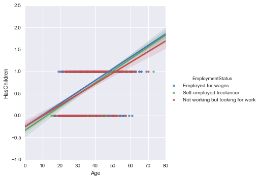
Generally, the value of ʻEmployed for wages` is a little high, but as we saw in the previous section, it seems to be a little clearer if we divide it by gender.
By the way, I will also stratify Gender.
sns.lmplot('Age', 'HasChildren', data=new_survey_df, hue='Gender')

Display multiple graphs side by side
You can also display multiple graphs side by side. I drew two graphs using subplots.
fig, (axis1, axis2) = plt.subplots(1, 2, sharey=True)
sns.regplot('HasChildren', 'Age', data=new_survey_df, ax=axis1)
sns.violinplot(y='Age', x='HasChildren', data=new_survey_df, ax=axis2)

regplot is a low-level version of lmplot, which is the same for making simple regressions.
I used regplots because the functions that can be used with subplots seem to be limited to those that return a matplotlib Axes object, and lmplot could not be used.
Detailed explanation Plotting with seaborn using the matplotlib object-oriented interface Was easy to understand.
It seems that the "Axis-level" function mentioned in this article can be used. (regplot, boxplot, kdeplot, and many others)
On the other hand, the "Figure-level" function is also introduced, and there is also lmplot in it.
(lmplot, factorplot, jointplot and one or two others)
It's almost ʻAxis and partly like Figure`.
So it seems that FacetGrid is good for figures.
Plotting on data-aware grids
You can also arrange multiple graphs with FacetGrid.
I tried to display the distribution of Age side by side by EmploymentStatus.
fig = sns.FacetGrid(new_survey_df, col='EmploymentStatus', aspect=1.5)
fig.map(sns.distplot, 'Age')
oldest = new_survey_df['Age'].max()
fig.set(xlim=(0, oldest))
fig.add_legend()

in conclusion
Organize what comes out
- df.shape
- df.info()
- df.describe()
- df.read_csv
- sns.countplot
- plt.hist
- plt.bar
- sns.kdeplot
- df.loc
- df.map
- sns.rugplot
- sns.boxplot
- sns.violinplot
- sns.distplot
- collections.Counter
- collections.Counter.most_common
- plt.barh
- pd.where
- sns.countplot(hue)
- sns.FacetGrid
- df.apply
- sns.lmplot
- sns.lmplot(hue)
- plt.subplots
Referenced in how to use python
Better writing that I've wanted to know since I started Python Python pandas data selection process in a little more detail <Part 2>
reference
[20,000 people in the world] Practical Python Data Science This is a recommended video course that is easy to understand with detailed explanations. The point is that even if you ask a question, the answer will be returned the next day.
[Introduction to Data Analysis with Python-Data Processing Using NumPy and pandas](https://www.amazon.co.jp/Python%E3%81%AB%E3%82%88%E3%82%8B%E3 % 83% 87% E3% 83% BC% E3% 82% BF% E5% 88% 86% E6% 9E% 90% E5% 85% A5% E9% 96% 80-% E2% 80% 95NumPy% E3% 80% 81pandas% E3% 82% 92% E4% BD% BF% E3% 81% A3% E3% 81% 9F% E3% 83% 87% E3% 83% BC% E3% 82% BF% E5% 87% A6% E7% 90% 86-Wes-McKinney / dp / 4873116554) O'Reilly's data analysis book. It is well organized.
Start Python Club The Python community. I'm not specialized in data analysis, but I'm widely active in Python, so if you use Python, I think it's fun to go.
Recommended Posts