[PYTHON] Data analysis before kaggle's titanic feature generation
Introduction
I tried to predict the survivors of the Titanic, which is a tutorial of kaggle.
** This time, instead of building a machine learning model to predict the probability of survival, we will look at the relationships between the data and investigate what kind of people survived **.
And I would like to use the obtained results when complementing missing values and generating features.
1. Data overview
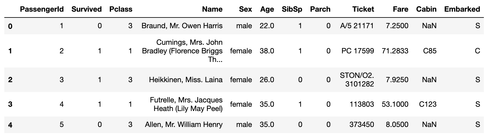
Import the library and read & check the train data
import pandas as pd
import numpy as np
import matplotlib.pyplot as plt
import seaborn as sns
sns.set()

data=pd.read_csv("/kaggle/input/titanic/train.csv")
data.head()
 ** Types of features **
・ PassengerId: Passenger ID
・ Survived: Life and death (0: death, 1: survival)
・ Pclass: Passenger social class (1: Upper, 2: Middle, 3: Lower)
・ Name: Name
・ Sex: Gender
・ Age: Age
・ SibSp: Number of siblings and spouses riding together
・ Parch: Number of parents and children riding together
・ Ticket: Ticket number
・ Fare: Boarding fee
・ Cabin: Room number
・ Embarked: Port on board
** Types of features **
・ PassengerId: Passenger ID
・ Survived: Life and death (0: death, 1: survival)
・ Pclass: Passenger social class (1: Upper, 2: Middle, 3: Lower)
・ Name: Name
・ Sex: Gender
・ Age: Age
・ SibSp: Number of siblings and spouses riding together
・ Parch: Number of parents and children riding together
・ Ticket: Ticket number
・ Fare: Boarding fee
・ Cabin: Room number
・ Embarked: Port on board
First, let's look at the missing values of the data, the summary statistics, and the correlation coefficient between each feature.
#Check for missing values
data.isnull().sum()
| Number of missing values | |
|---|---|
| PassengerId | 0 |
| Survived | 0 |
| Pclass | 0 |
| Name | 0 |
| Sex | 0 |
| Age | 177 |
| SibSp | 0 |
| Parch | 0 |
| Ticket | 0 |
| Fare | 0 |
| Cabin | 687 |
| Embarked | 2 |
#Check summary statistics
#You can check the maximum value, minimum value, average value, and quantile.
#Calculated by excluding any missing values
data.describe()
| PassengerId | Survived | Pclass | Age | SibSp | Parch | Fare | |
|---|---|---|---|---|---|---|---|
| count | 891.000000 | 891.000000 | 891.000000 | 714.000000 | 891.000000 | 891.000000 | 891.000000 |
| mean | 446.000000 | 0.383838 | 2.308642 | 29.699118 | 0.523008 | 0.381594 | 32.204208 |
| std | 257.353842 | 0.486592 | 0.836071 | 14.526497 | 1.102743 | 0.806057 | 49.693429 |
| min | 1.000000 | 0.000000 | 1.000000 | 0.420000 | 0.000000 | 0.000000 | 0.000000 |
| 25% | 223.500000 | 0.000000 | 2.000000 | 20.125000 | 0.000000 | 0.000000 | 7.910400 |
| 50% | 446.000000 | 0.000000 | 3.000000 | 28.000000 | 0.000000 | 0.000000 | 14.454200 |
| 75% | 668.500000 | 1.000000 | 3.000000 | 38.000000 | 1.000000 | 0.000000 | 31.000000 |
| max | 891.000000 | 1.000000 | 3.000000 | 80.000000 | 8.000000 | 6.000000 | 512.329200 |
#Check the correlation coefficient of each feature
data.corr()
| PassengerId | Survived | Pclass | Age | SibSp | Parch | Fare | |
|---|---|---|---|---|---|---|---|
| PassengerId | 1.000000 | -0.005007 | -0.035144 | 0.036847 | -0.057527 | -0.001652 | 0.012658 |
| Survived | -0.005007 | 1.000000 | -0.338481 | -0.077221 | -0.035322 | 0.081629 | 0.257307 |
| Pclass | -0.035144 | -0.338481 | 1.000000 | -0.369226 | 0.083081 | 0.018443 | -0.549500 |
| Age | 0.036847 | -0.077221 | -0.369226 | 1.000000 | -0.308247 | -0.189119 | 0.096067 |
| SibSp | -0.057527 | -0.035322 | 0.083081 | -0.308247 | 1.000000 | 0.414838 | 0.159651 |
| Parch | -0.001652 | 0.081629 | 0.018443 | -0.189119 | 0.414838 | 1.000000 | 0.216225 |
| Fare | 0.012658 | 0.257307 | -0.549500 | 0.096067 | 0.159651 | 0.216225 | 1.000000 |
I would like to see the features related to Survived from the correlation coefficient, but it is a little difficult to understand if it is a table with only numbers ... Therefore, I will remove the covered values in this table and show the absolute value notation in the heat map.
#Make the value an absolute value
corr_matrix = data.corr().abs()

#Create a lower triangular matrix, corr_Apply to matrix
map_data = corr_matrix.where(np.tril(np.ones(corr_matrix.shape), k=-1).astype(np.bool))

#Determine the size of the image and convert it to a heat map
plt.figure(figsize=(10,10))
sns.heatmap(map_data, annot=True, cmap='Greens')
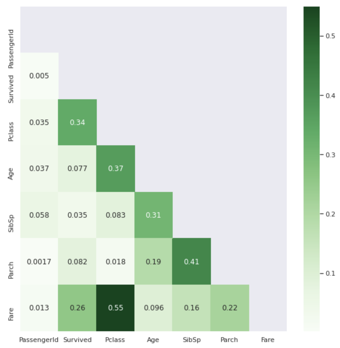 The darker the color, the closer the correlation coefficient value is to 1.
Isn't it easier to see than the .corr () table?
The darker the color, the closer the correlation coefficient value is to 1.
Isn't it easier to see than the .corr () table?
I don't know about non-numerical features (Name, Sex, Ticket, Cabin, Embarked), but from the table above, it can be seen that ** Pclass and Fare ** are largely involved in Survived. ..
- Pclass First, let's check the relationship between Pclass and Survived.
sns.barplot(x='Pclass',y='Survived',hue='Sex', data=data)
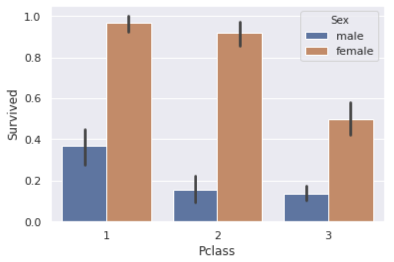 ** The higher the Pclass, the higher the survival rate **.
Does it mean that the higher the rank, the more preferentially helped?
You can also see that ** women have more than double the survival rate of men ** in every class.
By the way, the overall survival rate for men was 18.9% and that for women was 74.2%.
** The higher the Pclass, the higher the survival rate **.
Does it mean that the higher the rank, the more preferentially helped?
You can also see that ** women have more than double the survival rate of men ** in every class.
By the way, the overall survival rate for men was 18.9% and that for women was 74.2%.
- Fare Since the minimum value is 0 and the maximum value is 512, so let's examine the overall distribution.
plt.figure(figsize=(20,8))
sns.distplot(data['Fare'], bins=50, kde=False)
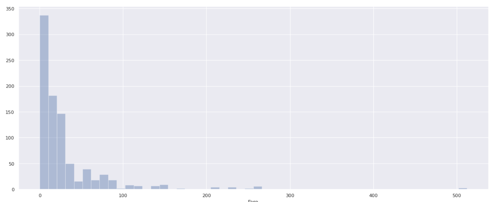
** Few people have a boarding fee of over 100, and most passengers have a boarding fee of 0-100 **. In order to investigate how the survival rate changes depending on the boarding fee, divide the Fare value by 10 (0 to 10, 10 to 20, 20 to 30 ...) and calculate the survival rate for each.
#Divided into 10'Fare_bin'Add column to data
data['Fare_bin'] = pd.cut(data['Fare'],[i for i in range(0,521,10)], right=False)

bin_list = []
survived_list = []
for i in range(0,511,10):
    #Find the survival rate in each section
    survived=data[data['Fare_bin'].isin([i])]['Survived'].mean()
    #Exclude the sections that are NaN and add only the sections for which the survival rate is required to the list.
    if survived >= 0:
        bin_list.append(f'{i}~{i+10}')
        survived_list.append(survived)

#Create a data frame from two lists and turn it into a graph
plt.figure(figsize=(20,8))
fare_bin_df = pd.DataFrame({'Fare_bin':bin_list, 'Survived':survived_list})
sns.barplot(x='Fare_bin', y='Survived', data=fare_bin_df, color='skyblue')
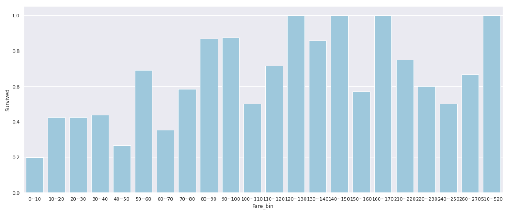
** People with a Fare of 0 to 10 have an extremely low survival rate of 20% or less **, and when the Fare exceeds 50, the survival rate often exceeds 50% **.
Instead of using the value as it is, it may be good to use __classified features such as'Low'for 0 to 10 people and'Middle' for 10 to 50 people. ..
Also, the correlation coefficient between Pclass and Fare was 0.55, so when I looked at the relationship between the two, it became like the graph below.
(* P class for people with Fare of 100 or more was 1 so omitted)
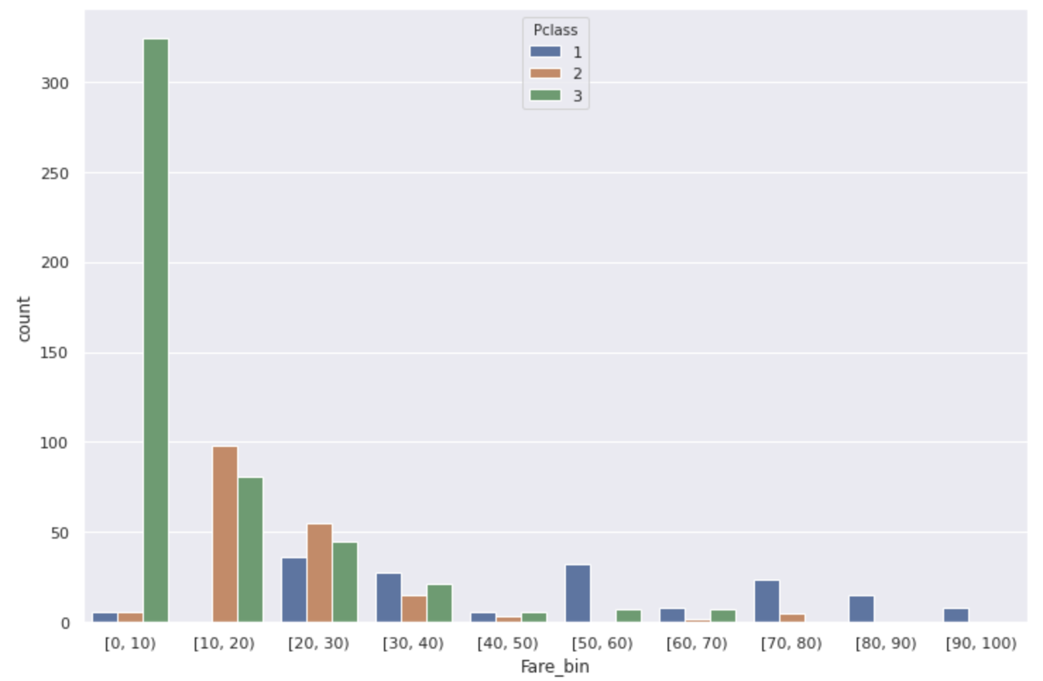 Most of the Fare [0,10) with low survival rates are low-ranking people.
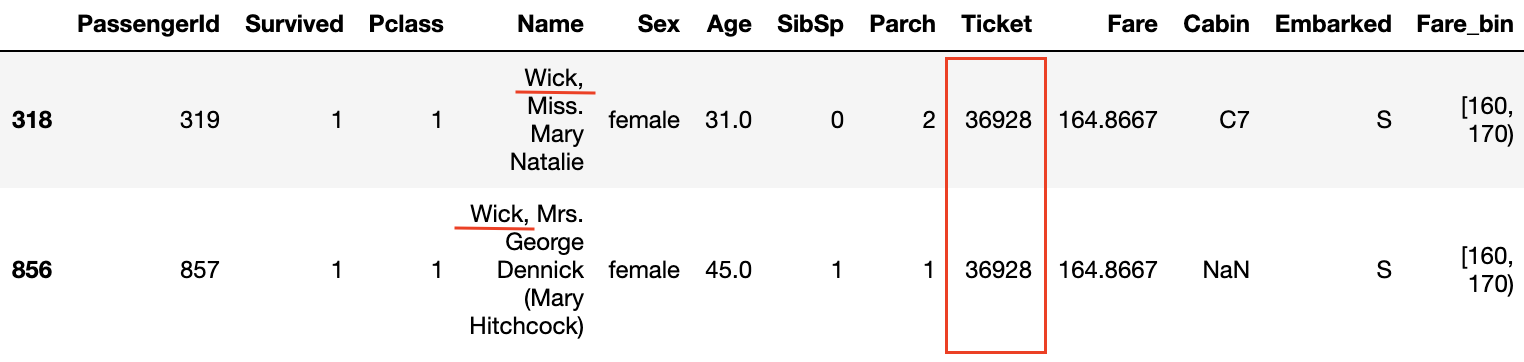
Furthermore, looking at the data where the survival rate is 1.0 in the Survived and Fare_bin graphs, ** the surnames are common ** or ** the ticket numbers are the same **.
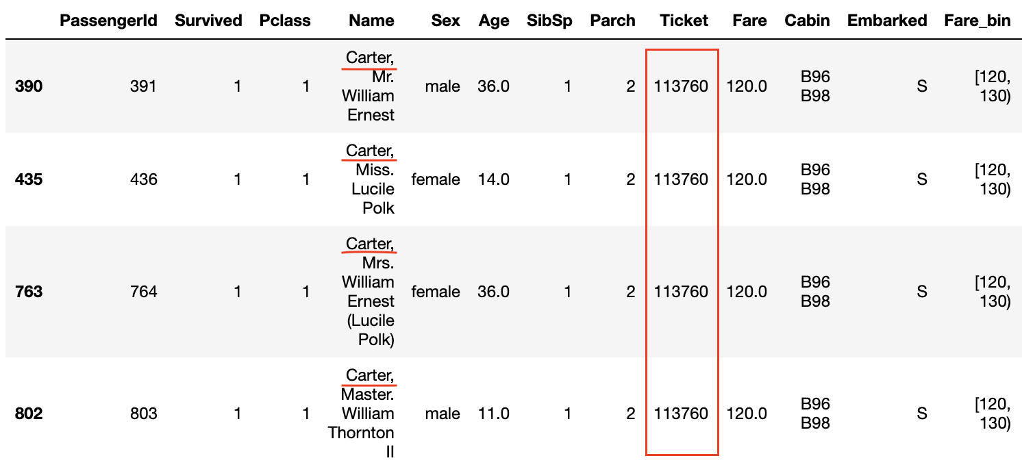
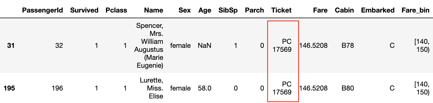
 Also, even if the ** P class is 3 and the Fare is not high, if the ticket numbers are the same, the survival rate seems to be high **.
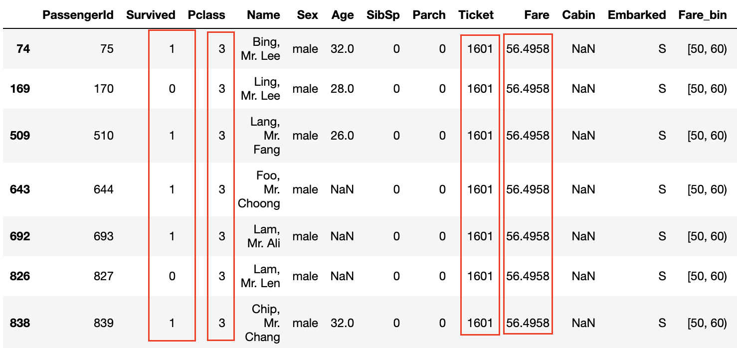 The fact that the ticket numbers are the same means that ** the family and friends bought the tickets together **, and that they were able to act together on board and help each other when escaping from the ship. It seems to be.
Now let's find out if there is a difference in survival rate depending on the number of family members and ticket numbers.
4. SibSP and Parch
Using the values of SibSp and Parch that are based on the Titanic data, let's create a feature quantity'Family_size'that indicates how many families boarded the Titanic.
#Family_Create feature of size
data['Family_size'] = data['SibSp']+data['Parch']+1

fig,ax = plt.subplots(1,2,figsize=(20,8))
plt.figure(figsize=(12,8))
#Graph the number of survivors and deaths
sns.countplot(data['Family_size'],hue=data['Survived'], ax=ax[0])
#Family_Find the survival rate for each size
sns.barplot(x='Family_size', y='Survived',data=data, color='orange', ax=ax[1])
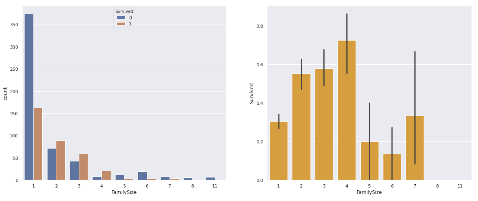
** The one-person ride had a lower survival rate than the one-person ride, and the four-person family had the highest survival rate. ** On the contrary, if the number of family members is too large, it seems that it was difficult to act together or survived.
As with Fare, it seems that it can be used as a feature by classifying it into about 4 according to the number of family members.
- Ticket Put the number of duplicate ticket numbers in the'Ticket_count' column This will allow us to see the survival rate of not only family members but also ** (probably) friends who boarded the ship **.
#Ticket_Create a column for count
data['Ticket_count'] = data.groupby('Ticket')['PassengerId'].transform('count')
#Find survival rate
plt.figure(figsize=(12,8))
sns.barplot(x='Ticket_count', y='Survived',data=data, color='skyblue')
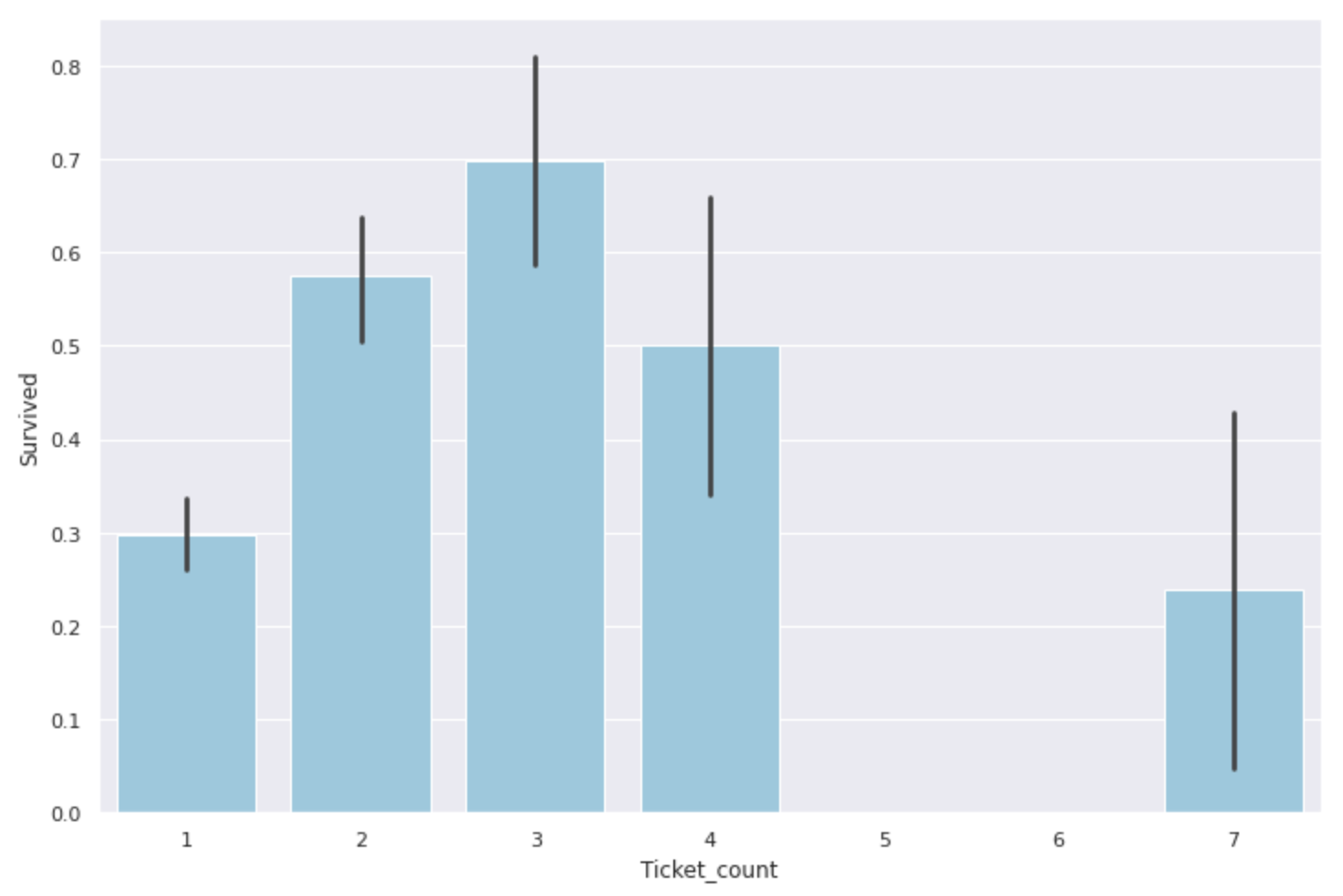
As with the number of family members, ** groups of 2-4 people are most helpful, and groups of 1 or 5 or more seem to have a low survival rate **. Similar to Fare and Family_size, this can also be classified as a feature quantity.
Now let's dig deeper into the information you get from your tickets. I referred to this site for the detailed classification of Tickets. pyhaya ’s diary: Analyzing Kaggle's Titanic Data
There are ticket numbers with numbers only and numbers & alphabets, so classify them.
#Get a number-only ticket
num_ticket = data[data['Ticket'].str.match('[0-9]+')].copy()
num_ticket_index = num_ticket.index.values.tolist()
#Tickets with only numbers dropped from the original data and the rest contains alphabets
num_alpha_ticket = data.drop(num_ticket_index).copy()
First, let's see how the number-only ticket numbers are distributed.
#Since the ticket number is entered as a character string, it is converted to a numerical value
num_ticket['Ticket'] = num_ticket['Ticket'].apply(lambda x:int(x))

plt.figure(figsize=(12,8))
sns.jointplot(x='PassengerId', y='Ticket', data=num_ticket)
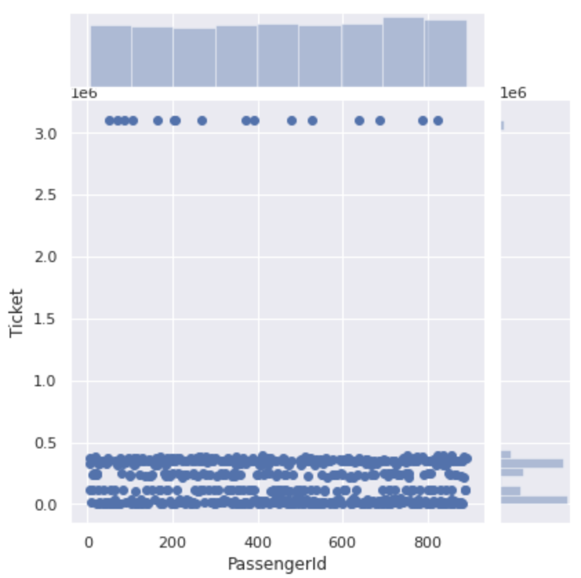 It is roughly divided into numbers of 500,000 or less and numbers of 3000000 or more.
If you take a closer look at the section from 0 to 500000, the ticket number for this section is divided into four.
It is roughly divided into numbers of 500,000 or less and numbers of 3000000 or more.
If you take a closer look at the section from 0 to 500000, the ticket number for this section is divided into four.
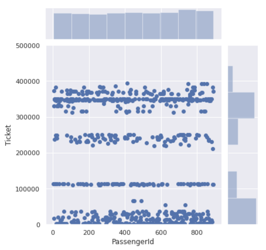 It seems that the ticket numbers are not just serial numbers, but ** there is a group for each number **.
Let's classify this as a group and see the difference in survival rate of each.
It seems that the ticket numbers are not just serial numbers, but ** there is a group for each number **.
Let's classify this as a group and see the difference in survival rate of each.
#0~Tickets with 99999 numbers are in class 0
num_ticket['Ticket_bin'] = 0
num_ticket.loc[(num_ticket['Ticket']>=100000) & (num_ticket['Ticket']<200000),'Ticket_bin'] = 1
num_ticket.loc[(num_ticket['Ticket']>=200000) & (num_ticket['Ticket']<300000),'Ticket_bin'] = 2
num_ticket.loc[(num_ticket['Ticket']>=300000) & (num_ticket['Ticket']<400000),'Ticket_bin'] = 3
num_ticket.loc[(num_ticket['Ticket']>=3000000),'Ticket_bin'] = 4

plt.figure(figsize=(12,8))
sns.barplot(x='Ticket_bin', y='Survived', data=num_ticket)
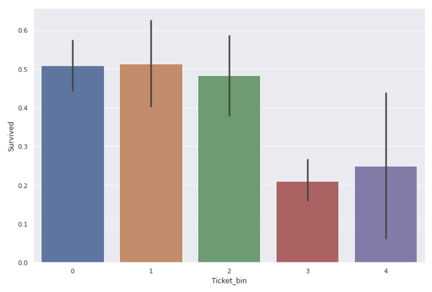 ** The survival rate of people with ticket numbers of 300000 ~ 400000 and 3000000 or more is considerably low **.
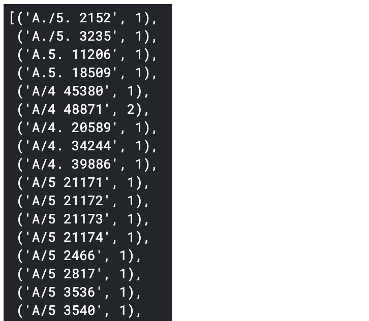
Next, we will look into numbers and alphabet tickets in the same way. First, let's check what kind there is.
#Sort by type to make it easier to see
sorted(num_alpha_ticket['Ticket'].value_counts().items())
 Since there are many types, classes 1 to 10 are given to those with a certain number, and classes with a small number are collectively set to 0.
(The color coding of the code has changed due to the influence of''...)
Since there are many types, classes 1 to 10 are given to those with a certain number, and classes with a small number are collectively set to 0.
(The color coding of the code has changed due to the influence of''...)
num_alpha_ticket['Ticket_bin'] = 0
num_alpha_ticket.loc[num_alpha_ticket['Ticket'].str.match('A.+'),'Ticket_bin'] = 1
num_alpha_ticket.loc[num_alpha_ticket['Ticket'].str.match('C.+'),'Ticket_bin'] = 2
num_alpha_ticket.loc[num_alpha_ticket['Ticket'].str.match('C\.*A\.*.+'),'Ticket_bin'] = 3
num_alpha_ticket.loc[num_alpha_ticket['Ticket'].str.match('F\.C.+'),'Ticket_bin'] = 4
num_alpha_ticket.loc[num_alpha_ticket['Ticket'].str.match('PC.+'),'Ticket_bin'] = 5
num_alpha_ticket.loc[num_alpha_ticket['Ticket'].str.match('S\.+.+'),'Ticket_bin'] = 6
num_alpha_ticket.loc[num_alpha_ticket['Ticket'].str.match('SC.+'),'Ticket_bin'] = 7
num_alpha_ticket.loc[num_alpha_ticket['Ticket'].str.match('SOTON.+'),'Ticket_bin'] = 8
num_alpha_ticket.loc[num_alpha_ticket['Ticket'].str.match('STON.+'),'Ticket_bin'] = 9
num_alpha_ticket.loc[num_alpha_ticket['Ticket'].str.match('W\.*/C.+'),'Ticket_bin'] = 10

plt.figure(figsize=(12,8))
sns.barplot(x='Ticket_bin', y='Survived', data=num_alpha_ticket)
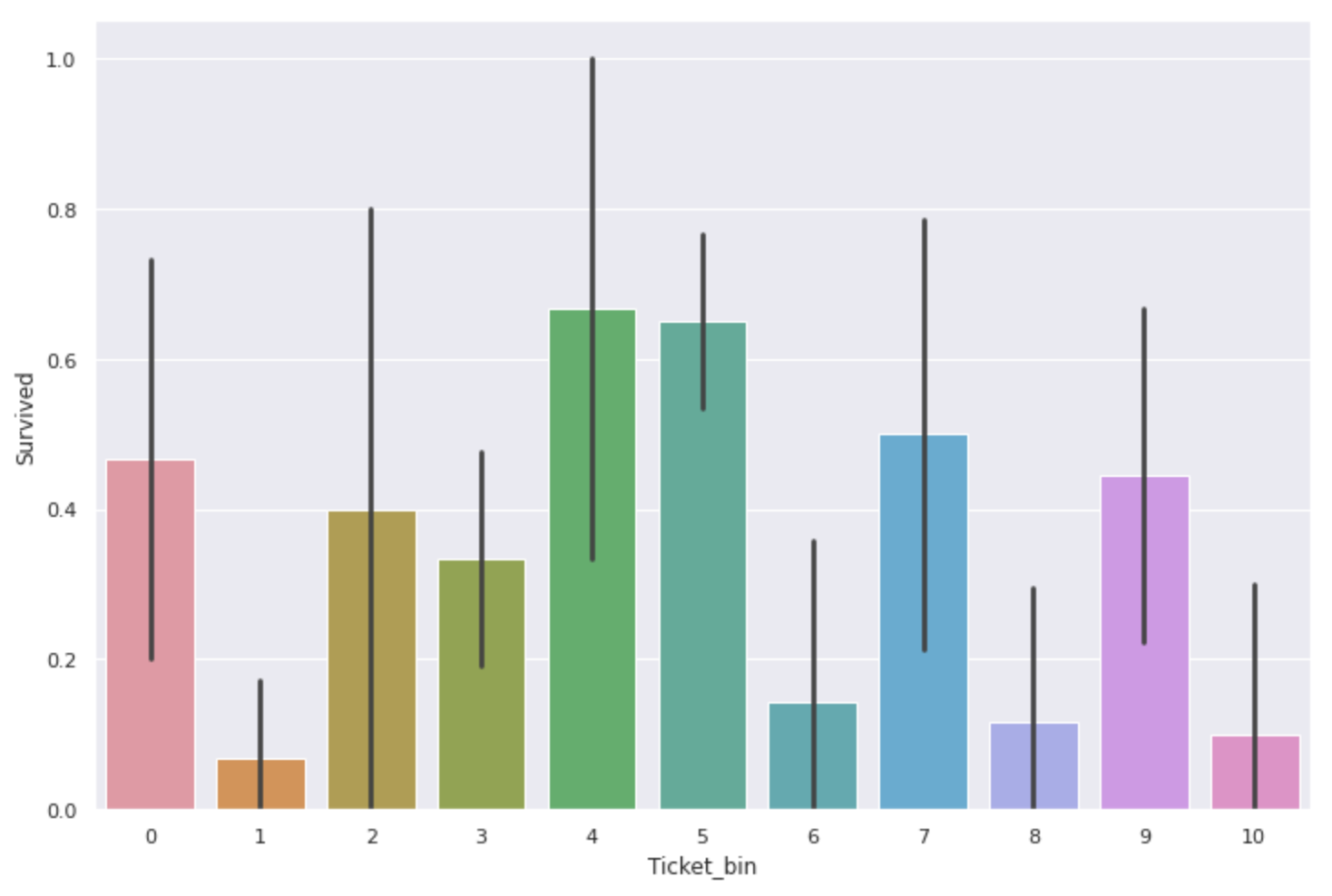 There was also a difference in survival rate here as well. ** The ones with'F.C'and'PC' are especially expensive **.
However, there are only 230 data for tickets including alphabets in total, and the number of data is only about one-third compared to tickets with only numbers, so ** the survival rate value itself may not be very credible **. Maybe.
There was also a difference in survival rate here as well. ** The ones with'F.C'and'PC' are especially expensive **.
However, there are only 230 data for tickets including alphabets in total, and the number of data is only about one-third compared to tickets with only numbers, so ** the survival rate value itself may not be very credible **. Maybe.
It seems that the survival rate changes depending on the ticket number ** because the numbers are divided according to the location and rank of the room **. Let's take a look at the relationships between Pclass and Fare, which are likely to be related to tickets.
↓ About tickets with numbers only
fig,ax = plt.subplots(1,2,figsize=(12,8))
sns.countplot(num_ticket['Ticket_bin'], hue=num_ticket['Pclass'], ax=ax[0])
sns.stripplot(x='Ticket_bin', y='Fare', data=num_ticket, ax=ax[1])
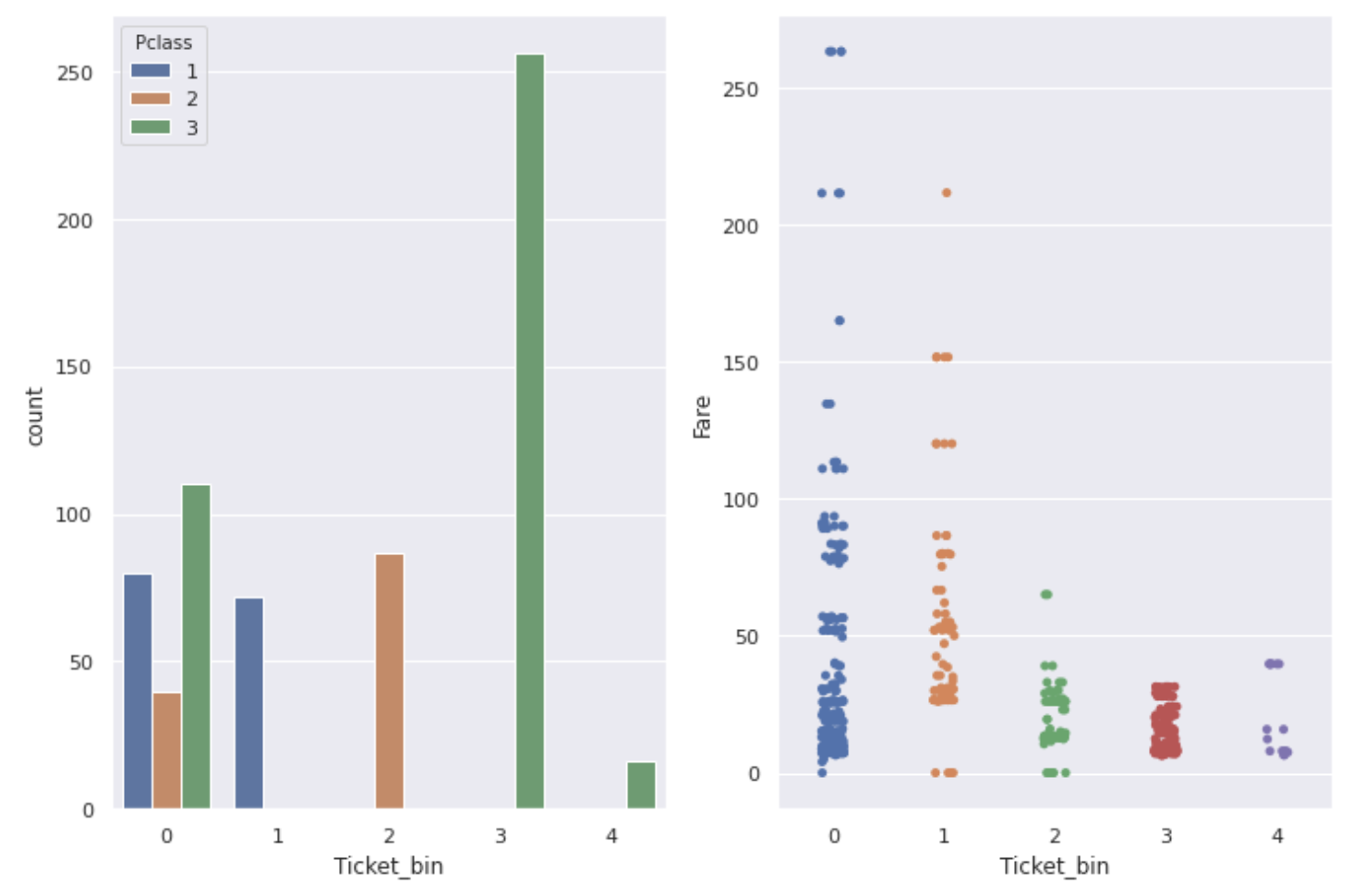 ↓ About numbers & alphabet tickets
fig,ax = plt.subplots(1,2,figsize=(12,8))
sns.countplot(num_alpha_ticket['Ticket_bin'], hue=num_alpha_ticket['Pclass'], ax=ax[0])
sns.stripplot(x='Ticket_bin', y='Fare', data=num_alpha_ticket, ax=ax[1])
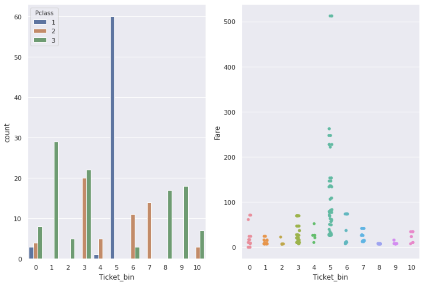
As you can see from the graph, ** Ticket, Pclass, and Fare are related to each other. Ticket numbers with a particularly high survival rate have a high Fare, and most people with a Pclass of 1 are **.
A ticket number that seems to be useless at first glance may be a useful feature if you search for it in this way.
- Age Since it contains missing values, drop the rows with missing values and then classify them every 10 years to check the survival rate.
#Data frame excluding missing values of Age'age_data'Create
data_age = data.dropna(subset=['Age']).copy()
#Divided by 10 years
data_age['Age_bin'] = pd.cut(data_age['Age'],[i for i in range(0,81,10)])

fig, ax = plt.subplots(1,2, figsize=(20,8))
sns.barplot(x='Age_bin', y='Survived', data=data_age, color='coral', ax=ax[0])
sns.barplot(x='Age_bin', y='Survived', data=data_age, hue='Sex', ax=ax[1])
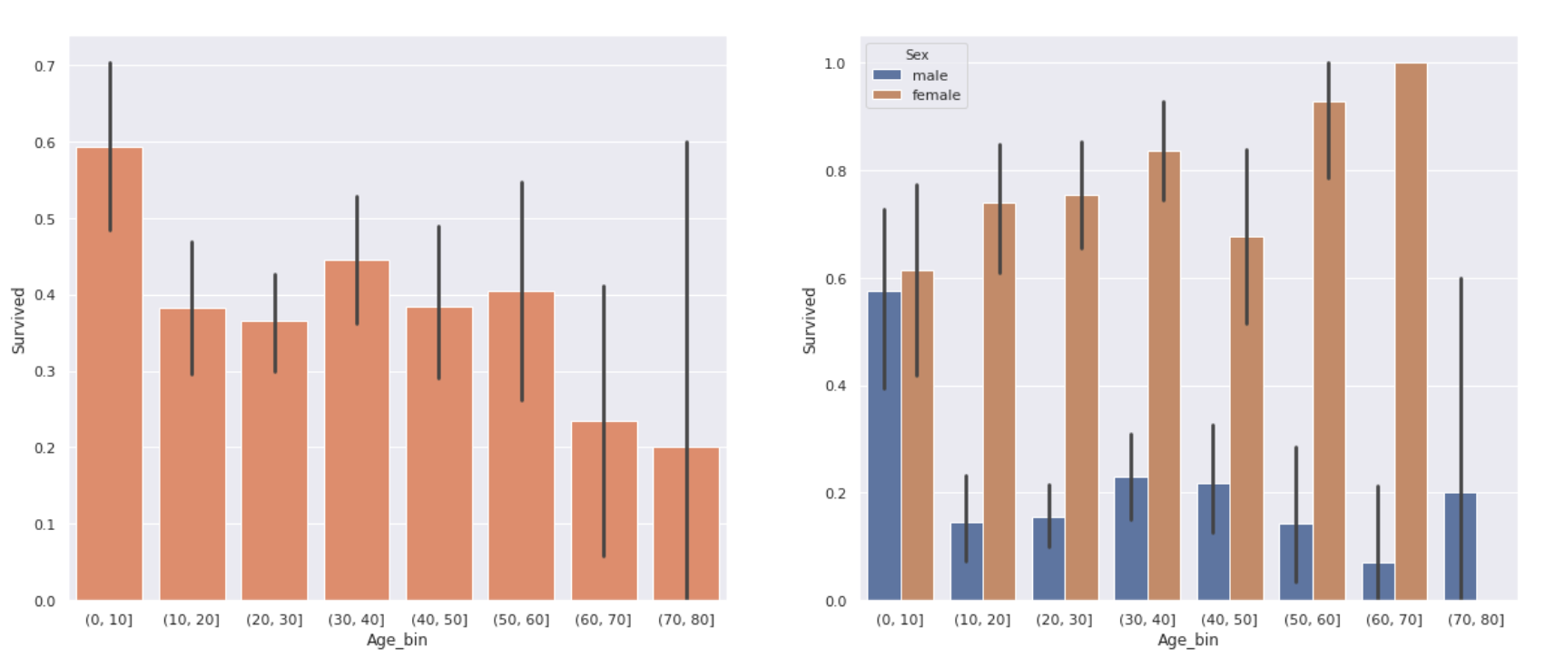
The graph on the right is the graph on the left divided by gender. There was a difference in survival rate depending on the age. ** The survival rate of children under 10 years old is relatively high, and the survival rate of elderly people over 60 years old is quite low, about 20% **. In addition, there was no significant difference in survival rates between teens and 50s.
However, looking at the results by gender, ** women have a considerably higher survival rate even if they are over 60 years old **. The low survival rate of the elderly in the graph on the left may also be due to the small number of women over the age of 60 (only 3).
- Embarked Is there a difference depending on the port where the passengers boarded?
plt.figure(figsize=(12,8))
sns.barplot(x='Embarked', y='Survived', data=data)
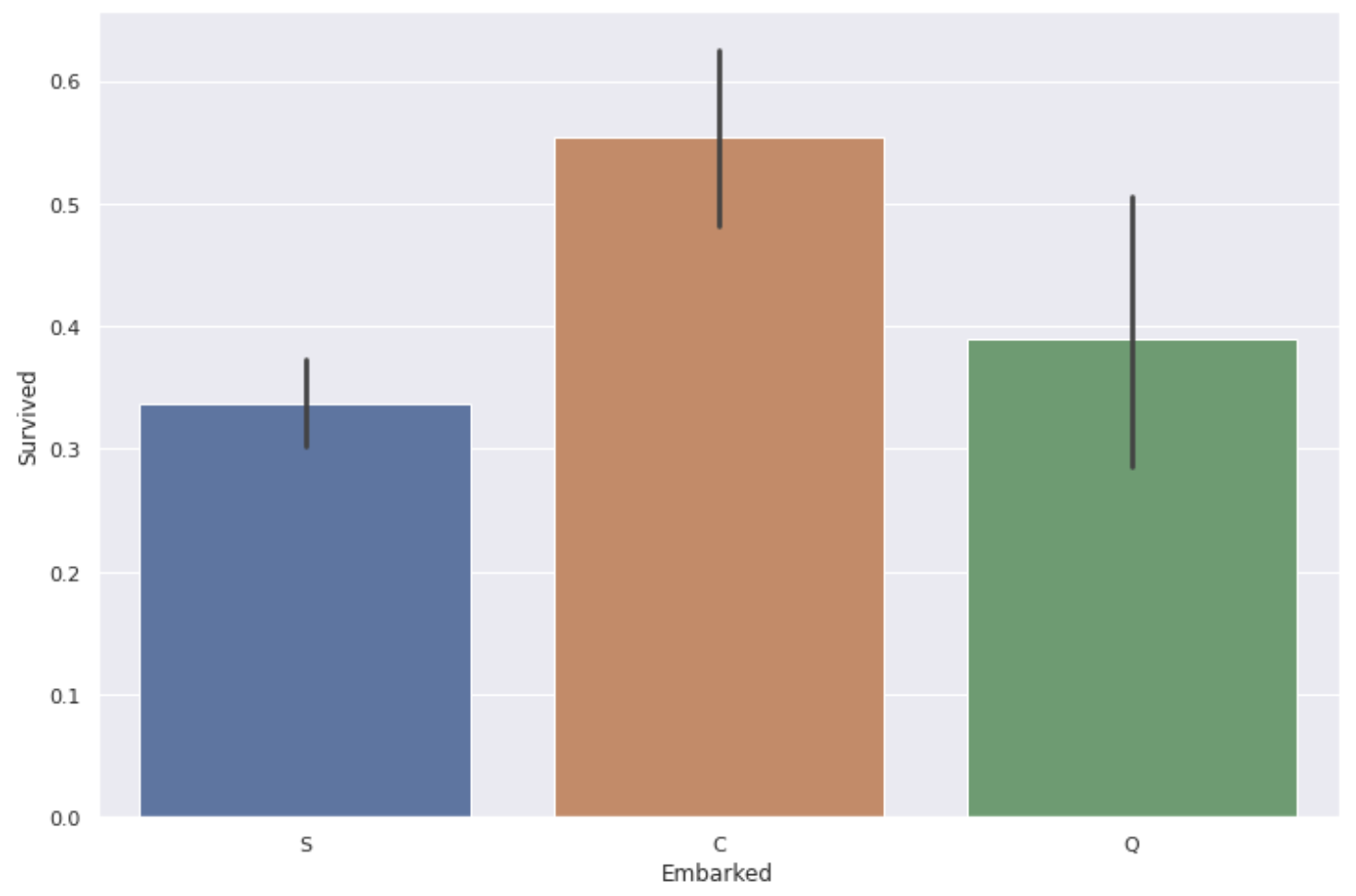 ** The survival rate of people boarding from the port of C (Cherbourg) is a little high **.
It is unlikely that the port itself has an effect, so let's take a look at the Pclass and Fare for each type of port.
fig, ax = plt.subplots(1,2, figsize=(12,8))
sns.countplot(data['Embarked'], hue= data['Pclass'], ax=ax[0])
sns.boxplot(x='Embarked', y='Fare', data=data, sym='', ax=ax[1])
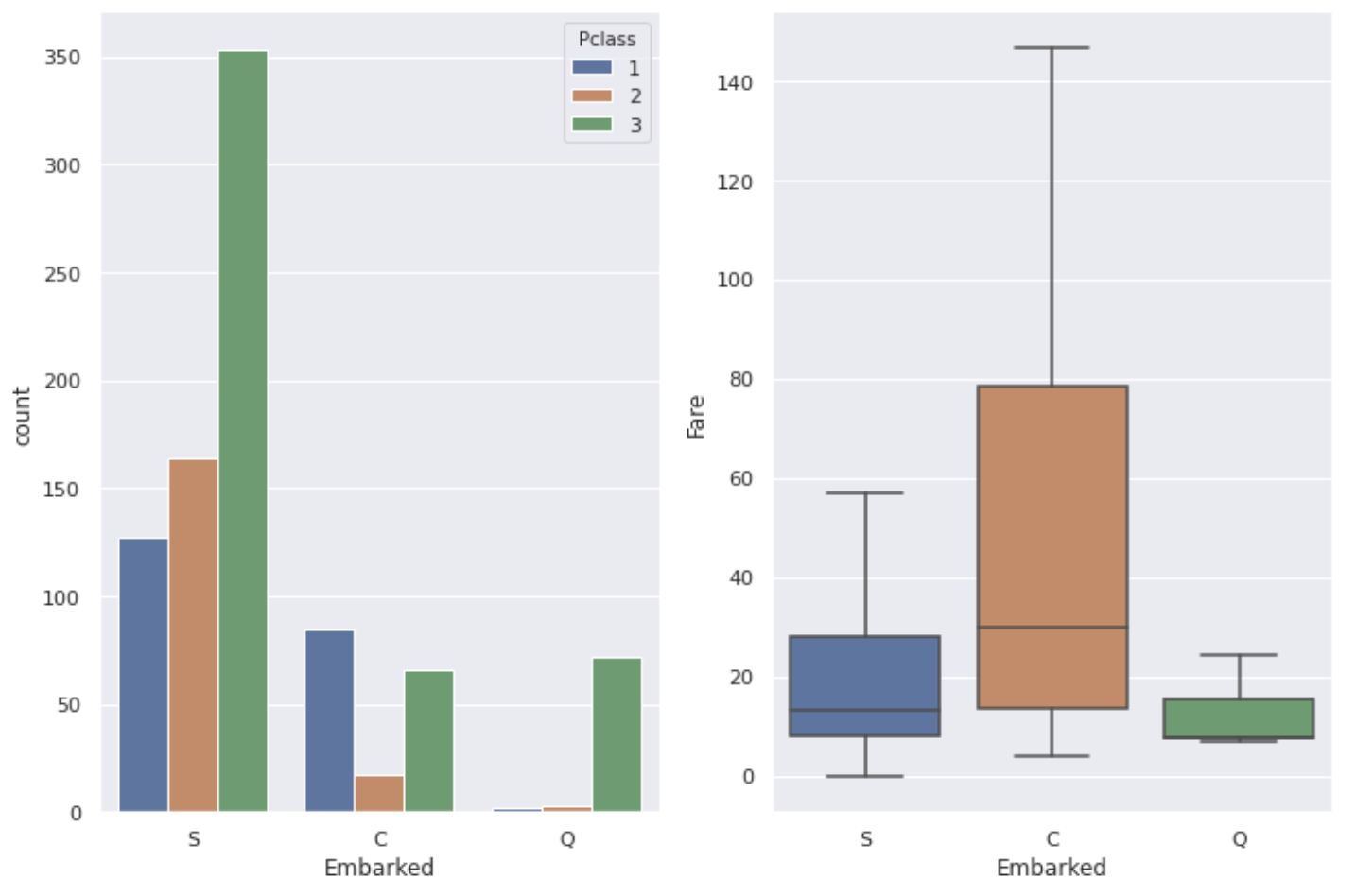 It seems that the classes and occupations of the people who live there differ depending on the area, so there are differences as shown in the graph above depending on the port.
Looking at the whole, it seems that there are quite a lot of people who got on from the port of S (Southampton). It can be said that the high survival rate at C's port is due to the high proportion of ** P class: 1 people and the relatively high Fare.
Most people who got on from the port of Q (Queenstown) have P class: 3, so it seems that the survival rate may be the lowest, but in reality, the survival rate at the port of S is the lowest. There is not so much difference between S and Q, but there is also a difference in the number of data, so the reason why the survival rate of people who got on from the port of S is the lowest is simply ** "There are many people of P class: 3" It seems that I can only say **.
- Cabin Since the percentage of missing values is as high as 77%, it is difficult to use it as a feature to give to the prediction model, but let's check if there is anything that can be obtained using the recorded data.
A drawing of the Titanic ship was on this site.
Plans détaillés du Titanic
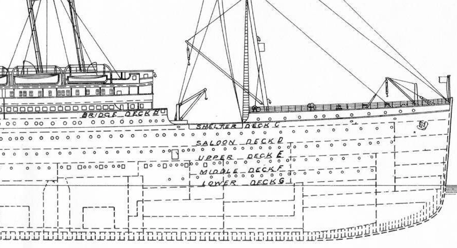 The guest rooms are written as "B96", and the first alphabet indicates the hierarchy of the guest rooms.
There are A to G and T alphabets, A is the top floor of the ship (luxury room) and G is the bottom floor (ordinary room).
** Considering that the lifeboat is placed on the upper deck ** and ** the inundation of the ship starts from the bottom **, the survival rate of the person in the room A closest to the upper deck is Looks expensive **.
Let's see what happens with the actual data.
The guest rooms are written as "B96", and the first alphabet indicates the hierarchy of the guest rooms.
There are A to G and T alphabets, A is the top floor of the ship (luxury room) and G is the bottom floor (ordinary room).
** Considering that the lifeboat is placed on the upper deck ** and ** the inundation of the ship starts from the bottom **, the survival rate of the person in the room A closest to the upper deck is Looks expensive **.
Let's see what happens with the actual data.
#I put only the alphabet of Cabin'Cabin_alpha'Create a column of
#n is the missing value line
data['Cabin_alpha'] = data['Cabin'].map(lambda x:str(x)[0])
data_cabin=data.sort_values('Cabin_alpha')

plt.figure(figsize=(12,8))
sns.barplot(x='Cabin_alpha', y='Survived', data=data_cabin)
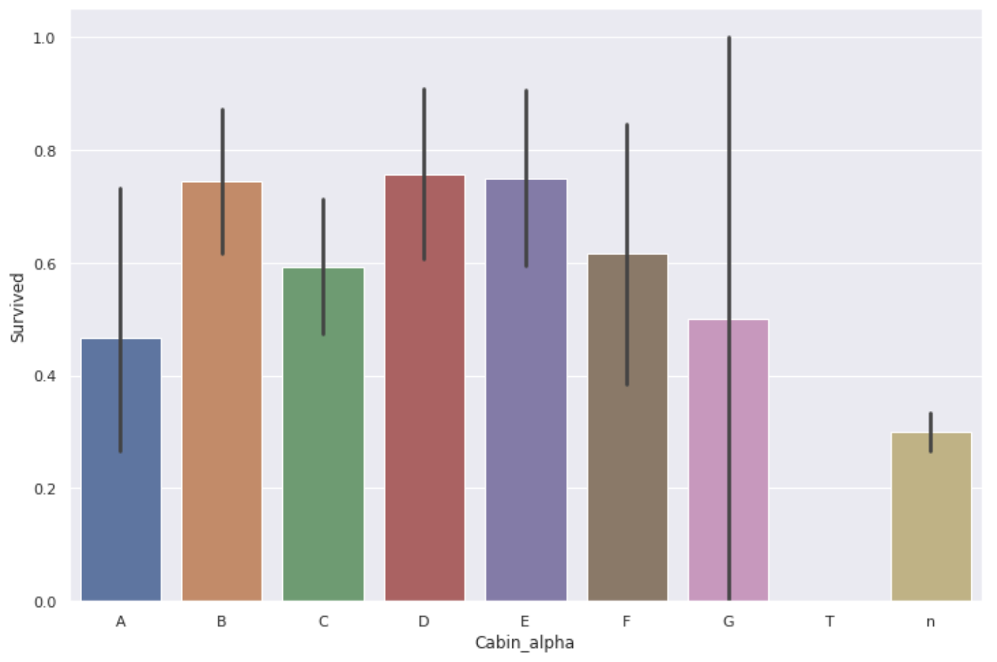 Contrary to expectations, the survival rate in A's room was not very high.
The table below shows the total number of data.
Contrary to expectations, the survival rate in A's room was not very high.
The table below shows the total number of data.
data['Survived'].groupby(data['Cabin_alpha']).agg(['mean', 'count'])
| mean | count | |
|---|---|---|
| Cabin_alpha | ||
| A | 0.466667 | 15 |
| B | 0.744681 | 47 |
| C | 0.593220 | 59 |
| D | 0.757576 | 33 |
| E | 0.750000 | 32 |
| F | 0.615385 | 13 |
| G | 0.500000 | 4 |
| T | 0.000000 | 1 |
| n | 0.299854 | 687 |
The amount of data for B and C may still be better, but the amount of data for A and G is quite small, so it cannot be said that there was a difference in survival rate depending on the floor of the guest room **.
Also, as with the ticket, there was a person with the same room number, so I thought "the room is the same" → "boarding with friends and family" → "the survival rate will be different", depending on whether the room numbers are duplicated The survival rate of each was calculated.
data['Cabin_count'] = data.groupby('Cabin')['PassengerId'].transform('count')
data.groupby('Cabin_count')['Survived'].mean()
| Cabin_count | Survival rate |
|---|---|
| 1 | 0.574257 |
| 2 | 0.776316 |
| 3 | 0.733333 |
| 4 | 0.666667 |
When I saw it, the survival rate of the person who was in the room alone was a little low ... I couldn't get it. After all, the number of data is too small to get a clear result.
On the contrary, the Cabin column may be cut off if it interferes with prediction or causes overfitting.
Summary
This time, I tried to analyze the data mainly on the relationship with Survived in order to find the data that can be used as the feature quantity given to the prediction model. We found that the features that seemed to be significantly related to survival rate were ** P class, Fare, number of family members (Family_size), duplicate tickets (Ticket_count), gender, and age **.
Next time, I would like to make up for the missing values contained in the train data and test data and complete the data frame given to the prediction model.
If you have any opinions or suggestions, we would appreciate it if you could comment.
Recommended Posts