Let's simulate the transition of infection rate with respect to population density with python
Disc breaker
I'm neither an infectious disease or immunology expert nor a cellular automaton expert, so the terminology and premise numbers are insanely appropriate. Please pardon. Please see it as part of the material on mathematical models and python programming.
motivation
** It is said that the contact is reduced by 80%, but should it be reduced by 70%? ** Or ** How long does it take to converge? Around this time, there are some voices saying **. Of course, exact numbers are confirmed daily by PCR tests, etc., but if you want to roughly estimate how the number of infected people will spread, a mathematical model will come into play. So, let's create a simple ** toy model ** and simulate the transition of the number of infected people in the entire population with respect to a given population density, probability of infection during close contact, and cure rate. It was. * Since it is a toy model, it is nonsense to discuss the policy with this. It seems to be persistent, but please see it for the purpose of intellectual curiosity. </ font>
Mathematical model
For the sake of simplicity, we make the following assumptions.
-
Residents of a flat two-dimensional world with no sea or mountains (in short, ** cellular automaton **).

-
Everyone walks on foot and does not use the Shinkansen or airplane (the maximum distance traveled at one time point is 1, and there is also diagonal movement).

-
People with close contact (adjacent cells) have a 20% chance of being infected the next day.
 In other words, ** the assumption that the number of infected people in a cluster with close contact will double in 4 days **.
(1+0.20)^4 = 2.07... \approx 2
- An infected person shall have a 2% chance of being cured the next day.
 In other words, ** the assumption that about half of infected people will heal in one month (31 days) **.
1-(1-0.02)^{31} = 0.46... \approx 0.5
I actually made it.
The number of infected people at time t = 0 (day) is 5% of the total (5 out of 100 people are infected first).
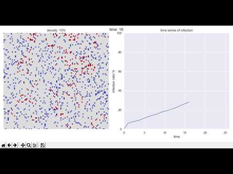
The figure on the left shows the state of the group one year (365 days) after the start, blue is healthy people </ font>, red is If you're an infected person and it's bright red overall, it's like a pandemic </ font>.
The figure on the right shows the time-series transition of the infection rate. The horizontal axis is time and the vertical axis is infection rate. The point is this ↓.

Population density = 10% case (big city)
This is a case where there are 10 people in 100 cells. As you can see from the figure, it is an image of a big city.
 After a year, the group was in a bright red pandemic.
Due to the logic of natural healing, the infection rate does not reach 100% and is saturated at about 90%, but this is not expected to converge.
After a year, the group was in a bright red pandemic.
Due to the logic of natural healing, the infection rate does not reach 100% and is saturated at about 90%, but this is not expected to converge.
Case of population density = 4% (60% reduction in contact)
Don't you think you're refraining from doing so? **No way! ** **
This kind of thing isn't enough.
 The infection rate has dropped to nearly 50% after one year, but it is still far from converging.
In this world, the Olympics cannot be held even if it is postponed by one year.
The infection rate has dropped to nearly 50% after one year, but it is still far from converging.
In this world, the Olympics cannot be held even if it is postponed by one year.
Case of population density = 3% (70% reduction in contact)
Is it necessary to have 70% instead of 80%?
** Yes, 70% is not good. ** **
 Sure, the infection rate is fairly low, but it has been increasing, albeit slowly, for nearly a year (slightly peaking out towards the end).
Although the speed of infection has been suppressed, it seems that one year is not enough to reach natural convergence.
Sure, the infection rate is fairly low, but it has been increasing, albeit slowly, for nearly a year (slightly peaking out towards the end).
Although the speed of infection has been suppressed, it seems that one year is not enough to reach natural convergence.
Case of population density = 2% (80% reduction in contact)
** The number of new infections and the number of healers are almost balanced. ** **
 Although the new infection rate and the cure rate were decided appropriately, the result was quite beautiful.
I'm a complete amateur, but is the number of 80% reduction in contact a kind of rule of thumb in infectious diseases?
Although the new infection rate and the cure rate were decided appropriately, the result was quite beautiful.
I'm a complete amateur, but is the number of 80% reduction in contact a kind of rule of thumb in infectious diseases?
Case of population density = 1% (90% reduction in contact)
** The number of infected people became 0 in just over 200 days. ** **
 I hope the real world will be like this soon ~
python code
This is a specification that draws an animation that changes in real time. When the cell value is 0, there is nobody, -1 indicates a healthy person, and +1 indicates an infected person.
import numpy as np
from numpy import random
import seaborn as sns
import matplotlib.pyplot as plt
sns.set()

# parameter
density = 0.03
prob_infect = 0.20
prob_heal = 0.02
infected_initial = 0.05

# initialize earth
earth = np.where((random.random(10000) > (1 - density)), -1, 0).reshape(100, 100)
for i in range(int(10000 * density * infected_initial)):
    earth[random.randint(0, 100), random.randint(0, 100)] = 1

time = 0
infection_ratio = np.zeros(10 ** 6) * np.nan
infection_ratio[time] = 0
plt.close()
fig, ax = plt.subplots(figsize=(12, 6), nrows=1, ncols=2)

no_end = True
while no_end:
    for (x, y) in [(x, y) for x in range(100) for y in range(100)]:
        if earth[x, y] != 0:
            # infection
            (x_min, x_max) = (max(x - 1, 0), min(x + 1, 98) + 1)
            (y_min, y_max) = (max(y - 1, 0), min(y + 1, 98) + 1)
            if np.any(earth[x_min: x_max, y_min: y_max] == 1):
                earth[x, y] = 1 if random.rand() < prob_infect else earth[x, y]
            # healing
            earth[x, y] = -1 if random.rand() < prob_heal else earth[x, y]
            # random walk around
            x_next = min(max(x + random.randint(-1, 2), 0), 99)
            y_next = min(max(y + random.randint(-1, 2), 0), 99)
            if ((x_next, y_next) != (x, y)) & (earth[x_next, y_next] == 0):
                earth[x_next, y_next] = earth[x, y]
                earth[x, y] = 0
    time += 1
    infection_ratio[time] = np.sum(np.where(earth == 1, 1, 0)) / (10000 * density) * 100
    try:
        subplot0.cla()
        subplot1.cla()
    except:
        print('no need to refresh figure')
    plt.suptitle('time: {}'.format(time))
    subplot0 = sns.heatmap(earth, vmin=-1, vmax=1, center=0, cmap='coolwarm', ax=ax[0], cbar=False)
    ax[0].axis('off')
    ax[0].set_title('density: {}%'.format(int(density * 100)))
    subplot1 = sns.lineplot(data=infection_ratio)
    ax[1].set_title('time series of infection')
    ax[1].set_xlabel('time')
    ax[1].set_ylabel('infection ratio %')
    ax[1].set_ylim([0, 100])
    ax[1].set_xlim([0, time + 10])
    plt.tight_layout()
    plt.draw()
    plt.pause(0.01)
Recommended Posts