Displaying candlestick charts in Python (matplotlib edition)
There are many packages for drawing graphs in Python, but none are specialized for candlestick charts.
This time, I tried matplotlib and Plotly as packages that can create candlestick charts relatively easily from 4-value data.
Preparation
The Python code in this article is intended to be run on a Jupyter notebook. Charts are also displayed inline in Jupyter notebook.
First, we will create fictitious market data for two months from June 2016. Random walk in Python With reference to
%matplotlib inline
import numpy as np
import pandas as pd

idx = pd.date_range('2016/06/01', '2016/07/31 23:59', freq='T')
dn = np.random.randint(2, size=len(idx))*2-1
rnd_walk = np.cumprod(np.exp(dn*0.0002))*100
As a result, create a random walk at 1-minute intervals, and then use pandas'resample, ʻohlc to create 4-value data.
df = pd.Series(rnd_walk, index=idx).resample('B').ohlc()
df.plot()
Here, the argument 'B' of resample indicates that sampling is performed only on business days. In other words, like the actual market price, the data is only on weekdays. When displayed as a line chart, it will be as follows.

Candlestick chart using matplotlib
matplotlib has Finance Tools, which has a function to display candlestick charts.
candlestick2_ochl(ax, opens, closes, highs, lows, width=4, colorup='k', colordown='r', alpha=0.75)
candlestick2_ohlc(ax, opens, highs, lows, closes, width=4, colorup='k', colordown='r', alpha=0.75)
candlestick_ochl(ax, quotes, width=0.2, colorup='k', colordown='r', alpha=1.0)
candlestick_ohlc(ax, quotes, width=0.2, colorup='k', colordown='r', alpha=1.0)
And 4 types of functions are prepared. These differ in whether the four-value data is input individually or collectively, and whether the order of the four values is OHLC or OCHL.
Since the 4-value data created earlier is the DataFrame class of OHLC, candlestick_ohlc is used here.
The argument quotes of candlestick_ohlc must have x-axis data, Open data, High data, Low data, and Close data in the form of a two-dimensional array. However, df.index cannot be used as it is as x-axis data. Therefore, df.index is set to datetime, and the real value is added to OHLC.
import matplotlib.pyplot as plt
import matplotlib.finance as mpf
from matplotlib.dates import date2num

fig = plt.figure()
ax = plt.subplot()

xdate = [x.date() for x in df.index] #Timestamp -> datetime
ohlc = np.vstack((date2num(xdate), df.values.T)).T #datetime -> float
mpf.candlestick_ohlc(ax, ohlc, width=0.7, colorup='g', colordown='r')

ax.grid() #Grid display
ax.set_xlim(df.index[0].date(), df.index[-1].date()) #x-axis range
fig.autofmt_xdate() #x-axis autoformat
When I run this code, I see a candlestick chart that looks like this:

Candlestick chart for business days only
For the time being, the chart above is a candlestick chart, but what is a little worrisome is that there is a space corresponding to Saturday and Sunday. Normally, in the market chart, only business days are connected and there is no Saturday and Sunday part.
Therefore, we will work on the x-axis data. Don't just use df.index as x-axis data, just make it an integer index. Then, set the x-axis scale to be displayed to the corresponding date and time data. Since the week starts on Monday in the market, the scale is displayed every 5 days from Monday.
fig = plt.figure()
ax = plt.subplot()

ohlc = np.vstack((range(len(df)), df.values.T)).T #x-axis data to integer
mpf.candlestick_ohlc(ax, ohlc, width=0.7, colorup='g', colordown='r')

xtick0 = (5-df.index[0].weekday())%5 #First monday index
plt.xticks(range(xtick0,len(df),5), [x.strftime('%Y-%m-%d') for x in df.index][xtick0::5])
ax.grid() #Grid display
ax.set_xlim(-1, len(df)) #x-axis range
fig.autofmt_xdate() #x-axis autoformat
When you do this, you should see a chart like this:
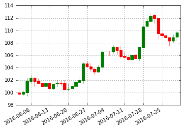
Now the chart is continuous only on business days. However, this method is for daily charts, and for intraday charts you will need to adjust the x-axis scale.
Plotly edition is ↓ Display candlestick chart in Python (Plotly edition)
Recommended Posts