Drawing candle charts in python
Candlestick with matplotlib.finance
Data creation
Create a fictitious currency chart with a random walk.
import numpy as np
import pandas as pd


def randomwalk(periods=None, start=None, end=None, freq='B', tz=None,
               normalize=False, name=None, closed=None, tick=1, **kwargs):
    """Returns random up/down pandas Series.

    Usage:
        ```
        import datetime
        randomwalk(100)  # Returns +-1up/down 100days from now.
        randomwalk(100, freq='H')  # Returns +-1up/down 100hours from now.
        randomwalk(100, ,tick=0.1 freq='S')  # Returns +-0.1up/down 100seconds from now.
        randomwalk(100, start=datetime.datetime.today())  # Returns +-1up/down 100days from now.
        randomwalk(100, end=datetime.datetime.today())
            # Returns +-1up/down back to 100 days from now.
        randomwalk(start=datetime.datetime(2000,1,1), end=datetime.datetime.today())
            # Returns +-1up/down from 2000-1-1 to now.
        randomwalk(100, freq='H').resample('D').ohlc()  # random OHLC data
        ```

    Args:
        periods: int
        start: start time (default datetime.now())
        end: end time
        freq: ('M','W','D','B','H','T','S') (default 'B')
        tz: time zone
        tick: up/down unit size (default 1)

    Returns:
        pandas Series with datetime index
    """
    if not start and not end:
        start = pd.datetime.today().date()  # default arg of `start`
    index = pd.DatetimeIndex(start=start, end=end, periods=periods, freq=freq, tz=tz,
                             normalize=normalize, name=name, closed=closed, **kwargs)
    bullbear = pd.Series(tick * np.random.randint(-1, 2, len(index)),
                         index=index, name=name, **kwargs)  # tick * (-1,0,Any of 1)
    price = bullbear.cumsum()  #Cumulative sum
    return price
np.random.seed(1)  #Random state reset. The same random walk is always created
rw = randomwalk(60*24*90, freq='T', tick=0.01)
rw.head(5)
2017-03-19 00:00:00    0.00
2017-03-19 00:01:00   -0.01
2017-03-19 00:02:00   -0.02
2017-03-19 00:03:00   -0.02
2017-03-19 00:04:00   -0.02
Freq: T, dtype: float64
rw.plot()

Generates 1 minute bar with a minimum tick of 0.01 yen for 30 days
df = rw.resample('B').ohlc() + 115  #The initial value is 115 yen
df.head()
| open | high | low | close | |
|---|---|---|---|---|
| 2017-03-17 | 115.00 | 115.38 | 114.76 | 115.36 |
| 2017-03-20 | 115.37 | 115.49 | 115.03 | 115.15 |
| 2017-03-21 | 115.14 | 115.69 | 115.07 | 115.65 |
| 2017-03-22 | 115.66 | 116.22 | 115.64 | 116.21 |
| 2017-03-23 | 116.20 | 116.47 | 115.93 | 116.11 |
Using the resample method, I changed it to a daily bar (option how ='B') only on weekdays, and summarized it into 4 values (ohcl) of open, high, low, and close.
df.plot()
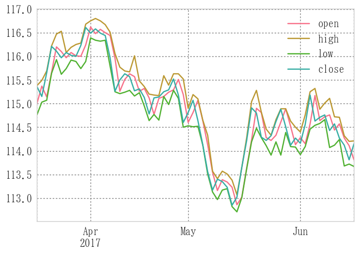
The 4-value graph is difficult to see as shown above, so I will fix it to a candlestick.
Reference 1
Reference: stack overflow --how to plot ohlc candlestick with datetime in matplotlib?
import numpy as np
import matplotlib.pyplot as plt
import matplotlib.finance as mpf
from matplotlib import ticker
import matplotlib.dates as mdates
import pandas as pd

def candlechart(ohlc, width=0.8):
    """Returns a candlestick chart for the input data frame
argument:
            * ohlc:
                *Data frame
                *In column name'open'", 'close', 'low', 'high'To put
                *In no particular order"
            * widrh:Candle line width
Return value: ax: subplot"""
    fig, ax = plt.subplots()
    #Candlestick
    mpf.candlestick2_ohlc(ax, opens=ohlc.open.values, closes=ohlc.close.values,
                          lows=ohlc.low.values, highs=ohlc.high.values,
                          width=width, colorup='r', colordown='b')

    #x-axis to time
    xdate = ohlc.index
    ax.xaxis.set_major_locator(ticker.MaxNLocator(6))

    def mydate(x, pos):
        try:
            return xdate[int(x)]
        except IndexError:
            return ''

    ax.xaxis.set_major_formatter(ticker.FuncFormatter(mydate))
    ax.format_xdata = mdates.DateFormatter('%Y-%m-%d')

    fig.autofmt_xdate()
    fig.tight_layout()

    return fig, ax

candlechart(df)
(<matplotlib.figure.Figure at 0x207a86dd080>,
 <matplotlib.axes._subplots.AxesSubplot at 0x207a6a225c0>)

Reference 2
Reference: Qiita --Display candlestick chart in Python (matplotlib edition)
import numpy as np
import matplotlib.pyplot as plt
import matplotlib.finance as mpf
from matplotlib import ticker
import matplotlib.dates as mdates
import pandas as pd

fig = plt.figure()
ax = plt.subplot()

ohlc = np.vstack((range(len(df)), df.values.T)).T #x-axis data to integer
mpf.candlestick_ohlc(ax, ohlc, width=0.8, colorup='r', colordown='b')

xtick0 = (5-df.index[0].weekday())%5 #First monday index

plt.xticks(range(xtick0,len(df),5), [x.strftime('%Y-%m-%d') for x in df.index][xtick0::5])
ax.grid(True) #Grid display
ax.set_xlim(-1, len(df)) #x-axis range
fig.autofmt_xdate() #x-axis autoformat

Addition of SMA (Simple Moving Average)
import matplotlib.pyplot as plt
import matplotlib.finance as mpf
from randomwalk import *

fig = plt.figure()
ax = plt.subplot()

# candle
ohlc = np.vstack((range(len(df)), df.values.T)).T  #x-axis data to integer
mpf.candlestick_ohlc(ax, ohlc, width=0.8, colorup='r', colordown='b')

# sma
sma = df.close.rolling(5).mean()
vstack = np.vstack((range(len(sma)), sma.values.T)).T  #x-axis data to integer
ax.plot(vstack[:, 0], vstack[:, 1])

# xticks
xtick0 = (5 - df.index[0].weekday()) % 5  #First monday index
plt.xticks(range(xtick0, len(df), 5), [x.strftime('%Y-%m-%d') for x in df.index][xtick0::5])
ax.grid(True)  #Grid display
ax.set_xlim(-1, len(df))  #x-axis range
fig.autofmt_xdate()  #x-axis autoformat
plt.show()

import matplotlib.pyplot as plt
import matplotlib.finance as mpf

def sma(ohlc, period):
    sma = ohlc.close.rolling(period).mean()
    vstack = np.vstack((range(len(sma)), sma.values.T)).T  #x-axis data to integer
    return vstack

fig = plt.figure()
ax = plt.subplot()

# candle
ohlc = np.vstack((range(len(df)), df.values.T)).T  #x-axis data to integer
mpf.candlestick_ohlc(ax, ohlc, width=0.8, colorup='r', colordown='b')

# sma
sma5 = sma(df, 5)
sma25 = sma(df, 25)
ax.plot(sma5[:, 0], sma5[:, 1])
ax.plot(sma25[:, 0], sma25[:, 1])


# xticks
xtick0 = (5 - df.index[0].weekday()) % 5  #First monday index
plt.xticks(range(xtick0, len(df), 5), [x.strftime('%Y-%m-%d') for x in df.index][xtick0::5])
ax.grid(True)  #Grid display
ax.set_xlim(-1, len(df))  #x-axis range
fig.autofmt_xdate()  #x-axis autoformat
plt.show()

Candlestick with plotly
Plotly practice
Reference: Qiita-[Python] Make a graph that can be moved around with Plotly
I'm using plotly for the first time, so how to do it
conda install plotly
Install with and import as follows.
There is a lot of information that you need to create an account, but it seems that deregulation has been relaxed and now you can do whatever you want for free to some extent.
import plotly as py
py.offline.init_notebook_mode(connected=False)
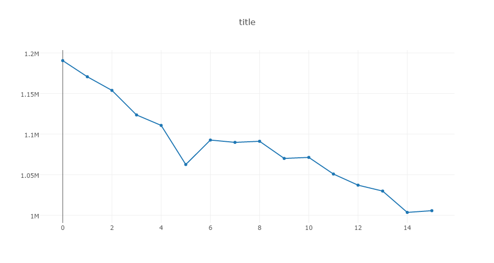
Create appropriate sample data.
fo = [[2000,1190547,1.36],
    [2001,1170662,1.33],
    [2002,1153855,1.32],
    [2003,1123610,1.29],
    [2004,1110721,1.29],
    [2005,1062530,1.26],
    [2006,1092674,1.32],
    [2007,1089818,1.34],
    [2008,1091156,1.37],
    [2009,1070035,1.37],
    [2010,1071304,1.39],
    [2011,1050806,1.39],
    [2012,1037101,1.41],
    [2013,1029816,1.43],
    [2014,1003532,1.42],
    [2015,1005656,1.46]]
raw = pd.DataFrame(fo, columns=['year', 'births', 'birth rate'])
raw
| year | births | birth rate | |
|---|---|---|---|
| 0 | 2000 | 1190547 | 1.36 |
| 1 | 2001 | 1170662 | 1.33 |
| 2 | 2002 | 1153855 | 1.32 |
| 3 | 2003 | 1123610 | 1.29 |
| 4 | 2004 | 1110721 | 1.29 |
| 5 | 2005 | 1062530 | 1.26 |
| 6 | 2006 | 1092674 | 1.32 |
| 7 | 2007 | 1089818 | 1.34 |
| 8 | 2008 | 1091156 | 1.37 |
| 9 | 2009 | 1070035 | 1.37 |
| 10 | 2010 | 1071304 | 1.39 |
| 11 | 2011 | 1050806 | 1.39 |
| 12 | 2012 | 1037101 | 1.41 |
| 13 | 2013 | 1029816 | 1.43 |
| 14 | 2014 | 1003532 | 1.42 |
| 15 | 2015 | 1005656 | 1.46 |
data = [
    py.graph_objs.Scatter(y=raw["births"], name="births"),
]
layout = py.graph_objs.Layout(
    title="title",
    legend={"x":0.8, "y":0.1},
    xaxis={"title":""},
    yaxis={"title":""},
)
fig = py.graph_objs.Figure(data=data, layout=layout)
py.offline.iplot(fig, show_link=False)
data = [
    py.graph_objs.Bar(x=raw["year"], y=raw["births"], name="Births"),
    py.graph_objs.Scatter(x=raw["year"], y=raw["birth rate"], name="Birth Rate", yaxis="y2")
]
layout = py.graph_objs.Layout(
    title="Births and Birth Rate in Japan",
    legend={"x":0.8, "y":0.1},
    xaxis={"title":"Year"},
    yaxis={"title":"Births"},
    yaxis2={"title":"Birth Rate", "overlaying":"y", "side":"right"},
)
fig = py.graph_objs.Figure(data=data, layout=layout)
py.offline.iplot(fig)
#py.offline.plot(fig)

Method of operation
- Display numerical value by mouse over
- Drag to enlarge
- Double click to return to the original view
Forex chart
Reference: Display candlestick chart in Python (Plotly edition)
from plotly.offline import init_notebook_mode, iplot
from plotly.tools import FigureFactory as FF
init_notebook_mode(connected=True) #Settings for Jupyter notebook
Normal plot
Since the candle chart function is prepared, you can easily create a candlestick graph if you have open, high, low, and close data.
However, it cannot be displayed only on weekdays. Saturdays and Sundays are also displayed.
fig = FF.create_candlestick(df.open, df.high, df.low, df.close, dates=df.index)
py.offline.iplot(fig)

Weekday only plot
The reference destination changed the index to weekday only.
fig = FF.create_candlestick(df.open, df.high, df.low, df.close)

xtick0 = (5-df.index[0].weekday())%5 #First monday index
fig['layout'].update({
    'xaxis':{
        'showgrid': True,↔
        'ticktext': [x.strftime('%Y-%m-%d') for x in df.index][xtick0::5],
        'tickvals': np.arange(xtick0,len(df),5)
    }
})

py.offline.iplot(fig)

Addition of indicators
def sma(data, window, columns='close'):
    return data[columns].rolling(window).mean()

sma5 = sma(df, 5)
fig = FF.create_candlestick(df.open, df.high, df.low, df.close, dates=df.index)

add_line = Scatter( x=df.index,  y=df.close,  name= 'close values',
                   line=Line(color='black'))
fig['data'].extend([add_line])
↔
py.offline.iplot(fig, filename='candlestick_and_trace', validate=False)

from plotly.graph_objs import *
fig = FF.create_candlestick(df.open, df.high, df.low, df.close, dates=df.index)
add_line = [Scatter(x=df.index, y=df.close.rolling(5).mean(), name='SMA5', line=Line(color='r')),
            Scatter(x=df.index, y=df.close.rolling(15).mean(), name='SMA15', line=Line(color='b')),
            Scatter(x=df.index, y=df.close.rolling(25).mean(), name='SMA25', line=Line(color='g'))]
↔
fig['data'].extend(add_line)
fig['layout'].update({'xaxis':{'showgrid': True}})

py.offline.iplot(fig, filename='candlestick_and_trace', validate=False)

SMA, EMA comparison
Creating a new chart
np.random.seed(10)
ra = randomwalk(60*24*360, freq='T', tick=0.01) + 115
df1 = ra.resample('B').ohlc()
import plotly.graph_objs as go
fig = FF.create_candlestick(df1.open, df1.high, df1.low, df1.close, dates=df1.index)
add_line = [go.Scatter(x=df1.index, y=df1.close.rolling(75).mean(), name='SMA75', line=Line(color='r')),
            go.Scatter(x=df1.index, y=df1.close.ewm(75).mean(), name='EMA75', line=Line(color='b'))]

fig['data'].extend(add_line)
fig['layout'].update({'xaxis':{'showgrid': True}})

py.offline.iplot(fig, filename='candlestick_and_trace', validate=False)

For some reason, the moving average is rattling, so let's expand it.
import plotly.graph_objs as pyg
from datetime import datetime

def to_unix_time(*dt):
    """Convert datetime to unix seconds
argument:List with datetime
Return value:List fixed to unix seconds"""
    epoch =  datetime.utcfromtimestamp(0)
    ep = [(i - epoch).total_seconds() * 1000 for i in list(*dt)]
    return ep

fig = FF.create_candlestick(df1.open, df1.high, df1.low, df1.close, dates=df1.index)
add_line = [pyg.Scatter(x=df1.index, y=df1.close.rolling(75).mean(), name='SMA75', line=Line(color='r')),
            pyg.Scatter(x=df1.index, y=df1.close.ewm(75).mean(), name='EMA75', line=Line(color='b')),
            pyg.Scatter(x=df1.index, y=df1.close.rolling(75).mean(), name='SMA75', mode='markers'),
            pyg.Scatter(x=df1.index, y=df1.close.ewm(75).mean(), name='EMA75', mode='markers')]

fig['data'].extend(add_line)  #Add data to plot
fig['layout'].update(xaxis = {'showgrid': True,
                               'type': 'date',
                               'range':to_unix_time([datetime(2017,9,1), datetime(2018,1,1)])})  #Layout change

py.offline.iplot(fig, filename='candlestick_and_trace', validate=False)

Holidays are drawn on the horizontal axis, but the holiday value in the moving average data is NaN. Therefore, a straight line connecting Friday and Monday is created, and the line that should have been smoothed looks rattling.
By the way, SAM and EMA are no longer plotted when xaxis is forced only on weekdays with layout as the reference person did. This is probably because xaxis is forced to be string and float in order to eliminate holidays, so it does not match the index of SMA and EMA. If the index of SMA and EMA is also a mixed index of string and float, it will not be possible to set it to xaxis only on weekdays, but since it is assumed that the timeframe will be changed to any length in the future, the datetime type is forced I don't want to break it.
Therefore, it is a little difficult to see due to holidays, but we will accept plotly's API as it is. Please comment if anyone knows any good way to make xaxis only on weekdays. I still don't know much about plotly.
Next Candle chart plot with plotly
Recommended Posts