Created a new corona app in Kyoto with Python's web framework Dash
I created a new corona app in Kyoto using the Python web framework Dash. Dash is a framework built using Flask, React, and Plotly to quickly create dashboard-like applications. You can also use callbacks to make your application work interactively. For people like me who like to knead data but don't really understand React or Vue, it's a framework that makes it easy to create dashboards.
The created application can be found at the following URL.
https://chomoku.herokuapp.com/kyoto-covid
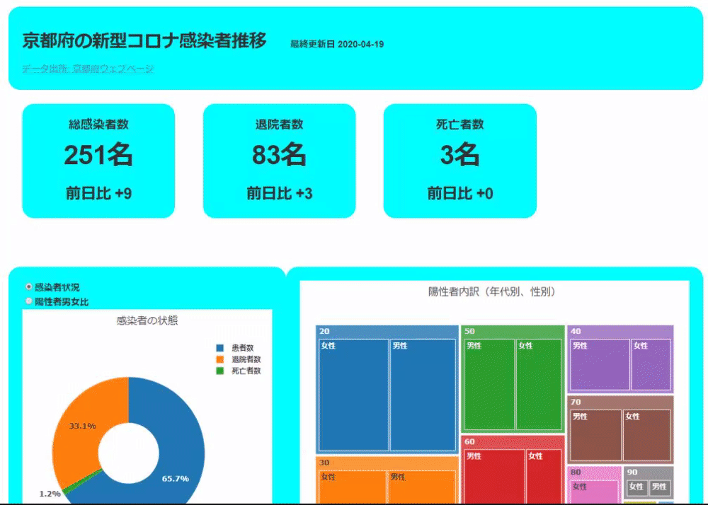
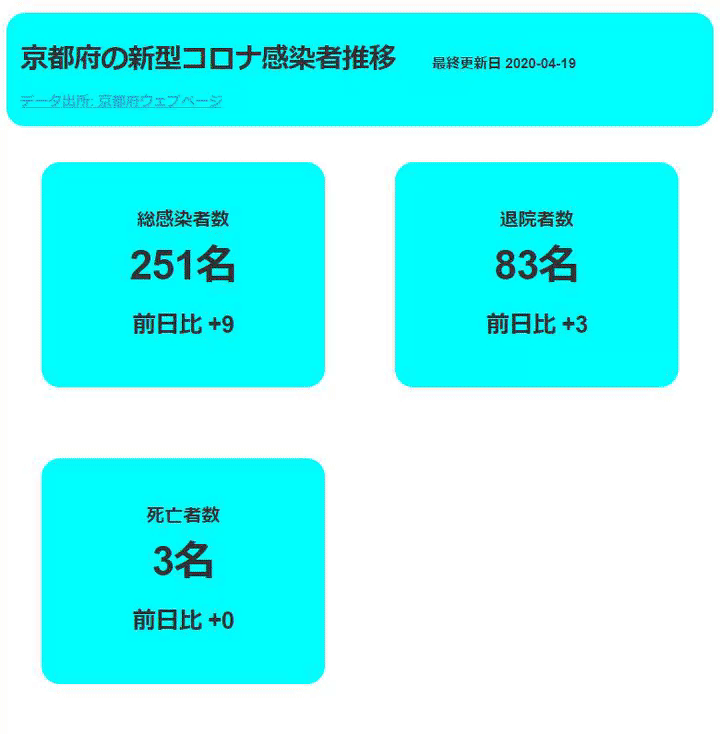
For PC
For smartphones
See github for the code.
The development environment is as follows.
Windows10 Pro Python3.7.5 dash 1.9.1 pandas 1.0.0
App features
The app reads and operates the data acquired from the Kyoto prefecture site (the acquisition method etc. will be described later) as a CSV file. CSV files are read and processed using pandas. The app has three functions.
First, the part that displays the entire numerical value.

The data displayed here is made to aggregate and display the CSV file read earlier.
Next is the data display part by graph and table.

The first pie graph can be displayed by switching the current status of the infected person and the gender ratio with a radio button. The second tree graph shows the age and gender ratio of infected individuals. The third bar graph shows changes in the number of newly infected people and the cumulative number of infected people. The fourth table shows the status of infected people by age and the status of infected people by region.
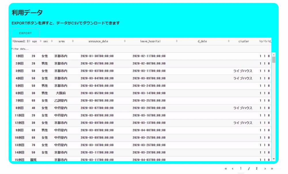
Finally, it is the display of the entire table data.

The table is created using a library called dash_table. With this, you can easily create a function that filters the table as shown below. You can also download the filtered data as CSV by pressing the EXPORT button. Of course, you can also download the unfiltered data as it is!

The nice thing about this library is that you can write such features in short code. The code below is the code for the table used here. This table can be sorted in addition to filtering, and other styling is done, but it can be created with this number of rows.
table = dash_table.DataTable(
                #Table creation part
                            columns=[{"id": i, "name": i} for i in kyoto_data.columns],
                            data=kyoto_data.to_dict("records"),
                #Style creation part
                            style_cell={"textAlign": "center"},
                            style_as_list_view=True,
                            style_data_conditional=[
                                {
                                    "if": {"row_index": "odd"},
                                    "backgroundColor": "rgb(248, 248, 248)",
                                }
                            ],
               #Filtering function
                            filter_action="native",
               #Sort function
                            sort_action="native",
                            sort_mode="multi",
                            fixed_rows={"headers": True},
               #File download function
                            export_format="csv",
                            virtualization=True,
                        ),
Data acquisition and preprocessing
The data is obtained from the table of Kyoto Prefecture Site. For table data, use pandas's read_html function. The actual way to take it is as below, but in reality, the number of tables on the site changes and it may be necessary to change the last numerical part.
df = pd.read_html("https://www.pref.kyoto.jp/kentai/news/novelcoronavirus.html#F")[1]
Also, the number of data in the table has increased, and currently the 1-50th and 51st-100th data are on different sites. So we read the tables for those pages separately and finally the pandas [concat function](https://pandas.pydata.org/pandas-docs/stable/reference/api/pandas.concat.html?highlight= Use concat) to squeeze the data frame.
df = pd.read_html("https://www.pref.kyoto.jp/kentai/news/novelcoronavirus.html#F")[1]
df1 = pd.read_html("https://www.pref.kyoto.jp/kentai/corona/hassei51-100.html")[0]
df2 = pd.read_html("http://www.pref.kyoto.jp/kentai/corona/hassei1-50.html")[0]
dff = pd.concat([df,df1,df2])
After reading the data, processing such as setting Reiwa to the Christian era and assigning the date of discharge to that column is performed. The data actually used for the application can be downloaded as a CSV file by pressing the "EXPORT" button on the upper left of the table at the bottom of the application.
That's all for data acquisition. The data may not be updated on Saturdays and Sundays, or may differ from the announcement, but I don't care about the details. Also, I am currently using a CSV file, but if the operation becomes stable, I am thinking of making it an API or changing it to one made externally.
Creating an application
The application is created by combining the components of Dash. Use dash_html_components, dash_core_components, and dash_table that are installed at the same time when dash is pip installed, which is used in this application.
dash_html_components for html elements, dash_core_components for tools and graphs , Dash_table is a component that creates a data table.
Dash components can be used declaratively. For example, the code for the title part at the top is as follows.

html.Div(
            [
                html.H3(
                    "Transition of new corona infections in Kyoto Prefecture",
                    style={"display": "inline-block", "marginRight": 40},
                ),
                html.P(
                    f"last updated{update_date.date()}", style={"display": "inline-block"}, className="update_date",
                ),
                html.A("Data source:Kyoto Prefecture Web Page", href="https://www.pref.kyoto.jp/kentai/news/novelcoronavirus.html#F", style={"display": "block"}),
            ],
            style={"backgroundColor": "aqua", "borderRadius": 20, "padding": "2%"},
        ),
The first pie chart allows you to switch between the current status of the infected person and the gender of the infected person with a radio button.

The part that moves the application interactively like this uses the callback function of Dash. Here's the code that allows you to create a Dash application that can switch and display this pie chart with a radio button. The data uses a sample from plotly.express to code the application to switch between a pie chart and a scatter plot so that it can be run as a stand-alone application on a test basis (it works with copy and paste).
import plotly.express as px
import dash
import dash_html_components as html
import dash_core_components as dcc
from dash.dependencies import Input, Output
#Read gapminder data
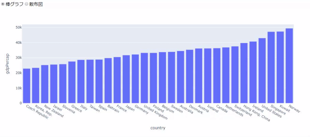
gapminder = px.data.gapminder()
gapminder2007 = gapminder[gapminder.year==2007].sort_values("gdpPercap")[-30:]
#Creating two types of graphs
gapminder_bar = px.bar(
gapminder2007,
x="country",
y="gdpPercap"
)
gapminder_scatter = px.scatter(
gapminder,
x="gdpPercap",
y="lifeExp",
size="pop",
size_max=70,
animation_frame="year",
log_x=True,
range_y=[20, 90],
color="continent"
)
#➌ Create a Dash instance
app = dash.Dash(__name__)
#➍ Creating a layout
app.layout = html.Div([
dcc.RadioItems(
id="gap_radio",
options=[{"label": i, "value": i} for i in ["pie chart", "Scatter plot"]],
value="pie chart"
),
dcc.Graph(id="gap_graph")
])
#➎ Creating a callback
@app.callback(Output("gap_graph", "figure"), [Input("gap_radio", "value")])
def update_graph(selected_value):
if selected_value == "pie chart":
return gapminder_pie
return gapminder_scatter
if __name__ == "__main__":
app.run_server(debug=True)
The code above first loads the gapminder data from plotly.express (➊). Next, use plotly.express to create the two types of graphs used for switching (➋). plotly.express is an excellent way to intuitively draw a graph by simply passing the column name declaratively using a data frame. The first graph is a bar graph of GDP per capita in 2007, and the second graph is a scatter plot of all the data.
Next, create an instance of Dash (➌). Next, create a layout (➍). Layouts are created by combining components. Here, we will create a layout that switches between two types of graphs with the radio button. Finally, there is a callback (➎). The callback returns the graph according to the value selected by the radio button.
When you run the code, a bar graph will be drawn first as shown below.

Then select a scatter plot to draw a scatter plot with a play button and slider. When you press the play button, the year is automatically updated and the data displayed in the scatter plot is switched. This is done because we are passing "year" to the animation_frame argument of the scatter function.
Like this, I am creating a switch for each graph in the application.
Mobile compatible
Mobile support was created by reading MDN Responsive Design. When I read this, I found that it is possible to support mobile by using meta tags and setting CSS according to the screen size using media queries.
To pass meta tags in Dash, use the Dash class argument meta_tags. Actually, it is passed as below.
app = dash.Dash(__name__, meta_tags=[
        {"name": "viewport", "content": "width=device-width, initial-scale=1.0"}
    ]
Then CSS is in the assets directory. If you put CSS or JavaScript in the assets directory, Dash will load it without permission.
Summary
With the above feeling, I created a new corona app for Kyoto. For those who want to know more about Dash, the Dash article I wrote a long time ago may fit.
https://qiita.com/OgawaHideyuki/items/6df65fbbc688f52eb82c
But I think the official documentation is the best.
https://dash.plotly.com/
Also, I'm doing hands-on at the Hannari Python meeting continuously, so if you have any questions, I think other stuff will answer.
https://hannari-python.connpass.com/event/173990/
Recommended Posts