[PYTHON] I tried cluster analysis of the weather map
Introduction
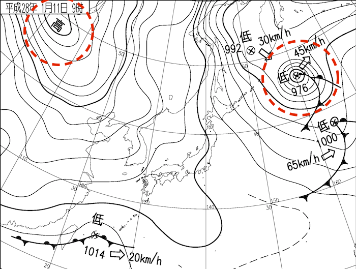
Have you ever heard the words west high east low and winter type pressure distribution? There are several patterns of pressure distribution near Japan, and the winter-type pressure distribution called West High East Low is probably the most famous (see the figure below). There are several other types, such as the summer-type pressure distribution covered by the Pacific High. In this article, I'll try to classify this pattern by unsupervised learning.
 (From weather news)
I did the following three things this time.
--Scraping satellite images --Elbow method --Cluster analysis (unsupervised learning)
Acquisition of satellite imagery
The satellite image was acquired from the website of Ebayama Museum of Meteorology. Because it was heavy to download row data, and it was this site that seemed to be good for scraping with nicely processed data. Originally, it seems appropriate to purchase from HP of Meteorological Business Support Center, so this area is self-judgment. Thank you. The source code is not shown here, but it is listed on github.
The image I used is an image near Japan at 12:00 (JST), which is as follows (854 x 480px). 
Preprocessing
import numpy as np
import pandas as pd
import matplotlib.pyplot as plt
import seaborn as sns
from PIL import Image
import glob
from tqdm import tqdm
from os import makedirs

from sklearn.cluster import KMeans
from sklearn.metrics import silhouette_score, silhouette_samples

x=np.empty((0,240*427))

paths=glob.glob("pictures/*.jpg ")
for path in tqdm(paths):
    img=Image.open(path)
    img = img.convert('L')
    img=img.resize((int(img.width/2), int(img.height/2)))
    x=np.append(x,np.array(img).reshape(1,-1),axis=0)
Load the image, reshape it into one line, and then populate it into a numpy array. It took a long time if the image quality was good, so I made it grayscale and halved it.
Elbow method
distortions = [] #Elbow method (find the optimum number of clusters)
for k in tqdm(range(1, 20)):
    kmeans = KMeans(n_clusters=k, n_init=10, max_iter=100)
    kmeans.fit(x)
    distortions.append(kmeans.inertia_)
fig = plt.figure(figsize=(12, 8))
plt.xticks(range(1, 20))
plt.plot(range(1, 20), distortions)
plt.savefig("elbow.jpg ")
plt.close()
The optimum number of clusters was calculated by the elbow method. It took about 10 minutes to do it at 20, so I think about 10 is enough. The result is shown in the figure below.
 I didn't know exactly how many would be good, but this time I decided to do it with 4.
Cluster analysis
k_means = KMeans(n_clusters=4).fit(x)
y_pred = k_means.predict(x)
print(k_means.labels_)
print(pd.Series(k_means.labels_, name='cluster_number').value_counts(sort=False))

out=pd.DataFrame()
out["picture"]=paths
out["classnumber"]=y_pred
out["date"]=pd.to_datetime(out["picture"].str.split("\\",expand=True).iloc[:,1].str.split(".",expand=True).iloc[:,0])
out.to_csv("out.csv")
The number of elements per cluster was 139,61,68,98. It looks good, so I can expect it.
#Save by class
for i in range(4):
    makedirs(str(i)+"_pictures", exist_ok=True)
for i in out.itertuples():
    img=Image.open(i.picture)
    img.save(str(i.classnumber)+"_"+i.picture)

for i in range(4):
    out["month"]=out["date"].dt.month
    sns.countplot("month",data=out[out["classnumber"]==i])
    plt.title(i)
    plt.savefig("Monthly distribution"+str(i))
    plt.close()
Let's save each class separately and see the monthly distribution and concrete images of each class.
Cluster No.0
 It feels like there are many in winter and few in summer. Is it a winter-type pressure distribution? It seems strange that this can be seen even in the summer, even though the number is small.
The images that belong to this cluster are as follows, for example.
| 2020/1/13 | 2020/1/19 |
|---|---|
 |
 |
This was a weather map with a typical west high east low pressure distribution and a cold wind blowing from the northwest, causing clouds over the Japanese archipelago.
In addition, the figures belonging to this cluster that are not in winter are as shown in the figure below.
| 2020/6/26 | 2019/10/26 |
|---|---|
 |
 |
The atmosphere is that there are clouds over the continent and over Japan, and there are no clouds over the Pacific Ocean. Although the cloud types are different, I feel that the atmosphere of the cloud place is certainly similar.
Cluster No.1
 It is increasing in April and November. I couldn't figure out what they had in common with this graph alone.
The images that belong to this cluster are as follows, for example.
| 2019/11/2 | 2020/4/29 |
|---|---|
 |
 |
It did not appear to have a clear pressure distribution feature. As a feature of the image, the area around Japan was sunny, and there were many images with diagonal clouds in the southeastern direction of Japan. Some of these clouds were formed around the edge of the Pacific High depending on the season, but I feel that similar clouds are formed by chance. If anything, this cluster had a strong impression like the remainder of other clusters.
Cluster No.2
 This is often the case during the rainy season. Is it the pressure distribution when there is a rainy season front? In addition, it seems that no one was seen in February, August, and September.
| 2020/6/28 | 2020/7/4 |
|---|---|
 |
 |
As expected, many of these clusters showed the Baiu front. The rainy season does not appear in the four categories of spring, summer, autumn and winter, but I think it has been shown that its meteorological characteristics are clear.
The images of other seasons belonging to this cluster were as follows.
| 2019/10/20 | 2020/3/19 |
|---|---|
 |
 |
Clouds with a shape similar to that of a front spread over the Japanese archipelago, and it is understandable that they were classified into this cluster.
Cluster No.3
 It shows an overwhelming summer. It seems to represent the summer-type pressure distribution overhanging the Pacific High.
Looking at the images actually classified into this cluster, it was an image full of summer type feeling as follows.
| 2019/7/29 | 2019/8/21 |
|---|---|
 |
 |
In addition, many of the images of other seasons had wider sunny days.
| 2019/10/14 | 2019/11/1 |
|---|---|
 |
 |
Summary
From the above analysis results, it was possible to classify the general tendency of pressure distribution by cluster analysis and interpret those that deviate from it. However, since satellite images do not directly represent atmospheric pressure, it is not possible to directly classify atmospheric pressure distribution, and clusters are divided according to the distribution of clouds, so if the shapes of clouds are similar, it will be incorrect. It will be classified. In order to classify the atmospheric pressure distribution, there is room to consider how to capture not only clouds but also atmospheric pressure. Code executed this time (github)
References
-[weathernews "What is the" pressure distribution of high west and low east "that you often hear in the weather forecast? ]](Https://weathernews.jp/s/topics/201610/140215/)
Recommended Posts