[PYTHON] Embedding method DensMAP that reflects the density of distribution of high-dimensional data
Somehow a new embedding method was proposed. From one to the next.
I missed it, but it was proposed by bioRxiv quite a while ago, and features have already been added to the official implementation of UMAP.
In this paper, we propose new methods, Den-SNE and DensMAP, which are improved by adding "a certain term" described later to the objective functions of t-SNE and UMAP.
The problem we are trying to solve is that t-SNE and UMAP tend to ignore the information on "density in high-dimensional space".
Let's take a concrete example below.
Concrete example
Embedding 6 clusters with different densities
Installing the latest version of UMAP makes it easy to run DensMAP's algorithms.
import umap
print(umap.__version__)
0.5.0
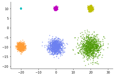
As a simple example, consider the following data consisting of six normal distributions.
Each consists of 1,000 data points, and there are 6 levels of variation in variance. The smallest cluster is tightly packed and the largest cluster is fluffy open.
%matplotlib inline
import matplotlib.pyplot as plt
import seaborn as sns
from sklearn.datasets import make_blobs

X, y = make_blobs(n_samples=6000,
                  cluster_std=[0.1, 0.4, 0.6, 1.0, 2.0, 3.0],
                  centers=[(-20, 10), (0, 10), (20, 10),
                           (-20, -10), (0, -10), (20, -10)],
                  random_state=42)

colors = ['c', 'm', 'y', '#FF9C34', '#6C80F0', '#4E9A06']
fig, ax = plt.subplots()
ax.scatter(X[:,0], X[:,1], c=[colors[i] for i in y], s=6, alpha=.5)
sns.despine()
Let's apply normal UMAP to this data. Then, the following expression is obtained.
normal_model = umap.UMAP(random_state=42)
normal_emb = normal_model.fit_transform(X)

fig, ax = plt.subplots()
ax.scatter(normal_emb[:,0], normal_emb[:,1], c=[colors[i] for i in y], s=6, alpha=.5)
sns.despine()
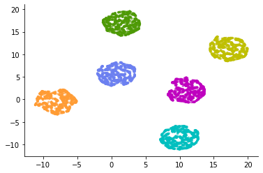
The six clusters have been represented in almost the same way.
Looking at these figures, it is a common misinterpretation to conclude that there were six evenly spread clusters in high-dimensional space. In most cases, t-SNE and UMAP cannot discuss the difference in the relative spread of low-dimensional visualized clusters.
However, even if we are repeatedly warned about the interpretation of t-SNE results, there is no doubt that these figures are misleading. It's not an intuitive expression. Looking at the figure in a single-cell analysis treatise makes me want to make a relative comparison of cluster spreads. Isn't it possible to obtain low-dimensional visualization that properly reflects the spread in high-dimensional space?
DensMAP solves this problem (to some extent).
It's easy to use, just give the regular UMAP constructor the parameter `` `densmap = True```.
densmap_model = umap.UMAP(densmap=True, random_state=42)
densmap_emb = densmap_model.fit_transform(X)

fig, ax = plt.subplots()
ax.scatter(densmap_emb[:,0], densmap_emb[:,1], c=[colors[i] for i in y], s=6, alpha=.5)
sns.despine()
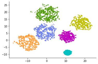
An expression different from normal UMAP was obtained. Originally, a small cluster has a small spread, and the cluster is represented by reflecting the increase or decrease in the spread.
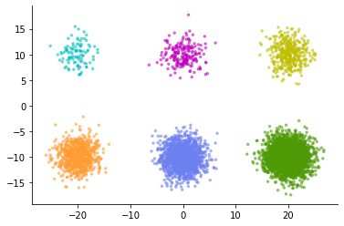
Now consider the opposite case. When the original cluster spread is the same, but the number of data points belonging to each cluster is different.
X, y = make_blobs(n_samples=[100, 200, 400, 800, 1600, 3200],
                  cluster_std=2.0,
                  centers=[(-20, 10), (0, 10), (20, 10),
                           (-20, -10), (0, -10), (20, -10)],
                  random_state=42)

fig, ax = plt.subplots()
ax.scatter(X[:,0], X[:,1], c=[colors[i] for i in y], s=6, alpha=.5)
sns.despine()
Let's compare the embedding of this data with UMAP and DensMAP.
normal_model = umap.UMAP(random_state=42)
normal_emb = normal_model.fit_transform(X)

densmap_model = umap.UMAP(densmap=True, random_state=42)
densmap_emb = densmap_model.fit_transform(X)

fig = plt.figure(figsize=(12,6))
ax1 = fig.add_subplot(121)
ax1.scatter(normal_emb[:,0], normal_emb[:,1], c=[colors[i] for i in y], s=6, alpha=.5)
ax1.set_title('Normal UMAP')
ax2 = fig.add_subplot(122)
ax2.scatter(densmap_emb[:,0], densmap_emb[:,1], c=[colors[i] for i in y], s=6, alpha=.5)
ax2.set_title('DensMAP')
sns.despine()
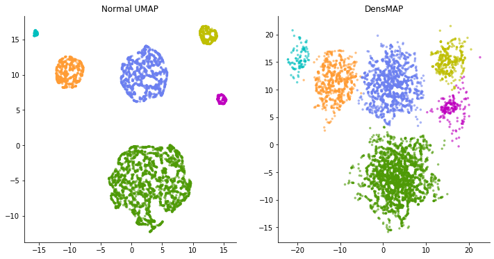
This time, on the contrary, in the normal UMAP calculation, the clusters that should have the same spread are expressed in a completely different spread. Looking at the figure on the left, a light blue cluster or the like looks like a cluster with a very uniform pattern of data points and lacks diversity. But in reality, the distribution of each cluster is the same. Light blue clusters simply have a small number of sampled data points.
DensMAP, on the other hand, portrays the spread of the cluster, if not completely, without much difference. In this way, DensMAP is an expression that reflects the actual density to some extent.
The paper introduces a number of examples of applying DensMAP to scRNA-seq data. The "spread" of data points expressed by DensMAP provides useful information when interpreting "diversity of gene expression patterns" from data.
That said, this isn't the only correct expression, and it actually adds one user-adjustable parameter. It is a weight parameter for adjusting "how important the density information is".
It feels like the weight applied to the regularization term such as LASSO, and if you increase this weight parameter $ \ lambda $, it will try to reflect the density as much as possible, and if you set it to zero, it will be the same expression as normal UMAP.
densmap_model1 = umap.UMAP(densmap=True, dens_lambda=5.0, random_state=42)
densmap_emb1 = densmap_model1.fit_transform(X)
densmap_model2 = umap.UMAP(densmap=True, dens_lambda=0.1, random_state=42)
densmap_emb2 = densmap_model2.fit_transform(X)

fig = plt.figure(figsize=(12,6))
ax1 = fig.add_subplot(121)
ax1.scatter(densmap_emb1[:,0], densmap_emb1[:,1], c=[colors[i] for i in y], s=6, alpha=.5)
ax1.set_title('DensMAP $\lambda=5.0$')
ax2 = fig.add_subplot(122)
ax2.scatter(densmap_emb2[:,0], densmap_emb2[:,1], c=[colors[i] for i in y], s=6, alpha=.5)
ax2.set_title('DensMAP $\lambda=0.1$')
sns.despine()
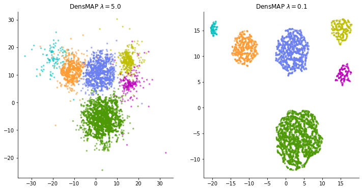
I'm not sure how to adjust this weight when applying it to real data. It is not always possible to obtain a good expression by increasing the weight and tightening the density constraint. If the weight is made too large, this time, too much emphasis is placed on the spread of data points, and many clusters that spread vaguely overlap, making it difficult to understand the "representation of local structure" that should have been an advantage of t-SNE and UMAP. turn into. Some trial and error may be required according to the data.
MNIST embedding
Try using the standard MNIST (handwritten number data set).
import numpy as np

dataset = np.load('./mnist.npz')
x = dataset['x_test']
y = dataset['y_test']

x = x.ravel().reshape(-1, 784)
x.shape
(10000, 784)
For normal UMAP.
normal_model = umap.UMAP(random_state=42)
normal_emb = normal_model.fit_transform(x)
import matplotlib
colors = [matplotlib.colors.to_hex(i) for i in matplotlib.cm.tab10.colors]

def plot_clusters(coords, y, ax, labels=None, title=None):
    for y_i in np.unique(y):
        ax.scatter(coords[y == y_i, 0], coords[y == y_i, 1],
                   s=6, alpha=0.5, c=colors[y_i])

    for y_i in np.unique(y):
        centroid = np.mean(coords[y == y_i, :], axis=0)
        label = labels[y_i] if labels else str(y_i)
        ax.annotate(label, xy=(centroid), fontsize=13, color='white',
                    bbox={'facecolor':colors[y_i], 'edgecolor':'k', 'alpha':0.8})

    if title:
        ax.set_title(title)
    plt.axis('off')
fig = plt.figure(figsize=(12, 10))
ax = fig.add_subplot(111)
plot_clusters(normal_emb, y, ax, title='MNIST Normal UMAP')
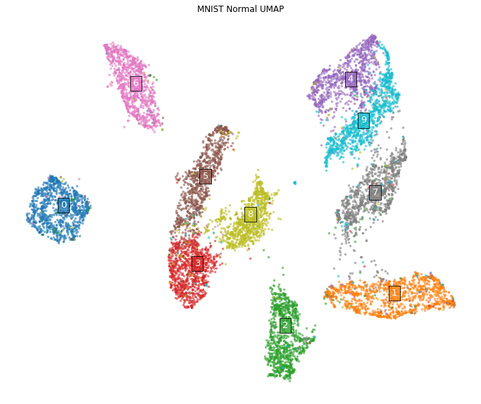
This figure is a low-dimensional representation of MNIST that you often see. All numbers appear to consist of clusters of similar extent.
On the other hand, in the case of DensMAP
densmap_model = umap.UMAP(densmap=True, random_state=42)
densmap_emb = densmap_model.fit_transform(x)

fig = plt.figure(figsize=(12, 10))
ax = fig.add_subplot(111)
plot_clusters(densmap_emb, y, ax, title='MNIST DensMAP')
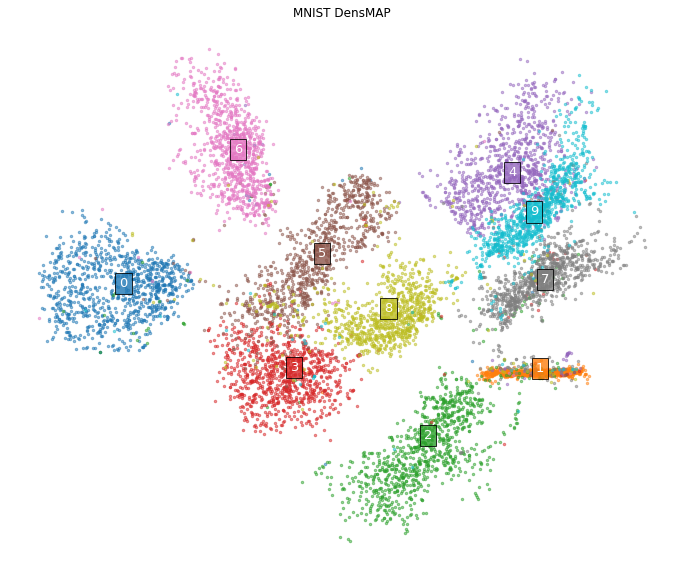
The appearance changes considerably. In particular, a cluster composed of the letter "1". In normal UMAP, it was a cluster with a certain extent, but in DensMAP, it is expressed as an almost linear cluster structure.
In fact, the variety of ways to draw the letter "1" is, in most cases, just the difference in "at what angle the straight line is drawn" when looking at the data. Therefore, it seems reasonable to express it as a one-dimensional structure that reflects the angle.
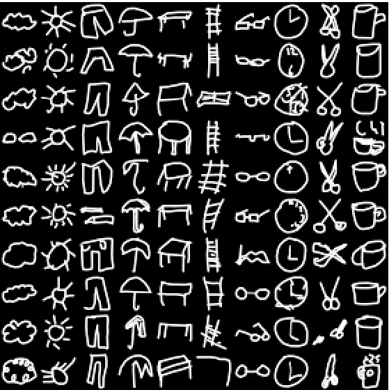
Let's try another example. Apply in the same way to Google's graffiti dataset (subsampled to 10 categories (https://github.com/zaidalyafeai/QuickDraw10)). This dataset is a rasterized version of the pictures written for the themes of 10 categories such as glasses and umbrellas in the same size as MNIST as shown below.
dataset = np.load('./QuickDraw10-master/dataset/test-ubyte.npz')
x = dataset['a']
y = dataset['b']

x = x.ravel().reshape(-1, 784)
x.shape
(20000, 784)
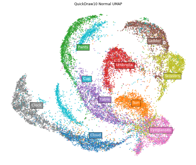
First of all, normal UMAP.
normal_model = umap.UMAP(random_state=42)
normal_emb = normal_model.fit_transform(x)

labels = ['Cloud', 'Sun', 'Pants', 'Umbrella', 'Table',
          'Ladder', 'Eyeglasses', 'Clock', 'Scissors', 'Cup']

fig = plt.figure(figsize=(12, 10))
ax = fig.add_subplot(111)
plot_clusters(normal_emb, y, ax,
              labels=labels, title='QuickDraw10 Normal UMAP')
On the other hand, in the case of DensMAP.
densmap_model = umap.UMAP(densmap=True, random_state=42)
densmap_emb = densmap_model.fit_transform(x)

fig = plt.figure(figsize=(12, 10))
ax = fig.add_subplot(111)
plot_clusters(densmap_emb, y, ax, labels=labels,
              title='QuickDraw10 DensMAP $\lambda$=2.0')
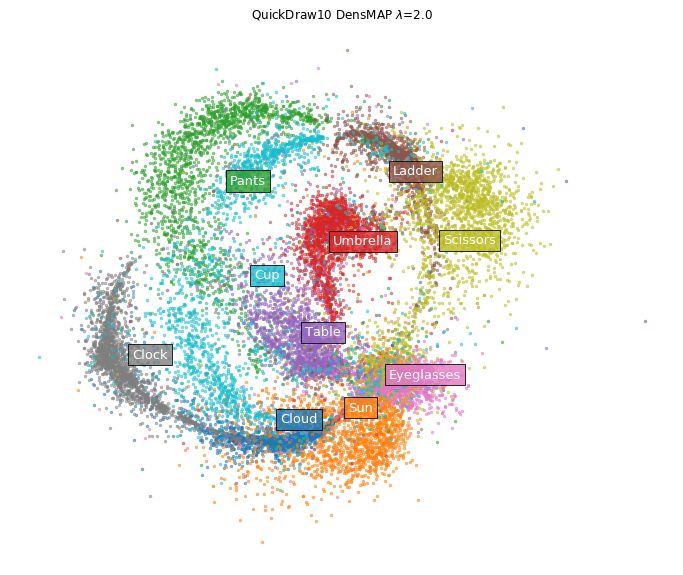
Clusters of eyeglasses and clouds have shrunk tightly. Certainly, looking directly at the image of the data, it seems that there are few variations in how to draw glasses and clouds.
theory
Only an overview of.
Both t-SNE and UMAP have slightly different forms of functions used for each process, but they do almost the same thing.
Both algorithms
- Convert the distance to the neighborhood into a probability value with a normally distributed kernel function for each data point in the high-dimensional space.
- For each data point on the low-dimensional side randomly arranged in the initial state, the distance to the neighborhood is converted to a probability value by the "heavy-tailed distribution" type kernel.
- Minimize the objective function that takes two inputs, the probability distribution on the high-dimensional side and the probability distribution on the low-dimensional side, and match the two as much as possible.
The problem is the first step, which determines the spread of the normal distribution (variance parameter). Both t-SNE and UMAP do not use a fixed width normal distribution, but set a different width for each data point. That is, the scale of the distance to the neighborhood is different for each data point.
The reason for doing this is that if the data density is not homogeneous, using a fixed width can cause problems. In some data, the data points are dense and dense, and in other areas, the distance from other data points is wide and the data is squishy. There may be many neighbors living in a radius of 10m like an apartment house in Tokyo, or there may be no one in a radius of 10m like "Potsun and a house". If you set it to a narrow width so that you can accurately grasp the neighborhood for data points in a dense area, there are no "neighborhood points" for sparse data points, and the relationship with other points is captured. Can not. If you set it to a wide width so that you can detect the neighborhood for sparse data points, the width will be too wide in a dense area and a large number of "neighborhood points" will be captured, and which one is really close. I don't know what it was.
In order to avoid this, t-SNE and UMAP are devised to adaptively change the width for each data point, narrowing the width in dense areas and widening in sparse areas. This makes it possible to capture the magnitude relationship of the distances to approximately the same number of "neighboring points" for any data point, whether in a dense or sparse area. If the data points are arranged so that the distance relationship with the captured neighborhood can be reproduced even on the low-dimensional side, a low-dimensional representation that maintains the local structure can be obtained.
However, this process almost loses the information of sparse and dense in the high-dimensional space.
The idea adopted by Den-SNE and DensMAP to solve this is very simple, let's add another term to the objective function minimized by t-SNE and UMAP and minimize it at the same time. ,something like.
The original objective function is calculated by calculating the peripheral density of each data point on the high-dimensional side and the low-dimensional side, calculating their Pearson correlation coefficient, and multiplying it by the weight parameter $-\ lambda $. Add to (Kullback-Leibler information amount for t-SNE, cross entropy for UMAP). If it can be minimized, it should be possible to obtain a balanced expression of maintaining the distance relationship with the neighborhood for each data point and maintaining the local density for each data point.
Specifically, the normally distributed kernel $ P $ for each data point on the higher dimensional side is calculated on an adaptive scale for each data point as usual.
Then, the "average distance" $ R_p (x_i) $ with the surrounding data points for the data point $ x_i $ is weighted by P and calculated by the following calculation.
(At this time, "distance" is measured not by Euclidean distance but by square Euclidean distance, but the reason is unknown)
This value reflects the density around the data points. The average distance to the neighborhood is small for data points located in dense areas, and large in sparse areas.
Similarly, using the "heavy-tailed distribution" type kernel Q for each data point on the lower dimension side, the "average distance" $ R_q (y_i) $ from the peripheral data points for the coordinate $ y_i $ on the lower dimension side is calculated. Calculate by weighting with Q.
Now, I want to match this average distance on the high-dimensional side and the low-dimensional side, but since the size of each dimension is different, they do not match as they are. $ R_q (y_i) \ sim \ alpha [R_p (x_i)] It seems that it is considered to have a power law relationship such as ^ \ beta $.
So, if you take the logarithm of both sides like $ r_q (y_i) = log R_q (y_i) $,
It becomes a linear relationship like.
Therefore, the goodness of matching of the "average distance" for each data point on the high-dimensional side and the low-dimensional side can be measured by the Pearson correlation coefficient between $ r_q (y_i) $ and $ r_p (x_i) $.
Therefore, if the value of this Pearson correlation coefficient is incorporated into the normal objective function, the objective functions of Den-SNE and DensMAP will be completed.
For t-SNE, the usual objective function is the Kullback-Leibler information amount (KL) for P and Q, so a new loss function
Can be set, and if this is minimized, the purpose can be achieved.
Also, since the weight parameter $ \ lambda $ is applied to the part of the correlation coefficient, it is arranged so that the correlation increases as the weight increases, and the correlation value is almost ignored when the weight decreases. It is arranged in the same way as t-SNE and UMAP.
As mentioned above, the idea is simple, but there are some ideas to make it differentiable, the calculation of the gradient to execute the optimization calculation is not so simple, and in reality it is variously complicated, so refer to the Supplementary Note of the paper for details. Please give me.
Recommended Posts