[PYTHON] You can use Dash on Jupyter jupyter_dash
Dash is a web framework for interactive visualization. And Dash has a package called jupyter_dash that runs applications on Jupyter. And recently, jupyter_dash has started running on Google Colab.
This time, in addition to how to use jupyter_dash, I would like to introduce the advantages of using Dash on Jupyter.
This time we will do all the work on Google Lab. Sample notes can be found at the following links:
https://colab.research.google.com/drive/1eUlcEKeHLzN7zBYPutFeU9yRPOwnWqKi?usp=sharing
Preparation
jupyter_dash is not installed in the collaboration. Also, the version of plotly used for visualization is old, so I will update it.
!pip install jupyter_dash
!pip install --upgrade plotly
Next, import the library to be used this time.
import dash
from jupyter_dash import JupyterDash
import dash_core_components as dcc
import dash_html_components as html
import plotly.express as px
from dash.dependencies import Input, Output
jupyter_dash is a package for using Dash on Jupyter. dash_core_components is a package that provides various tools, and dash_html_components is a package that provides HTML components. plotly.express is a graphing package.
Practice
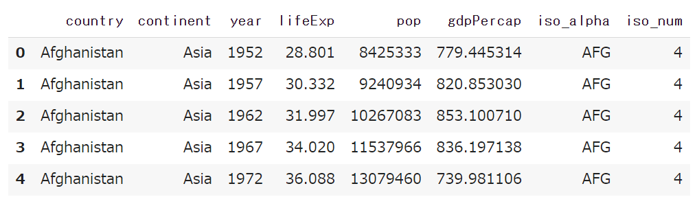
From here, we'll use Plotly Express Gapminder data. Gapminder data is a dataset with life expectancy, population, and GDP per capita for countries around the world from 1952 to 2007.
gapminder = px.data.gapminder()
gapminder.head()
Visualize life expectancy with line graph (1 country)
First, let's say you want to observe the life expectancy of each country. Here's how to draw a Plotly Express graph:
--Use the function of the graph type you want to draw --Pass the data frame you want to draw on the graph --Pass the element to be used for each element as an argument
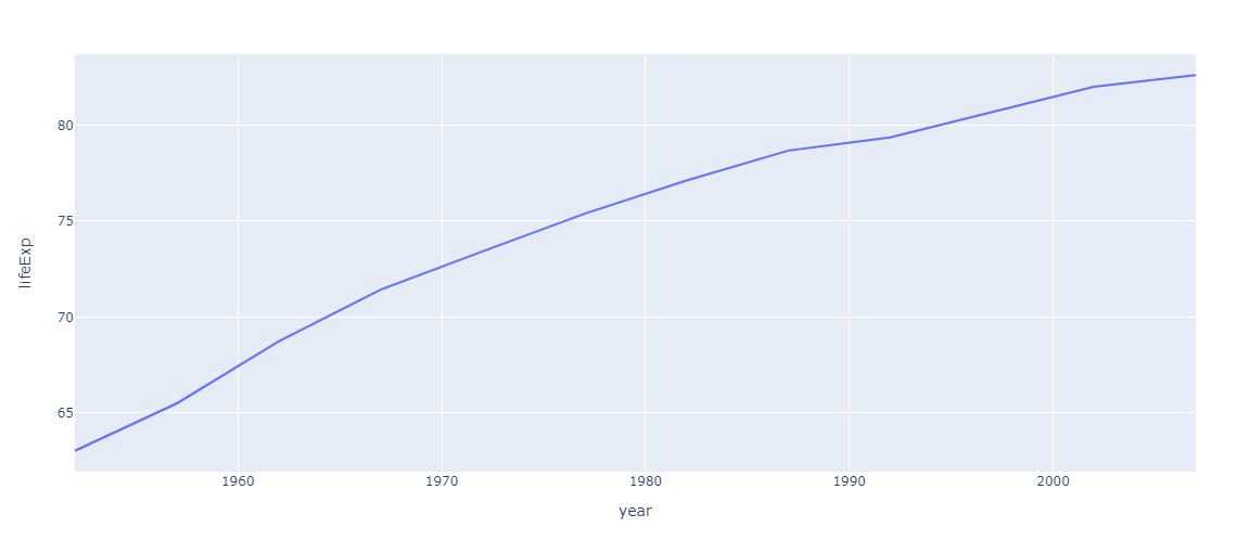
First, let's visualize the transition of life expectancy in Japan.
#Code 1
jp_gapminder = gapminder[gapminder["country"] == "Japan"] #Japan data frame creation
px.line(jp_gapminder, x='year', y="lifeExp") #Graph drawing
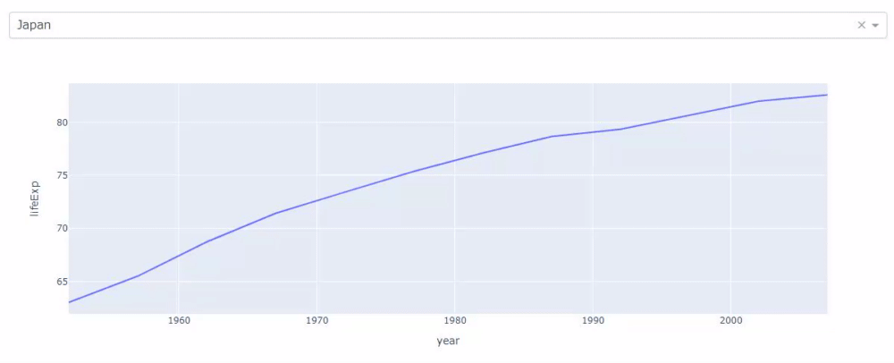
Next, if you want to observe the life expectancy in China, in most cases you will create a data frame in China, pass the data to the argument of the function in the same way, and execute it like shift + enter.
However, with jupyter_dash you can switch graphs by simply selecting a dropdown, which will nicely prevent shifts and enter wear.
#Code 2
#Creating a JupyterDash instance
app = JupyterDash(__name__)

#Pass the layout to the layout attribute (dropdown and graph)
app.layout = html.Div([
                       dcc.Dropdown(id="my_dropdown",
                                    options=[{"value": cnt, "label": cnt} for cnt in gapminder.country.unique()],
                                    value="Japan"
                                    ),
                       dcc.Graph(id="my_graph")
])

#Callback function to reflect the dropdown selection value in the graph
@app.callback(Output("my_graph", "figure"), Input("my_dropdown", "value"))
def update_graph(selected_country):
  selected_gapminder = gapminder[gapminder["country"] == selected_country]
  return px.line(selected_gapminder, x="year", y="lifeExp")

#Run on notebook
app.run_server(mode="inline")
The code above will draw a graph that reflects the dropdown selection.
Create life expectancy as a line graph (multiple countries)
When drawing multiple countries, Plotly Express separates the countries by color (argument color).
#Code 3
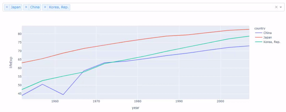
country_list = ["China", "Korea, Rep.", "Japan"]
selected_gapminder = gapminder[gapminder["country"].isin(country_list)]
px.line(selected_gapminder, x='year', y="lifeExp", color="country")
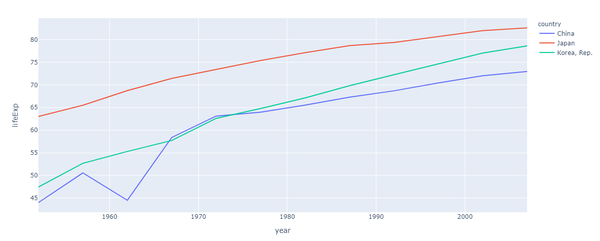
It is quite troublesome to see this in detail while changing countries. However, if you use jupyter_dash, you can easily create an application that can switch the display of multiple countries like the following with a little change in the previous code.
#Code 4
app = JupyterDash(__name__)

app.layout = html.Div([
                       dcc.Dropdown(id="my_dropdown",
                                    options=[{"value": cnt, "label": cnt} for cnt in gapminder.country.unique()],
                                    value=["Japan", "China", "Korea, Rep."], # ➊
                                    multi=True # ➋
                                    ),
                       dcc.Graph(id="my_graph")
])

@app.callback(Output("my_graph", "figure"), Input("my_dropdown", "value"))
def update_graph(selected_country):
  selected_gapminder = gapminder[gapminder["country"].isin(selected_country)] # ➌
  return px.line(selected_gapminder, x="year", y="lifeExp", color="country") # ➍

app.run_server(mode="inline")
The change is the numbering. In ➊, pass the country name in the list so that multiple countries are selected from the beginning in the dropdown. In ➋, pass True to the argument multi to allow multiple countries to be selected in the dropdown. ➌ creates a data frame with multiple countries selected. In ➍, pass "country" as the argument color and specify that the line color is changed for each country name.
The created application works as follows.
Visualization using treemaps
Finally, create a visualization using a treemap. I don't have the writing ability to explain the treemap in letters, so I'll try to create it first.
#Code 5
gapminder['board'] = 'world' # "board"Add a column and'world'Add the string
px.treemap(gapminder, path=['board', 'year', 'country'], values='pop')
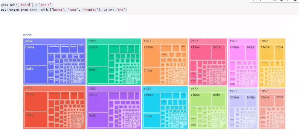
This time I tried to visualize only the population. You can dynamically check the numbers in the treemap as follows. Treemaps allow you to nest data, so just changing the order will make new discoveries as data.
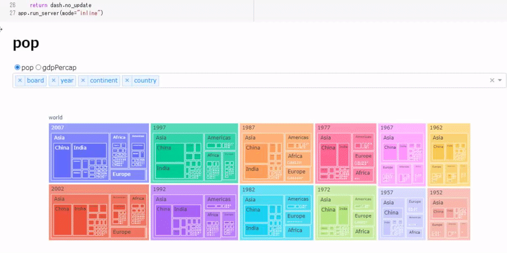
Next, create a tool that allows you to switch the display order of the treemap with a dropdown while switching the display of population and GDP per capita with radio buttons.
#Code 6
app = JupyterDash(__name__)

app.layout = html.Div([
                       html.H1(id="title"), #Show radio button selection
                       dcc.RadioItems(
                           id="my_radio",
                           options=[{"label": i, "value": i} for i in ["pop", "gdpPercap"]],
                           value = "pop"
                       ),
                       dcc.Dropdown(
                           id="my_drop",
                           options=[{"label": i, "value": i} for i in ['board', 'year', 'continent', 'country']],
                           value = ['board', 'year', 'continent', 'country'],
                           multi=True
                       ),
                       dcc.Graph(id="my_graph")
])

@app.callback([Output('title', 'children'),Output('my_graph', "figure")],
              [Input("my_radio", "value"), Input("my_drop", "value")])
def update_tree(radio_select, drop_select):
#Draw graph only if 3 or more elements are selected in the dropdown
  if len(drop_select) == 3:
    return radio_select, px.treemap(gapminder, path=drop_select, values=radio_select)
  else:
    return dash.no_update
app.run_server(mode="inline")
The code is less than 30 lines, but it behaves quite complicatedly as follows.
Summary
By using jupyter_dash as above, you can reduce a little hassle in drawing graphs (and maybe the keyboard will last longer).
If you want to know more about Dash, please refer to the past articles.
https://qiita.com/OgawaHideyuki/items/6df65fbbc688f52eb82c
If you would like to know more examples using actual data, I wrote an article on WEB + DB PRESS VOL118, so I hope you can pick it up.
https://gihyo.jp/magazine/wdpress
In addition, the tutorial materials used at PyConJP2020 are available, so I think this will also be helpful. This is the flow of data preprocessing, visualization, and machine learning. I would be happy if you could give me a star.
https://github.com/hannari-python/tutorial
If you would like to know more details, please refer to Original Documents or purchase a book that will be released around November. It's a promotion.
http://www.asakura.co.jp/books/isbn/978-4-254-12258-9/
Also, I had the opportunity to speak at PyCon mini Hiroshima2020, so I'm working on ideas. We hope you will join the event and listen to the talk on the day!
https://pycon-hiroshima.connpass.com/event/186849/
Recommended Posts