Visualize network data using Cytoscape from IPython Notebook Part 1
Introduction
Article posted the other day was written with a focus on how to efficiently proceed with workshops using data visualization software. , I would like to introduce the contents of the actual workshop that I introduced a little in that, that is, the part of the procedure for interactively visualizing the network, in Japanese as well.
Background of the problem
![]()
Regardless of network analysis, the number of tools that can be used for data analysis and visualization is increasing, but the know-how to actually use them in combination is still small. Recently, Python and R have become the standard in the fields of data analysis and visualization, but here are some examples using Python. Using the network visualization software called Cytoscape that we are developing, NetworkX etc. The purpose is to take advantage of Cytoscape's abundant analysis functions and Cytoscape's flexible visualization functions. The article in English is here, but I would like Japanese people to use this combination of tools more widely. I think it's easy, but I'll introduce it.
Environmental setting
It's easiest to proceed with Docker. I'm sure many programmers are reading this article, so I won't go into details, but the steps below will exactly recreate the same environment I used. Of course, you can build your own environment locally, but I think it will take extra effort.
Required software
- Git
- Docker (tested with 1.5)
This is fine if you just want to try the basics of the notebook, but if you want to visualize the network using Cytoscape, you need to install it as well. The required software in that case is
- Java 8 latest version
- Cytoscape 3.2.1
- cyREST App --An add-on (called App) that adds a REST API to Cytoscape. You can install directly from the Install button by opening this page while Cytoscape is running. The latest version (0.9.13 or later) is required.
Building a notebook environment
Basically everything is done automatically with the following command:
git clone https://github.com/idekerlab/vizbi-2015

cd vizbi-2015

docker run -d -p 80:8888 -v $PWD:/notebooks -e "PASSWORD=(PW for accessing notebooks)" -e "USE_HTTP=1" idekerlab/vizbi-2015
If it's running, all you have to do is access it from your browser. If you are using boot2docker, the address should look like this:
http://192.168.59.103/

Now you can immediately access the notebooks in tutorials

If you haven't touched the IPython Notebook at all, it will be useful to learn some basic note operations and how to use a special command called magic in Lesson 0.
Unfortunately, all of these notebooks are in English, so I will add some explanations in Japanese.
What is cyREST?
![]()
Cytoscape is open source software for network analysis and visualization that is widely used in the biology community. Since it is a GUI-based operation, it is relatively easy to install, but for those who use it hard, there are some people who find it difficult to use because there is no means of automation. To solve this problem, we created a widely used RESTful API using the resource-oriented design method, which is a recent standard method, and App. It is implemented as.
When accessing from inside the Docker container on Boot2docker
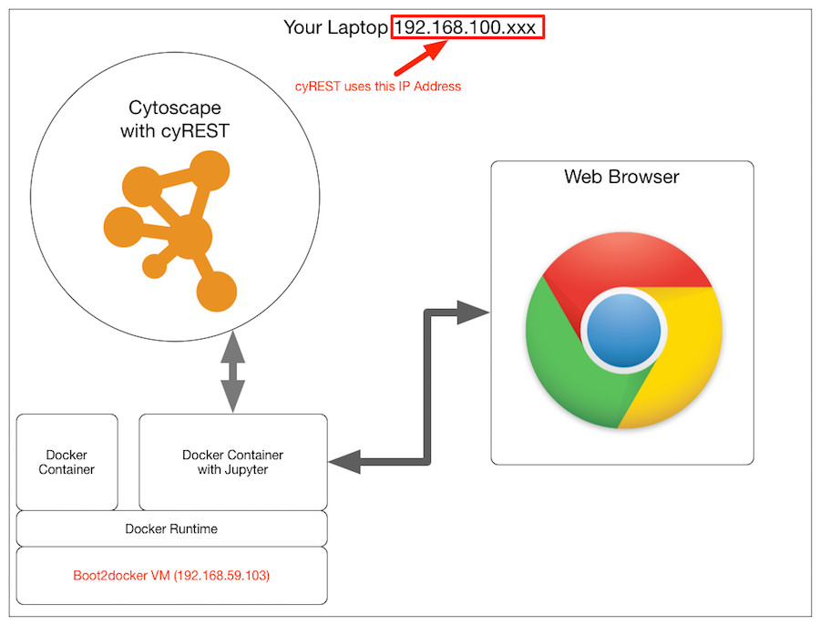
It's okay if you install everything directly on your local machine, but you can't access it from the container on boot2docker via localhost, so you need to specify the IP address of the machine where Cytoscape is running, and at the beginning of the notebook You'll need code like this:
#IP address of the cyREST server (the address of the machine running Cytoscape). Must be set!
IP = '10.0.1.6'

#cyREST server information. The default port is 1234
PORT_NUMBER = 1234

#Save the base URL as a constant
BASE = 'http://' + IP + ':' + str(PORT_NUMBER) + '/v1/'
Actual flow
This time, I will upload a sample that uses very basic functions as a notebook.
Network generation and POST
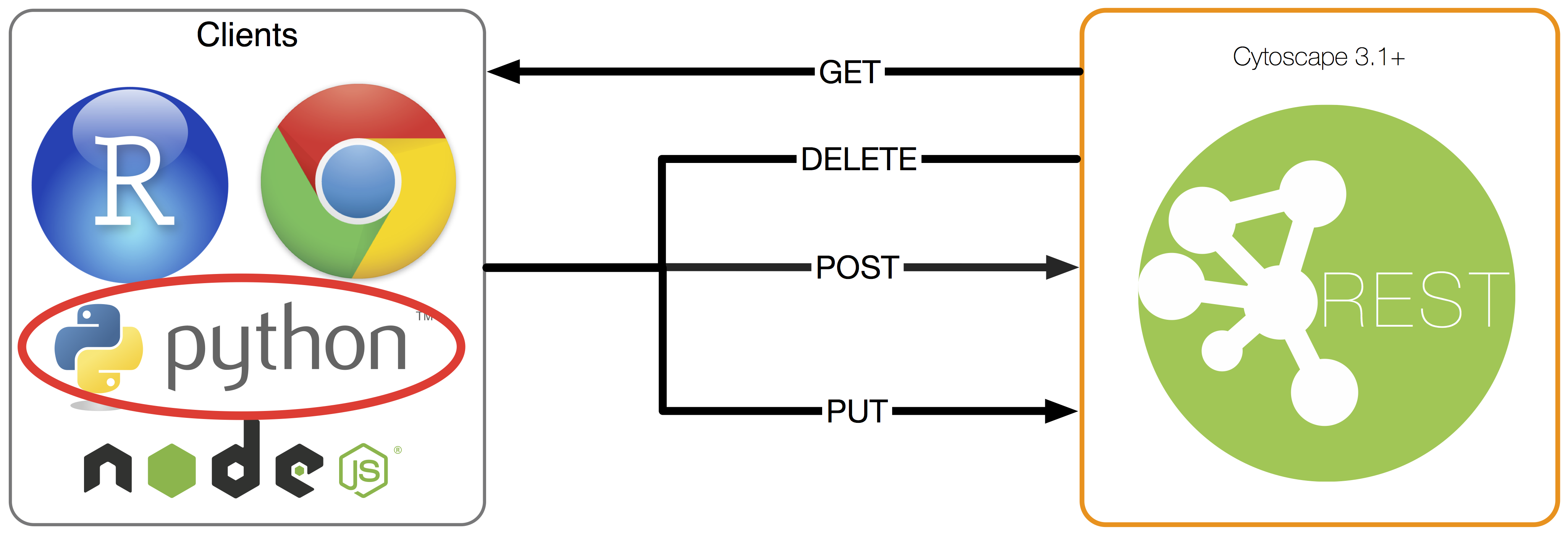
The cyREST feature is as simple as allowing you to perform CRUD operations on the basic data structures used within Cytoscape. is. I won't go into details here, but it supports basic CRUD for the following data:
- CyNetwork
- Group
- CyTable
- Visual Style
See the official Cytoscape documentation for more details. We are currently adding features and fixing bugs for the v1.0.0 release, so some features will be added to the final version.
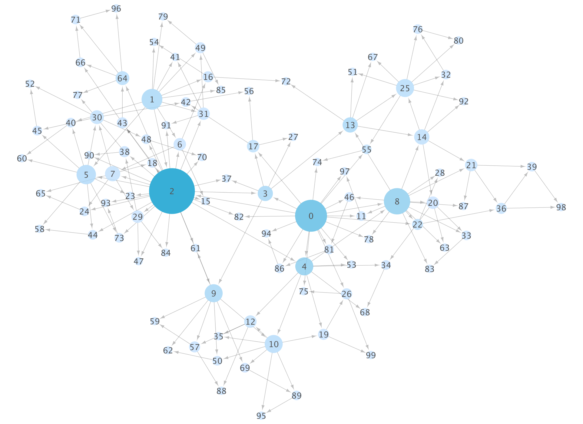
I think it's faster to actually look at the code to use the basic functions, so here's an example. The code below transforms the data generated by NetworkX into JSON in a format accepted by Cytoscape and POSTs it.
#Number of nodes included in the generated network
NUM_NODES = 100

#Create a small scale-free network
scale_free_graph = nx.scale_free_graph(NUM_NODES)

#Name it as a network attribute
scale_free_graph.graph['name'] = 'Scale-free network(Number of nodes: ' + str(NUM_NODES) + ')'

#Cytoscape it with a utility.Get a dictionary object that can be converted to js format JSON
cy_netwiork1 = cy.from_networkx(scale_free_graph)

#POST your network to Cytoscape(Create)
res = requests.post(BASE + 'networks', data=json.dumps(cy_netwiork1), headers=HEADERS)

#SUID of the generated network(Session-Unique ID)Get
suid = res.json()['networkSUID']

#Use that SUID to run an automatic layout algorithm (here a spring model)
requests.get(BASE + 'apply/layouts/force-directed/' + str(suid))

#Preset Visual Style(See below)Apply
requests.get(BASE + 'apply/styles/Directed/' + str(suid))

#Use the image API to embed the visualization results in this note
Image(url=BASE+'networks/' + str(suid) + '/views/first.png', embed=True)
When you do this, the note side will have an image like this (which is generating a random network, so the topology will change with each run):

And the same thing is displayed on the Cytoscape side.

This combination is convenient because you can selectively use __ (network) data analysis and visualization work to choose how much to automate and what to make interactive search. In other words, data can be easily and analyzed automatically by the Python code written in the notebook, and can be operated from the interactive Cytoscape GUI as needed.
By the way, if you visualize the same data as it is using the basic functions of NetworkX, it will be as follows:

If you do it only with NetworkX, you will write down various parameters as code from here, but it is often easier to do some work (correction of fine layout etc.) by hand.
It is recommended that you work in a dual monitor environment, as you will often switch between the two windows when using this technique.
Use the basic visualization function (Visual Style)
Visualization is a core feature of Cytoscape, but it's very simple to do. that is,
__ Specify a function that maps data to visual variables and use it for visualization. If the function does not exist, use the default value specified in advance __
It is called. The former is called Visual Mapping Functions, the latter is called defaults, and their set is called Visual Style. This time I will only introduce a small part, but I adjusted various values and got the Visual Style manually edited on the __Cytoscape side as JSON with the GET method, and based on that, I used the new style as code I think that doing the work of creating __ is a shortcut to learning the basic concept.
PUT (update) the value of defaults
This part is very simple. All you have to do is create a list of the colors and shapes that will be used if the mapping does not exist and then PUT.
defaults = [
    {
        'visualProperty':'NODE_FILL_COLOR',
        'value': '#FFFFFF'
    },
    {
        'visualProperty':'NODE_BORDER_WIDTH',
        'value': 0
    },
    {
        'visualProperty':'NODE_LABEL_FONT_SIZE',
        'value': 18
    },
    {
        'visualProperty':'NODE_LABEL_COLOR',
        'value': '#555555'
    },
    {
        'visualProperty':'NODE_SIZE',
        'value': 30
    },
    {
        'visualProperty': 'EDGE_WIDTH',
        'value': 1
    },
    {
        'visualProperty': 'NODE_TRANSPARENCY',
        'value': 200
    },
    {
        'visualProperty': 'EDGE_TRANSPARENCY',
        'value': 80
    }
]

res = requests.put(BASE + 'styles/Directed/defaults', data=json.dumps(defaults), headers=HEADERS)
Generate Mapping
NetworkX has many graph analysis algorithms, which can be used to calculate various indicators. You can use Cytoscape's flexible Visual Mapping Function (http://wiki.cytoscape.org/Cytoscape_3/UserManual/Styles) to map such numbers to visual variables (Visual Properties).
#Map the degree of a node to size
node_size_mapping = {
    'mappingType': 'continuous',
    'mappingColumn': 'degree',
    'mappingColumnType': 'Double',
    'visualProperty': 'NODE_SIZE',
    'points':[
        {
            'value': 1,
            'lesser': '15',
            'equal': '15',
            'greater': '15'
        },
        {
            'value': max(degree.values()),
            'lesser': '100',
            'equal': '100',
            'greater': '100'
        }
    ]
}

#Map Betweenness to node color
node_color_mapping = {
    'mappingType': 'continuous',
    'mappingColumn': 'betweenness',
    'mappingColumnType': 'Double',
    'visualProperty': 'NODE_FILL_COLOR',
    'points':[
        {
            'value': 0,
            'lesser': '#C6E2FF',
            'equal': '#C6E2FF',
            'greater': '#C6E2FF'
        },
        {
            'value': max(bc.values()),
            'lesser': '#009ACD',
            'equal': '#009ACD',
            'greater': '#009ACD'
        }
    ]
}

res = requests.post(BASE + 'styles/Directed/mappings', data=json.dumps([node_size_mapping, node_color_mapping]), headers=HEADERS)
In this notebook example, a desktop like this will eventually be configured

From here you can further fine-tune the visualization manually, or you can change the code on the notebook side to apply the same workflow to other data.
in conclusion
This article looks like a digest version of the workshop that was held the other day, so if you are interested in the details, it is in English [here](https://github.com/idekerlab/cyREST] / wiki / VIZBI-2015-Tutorial).
I would like to post more complicated samples at a later date.
Recommended Posts