[PYTHON] A network diagram was created with the data of COVID-19.
Introduction
Create graphs, network diagrams, and data tables based on the data from COVID-19 infection status of the Ministry of Health, Labor and Welfare and create a Web application. Did. The created app will be the one linked below.
App link: https://chomoku.herokuapp.com/covid-19
Below is the screen of the network diagram.
The data used is obtained from the website of the Ministry of Health, Labor and Welfare. Scraping is just using the pandas read_html function. You can get it from github below, but you can also get it from the app as described later.
https://github.com/mazarimono/chomoku/blob/master/src/kosei.csv
The reason why I created this app was because I saw Visualization of Toyo Keizai and wanted to see this kind of thing myself. That was the trigger.
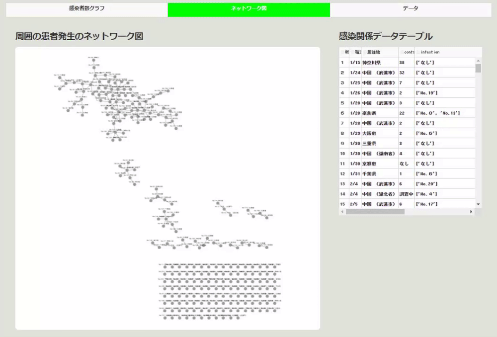
The app is divided into three parts by switching pages with tabs.
The first is a page that displays ordinary graphs. The second is the page that displays the network diagram. A page where you can display the CSV file used by the third as a table and download the data.
The app was created using the web framework Dash. The environment is as follows.
Python 3.7.4 dash 1.9.0 dash-core-components 1.8.0 dash-html-components 1.0.2 dash-cytoscape 0.1.1 dash-table 4.6.0 plotly 4.5.0
Number of close contacts and number of patients
Looking at various news this time, I was wondering if I could get infected if I stayed nearby for a long time. It was that. Therefore, looking at the figures on the Ministry of Health and Welfare website, there was data on the number of close contacts and the occurrence of surrounding patients (By the way, the occurrence of surrounding patients is not updated so much, so the data accurately represents the situation. It's unclear if it's there).
Therefore, I decided to visualize the data first.
The graph is at the bottom left of the patient number graph page. The x-axis is the number of close contacts and the y-axis is the number of patients.

By the way, Plotly Express is used for this visualization. Dash passes a figure to the Graph component to display the graph. The code looks like this:
import dash_core_components as dcc
import plotly.express as px

dcc.Graph(
                    id="ratio_scatter",
                    figure=px.scatter(
                        df_covid,
                        x="contact_num",
                        y="infection_num",
                        title="Number of contacts (x-axis) and surrounding patient occurrence (y-axis)",
                        hover_data=["New No."],
                    ),
                    className="six columns",
                )
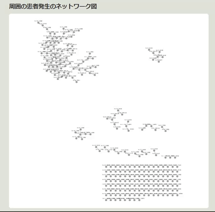
Network diagram
Next, the patient number is written in the "Outbreak of surrounding patients" section of the data. There are "new No." and "old No." in the original data, and it is a delicate place to point to, but we will create a network diagram assuming that it points to "new No.".
The dash-cytoscape used to create the network diagram this time is a component that uses cytoscape. Nodes are created using the new No. and residence, and the edges are connected to the numbers of outbreaks of surrounding patients. Then, choose is selected as the type of node arrangement. Then, the connected items will be displayed side by side in a nice way as shown below.
This network diagram is incorrect if the outbreak data for surrounding patients is made with the "old number". If it was made with "New No.", it seemed that there would be no mistake when compared with the data attached next to it.
In this way, it seemed that there was a considerable connection between patients. By the way, the creation of this part is like creating node data and edge data using csv data and visualizing it with cytoscape. The code looks like this:
import dash_cytoscape as cyto
import pandas as pd
import ast

#Read CSV file
df_covid = pd.read_csv("./src/kosei.csv", index_col=0, parse_dates=["date"])

#Creating data to pass to elements of cytoscape
covid_el = []
for i in range(len(df_covid)):
    covid_el.append(
        {
           #Creating node data
            "data": {
                "id": f"No.{df_covid.iloc[i, 0]}",
                "label": f"No.{df_covid.iloc[i, 0]} / {df_covid.iloc[i, 5]}",
            }
        }
    )
    #Creating edge data
    contact_list = []
    for i2 in ast.literal_eval(df_covid.iloc[i, -2]):
        if i2.startswith("No."):
            covid_el.append(
                {"data": {"source": f"No.{df_covid.iloc[i, 0]}", "target": f"{i2}"}}
            )

network = html.Div(
    [
        html.Div(
            [
                html.H4("Network diagram of surrounding patient outbreaks"),
                cyto.Cytoscape(
                    id="covid_cyto",
                    layout={"name": "cose"}, #layout cose selection
                    elements=covid_el,   #Data to be visualized in the network diagram
                    style={
                        "width": "100%",
                        "height": "80vh",
                        "backgroundColor": "white",
                        "borderRadius": "10px",
                    },
                ),
            ],
            className="eight columns",
        ),])
Display CSV file in table
There are various ways to create a table in Dash, but here we are creating a table using dash-table. The nice thing about this table is that it can be edited in various ways, and the data in the edited table can be reused for visualization or downloaded by the user as a CSV file. By the way, the data is CC, so feel free to use it.
For example, if you want data other than "Old No.", click the trash can in the header of the table as shown below, and then press the export button to download the CSV file.
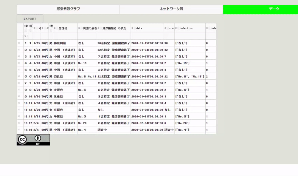
How to add the function to download the csv file to the table, just pass "csv" to the export_format of the DataTable instance of the dash-table package. The code of the table created here is as follows.
import dash_table

table = html.Div(
    [
        dash_table.DataTable(
            id="covid_table",
            columns=[{"name": i, "id": i, "deletable": True} for i in df_covid.columns],
            data=df_covid.to_dict("records"),
            fixed_rows={"headers": True, "data": 0},
            editable=True,
            filter_action="native",
            row_deletable=True,
            sort_action="native",
            export_format="csv",
            fill_width=False,
            virtualization=True,
            style_cell={"textAlign": "left"},
        ),
        html.Img(src="assets/cc.png "),
    ]
)
Summary
As mentioned above, I extracted the part I was interested in from the data of the Ministry of Health, Labor and Welfare and visualized it as an application.
Last year, when you attended the Ethereum event Devcon, Taiwanese Audrey Tan was giving a lecture. At that time, there was a question, "A grandfather who doesn't understand much in Japan became the IT minister, but what do you think?", And I thought I should stop asking such a difficult question, but I asked at that time. There is something like currently realized of people's concerns.
But yesterday, I just announced Tokyo is a great site, and the amount of data that can be used is increasing, and useful ones will be created again. It would be nice to have a cycle that makes you want to be.
By the way, the application code is on github. I will update the application little by little.
https://github.com/mazarimono/chomoku/blob/master/app.py#L837
Postscript
Thank you for many LGTM. A simple hands-on of Dash, the framework that supports applications, is done with "Hannari Python". If you are interested, please do!
https://hannari-python.connpass.com/event/170431/
Recommended Posts