[PYTHON] Bar graph display in pandas (basic edition)
Thing you want to do
- I want to read CSV data with pandas and display a bar graph.
- I want to customize the color and size of the graph.
- Since the purpose is to learn basic operations, the dataset handles simple contents created by yourself.
- Here, group by etc. is not used because the purpose is not "aggregation" but "visualization" of data.
Premise
- The jupyter environment has already been built.
- You have installed the required python library.
Official documentation
Official pandas documentation. Specifications of plot.bar.
https://pandas.pydata.org/pandas-docs/stable/reference/api/pandas.DataFrame.plot.bar.html
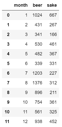
CSV dataset
sample.csv
Fictitious data created by myself. Shows the sales of companies that sell alcoholic beverages. Monthly sales amount of beer and sake (100 million yen). For example, in February, beer (beer) sold 43.1 billion yen and sake (sake) sold 26.7 billion yen.
month,beer,sake
1,1024,667
2,431,267
3,341,166
4,530,461
5,482,367
6,339,331
7,1203,227
8,1376,312
9,896,211
10,754,361
11,561,325
12,938,452
Below, implementation in python.
Import the library
import pandas as pd
import matplotlib as mpl
import matplotlib.pyplot as plt
Read CSV
df = pd.read_csv('csv/sample.csv')
The contents of df are as follows.
View monthly beer sales
df.plot.bar('month', 'beer')
The horizontal axis is "month" and the vertical axis is "beer sales amount (100 million yen)".
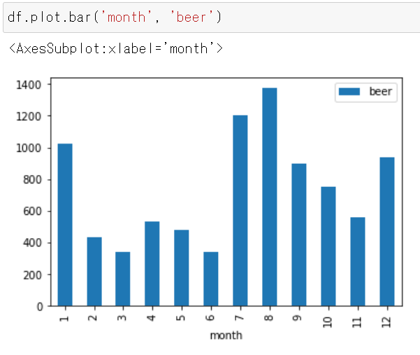
- It can be seen that August sales were the highest (137.6 billion yen).
View monthly sake sales
df.plot.bar('month', 'sake')
The horizontal axis is "month" and the vertical axis is "sake sales amount (100 million yen)".
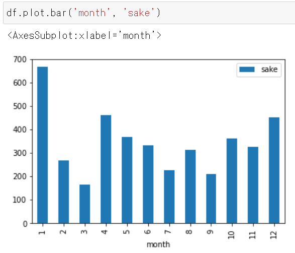
- It can be seen that January sales are the highest (66.7 billion yen).
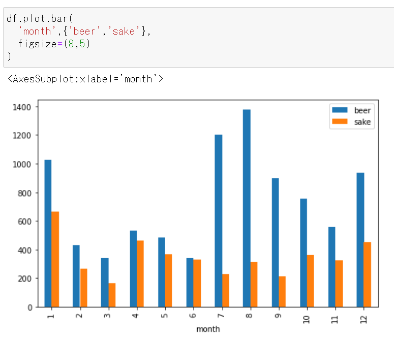
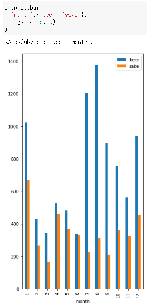
Display monthly "Beer and Sake Sales"
df.plot.bar('month',{'beer','sake'} )
The horizontal axis is "month" and the vertical axis is "sales amount of beer (blue) and sake (orange) (100 million yen)".
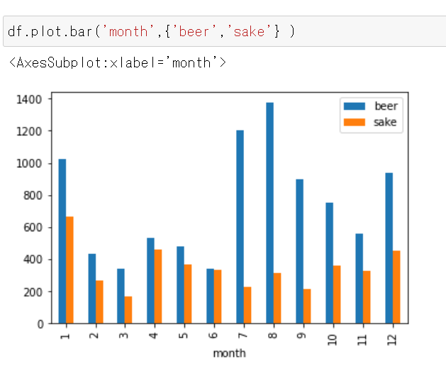
You can see the following.
- Beer sales are highest in August, but sake sales are highest in January.
- Beer sells more than sake.
Display monthly "sales of beer and sake" (stacked)
Add stacked = True to make a stacked graph.
df.plot.bar('month',{'beer','sake'}, stacked=True)
The horizontal axis is "month" and the vertical axis is "sales amount (100 million yen) of beer (blue) and sake (orange)" (accumulated).
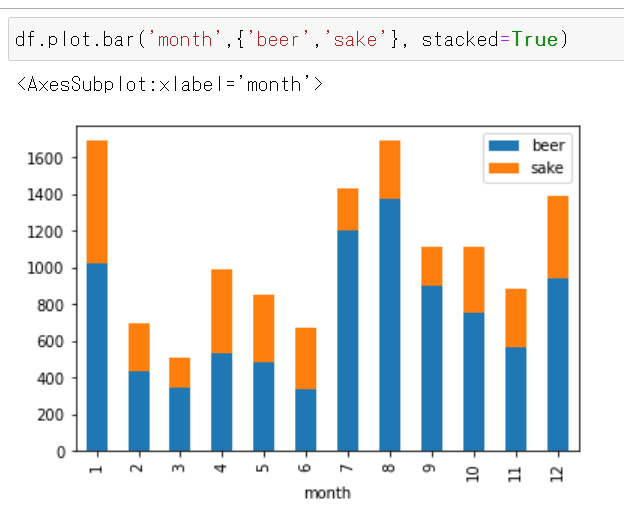
You can see the following.
- In total, beer and sake sell best in January and August.
- Beer has a higher ratio to total sales than sake.
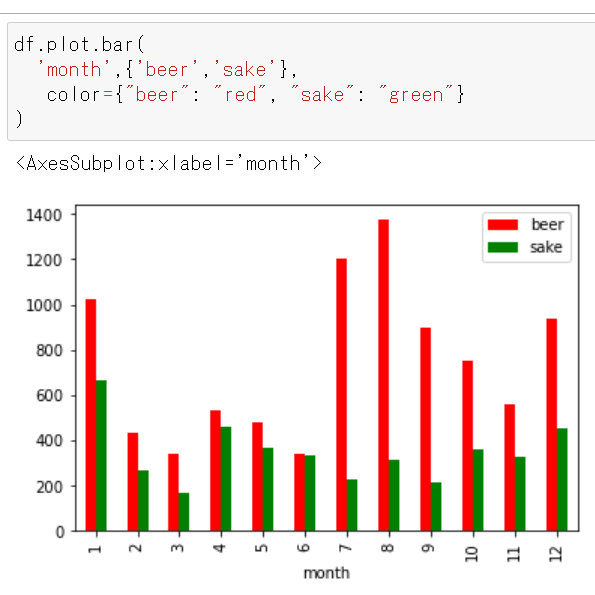
Change the color of the stick
- If you want beer to be red and sake to be green.
df.plot.bar(
  'month',{'beer','sake'},
   color={"beer": "red", "sake": "green"}
)
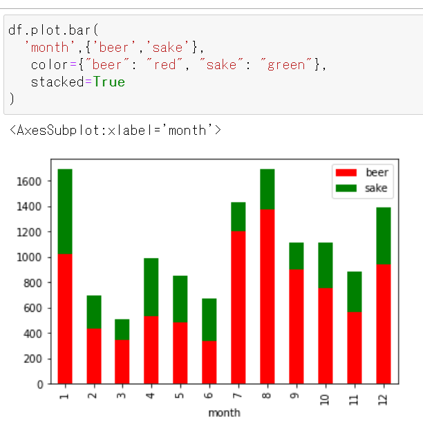
Stack
df.plot.bar(
  'month',{'beer','sake'},
   color={"beer": "red", "sake": "green"},
   stacked=True
)
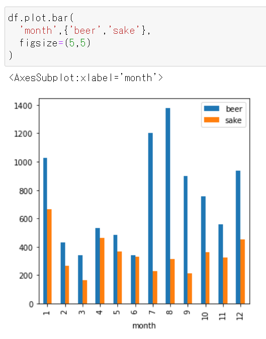
Scale the size of the graph display area
Specify with figsize.
figsize=(5,5)
df.plot.bar(
  'month',{'beer','sake'},
  figsize=(5,5)
)
figsize=(8,5)
figsize=(5,10)
Recommended Posts