[PYTHON] Future population of my town on Plotly/Dash to find a place to live
The beginning of the year is the time to think and act about the future. There was also a corona this year, and I was thinking about the future living environment. At that time, what is the future population of the city? I was worried. Home prices are marketable, so the more people you want, the higher the price, and vice versa. And that's the biggest investment in life.
When I googled that I would be interested in the population in the future, an organization called the National Institute of Population and Social Security Research based on the 2015 census, by prefecture and municipality by 2045, by region of Japan. It was found that data on the future estimated population (estimated in 2018, every 5 years, by gender age (5 years old) class) is being created (Data Source).
It seems that this data estimates the population of many cities, wards, towns and villages (Original: The areas targeted for estimation are 1 prefecture (Fukushima prefecture) and 1,798 cities and wards as of March 1, 2018. Towns and villages (Tokyo's 23 wards (special wards), 128 wards of 12 ordinance-designated cities *, and other 766 cities, 713 towns, and 168 villages). With so many, it seems difficult to find out. It feels like that, but the amount of my money it costs is also large! !! So, I made it into an application to check various things so that I can see the data.
After making it, it was oops. I forgot the Advent calendar ... This is fine. So, this article is the article of Data Visualization Advent Calendar on December 16th. In this article, I will explain the process of processing data with Pandas to make it easier to use and creating an application that can dynamically view data with Dash.
Dash is a Python web framework that is great for showing data dynamically. It looks like I have some books. I'm a co-author w
If you are interested in the article, I would appreciate it if you could LGTM.
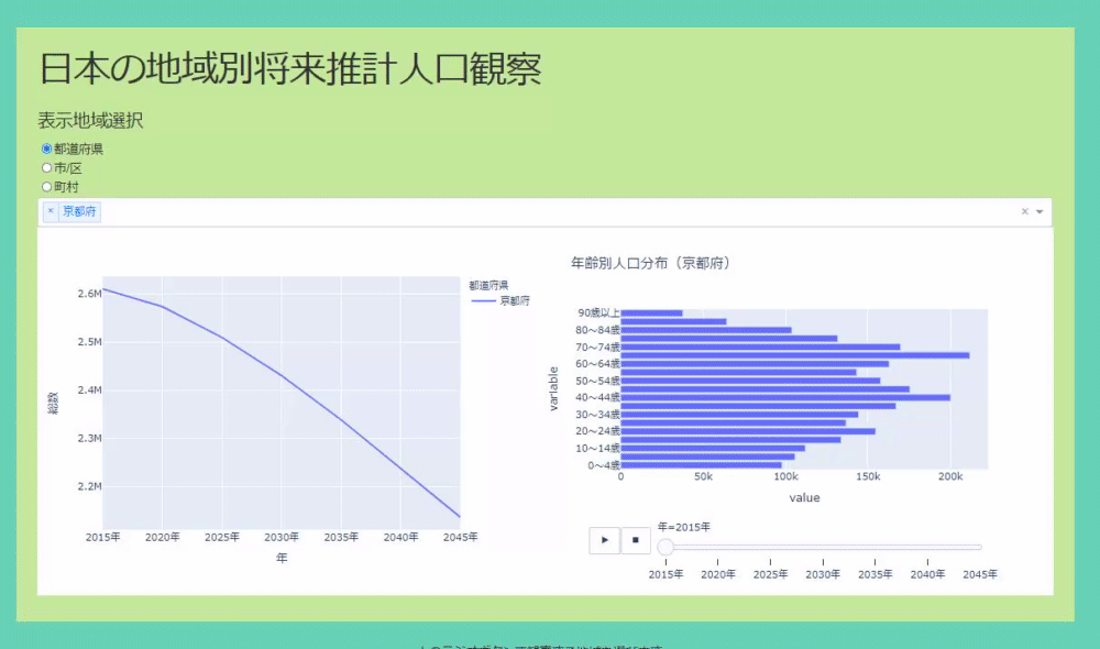
The app and environment created this time
The application has been deployed on Heroku. You can contact us directly (~~ It's free, so it may be slow to start ... ~~ I'm planning to use it for the event on the 12th, so I moved to the paid one).
https://chomoku.herokuapp.com/pyramid
The environment looks like this:
Python 3.8.3 dash 1.16.3 pandas 1.1.2
The application can select where you want to see the population based on radio buttons and dropdowns. The original data was divided like prefectures, cities, towns and villages, so I made it visible for each. The data allows you to see the real numbers, you can select multiple positions in the dropdown, and the real numbers of the population transition are displayed in the line graph. If there is a place you are interested in, you can left-click to see the population transition by age and its time-series change in a bar graph (see GIF below).
Let's check the outline of data creation and application creation.
Data creation
In data creation, first, the page of the National Institute of Population and Social Security Research, 3. Download the estimation result list (Excel about 8.0MB) by gender / age (5 years old) class. And this time, in order to observe the total population pyramid, the goal of data creation is to extract that data.
First, load the locally downloaded data.
df = pd.read_excel('suikei_kekka.xls')
df.head()
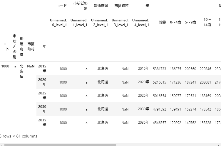
The output result is as follows.
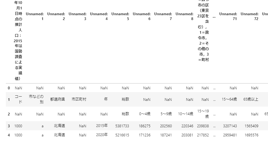
The explanation of the data is written on the first line, and the data itself starts from the first line. It seems that rows 1 and 2 are columns of data. So, specify it and read the data.
df = pd.read_excel('suikei_kekka.xls', header=[2,3)
df.head()
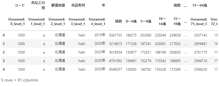
it is a good feeling. Then multi-index the columns up to the year. First, create the data to be used for the index.
df_index = df.iloc[:,[0,1,2,3,4]].copy() #Get data up to the year to index
index_col_name = df_index.columns.get_level_values(0) #Get the top data to make the column name single
df_index.columns = index_col_name  #Pass the data created earlier to the column name
It looks like the one below.
Use the data to make a multi-index.
df.index = pd.MultiIndex.from_frame(df_index)
df.head()
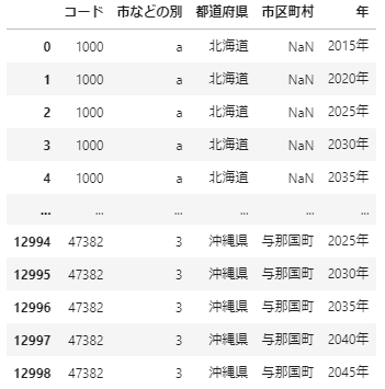
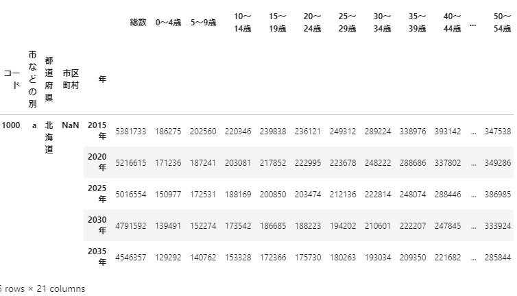
Do so because the data uses only the total number. If you get the data of'total number'at the top of the column, the data will be completed.
sousu = df['Total number']
sousu.head()
The data is completed with the following feeling! Now, next is the application creation.
Creating an application using Dash
Dash is a Python web framework that allows you to create declarative UIs. The UI is assembled using components. You can then use callbacks to run your application dynamically. In addition to Plotly, you can use various graphs such as matplotlib and holoviews.
If you check Keep the whole code on github (make it sloppy and waste a lot. Please pull request), here, click the graph on the left side of the application and the right side Check the part where the place displayed in the graph changes and how to make a bar graph that moves when you press the play button to show the data for each year.
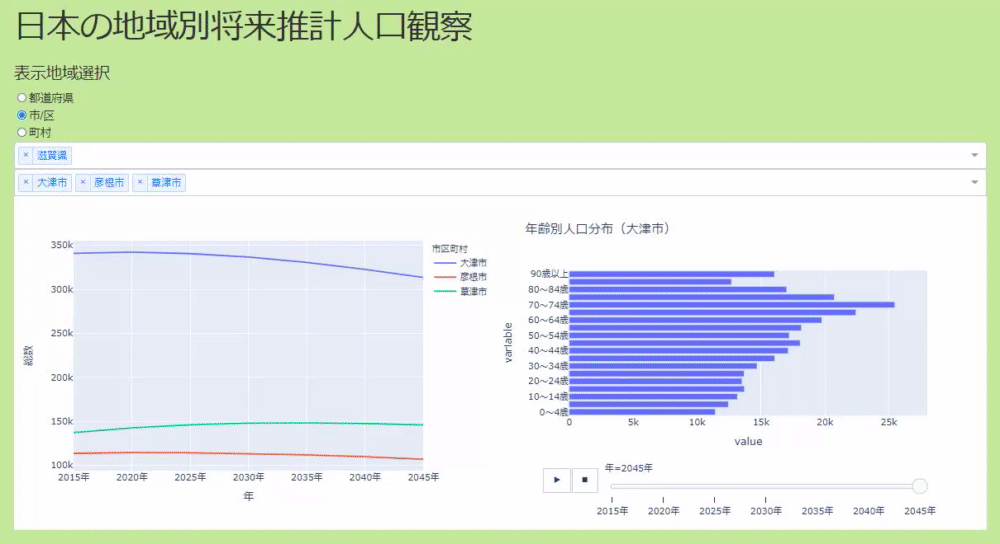
Click the line graph to switch the display elements of the bar graph
I'm using a callback here. The callback is created by specifying the properties of the component that is output to the decorator called app.callback and the input of the callback. This application recreates the UI for prefectures and cities, so the code below is a callback for the actual prefecture part.
@app.callback(
    Output('todou_graph_selected', 'figure'), #Specify the figure of the graph component on the right in the output
    Input('todou_graph_multi', 'clickData'), #Specify clickData of the graph on the left as input
    Input("todou_dropdown", "value"), #Specify a dropdown value for the state
)
def update_pop_pyramid(clickData, pref_value):
    #Create a process when there is no click data (pass the first value of the prefecture dropdown)
    if clickData is None:
        clickData = {'points': [{'hovertext': f'{pref_value[0]}'}]}

    #Create data for selected prefectures and create graphs
    selected_area = clickData['points'][0]['hovertext']
    selected_df = sousu[sousu["By city etc."] == "a"]
    selected_df = selected_df[selected_df["Prefectures"].isin([selected_area])]
    selected_df = selected_df.iloc[:, 4:].drop('Total number', axis=1)
    melted_df = selected_df.melt(id_vars='Year')
    #The return value is a graph created using the data created above.
    return px.bar(melted_df, x='value', y='variable', orientation='h', animation_frame='Year', title=f'Year齢別人口分布({selected_area})')
Dash's Graph component has a clickData property that allows you to do various things with the data obtained by clicking.
Graph that moves when you press the play button
As you can see in the code above, plotly makes it easy to create a graph that moves when you press the play button. Just pass the column name of the data you want to move to the argument animation_frame. In addition to pressing the play button, you can also use the slider below to move the graph.
The code is as simple as below.
px.bar(melted_df, x='value', y='variable', orientation='h', animation_frame='Year', title=f'Year齢別人口分布({selected_area})')
Summary
As mentioned above, I created an application to see the future population using data. It's expensive to buy at home unless you buy it with glue, but if it's too glued, you'll be in trouble 40 years later, so it might be a good idea to take a look. And it's very good that the data that helps you do that is free.
You can also use this to have your wife look at it on your tablet and explain that it's like this.
Yes. As for the contents of the data, as you can see in this article, it is expected that the population will decrease ** in many parts of Japan in the future. However, even in such an environment, there are places like Kusatsu City in Shiga Prefecture where the population does not decrease, so I would like to find a place like this. Well, this is not the only decision, but I think it is a big factor.
The population pyramid is known to have a high probability of predicting the future to some extent. So it can be used for other than finding a place to live. In the future, I would like to add maps and house prices.
That's why it's a promotion at the end. It's like Paid online event for 3 authors will be held at Junkudo of the long title book "Introduction to Python Interactive Data Visualization" on January 12th of the week. This person is also Yoro.
Oh, by the way, it seems that many people are not good at Pandas multi-index (I am one of them), but for those people, I recommend papi_tokei's About Pandas multi-index article.
Recommended Posts