When I was visualizing the data with matplotlib, I wondered if I could display a bar graph with a line graph superimposed. (Because I often see different types of graphs appearing in different graphs) I had a hard time thinking that it would be easy, so I will summarize the knowledge that I needed to visualize it.
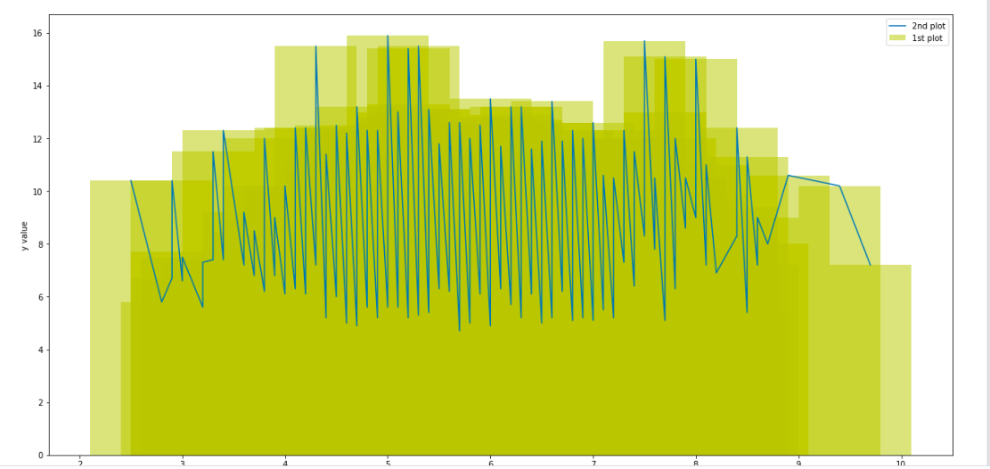
Final code and graph </ b>
#Importing required packages.
import pandas as pd
import seaborn as sns
import matplotlib.pyplot as plt
from sklearn.ensemble import RandomForestClassifier
from sklearn.svm import SVC
from sklearn.linear_model import SGDClassifier
from sklearn.metrics import confusion_matrix, classification_report
from sklearn.preprocessing import StandardScaler, LabelEncoder
from sklearn.model_selection import train_test_split, GridSearchCV, cross_val_score
%matplotlib inline
#Loading dataset
train_df = pd.read_csv('./input/train.csv')
test_df = pd.read_csv('./input/test.csv')
#Create sorted data for plot
line_df = train_df.sort_values(by=["quality","fixed acidity"])
fig = plt.figure(figsize = (20,10))
ax = fig.add_subplot(1,1,1) #Create Axes
line1= ax.bar('quality', 'fixed acidity', data = train_df, label='1st plot',alpha=0.5,color='y') # Axes.Added Line2D to lines
line2 = ax.plot('quality', 'fixed acidity', data = line_df, label='2nd plot') # Axes.Added Line2D to lines
ax.legend()
ax.set_xlabel('x value')
ax.set_ylabel('y value')
```
Output result
## Knowledge of the structure of matplotlib
Until now, I had only the knowledge to put the data in the parentheses of plt.plot (), but there was another way to create an image that creates the parts of the graph in an object-thinking manner.
The image is to create a base (figure) for creating a graph, draw a graph on it (axes), and create axes (Axis) on it.
After making it with, you can draw the graph using the function to display the graph on the drawing board (axes) (axes.plot etc.).
This object-oriented one seems to be better when adjusting small parts because it can be created while imagining each part.
[Click here for details](https://qiita.com/skotaro/items/08dc0b8c5704c94eafb9)
## The trap of matplotlib.axes.Axes.plot
I stumbled on two places with axes.plot ().
<b> First point </ b>
At first, I specified the data directly like x =, y =, but I got an error.
The cause was that I passed the dataframe object this time, so I had to enter only the column name of the data in the option.
Below is the documentation for matplotlib.axes.Axes.plot
>
There's a convenient way for plotting objects with labelled data (i.e. data that can be accessed by index obj['y']). Instead of giving the data in x and y, you can provide the object in the data parameter and just give the labels for x and y:
>>> plot('xlabel', 'ylabel', data=obj)
[Documentation for matplotlib.axes.Axes.plot]
(https://matplotlib.org/3.1.1/api/_as_gen/matplotlib.axes.Axes.plot.html)
The code part solved below
```python
line2 = ax.plot('quality', 'fixed acidity', data = line_df, label='2nd plot')
```
<b> Second point </ b>
I made a line graph with axes.plot (), but this just connects the points plotted from the beginning of the array array, so if I don't arrange the order, a messy graph is created. (The figure below is an image)
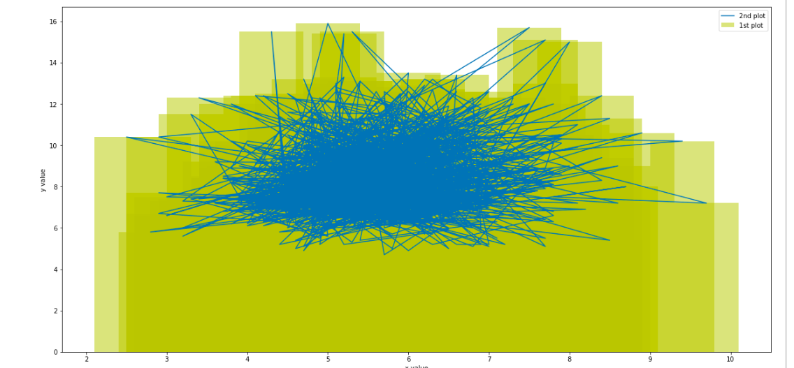
Solved by creating a new dataframe that sorts the order on the X and Y axes
```python
line_df = train_df.sort_values(by=["quality","fixed acidity"])
```
Recommended Posts