I made Togmarks, which allows the second year of junior high school to vote for their ideas in a week.
We have created a site called Togmarks where you can vote for ideas. I started making it on May 26th and released it on June 2nd. It's only been a week, but I think it's better than the previous Qua (with fewer features). This time, I would like to look back on the good points and worries as before.
Introduction
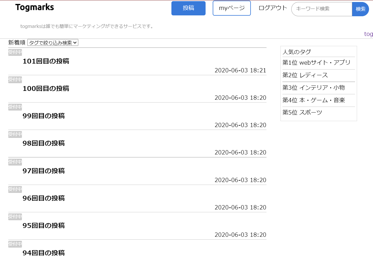
top page

I can't say it's really good because it was made by an amateur in a week, but I like the simple design with blue as the accent color.
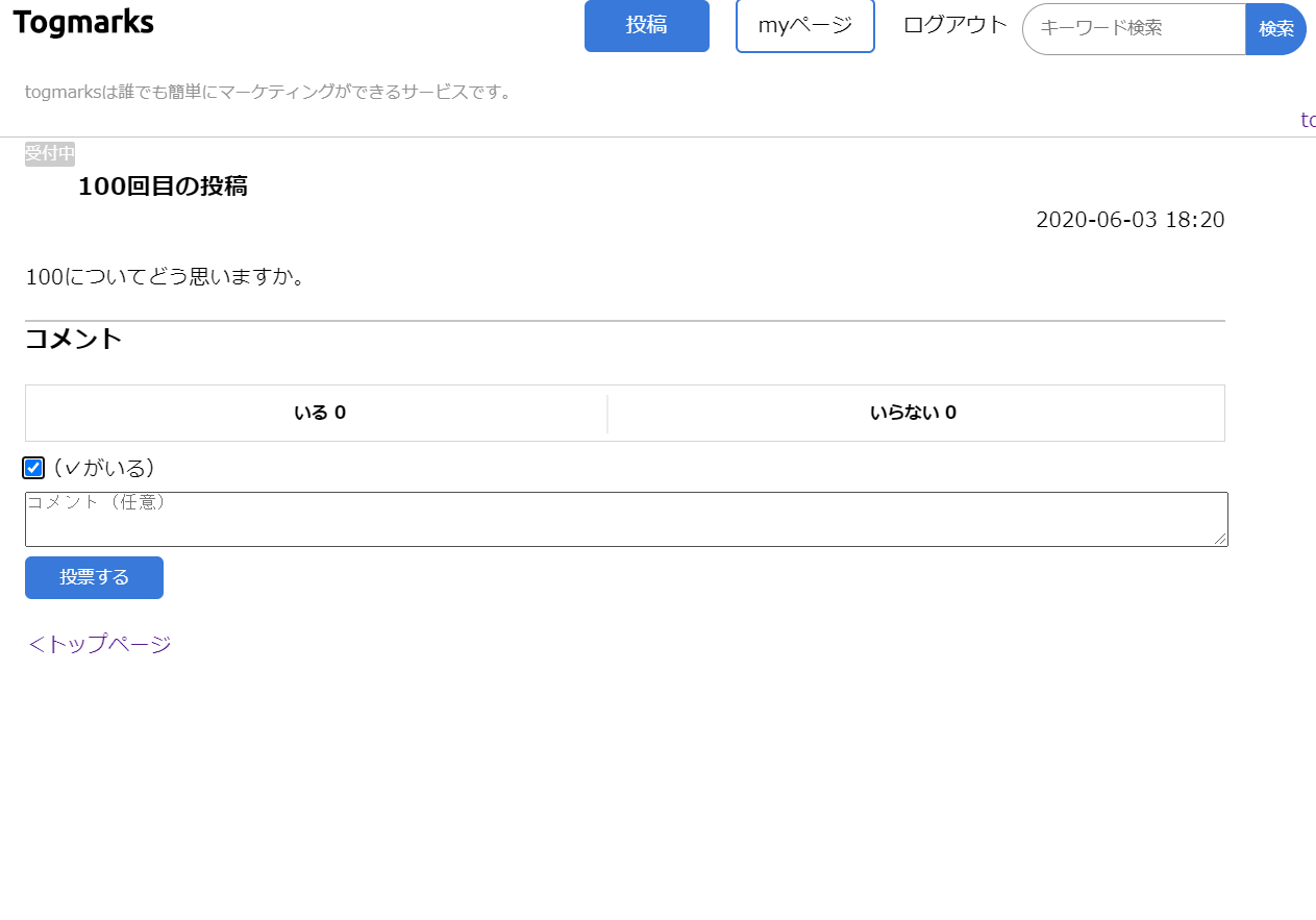
Voting screen

Don't worry about the title and content (laughs) Since it was just released, there were no posts and I had to create data with seed in the development environment (crying)
There are other pages, but I will omit them because they are similar to the top page and I do not comment.
Why i made
Even when I think of my own ideas, I often think, "I wonder if this will be used ... I want to hear the opinions of other people because it's okay for someone to do it ...". I think there are people who do it as a hobby individually. ' That's when I came up with this web app. To be honest, I don't know if there are people who think that this web app is also available, but if there are people who vote, I would like to use it myself.
The good point of this time
(1) We developed after solidifying the site map and database design ... It may be natural, but I didn't do that at all with Qua, so it was the first time I did it soberly. After all I felt that this kind of thing was important. (2) Separate the required functions from the desired functions ... If you put them together first, you will know what to do next, so it will be smooth. ③ I was able to reduce the css code ... Actually, it was the best point for me. Css tends to be long if it is separated from the design for smartphones and PCs, but this time I think that it was possible to minimize it by using the same class many times. ④ I have never had any technical problems ... I think it is because the function and design have been simplified.
What I was worried about
① Money ・ ・ ・ Logo and illustration stand. There is no reason to pay middle 2. Eventually I decided to go without it. However, I'm lonely without a favicon, so one day I'll look for a free one and set it up. (2) Will it be used? I'm worried that there are people who use it, as everyone thinks. However, nothing can be done without surviving this.
Finally
What surprised me most while developing this web app was the speed of development. This may be normal, but I thought that it would be possible to make it in a week with only basic functions. I mentioned it only at the beginning, but I wonder if this app was made in a week. I think it's reasonable for me. This is the second app, but I don't want to register anyone ... I would like everyone.
https://togmarks.herokuapp.com/
Recommended Posts