[PYTHON] matplotlib gallery and color map
You can use the data visualization library matplotlib for visualization that can withstand print quality. I have used it extensively in the article until now. Depending on your ingenuity, you can draw a wide variety of shapes. Take a look at the Online Gallery to see what kind of illustrations are possible.
Thumbnail gallery http://matplotlib.org/gallery.html
Today, I would like to select some interesting illustrations from this at my own discretion.
3D pie chart
pie_and_polar_charts http://matplotlib.org/examples/pie_and_polar_charts/pie_demo_features.html
pylab_examples http://matplotlib.org/examples/pylab_examples/pie_demo2.html
Speaking of 3D pie charts, You can win the first place in the graph ranking that you should kill In a sense, it's wonderful. Although it is visualization, you can also make such an illustration by using matplotlib.
If you describe the reason why it is not good just in case, it is easy to misunderstand because the ratio of the items located on the lower side seems to be larger than the items located on the left and right due to the optical illusion.
As you can see, the source code is also posted on the official website, so it is convenient to make such an illustration as well, destroying the reader's sensibility.
Box plot
statistics http://matplotlib.org/examples/statistics/boxplot_demo.html
This is a box plot that visualizes the basic and summary statistics in the basics of statistics. Since looking at the representative value is the basis of analysis, it can be said that it is a representative of frequently used graphs.
You can optionally display the average and customize the shape of the box. Since the source code is also posted including variations, it is useful when applying it.
Objects you don't know what to use
shapes_and_collections http://matplotlib.org/examples/shapes_and_collections/artist_reference.html
You can place graphic objects such as arrows and circles. These are called patches. You can also draw a picture with a patch.
I haven't faced the case of actually using this, but maybe there is an application example.
Color map reference
color example http://matplotlib.org/examples/color/colormaps_reference.html
matplotlib provides several colormaps by default. By using this, for example, if you specify Greens, you can draw bar graphs and various charts with a green gradation as a whole.
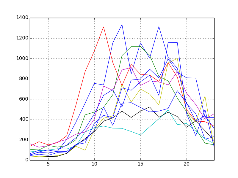
- Dashed line chart drawn normally
- Dashed line chart with green color map
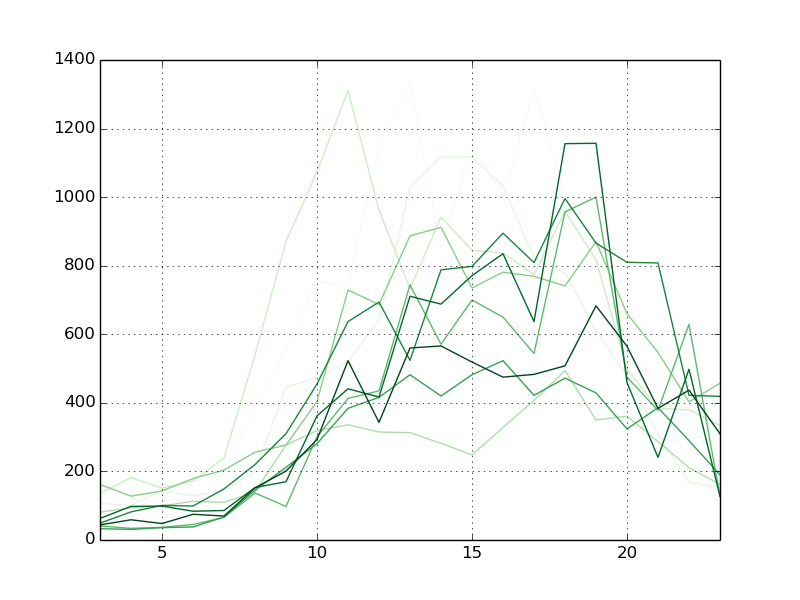
By changing the colors in this way, it is possible to support black-and-white printing and to make the colors easy on the eyes. Various graphs of the past also changes the impression unexpectedly when you try changing the hue. It's a good idea to know what [colormaps] you have (http://matplotlib.org/examples/color/colormaps_reference.html).
Summary
This time, I was talking about exploring the online gallery of matplotlib. There are other illustrations that are of interest to you, so take a look.
Recommended Posts