[PYTHON] Get data from Poloniex, a cryptocurrency exchange, via API and use deep learning to forecast prices for the next day.
Introduction

Ladies and gentlemen, Hello. I'm Yoshizaki (Twitter: @yoshizaki_kkgk), CEO of Kikagaku Co., Ltd.
Let's do something interesting on our holiday after a long absence! This article came up with the idea. We hope that this article will give readers a better understanding of the data analysis approach.
Surprisingly the response!
Last time, I wrote an article for beginners to get data from Liqui on the cryptocurrency exchange via API. Previous article: Let's get information from the API of the virtual currency exchange Liqui with Python
How I wrote this article
Of course, there was a response from the previous article, but we are holding a "** Artificial Intelligence / Machine Learning De-Black Box Seminar ** As the next step, we received many questions from the students participating in "/ seminars /)", such as "How should I study?", And handed it over as the next step. I wanted to write a technical article that I could give you.
I thought that what kind of technical article should be written to respond to the voices of the students, and I was looking for something that could satisfy the following.
--Full-scale data can be easily obtained → ** Virtual currency ** --Enjoy with visualization and data processing → ** Time series data ** ――You can practice cutting-edge techniques → ** Deep learning **
And
** Hopefully there are benefits **
With that in mind, we decided to introduce the most advanced time-series analysis methods based on virtual currencies.
This goal
I often see articles such as building an environment or acquiring data, but I always want to read the articles that explain from the beginning to the end **, so for myself I will write an article that I find interesting for other people as well.
-** Build an environment to use Poloniex API with Python ** --Get ** Poloniex ** data via API -Load data into ** Pandas ** and calculate the moving average -** Visualize your data with Matplotlib ** -** Multiple regression analysis ** predicts next day prices -Predict the next day's price with ** RNN (LSTM) ** using ** Chainer **
In conclusion, there is still room for improvement in predictions using deep learning! However, I will write in this article to the level where I can enter into the discussion of trial and error. There is a great need for price / demand forecasting for virtual currencies, but I hope you will experience that it is still difficult.
Also, I improved this method and got relatively good results! If so, please let me know! → Yoshizaki (Twitter: @yoshizaki_kkgk)
Building an environment to use Poloniex API in Python
Python environment construction
First of all, if you haven't installed Python on your PC, please follow the steps in the article below. We have had hundreds of people go to the seminar hosted by our company so far, but it is a setting procedure with almost no errors.
Please note that the setting procedure is different between Windows and Mac.
・ For Windows [Definitive Edition] Building an environment for learning "machine learning" using Python on Windows
・ For Mac [Definitive Edition] Building an environment for learning "machine learning" using Python on Mac
Install Poloniex module
Let's open ** Jupyter Notebook ** first.
If you execute the following command in the terminal (command prompt / Windows Powershell), the environment that can be executed via the browser will be launched.
jupyter notebook
In fact, with Jupyter Notebook, you can install with pip, so it is convenient because you do not have to open the terminal each time.
Use pip for Windows and pip3 for Mac.
- I am using
pip3because I am working on a Mac.
Please note that when using pip in Jupyter Notebook, you need to add! At the very beginning.
# python-Installation of poloniex
!pip3 install https://github.com/s4w3d0ff/python-poloniex/archive/v0.4.6.zip
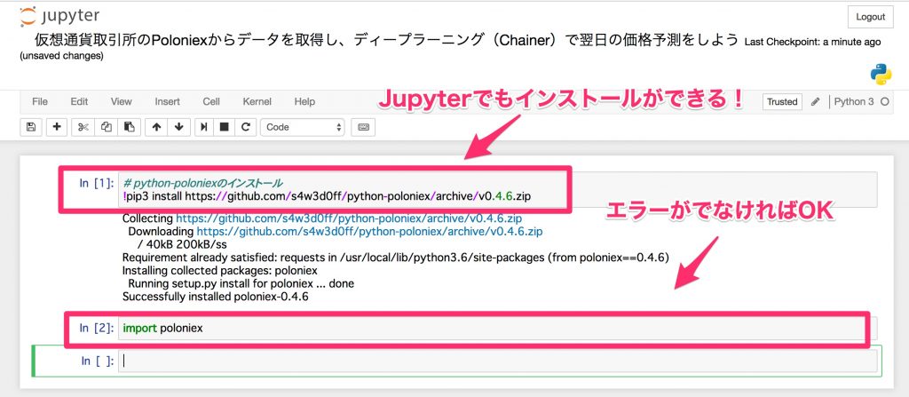
After installation, import it and check if it is installed correctly.
import poloniex
Now you are ready to get the data from Poloniex via API.
Actually, in Poloniex's API, you can get the data by hitting the URL, but the interface for Python that makes it even easier to use is python-poloniex installed this time.
These things, which have the same functions but are easy for humans to use (wrap), are called wrappers, and in the programming industry, these things are often made and published.
Get Poloniex data via API
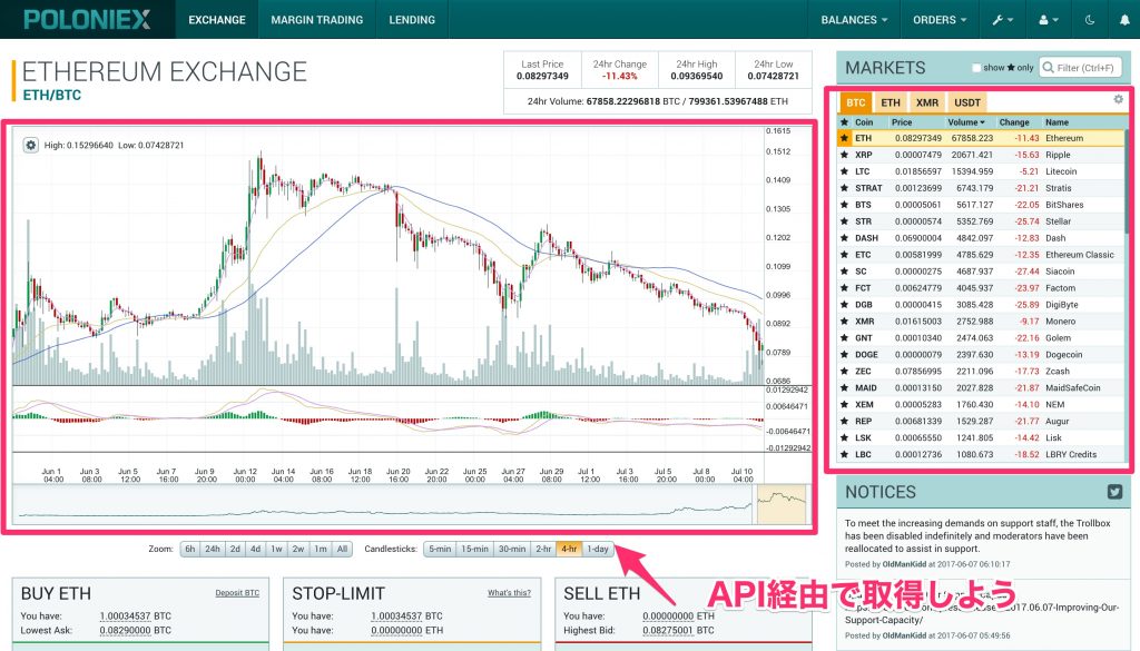
Data acquisition
Now, let's get the data of Poloniex, which is the main subject. With Poloniex, you can get data for several years at once, so you can access past data without having to save it yourself, which is a very nice environment for prototype level analysis.
Thanks to the Poloniex wrapper, you can get the data with a single command line like this: Adjust the sampling interval and the number of days as needed.
import time

#Preparing the poloniex API
polo = poloniex.Poloniex()

#Read 100 days at 5 minute intervals (sampling interval 300 seconds)
chart_data = polo.returnChartData('BTC_ETH', period=300, start=time.time()-polo.DAY*100, end=time.time())
Unfortunately, you can only read the source code written on GitHub for the values to be entered in the sampling interval and the number of days (especially the sampling interval).
If you read the source code in this, you will find the following comments.
def returnChartData(self, currencyPair, period=False, start=False, end=False):
    """ Returns candlestick chart data. Parameters are "currencyPair",
    "period" (candlestick period in seconds; valid values are 300, 900,
    1800, 7200, 14400, and 86400), "start", and "end". "Start" and "end"
    are given in UNIX timestamp format and used to specify the date range
    for the data returned (default date range is start='1 day ago' to
    end='now') """
That is, the period includes 300 (5 minutes), 900 (15 minutes), 1800 (1 hour), 7200 (4 hours), 14400 (8 hours), 86400 (12). Time) can be specified.
Also, although it is not in this comment, if you want to set the period to one day interval, you can set it to polo.DAY.
When I checked the data acquired this time, the data was stored in the following format.
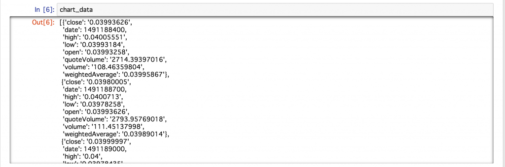
It seems that the above data is stored in the dictionary type for each sampling time. As it is, it is difficult to handle it as data, so let's extract the data efficiently using Pandas, which is convenient for database operations.
Load data into Pandas and calculate the moving average
Load data into Pandas
When working with data in Python, Pandas is definitely useful (operability + many reference articles). You can also use Jupyter Notebook to visualize the table easily and neatly.
Loading data into Pandas is easy.
In particular, if you have data labels and values for each sampling time, like this one, you can just use Pandas's DataFrame to load them.
#Import pandas
import pandas as pd

#Import data into pandas
df = pd.DataFrame(chart_data)
As many of you may already know,
ModuleNotFoundError: No module named 'pandas'
If you get an error saying that there is no module called pandas like
!pip3 install pandas # !Can be installed in Jupyter Notebook with
If you install it like this, you can use it immediately (or pip).
Now let's display the first 10 lines.
df.head(10)

** Excellent! ** **
You can easily read the data with just one command, and you can check the data in a very beautiful format, so the data analysis work will be quick! Thank you Pandas!
By the way, for example, if you want to extract data only for the close column, you can extract it just by naming the column as df ['close'], which is very easy.

Let's calculate the moving average
Pandas also makes it easy to calculate the ** moving average **.
This time, the window width for calculating the average as the short-term line was set to 1 day, and the window width for calculating the average for the long-term line was set to 5 days. The source code for calculating the moving average is as follows.
#Short-term line: Window width 1 day (5 minutes x 12 x 24)
data_s = pd.rolling_mean(df['close'], 12 * 24)

#Long-term line: Window width 5 days (5 minutes x 12 x 24 x 5)
data_l = pd.rolling_mean(df['close'], 12 * 24 * 5)
This completes the calculation (easy!). If this is the case, you can try changing the window width in various ways!
Now, let's plot the moving average calculated this time because it is difficult to understand the change only by the numerical value.
Visualize your data with Matplotlib
Let's use it first
Matplotlib is also a well-known module (library) for visualizing Python. Seeing is believing! Let's plot including the moving average mentioned earlier!
#Load matplotlib (install with pip or pip3 if an error occurs)
import matplotlib.pyplot as plt

#The simplest plot
plt.plot(df['close'])
plt.show()

Oh! A time-series graph like that was displayed.
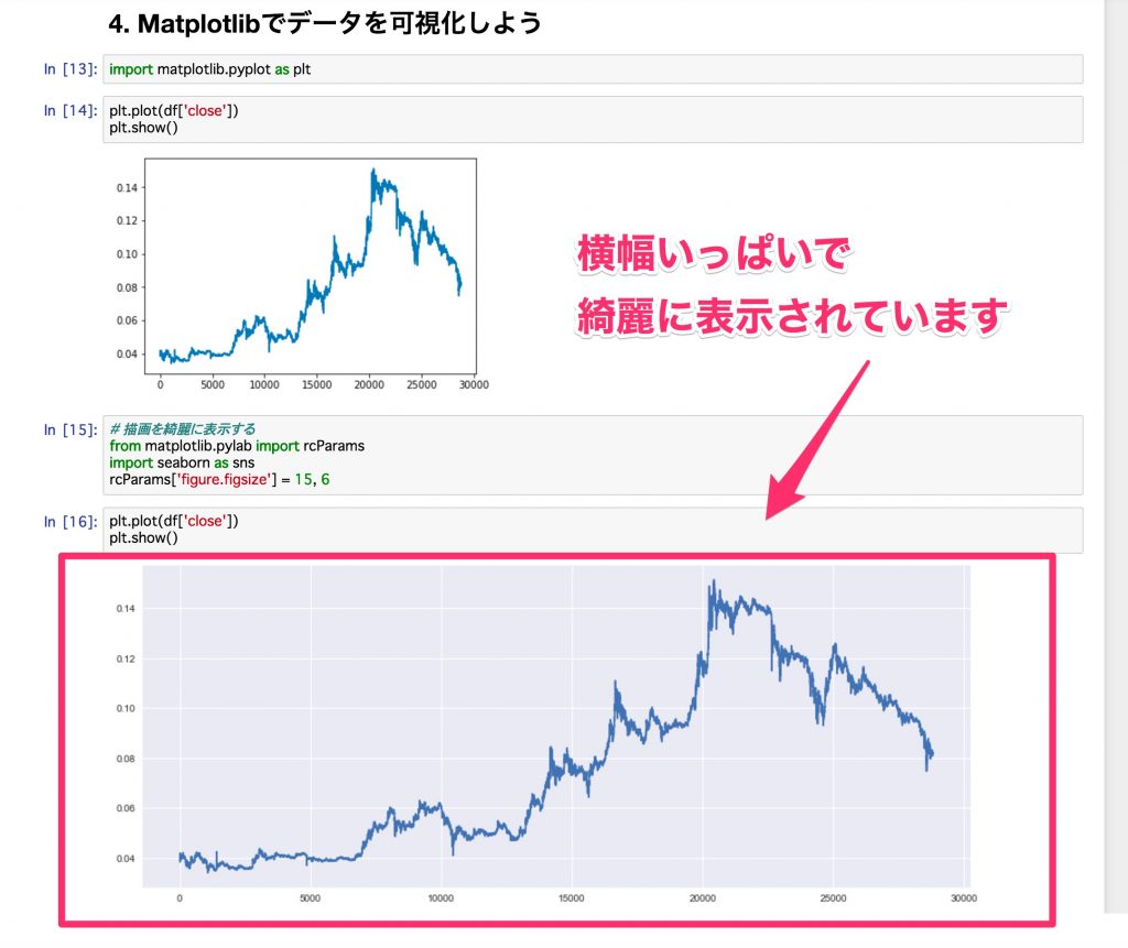
Clean up your plot with Seaborn
We will use Seaborn, a wrapper for Matplotlib, which can make plots in Matplotlib even cleaner. Also, if you set the width to fill the screen, it will be easier to see, so if you change this setting a little with copy and paste, it will be easier to analyze.
#Display the drawing neatly
from matplotlib.pylab import rcParams
import seaborn as sns
rcParams['figure.figsize'] = 15, 6
Let's plot the previous data here.

The width is full, grid lines are included, and the background is colored, so it feels like it has become beautiful. Looking at the Jupyter Notebook, the difference is obvious like this.
The background color etc. can be changed on the Seaborn side, so if you are interested, please refer to the following article.
Reference: Introduction to Seaborn, a Python library that makes it easy to draw beautiful graphs
Let's change the color of the plot
With Matplotlib, changing colors is also very easy. You can use the name of the color (for example, blue or red) in the color option, and if you are particular about beautiful colors, you should specify it in the format of hexadecimal # .....
#Let's specify the color of the plot (color)
plt.plot(df['close'], color='#7f8c8d')
plt.show()

In this way, the color has changed. This time's color is selected from this Flat UI Colors.
Reference: flat ui colors
Let's plot the short-term line and the long-term line
In Matplotlib it's also very easy to plot multiple lines, just declare what you want to display and finally plt.show () and you're done.
Now, let's plot the short-term line and long-term line that were calculated on the Pandas side as well.
#Short-term and long-term lines are also plotted
plt.plot(df['close'], color='#7f8c8d')
plt.plot(data_s, color='#f1c40f')  #Short-term line
plt.plot(data_l, color='#2980b9')  #Long-term line
plt.show()

I can plot it nicely! Now you can visually judge not only the numerical value but also how wide the window width should be for the short-term line and the long-term line!
With Pandas and Matplotlib, it's really amazing to be able to analyze this in just a few lines, and it's a loss if you don't know.
So, so far, we have acquired the data, ** simple aggregation **, and then ** visualization **. From here, we will introduce data analysis methods that make full use of advanced machine learning (the main technology of artificial intelligence).
This area is dealt with more deeply in our ** System Automation Seminar **, so if you are interested, please do!

Predict the next day's price with multiple regression analysis
Prerequisites for working with time series data
Then, I think that many people are wondering if the price can be predicted by machine learning technology, so let's look at it in a practical format.
** In time series data (data that fluctuates at each time) **, there are many tests such as what kind of characteristics it has as a prerequisite for analysis, and it is necessary to clear these characteristics in the first place. Many theories such as are discussed.
Of course, I think that you should check it one by one, but it is not the essence of this time to see these small properties, but can you really predict the price by machine learning? ?? First of all, I would like to know the conclusion, so let's leave a little discussion about the nature of this data this time.
For those who want to dig deeper into this property, the following articles are recommended because they are detailed about various characteristics. Reference: [Important points that beginners of time series data analysis should know-Regression analysis / Correlation analysis must be done before performing correlation analysis (checking and transforming data shape)](http://qiita.com / HirofumiYashima / items / b6dabe412c868d271410)
Let's predict the price immediately after
Then, first, in machine learning, we will associate the relationship between the input variable X and the output variable y.
- In the program, the teacher data of the output variable is
t, and the predicted value of the output variable isy.
When making a prediction based on time series data, it is first necessary to consider what kind of input variables and output variables the current data should be separated into. This time, the price we want to predict (output variable y) is the price after 5 minutes, and the factor used for the prediction (input variable X) is the latest 30 samples (5 minutes x 30 data).
In many cases, it is divided in this way, but in reality it is not simple time series data, but it is often the case that the difference is taken or the logarithm of the difference is taken, but trial and error around that is the next step. Let's do it.
#Reading numpy, which is often used in linear algebra operations
import numpy as np

#Since it is received as a character string (String type) via API, convert it to float type.
#Also, Chainer recommends float32, so match it here.
data = df['close'].astype(np.float32)

#Divide the data into input variable x and output variable t
x, t = [], []
N = len(data)
M = 30 #Number of input variables: Use the last 30 samples
for n in range(M, N):
    #Separation of input variables and output variables
    _x = data[n-M: n] #Input variables
    _t = data[n] #Output variables
    #List for calculation(x, t)Will add to
    x.append(_x)
    t.append(_t)
Also, when using it in later analysis, it is convenient to store the data in numpy format, such as checking the size, so convert the data.
#Convert to numpy format (because it's convenient)
x = np.array(x)
t = np.array(t).reshape(len(t), 1)  #reshape is a measure to prevent errors in Chainer later
Divide into training data (train) and verification data (test)
In machine learning, make a model and you're done! Instead, it is divided into two data in order to confirm (verify) how accurate the created model is.
-** Training data (train) : Data for training the model - Verification data (test) **: Data for checking the accuracy by matching the answers
- As a further development, there is a case where the data is divided into three to determine the parameters that should be determined manually within the method called hyperparameters.
First of all, let's be able to firmly verify the created model by dividing this training data and verification data into two parts. This time, the training data will be 70% of the total and the verification data will be 30% of the total.
# 70%For training, 30%For verification
N_train = int(N * 0.7)
x_train, x_test = x[:N_train], x[N_train:]
t_train, t_test = t[:N_train], t[N_train:]
If you take advantage of Python's list carving feature, you can easily split your dataset as described above.
Learn a model for multiple regression analysis
In Python, ** Scikit-learn ** is a standard for machine learning. If you are not particular about the cutting edge, almost all methods are implemented here, and above all, the interface for operation is very good, so it is recommended.
Now let's implement model training using Scikit-learn (sklearn in the program).
# scikit-learn linear_load model
from sklearn import linear_model

#Declaration of multiple regression analysis model
reg = linear_model.LinearRegression()

#Model learning using training data
reg.fit(x_train, t_train)
Yes. That's it!
All you have to do is declare the model, pass the training data to the model and fit.
It's easy enough to beat, but I'm very grateful that this simple chord reduces mistakes on the human side.
When data analysis does not work, it is often difficult to tell whether the data is bad or the program is bad, and by using such a library, you can reduce your own responsibility (program mistake), so factor analysis Can proceed smoothly.
Validate the model
Let's verify the accuracy using the verification data above. As an index of accuracy, we use an index called the coefficient of determination, which is calculated between 0 and 1 (strictly speaking, it also takes a minus). Roughly speaking, 1 is the best, 0 is out of the question (although the expression is too extreme).
Also, when verifying, let's look at the value of the coefficient of determination not only for the verification data but also for the training data. Ideally, a good model is good if the two values are comparable and accurate.
You can use score to calculate the coefficient of determination.
#Training data
reg.score(x_train, t_train)

#Training data
reg.score(x_train, t_train)

As mentioned above, the value ** is very close to ** 1, and I imagine the following story development.
Welcome to rich
"Oh! I think this can be predicted with insanely good accuracy! You may be very rich from tomorrow." "I have to think about tax-saving measures because I can make a profit from investment." "Let's start real estate with an apartment around here. Alright, let's buy a million dollars."
Visualize results
Now, let's plot the measured value and the predicted value with the expectation that the coefficient of determination was a very good value.
First, plot the measured value (blue) and predicted value (orange) for the training data.
#Training data
plt.plot(t_train, color='#2980b9')  #The measured value is blue
plt.plot(reg.predict(x_train), color='#f39c12')  #Predicted value is orange
plt.show()

You can see that the two data overlap very well and are almost the same (expected value further increased). However, since this is the data used for training, it is natural that it is working well. The main subject is the result for the validation data.
Now, for the verification data, plot the measured value (blue) and the predicted value (orange).
#Validation data
plt.plot(t_test, color='#2980b9')  #The measured value is blue
plt.plot(reg.predict(x_test), color='#f39c12')  #Predicted value is orange
plt.show()

Oh! This is also exactly overlapping! Great! Too wonderful! This may have confirmed the rich man.
Everyone, see you next time in Dubai.
Fall from a rich man who was too early
Actually, this seems to be working very well, but it's not really working at all. Unfortunately, Dubai is likely to be a little further ahead. Ah, a million dollars ... lol
To explain what that means, let's look at a portion of the validation data, not the whole.
When extracting a part, it is OK if you specify the range with plt.xlim ().
#Let's take a look at a part for verification
plt.plot(t_test, color='#2980b9')  #The measured value is blue
plt.plot(reg.predict(x_test), color='#f39c12')  #Predicted value is orange
plt.xlim(200, 300)  #Some of the features are easy to understand
plt.show()

Actually, it seems that the prediction is good at first glance, but you can see that the predicted value (orange) is simply deviated by one sample from the measured value (blue). ..
In short, I thought that some plausible value was obtained by prediction after learning by machine learning, but I just output the value one sample before as the predicted value, and it was not a method that used my head at all. If the value 5 minutes ago is used as the predicted value, a plausible value will surely come out, and the coefficient of determination will be calculated high.
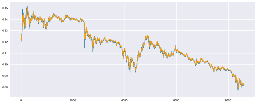
When I changed this to the prediction after 1 day instead of the prediction after 5 minutes, such a result was obtained.
- Everyone, please try this program.

This is a prediction for the training data, but the result is very remarkable that the prediction value only shifted the data by one day (1 sample x 12 x 24 = 288 samples in 5 minutes).
This may be the reason why it is said that demand forecasting is very difficult to achieve by data analysis.
Why is this happening?
Many machine learning techniques allow for better fitting by adjusting values called parameters in the model to reduce the error throughout. And, in time series data like this time, a phenomenon called ** random walk ** occurs, which raises the difficulty of parameter adjustment.
What this means is that the probability of the price going up or down in the next sample is 5: 5 compared to the previous sample. Considering 5: 5 on average (expected value), the answer of honor student machine learning is to think that ** the next price will neither rise nor fall **. As a result, it is the theory that it is best to reflect the value of the previous day as it is in the value of the next day.
In machine learning, this reasoning is derived purely from the data and reflected in the predicted value.
As a test, looking at the price difference from the previous day, the histogram is as follows.
#Take the difference from the previous sample
t_diff = t[:-1] - t[1:]

#seaborn distroplot is convenient
sns.distplot(t_diff)
plt.show()

The width of the bin is a little wide, so let's take a closer look. Also, the plotted lines (results of kernel density ratio estimation) are not needed, so let's delete them.
#Increase the number of bins, kde(Gaussian kernel density ratio estimation)Plot off
sns.distplot(t_diff, bins=3000, kde=False)
plt.xlim(-0.00075, 0.00075)
plt.ylim(0, 750)
plt.show()

The right half of 0 is the number of times the price has risen from the previous day, and the left half of 0 is the number of times the price has fallen from the previous day. As you can see, it is distributed symmetrically around 0. Therefore, it is a 5: 5 ** random walk ** whether it goes up or down. Note: There are various statistical test methods for determining random walkability, not visually, so if you are interested, please check it out.
What should i do?
Machine learning methods such as multiple regression analysis assume that ** data is generated independently from the true distribution at each time of day ** in the first place. In other words, it is assumed that ** the data at the previous time does not affect the data at the next time ** (it should be randomly generated from the true distribution).
For example, when it comes to estimating rent, the first sample contains the conditions for Mr. A's house (distance from the station, the size of the room), and the second sample contains the conditions for Mr. B's house. However, in particular, Mr. A's house does not have a relationship with Mr. B's house (it is generated independently).
Therefore, in the case of time series analysis where the data of the previous time has a great influence, the assumptions are different in the first place, so naturally it should not work.
The Hidden Markov Model was the one that wanted to model this property. The detailed explanation is omitted because the following article explains it in a wonderful and easy-to-understand manner, but in short, ** I made a mechanism that can predict even if the previous data affects the next data **. ..
Reference: Time series data: Hidden Markov model basics and recurrent net stand, etc.
And it is also implemented in deep learning, which has been booming in recent years, ** Recurrent Neural Network **, so-called ** RNN **.
So, at the end of this article, I would like to conclude by introducing the modeling using this ** RNN **.
Predict next day prices with RNN (LSTM) using Chainer
What is Chainer?

** Chainer ** is a framework that can be used with ** Python **, which is specialized for ** deep learning (neural network) **, which is being developed by Japanese company ** Preferred Networks **. There are also TensorFlow provided by Google and Keras, its rapper, and I personally feel that many people in Japan use either of these.
** Chainer is originally made with an interface that is easy to learn **, and compared to other frameworks, it is very flexible when customizing deep learning development at the dissertation level ** I find it attractive that you can do it **.
The mechanism called ** Define by Run ** is a big difference from other frameworks such as Google's TensorFlow, and for beginners, ** you can check the numerical value and size during learning ** etc. ** The advantage is the ease of debugging ** (I heard directly from the Chainer developers). Certainly, ** how it behaves during learning and where the error is occurring ** is very important to the developer, so adopting this structure is ** a big advantage * I feel it is *.
Our company is the only official training company in Japan (as of July 27, 2017) to spread the Chainer technology of Preferred Networks, Inc. to society. To do. In addition, we are also collaborating with Microsoft to hold a deep learning hands-on seminar where you can learn how to accelerate the implementation of deep learning by Chainer on a GPU machine on Microsoft Azure, so if you like ** here ** Please take a look.

Let's predict with LSTM
Now, let's implement a method called ** LSTM (Long Short-Term Memory) **, which is often implemented in RNNs. There are various reasons, but since LSTMs are often introduced as RNNs, it is good to remember that RNN ≒ LSTM at first.
Load the required module
In Chainer, it is necessary to load various modules, and since you will get used to this area while using it, you can copy and paste it first. The ones used below are narrowed down to the minimum necessary, so it's a good idea to remember just the name.
import chainer
import chainer.links as L
import chainer.functions as F
from chainer import Chain, Variable, datasets, optimizers
from chainer import report, training
from chainer.training import extensions
Let's define a model of LSTM
Not to mention Chainer, if you are not familiar with how to use Python, you may find it difficult at first, but for the time being, we have included the L.LSTM section, so it is okay to have enough intervals to implement LSTM.
class LSTM(Chain):
    #Specify the structure of the model
    def __init__(self, n_units, n_output):
        super().__init__()
        with self.init_scope():
            self.l1 = L.LSTM(None, n_units) #Added LSTM layer
            self.l2 = L.Linear(None, n_output)

    #Reset the value held in the LSTM
    def reset_state(self):
        self.l1.reset_state()

    #Calculation of loss function
    def __call__(self, x, t, train=True):
        y = self.predict(x, train)
        loss = F.mean_squared_error(y, t)
        if train:
            report({'loss': loss}, self)
        return loss

    #Forward propagation calculation
    def predict(self, x, train=False):
        l1 = self.l1(x)
        h2 = self.l2(h1)
        return h2
After that, for those who are accustomed to Chainer, LSTM has a structure that holds the state internally, so use reset_state () to hold it in the internal state every time you learn. You need to reset the value you have.
It's okay to use this area, so let's study little by little.
Customize Updater for LSTM
This is the most stumbling point, and it is very difficult to make it yourself.
A new function called Trainer has been added to Chainer, and if you set the necessary information such as the model in advance, and then usetrainer.run (), learning will start automatically and the learning status. An easy-to-use function has been added, such as checking the progress of.
However, because the inside was black boxed in a good way, it became difficult to customize it by myself.
When using LSTM, it is necessary to execute reset_state () written at the beginning to initialize the state value for each learning loop, but training described in the official tutorial etc. When .StandardUpdater is used, reset_state () for each learning loop is not executed (obviously), and LSTM system learning cannot be performed well.
When I asked the developers of Chainer, they told me that there are two ways to solve it.
--Override the function of the update part of training.StandardUpdater and customize by yourself
--Write in Stateless LSTM
The latter method is difficult because the variables held internally are written and passed by oneself, and the former method will be used to solve the problem.
Create your own LSTMupdater that inherits training.StandardUpdater.
It was said that the update part is described in ʻupdate_core`, so override this function.
class LSTMUpdater(training.StandardUpdater):
    def __init__(self, data_iter, optimizer, device=None):
        super(LSTMUpdater, self).__init__(data_iter, optimizer, device=None)
        self.device = device

    def update_core(self):
        data_iter = self.get_iterator("main")
        optimizer = self.get_optimizer("main")

        batch = data_iter.__next__()
        x_batch, y_batch = chainer.dataset.concat_examples(batch, self.device)

        #↓ reset here_state()Allows you to run
        optimizer.target.reset_state()

        #Others are the same as the time series update
        optimizer.target.cleargrads()
        loss = optimizer.target(x_batch, y_batch)
        loss.backward()
        #Unchain in chronological order_backward()It seems that the calculation efficiency will increase
        loss.unchain_backward()
        optimizer.update()
Prepare training and validation data for Chainer
For the dataset used by Chainer, it is necessary to prepare data in the form of list or Numpy, and for each sample, it is necessary to summarize it into tuples with input and output and list it.
It will be difficult to write in sentences, but it is OK if you give it as list (zip (..., ...)).
It's hard to find a reference, so you may be wondering how to create your own dataset to use with Chainer, but this is the method recommended by Chainer developers.
#If the data set for chainer is enough to fit in memory, list(zip(...))Recommended
#↑ PFN developer recommended method
train = list(zip(x_train, t_train))
test  = list(zip(x_test,  t_test))
Also, in cases where the dataset does not fit in memory (eg, tens of thousands of image data), Chainer's TupleDataset can be used to efficiently load data into memory only when used in batches. It seems that it is implemented, so if you feel that the data size is large and slow, please use this.
About TupleDataset: https://docs.chainer.org/en/stable/reference/datasets.html
Preparation to Trainer
At this point, the preparation is complete, so set up to Trainer in the following flow.
--Model Declaration: Use the model you created --Definition of optimizer: Select an optimizer method and associate it with the model --Definition of iterators: Separate datasets by batch --Definition of updater: Summarize update rules, etc. --Definition of trainer: Summarize the settings related to training execution
Also, be sure to fix the seed with the following command at the very beginning and ** ensure reproducibility **. Be aware that if you forget this, the results will change between today and tomorrow, and you will get hurt when you try to report to your boss tomorrow.
#Ensuring reproducibility
np.random.seed(1)
Let's go through the above flow at once.
#Model declaration
model = LSTM(30, 1)

#Define optimizer
optimizer = optimizers.Adam()  #Optimization algorithm uses Adam
optimizer.setup(model)

#definition of iterator
batchsize = 20
train_iter = chainer.iterators.SerialIterator(train, batchsize)
test_iter = chainer.iterators.SerialIterator(test, batchsize, repeat=False, shuffle=False)

#definition of updater
updater = LSTMUpdater(train_iter, optimizer)

#definition of trainer
epoch = 30
trainer = training.Trainer(updater, (epoch, 'epoch'), out='result')
#trainer extension
trainer.extend(extensions.Evaluator(test_iter, model))  #Evaluation with evaluation data
trainer.extend(extensions.LogReport(trigger=(1, 'epoch')))  #Display the middle of the learning result
#Output loss for train data and loss for test data for each epoch
trainer.extend(extensions.PrintReport(['epoch', 'main/loss', 'validation/main/loss', 'elapsed_time']), trigger=(1, 'epoch'))
Execution of learning
Execution of learning starts with the following command.
trainer.run()

As mentioned above, it is displayed in ** interactive **, so it is very convenient to see the learning process at a glance.
This time, the above learning results are obtained, but the loss for the training data is decreasing, but the loss for the verification data is increasing rather than decreasing. Please try various trials and errors, such as trying ** dropout **.
Bonus: Model with added dropout
By the way, when adopting dropout, it is OK to make such a model.
class LSTM(Chain):
    def __init__(self, n_units, n_output):
        super().__init__()
        with self.init_scope():
            self.l1 = L.LSTM(None, n_units)
            self.l2 = L.Linear(None, n_output)

    def reset_state(self):
        self.l1.reset_state()

    def __call__(self, x, t, train=True):
        y = self.predict(x, train)
        loss = F.mean_squared_error(y, t)
        if train:
            report({'loss': loss}, self)
        return loss

    def predict(self, x, train=False):
        #Add dropout (use only during training)
        if train:
            h1 = F.dropout(self.l1(x), ratio=0.05)
        else:
            h1 = self.l1(x)
        h2 = self.l2(h1)
        return h2
When this dropout was added, the loss of validation also decreased steadily, so it seems that overfitting measures are necessary for such data.
Plot the results
Let's first look at training data.
#Predicted value calculation
model.reset_state()
y_train = model.predict(Variable(x_train)).data

#plot
plt.plot(t_train, color='#2980b9') #The measured value is blue
plt.plot(y_train, color='#f39c12') #Predicted value is orange
plt.show()

It seems that you can predict it to some extent.
Next, let's look at the verification data.
#Predicted value calculation
model.reset_state()
y_test = model.predict(Variable(x_test)).data

#plot
plt.plot(t_test, color='#2980b9')  #The measured value is blue
plt.plot(y_test, color='#f39c12')  #Predicted value is orange
plt.show()
It seems that the verification data can be predicted to some extent. I would like to evaluate this quantitatively, but the coefficient of determination mentioned earlier gives quite good results even if there is a time lag, so it is not reliable, so let's take a look.
Now let's look at what was purely off.
#Let's take a look at a part for verification
plt.plot(t_test, color='#2980b9')  #The measured value is blue
plt.plot(y_test, color='#f39c12')  #Predicted value is orange
plt.xlim(200, 300)  #Some of the features are easy to understand
plt.show()

Somehow, it seems that the problem of a simpler deviation than the previous multiple regression analysis has been solved. However, there is still a slight time lag, so it's not perfect.
Future outlook
This time, the goal was to use it roughly, so I plan to do trial and error from now on. We are planning to introduce the following trial and error if we have another chance.
--Consider prices other than virtual currency that correspond to input variables --Consider other indicators such as difference and logarithm of difference
Originally, it is said that features like the latter are automatically created as features in neural networks, but it does not seem to be so ideal, and it is understood as human know-how. It is said that it is better to add the feature amount obediently if it is a feature amount, so I think I should try this area as well.
in conclusion
I noticed that it was a very long article, but there are not many technical blogs that I went through from the beginning to the end, and I am happy to write a lot of things that I personally want to write, and this is for readers. I'm still happy if it helps.
The word data analysis sounds pretty, but it also requires engineering know-how such as acquiring and shaping such data, and mathematical consideration when building Chainer's LSTM. It's a tough and fun job to quickly absorb a wide range of knowledge, so please give it a try.
We look forward to your follow-up
We provide information on machine learning and artificial intelligence from a business perspective and recommended reference books.
Kikagaku Co., Ltd. (Official HP) President and CEO Ryosuke Yoshizaki
- Twitter:@yoshizaki_kkgk
- Facebook:@ryosuke.yoshizaki --Blog: Blog of Kikagaku representative
Until the end Thank you for reading.
Recommended Posts