[PYTHON] Kernel SVM (make_circles)
■ Introduction
This time, I will summarize a simple kernel SVM implementation.
[Target readers]
・ Those who want to learn simple code of kernel SVM
・ Those who do not understand the theory but want to see the implementation and give an image, etc.
■ Kernel SVM procedure
Proceed with the next 7 steps.
- Preparation of module
- Data preparation
- Data visualization
- Creating a model
- Model plot
- Output of predicted value
- Model evaluation
1. Preparation of module
First, import the required modules.
import numpy as np
import pandas as pd
import matplotlib.pyplot as plt
import seaborn as sns

from sklearn.datasets import make_circles
from sklearn.preprocessing import StandardScaler
from sklearn.model_selection import train_test_split
from sklearn.svm import SVC
from sklearn.metrics import roc_curve, roc_auc_score
from sklearn.metrics import accuracy_score, f1_score
from sklearn.metrics import confusion_matrix, classification_report
## 2. Data preparation This time, we will use the dataset called make_circles provided by sklearn.
First get the data, standardize it, and then split it.
X , y = make_circles(n_samples=100, factor = 0.5, noise = 0.05)

std = StandardScaler()
X = std.fit_transform(X)
In standardization, for example, when there are 2-digit and 4-digit features (explanatory variables), the influence of the latter becomes large. The scales are aligned by adjusting so that the average is 0 and the variance is 1 for all features.
X_train, X_test, y_train, y_test = train_test_split(X, y, test_size = 0.3, random_state=123)

print(X.shape)
print(y.shape)
# (100, 2)
# (100,)

print(X_train.shape)
print(y_train.shape)
print(X_test.shape)
print(y_test.shape)
# (70, 2)
# (70,)
# (30, 2)
# (30,)
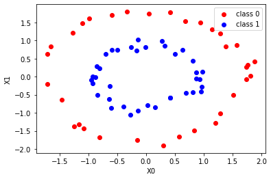
3. Data visualization
Let's look at the data plot before binary classification in the kernel SVM.
fig, ax = plt.subplots()

ax.scatter(X_train[y_train == 0, 0], X_train[y_train == 0, 1], c = "red", label = 'class 0' )
ax.scatter(X_train[y_train == 1, 0], X_train[y_train == 1, 1], c = "blue", label = 'class 1')

ax.set_xlabel('X0')
ax.set_ylabel('X1')
ax.legend(loc = 'best')

plt.show()
Features corresponding to class 0 (y_train == 0) (X0 is the horizontal axis, X1 is the vertical axis): Red
Features corresponding to class 1 (y_train == 1) (X0 is the horizontal axis, X1 is the vertical axis): Blue
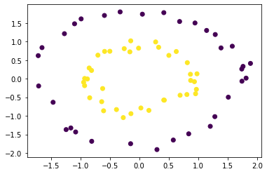
 The above is a bit verbose code, but it can be concise and short.
plt.scatter(X_train[:, 0], X_train[:, 1], c = y_train)
plt.show()
4. Creating a model
Create an instance of the kernel SVM and train it.
svc = SVC(kernel = 'rbf', C = 1e3, probability=True)
svc.fit(X_train, y_train)
Since linear separation (separation by one straight line) is already impossible this time, kernel ='rbf' is set in the argument.
C is a hyperparameter that you adjust yourself while looking at the output values and plots.
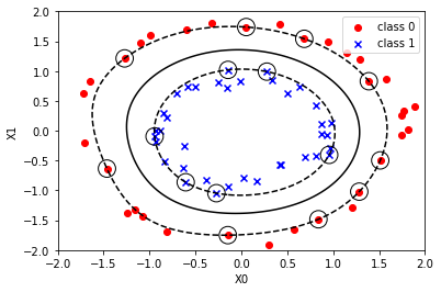
5. Model plot
Now that you have a model of the kernel SVM, plot it and check it.
The first half is exactly the same as the scatter plot code above. After that, it's a little difficult, but you can plot other data just by pasting it as it is. (Some fine adjustment is required)
fig, ax = plt.subplots()

ax.scatter(X_train[y_train == 0, 0], X_train[y_train == 0, 1], c='red', marker='o', label='class 0')
ax.scatter(X_train[y_train == 1, 0], X_train[y_train == 1, 1], c='blue', marker='x', label='class 1')

xmin = -2.0
xmax = 2.0
ymin = -2.0
ymax = 2.0

xx, yy = np.meshgrid(np.linspace(xmin, xmax, 100), np.linspace(ymin, ymax, 100))

xy = np.vstack([xx.ravel(), yy.ravel()]).T
p = svc.decision_function(xy).reshape(100, 100)
ax.contour(xx, yy, p, colors='k', levels=[-1, 0, 1], alpha=1, linestyles=['--', '-', '--'])

ax.scatter(svc.support_vectors_[:, 0], svc.support_vectors_[:, 1],
           s=250, facecolors='none', edgecolors='black')

ax.set_xlabel('X0')
ax.set_ylabel('X1')

ax.legend(loc = 'best')

plt.show()
6. Output of predicted value
With the created model, we will give the predicted value of the classification.
y_proba = svc.predict_proba(X_test)[: , 1]
y_pred = svc.predict(X_test)

print(y_proba[:5])
print(y_pred[:5])
print(y_test[:5])

# [0.99998279 0.01680679 0.98267058 0.02400808 0.82879465]
# [1 0 1 0 1]
# [1 0 1 0 1]
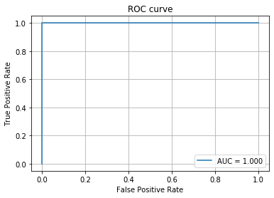
## 7. Performance evaluation Use the ROC curve to find the value of AUC.
fpr, tpr, thresholds = roc_curve(y_test, y_proba)
auc_score = roc_auc_score(y_test, y_proba)
plt.plot(fpr, tpr, label='AUC = %.3f' % (auc_score))
plt.legend()
plt.title('ROC curve')
plt.xlabel('False Positive Rate')
plt.ylabel('True Positive Rate')
plt.grid(True)

print('accuracy:',accuracy_score(y_test, y_pred))
print('f1_score:',f1_score(y_test, y_pred))

# accuracy: 1.0
# f1_score: 1.0
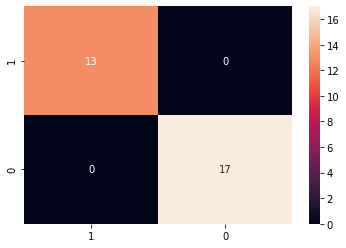
classes = [1, 0]
cm = confusion_matrix(y_test, y_pred, labels=classes)

cmdf = pd.DataFrame(cm, index=classes, columns=classes)

sns.heatmap(cmdf, annot=True)
print(classification_report(y_test, y_pred))

'''
              precision    recall  f1-score   support

           0       1.00      1.00      1.00        17
           1       1.00      1.00      1.00        13

    accuracy                           1.00        30
   macro avg       1.00      1.00      1.00        30
weighted avg       1.00      1.00      1.00        30

'''
■ Finally
Based on the steps 1 to 7 above, we were able to create a kernel SVM model and evaluate its performance.
We hope that it will be of some help to beginners.