[PYTHON] Beginner Kmeans
Now, let's try Kmeans easily.
Library
This is what I imported
from random import randint

from sklearn.cluster import KMeans
from sklearn.decomposition import PCA
import numpy as np

import matplotlib.pyplot as plt
I wanted a random number to generate the dataset, so randint I'm using PCA to plot the data because I wanted the 3D features to be 2D.
Data preparation
This time, as a data set, RGB values are generated with random numbers.
def create_data(num):
    data = np.empty((0,3), int)
    for i in range(num):
        red = randint(0,256)
        blue = randint(0,256)
        green = randint(0,256)

        data = np.append(data, np.array([[red,blue,green]]), axis=0)

    return data

data = create_data(100)
We use a function that creates a dataset of arbitrary size with create_data (
Clustering
The generated data is classified by the Kmeans model.
# kmeans clustering
CLUSTERS = 3
N_JOBS = 2

model = KMeans(n_clusters=CLUSTERS, n_jobs=N_JOBS).fit(data)

print(model.labels_)
This time, clustering is performed with 3 clusters. N_JOBS indicates the number of CPU cores used. The cluster number of each data is listed in model.labels_.
Result output
Since we want to output as a 2D image this time, we will reduce the 3D features to 2D by principal component analysis. be able to.
Dimensionality reduction
#Make 3D features 2D
pca = PCA(n_components=2)
pca.fit(data)
pca_data = pca.fit_transform(data)
You can specify how many dimensions to reduce with n_components. The reduced data is stored in pca_data.
Actual plot
color = ["red", "blue", "green"]

#Plot of clustering results
plt.figure()
for i in range(pca_data.shape[0]):
    plt.scatter(pca_data[i,0], pca_data[i,1], c=color[int(model.labels_[i])])

#Raw data plot
plt.figure()
for j in range(pca_data.shape[0]):
    color = tuple((round(data[j][0]/256, 3), round(data[j][1]/256, 3), round(data[j][2]/256, 3)))

    plt.scatter(pca_data[j,0], pca_data[j,1], c=color)

plt.show()
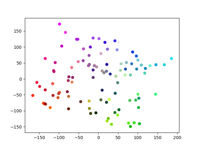
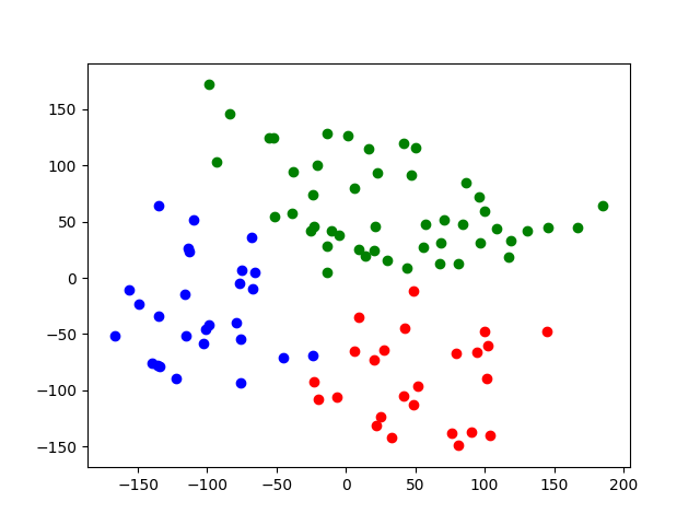
First, the clustering results are plotted. Since the first dimension of the data after dimension reduction is x and the second dimension data is y, and model.label_ has classes 0 to 2, the list color corresponds to the class number. In the second plt.figure (), the raw data is plotted in the same color. However, the problem is that in the plt plot, the RGB values must be 0 to 1, so the original RGB values are divided by 256. After that, it is rounded to the third decimal place.
The result of the actual plot is
Raw data

Clustering result

This time, we were able to cluster relatively neatly.
Summary
This time, I tried Kmeans using colors for easy understanding. Since it was simple data, we were able to cluster it neatly.
Source Code https://github.com/sasayabaku/Machine-Learning/blob/master/Kmeans/color_kmeans.ipynb
Recommended Posts