[PYTHON] Combine correspondence analysis and association analysis (attribute-specific feature extraction association plot)
Introduction
"Visualization of Questionnaire Results by Association Rules Using Correspondence Analysis", which was published in [Theory and Application of Data Analysis, Vol. Can it be used for other than questionnaires? I thought that I tried it with Python. It also serves as a practice for networkx. A style that exposes the fucking code that seems to have been written down.
Rough description
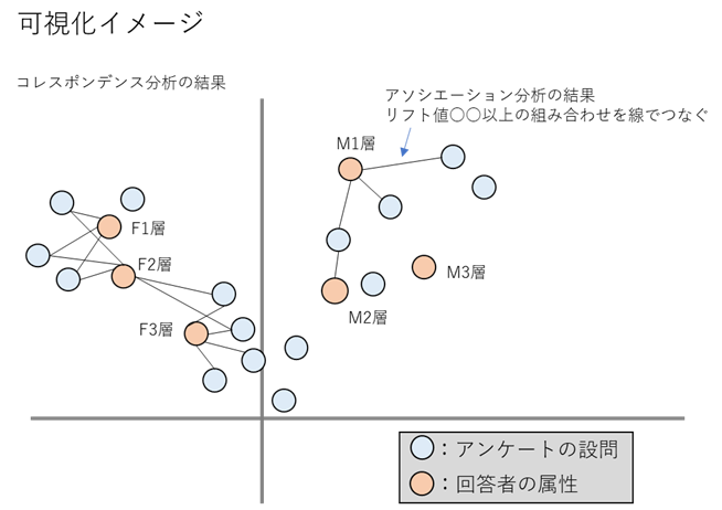
To briefly explain the treatise, an image of connecting the combinations of association analysis results with a line on the plot of the correspondence analysis results. In the paper, it is called "attribute-specific feature extraction association plot".
As an example in the paper, we are visualizing the results of questionnaires on health concerns by media layer (attribute).
As a result of visualization, for example, "The F3 layer tends to have problems with XX, while the F1 and F2 layers tend to have problems with XX, but the problems of ~~ are common to the F2 and F3 layers." You can see that.
Application to POS data
For example, using ID-POS data, if the part corresponding to the attribute is the area or store and the part corresponding to the questionnaire is the number of purchases of the purchased product category or brand, the purchasing tendency of the area or store can be visualized. In fact, Computer Statistics Vol. 29, No. 22, "Analysis and Visualization of Store Classification and Purchasing Trends by Sales Trends," analyzes purchasing trends by store. This trial was also carried out on POS data.
Usage data
Use kaggle superstore_data. Retail data for a four-year global supermarket, including Customer ID, Product ID, City, etc., but no store ID. Since there is no store ID, this time we will visualize the purchasing tendency of the country and product sub-category.
<class 'pandas.core.frame.DataFrame'>
RangeIndex: 51290 entries, 0 to 51289
Data columns (total 24 columns):
 #   Column          Non-Null Count  Dtype
---  ------          --------------  -----
 0   Row ID          51290 non-null  int64
 1   Order ID        51290 non-null  object
 2   Order Date      51290 non-null  datetime64[ns]
 3   Ship Date       51290 non-null  datetime64[ns]
 4   Ship Mode       51290 non-null  object
 5   Customer ID     51290 non-null  object
 6   Customer Name   51290 non-null  object
 7   Segment         51290 non-null  object
 8   City            51290 non-null  object
 9   State           51290 non-null  object
 10  Country         51290 non-null  object
 11  Postal Code     9994 non-null   float64
 12  Market          51290 non-null  object
 13  Region          51290 non-null  object
 14  Product ID      51290 non-null  object
 15  Category        51290 non-null  object
 16  Sub-Category    51290 non-null  object
 17  Product Name    51290 non-null  object
 18  Sales           51290 non-null  float64
 19  Quantity        51290 non-null  int64
 20  Discount        51290 non-null  float64
 21  Profit          51290 non-null  float64
 22  Shipping Cost   51290 non-null  float64
 23  Order Priority  51290 non-null  object
dtypes: datetime64[ns](2),float64(5),int64(2),object(15)
memory usage: 9.4+ MB
Write code
Preparation
First import the required packages
#Package import
import numpy as np
import scipy
import matplotlib as mpl
import matplotlib.pyplot as plt
import seaborn as sns
import pandas as pd
from pandas.plotting import register_matplotlib_converters
import sklearn
from sklearn.model_selection import train_test_split
from sklearn.preprocessing import LabelEncoder
import os
import mlxtend
from mlxtend.preprocessing import TransactionEncoder
from mlxtend.frequent_patterns import apriori, association_rules, fpgrowth
import networkx as nx
import mca
import codecs
sns.set()
#Required when using Japanese(Not needed this time)
font_path = 'C:\\Users\\[YOUR_USERNAME]\\Anaconda3\\envs\\[ENV_NAME]\\Lib\\site-packages\\matplotlib\\mpl-data\\fonts\\ttf\\ipaexg.ttf'
font_prop = mpl.font_manager.FontProperties(fname=font_path)

#Version of each package
"""
numpy 1.18.1
scipy 1.4.1
matplotlib 3.1.3
seaborn 0.10.0
pandas 1.0.3
sklearn 0.22.1
mlxtend 0.17.3
networkx 2.5
mca 1.0.3
"""
Read the data. This time, 80% of the data is discarded to make the processing lighter.
with codecs.open('superstore_dataset2011-2015.csv', "r", "shift-jis", "ignore") as f:
df = pd.read_csv(f, parse_dates=['Order Date','Ship Date'], dayfirst=True)
#Process some columns for later processing
df['Order Date']=pd.to_datetime(df['Order Date'])
df['Ship Date']=pd.to_datetime(df['Ship Date'])
df['Country']='Country_'+df['Country']
df['Sub-Category']='SubC_'+df['Sub-Category']
#Since the processing was heavy, about 80% of the data is discarded.
df, gomi=train_test_split(df, test_size=0.8, random_state=0)
display(df)
#Unique number of values in each column
"""
Customer ID 1493
Category 3 ;['Office Supplies' 'Technology' 'Furniture']
Sub-Category 17
Product Name 3038
Region 13
Market 7
Country 137
State 891
City 2431
"""

Association analysis
First, data processing such as encoding is performed in order to perform association analysis.
- Please note that the encodings are numbered in ascending order. This time, the subsequent processing is carried out keeping in mind that Country will be a younger number than Sub-Category. ※that? Why did you bother to encode it ... It doesn't matter if you don't do it ...?
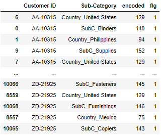
#Country df for each Customer ID and Sub for each Customer ID-Concat and encode Category df
#Encodings are numbered in ascending order
ro='Country'
co='Sub-Category'
def create_city_product_matrix(df):
    df_store=df.groupby(['Customer ID',ro,'Order Date'])[[co]].count().reset_index()
    df_product=df.groupby(['Customer ID',co,'Order Date'])[[ro]].count().reset_index()
    df_concat=pd.concat([df_store[['Customer ID',ro,'Order Date']].rename(columns={ro:co}),df_product[['Customer ID',co,'Order Date']]])
    df_concat=df_concat.sort_values(by=['Customer ID','Order Date',co])
    le = LabelEncoder()
    encoded = le.fit_transform(df_concat[co].values)
    df_concat['encoded'] = encoded
    return df_concat[['Customer ID',co,'encoded']], le
# city_cnt:Unique number of countries(Used in later processing);Country and Sub of encoded numbers-Category break numbers
city_cnt=df[ro].unique().shape[0]

df_label,le=create_city_product_matrix(df)
df_label['flg']=1
display(df_label)
#List the numbers encoded for each Customer ID
df_list = df_label.groupby(["Customer ID"])["encoded"].apply(lambda x:list(x)).reset_index()
display(df_list)

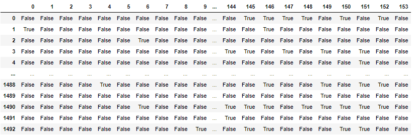
#Creating a mart for association analysis
te = TransactionEncoder()
te_ary = te.fit(df_list['encoded']).transform(df_list['encoded'])
df_mart = pd.DataFrame(te_ary, columns=te.columns_)
#df_mart.columns=le.inverse_transform(df_mart.columns.values)
display(df_mart)
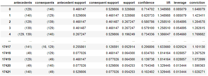
Conducted association analysis.
#Support 5%Narrow down to the above items
min_support=0.05
frequent_itemsets = fpgrowth(df_mart,min_support=min_support,use_colnames=True)
#Execute association analysis
rules = association_rules(frequent_itemsets,metric='support',min_threshold=min_support)
display(rules)
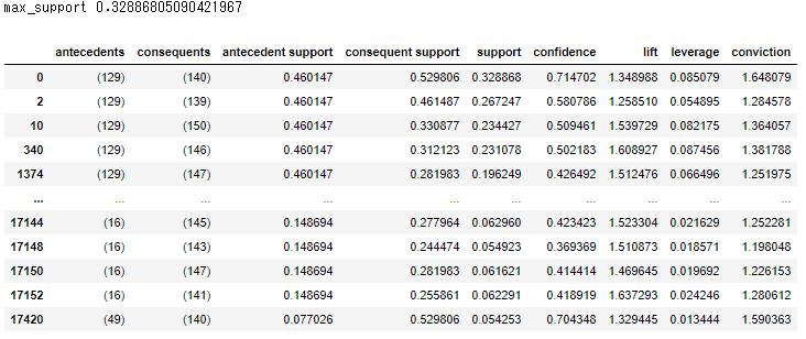
I want Country to come to the condition part, so I extracted the data so that Country comes to the condition part and Sub-Category comes to the conclusion part.
#County in the condition part, Sub in the conclusion part-Extract rules so that Category comes
labels_no_frozen=[i for i in rules['antecedents'].values]
labels_no=[list(i) for i in rules['antecedents'].values]
consequents_no_frozen=[i for i in rules['consequents'].values]
consequents_no=[list(i) for i in rules['consequents'].values]
city_labels=[]
product_labels=[]
for i,k,l,n in zip(labels_no,labels_no_frozen,consequents_no,consequents_no_frozen):
    for j in i:
        # city_cnt-1 or less=Country encoded number
        if j <= city_cnt-1:
            for m in l:
                # city_cnt-Greater than 1= Sub-Category encoded number
                if m > city_cnt-1:
                    #Add County number
                    city_labels.append(k)
                    # Sub-Add Category number
                    product_labels.append(n)
                    break
                break

rules1=rules[(rules['antecedents'].isin(city_labels))&(rules['consequents'].isin(product_labels))&(rules["antecedents"].apply(lambda x: len(x))==1)&(rules["consequents"].apply(lambda x: len(x))==1)]
max_support=rules1['support'].max()
print('max_support',max_support)
display(rules1)
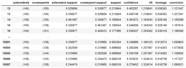
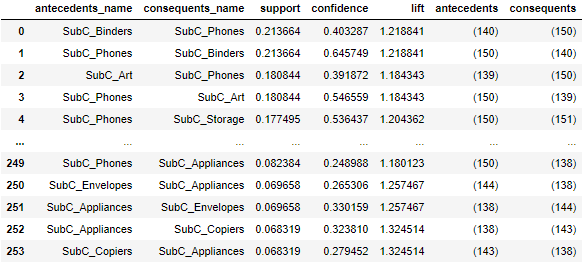
Later, I want to visualize the combination of Sub-Categories, so I will extract the data so that Sub-Category comes to both the condition part and the conclusion part.
#Sub for both the condition part and the conclusion part-Extract rules so that Category comes
labels_no_frozen=[i for i in rules['antecedents'].values]
labels_no=[list(i) for i in rules['antecedents'].values]
consequents_no_frozen=[i for i in rules['consequents'].values]
consequents_no=[list(i) for i in rules['consequents'].values]
city_labels=[]
product_labels=[]
for i,k,l,n in zip(labels_no,labels_no_frozen,consequents_no,consequents_no_frozen):
    for m in l:
        # city_cnt-Greater than 1= Sub-Category encoded number
        if m > city_cnt-1:
            city_labels.append(k)
            product_labels.append(n)
            break
        break

rules11=rules[(rules['antecedents'].isin(product_labels))&(rules['consequents'].isin(product_labels))&(rules["antecedents"].apply(lambda x: len(x))==1)&(rules["consequents"].apply(lambda x: len(x))==1)&(rules['support']<=max_support)]
display(rules11)
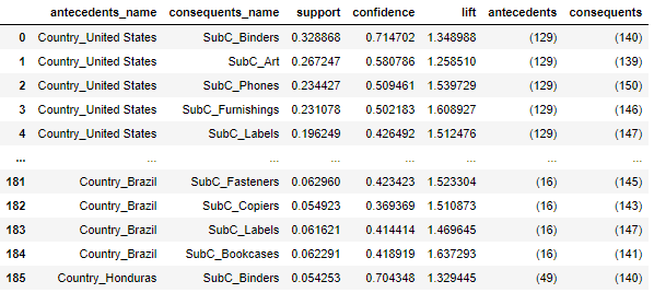
Decode the table of association analysis results.
#Make a table of association analysis results
def create_association_matrix(rules1):
    #Decode antecedents in rules1
    antecedents_scale=pd.DataFrame(le.inverse_transform([list(i)[0] for i in rules1['antecedents'].unique()]),columns=[co])
    antecedents_scale['antecedents']=[i for i in rules1['antecedents'].unique()]

    #Decode the consequents of rules1
    #I try to make it okay if there are multiple combinations
    consequents=[list(i) for i in rules1['consequents'].unique()]
    consequents=[([le.inverse_transform([i])[0] for i in j]) for j in consequents]
    consequents_scale=pd.DataFrame(consequents,columns=[co])
    consequents_scale['consequents']=[i for i in rules1['consequents'].unique()]

    rules3=pd.merge(rules1, antecedents_scale, on=['antecedents'], how='left').rename(columns={co:'antecedents_name'})
    rules3=pd.merge(rules3, consequents_scale, on=['consequents'], how='left').rename(columns={co:'consequents_name'})
    rules3=rules3.reindex(columns=['antecedents_name','consequents_name','support','confidence','lift','antecedents','consequents'])
    return rules3
rules3=create_association_matrix(rules1)
rules33=create_association_matrix(rules11)
display(rules3)
display(rules33)
Let's express the result of association analysis in a network diagram.
#Count the number of people by country
def create_country_uu(df_label):
    count_UU=df_label.groupby([co,'Customer ID'])[['flg']].count().reset_index()
    count_UU['cnt']=1
    count_UU=count_UU.groupby([co])[['cnt']].sum().reset_index()
    return count_UU

#Make nodes and edges
GA=nx.from_pandas_edgelist(rules1[['antecedents','consequents','lift']],source='antecedents',target='consequents', edge_attr=True)

count_UU=create_country_uu(df_label)
count_UU_mst=pd.DataFrame(le.inverse_transform([list(i)[0] for i, j in GA.nodes(data=True) if i in rules1['antecedents'].values]),columns=[co])
count_UU_mst=pd.merge(count_UU_mst, count_UU, on=[co],how='left').rename(columns={co:ro})

#Create a node master(Decode)
labels_no=[list(j) for j in [i for i in GA.nodes]]
labels=[]
for no in labels_no:
    labesl2=[]
    for label in no:
        labesl2.append(le.inverse_transform([label])[0])
    labels.append(labesl2)

new_labels2={}
for i, j in zip(GA.nodes, labels):
    new_labels2[i]=j
#Representing the results of association analysis in a network diagram
def association_network(GA, rules1, count_UU_mst):
    fig, ax=plt.subplots(figsize=(30,15))
    pos = nx.kamada_kawai_layout(GA,scale=0.06)

    #Edge thickness is proportional to lift value
    edge_width = [d['lift']*8 for (u,v,d) in GA.edges(data=True)]

    #Plot Country as a square
    #Node size is proportional to the number of UUs per Country
    nx.draw_networkx_nodes(GA, pos, alpha=0.5, node_shape="s", linewidths=5, node_color='red',
                           nodelist=[i for i, j in GA.nodes(data=True) if i in rules1['antecedents'].values],
                           node_size=[4.*v for v in count_UU_mst['cnt'].values])

    # Sub-Plot Category in circle
    nx.draw_networkx_nodes(GA, pos, alpha=0.5, node_shape="o", linewidths=0, node_color='blue', node_size=600,
                           nodelist=[i for i, j in GA.nodes(data=True) if i in rules1['consequents'].values])

    #Plot edges
    nx.draw_networkx_edges(GA, pos, alpha=0.2, edge_color='grey', width=edge_width)
    #Install the label
    datas = nx.draw_networkx_labels(GA,pos,new_labels2,font_size=20)

    #Set fonts that can use Japanese so that it can support Japanese
    #for t in datas.values():
    #    t.set_fontproperties(font_prop)

    plt.grid(False)
    plt.show()

association_network(GA, rules1, count_UU_mst)
 This is also a hard-to-see figure ...
The size of the red square is proportional to the number of customers in the country, and the thickness of the gray line is proportional to the lift value.
It can be said that various categories of products are being bought in developed countries, and some categories of products are being bought in developing countries.
This is also a hard-to-see figure ...
The size of the red square is proportional to the number of customers in the country, and the thickness of the gray line is proportional to the lift value.
It can be said that various categories of products are being bought in developed countries, and some categories of products are being bought in developing countries.
However, the positional relationship between the nodes does not make sense in this figure yet. By combining correspondence analysis, the purpose of this time is to create a diagram in which the positional relationship of nodes is also meaningful.
Correspondence analysis
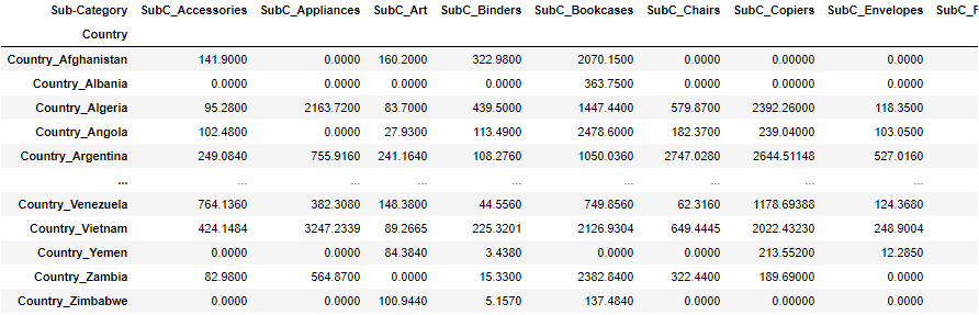
Created a mart for performing correspondence analysis.
#Country and Sub-Make a cross-table of Category sales
df_corre=df.copy()
df_corre=df_corre.pivot_table(index=ro, columns=co, values='Sales', aggfunc=lambda x:x.sum()).fillna(0)
display(df_corre)
Conducted correspondence analysis.
#Plot correspondence analysis
fig, ax=plt.subplots(figsize=(30,20))

mca_counts = mca.MCA(df_corre)
rows = mca_counts.fs_r(N=2)
cols = mca_counts.fs_c(N=2)

ax.scatter(rows[:,0], rows[:,1], c='red',marker='s', s=200)
labels = df_corre.index.values
for label,x,y in zip(labels,rows[:,0],rows[:,1]):
        ax.annotate(label,xy = (x, y),fontsize=20)

ax.scatter(cols[:,0], cols[:,1], c='blue',marker='x', s=400)
labels = df_corre.columns.values
for label,x,y in zip(labels,cols[:,0],cols[:,1]):
        ax.annotate(label,xy = (x, y),fontsize=20, color='c')

ax.tick_params(left=True, bottom=True, labelleft=True, labelbottom=True)
ax.axhline(0, color='gray')
ax.axvline(0, color='gray')
plt.show()
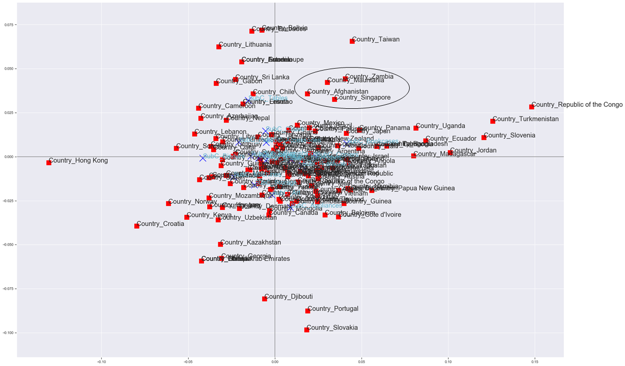 Although they overlap and are almost invisible, you can create a diagram that has meaning in the positional relationship of each country and product category. (Zambia, Mauritania, Afghanistan and Singapore have similar purchasing trends. Is that true ...?)
If the edge of the result of the association analysis can be added to this figure, the attribute-specific feature extraction association plot is completed.
Attribute-specific feature extraction association plot
First, perform correspondence analysis as before.
mca_counts = mca.MCA(df_corre)
rows = mca_counts.fs_r(N=2)
cols = mca_counts.fs_c(N=2)
I used plt.scatter to plot the results of correspondence analysis earlier, but here I use networkx.
#Representing the results of correspondence analysis and association analysis in a network diagram
def mca_association_plot(df_corre, df_label, rows, cols, new_labels2
                         , strong_node_row=None, strong_node_col=None
                         , xlim=[None, None], ylim=[None, None]):
    fig, ax=plt.subplots(figsize=(30,20))
    uu_list=create_country_uu(df_label)

    #Plot Country with red square
    G = nx.Graph()
    node_weights=[]
    for node, pos in zip(df_corre.index, rows):
        if strong_node_row is None:
            G.add_node(node)
            G.nodes[node]["pos"] = (pos[0], pos[1])
            node_weights.append(uu_list[uu_list[co]==node]['cnt'].values[0])
        else:
            if node in strong_node_row:
                G.add_node(node)
                G.nodes[node]["pos"] = (pos[0], pos[1])
                node_weights.append(uu_list[uu_list[co]==node]['cnt'].values[0])
    position=np.array([v['pos'] for (u,v) in G.nodes(data=True)])
    pos = {n:(i[0], i[1]) for i, n in zip(position ,G.nodes)}
    nx.draw_networkx(G, pos=pos, node_color="red",ax=ax, linewidths=5, node_shape="s", node_size=[1.5*v for v in node_weights], alpha=0.5)
    new_labels2={}
    for i, j in zip(G.nodes, G.nodes):
        new_labels2[i]=j
    datas = nx.draw_networkx_labels(G,pos, new_labels2, font_size=20, font_color='k')
    #Fonts that can use Japanese are set so that they can support Japanese.
    #for t in datas.values():
    #    t.set_fontproperties(font_prop)

    # Sub-Plot Category with blue crosses
    G2 = nx.Graph()
    node_weights2=[]
    for node, pos in zip(df_corre.columns, cols):
        if strong_node_col is None:
            G2.add_node(node)
            G2.nodes[node]["pos"] = (pos[0], pos[1])
            node_weights2.append(uu_list[uu_list[co]==node]['cnt'].values[0])
        else:
            if node in strong_node_col:
                G2.add_node(node)
                G2.nodes[node]["pos"] = (pos[0], pos[1])
                node_weights2.append(uu_list[uu_list[co]==node]['cnt'].values[0])
    position2=np.array([v['pos'] for (u,v) in G2.nodes(data=True)])
    pos2 = {n:(i[0], i[1]) for i, n in zip(position2 ,G2.nodes)}
    nx.draw_networkx(G2, pos=pos2, node_color="blue",ax=ax, node_shape="x", node_size=[5*v for v in node_weights2], alpha=0.5)
    new_labels2={}
    for i, j in zip(G2.nodes, G2.nodes):
        new_labels2[i]=j
    datas = nx.draw_networkx_labels(G2,pos2, new_labels2, font_size=20, font_color='b')
    #Fonts that can use Japanese are set so that they can support Japanese.
    #for t in datas.values():
    #    t.set_fontproperties(font_prop)

    #Country and Sub-Plot edges between categories (gray and thicken in proportion to lift value)
    U=nx.Graph()
    U.add_nodes_from(G.nodes(data=True)) #deals with isolated nodes
    U.add_nodes_from(G2.nodes(data=True))
    for edge1, edge2, lift in zip(rules3[rules3['lift']>=1.6]['antecedents_name'].values, rules3[rules3['lift']>=1.6]['consequents_name'].values, rules3[rules3['lift']>=1.6]['lift'].values):
        if strong_node_col is None:
            U.add_edge(edge1, edge2, lift=lift)
        else:
            if edge2 in strong_node_col:
                U.add_edge(edge1, edge2, lift=lift)
    pos_all = {n:(i[0], i[1]) for i, n in zip(np.vstack((position, position2)) ,U.nodes)}
    edge_width = [d['lift']*8. for (u,v,d) in U.edges(data=True)]
    nx.draw_networkx_edges(U, pos=pos_all, alpha=0.3, edge_color='grey', width=edge_width, ax=ax)

    # Sub-Category and Sub-Plot edges between categories (light blue and thicker in proportion to lift value)
    V=nx.Graph()
    V.add_nodes_from(G.nodes(data=True)) #deals with isolated nodes
    V.add_nodes_from(G2.nodes(data=True))
    for edge1, edge2, lift in zip(rules33[rules33['lift']>=1.5]['antecedents_name'].values, rules33[rules33['lift']>=1.5]['consequents_name'].values, rules33[rules33['lift']>=1.5]['lift'].values):
        if strong_node_col is None:
            V.add_edge(edge1, edge2, lift=lift)
        else:
            if edge1 in strong_node_col and edge2 in strong_node_col:
                V.add_edge(edge1, edge2, lift=lift)
    pos_all2 = {n:(i[0], i[1]) for i, n in zip(np.vstack((position, position2)) ,V.nodes)}
    edge_width = [d['lift']*8. for (u,v,d) in V.edges(data=True)]
    nx.draw_networkx_edges(V, pos=pos_all2, alpha=0.2, edge_color='c', width=edge_width ,ax=ax)

    ax.tick_params(left=True, bottom=True, labelleft=True, labelbottom=True)
    ax.set_xlim(xlim[0], xlim[1])
    ax.set_ylim(ylim[0], ylim[1])
    ax.axhline(0, color='gray')
    ax.axvline(0, color='gray')
    plt.grid(True)
    plt.show()
It's time to implement.
xlim=[None,None]
ylim=[None,None]
mca_association_plot(df_corre, df_label, rows, cols, new_labels2, strong_node_row=None, strong_node_col=None, xlim=xlim, ylim=ylim)
 Burn
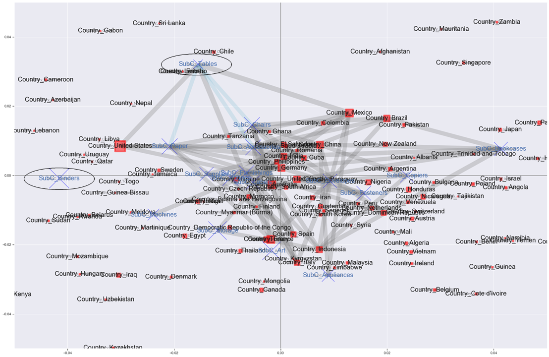
A diagram was created that reflected the results of the association analysis in the results of the correspondence analysis.
The gray edges represent the relationship between countries and product subcategories, and the light blue edges represent the relationships between product subcategories.
Only the edges with lift values of 1.6 or more (gray) and 1.5 or more (light blue) are drawn.
The red square and blue cross increase in proportion to the unique number of Customer IDs.
However, I'm not sure because it overlaps, so I'll zoom in on the center a little.
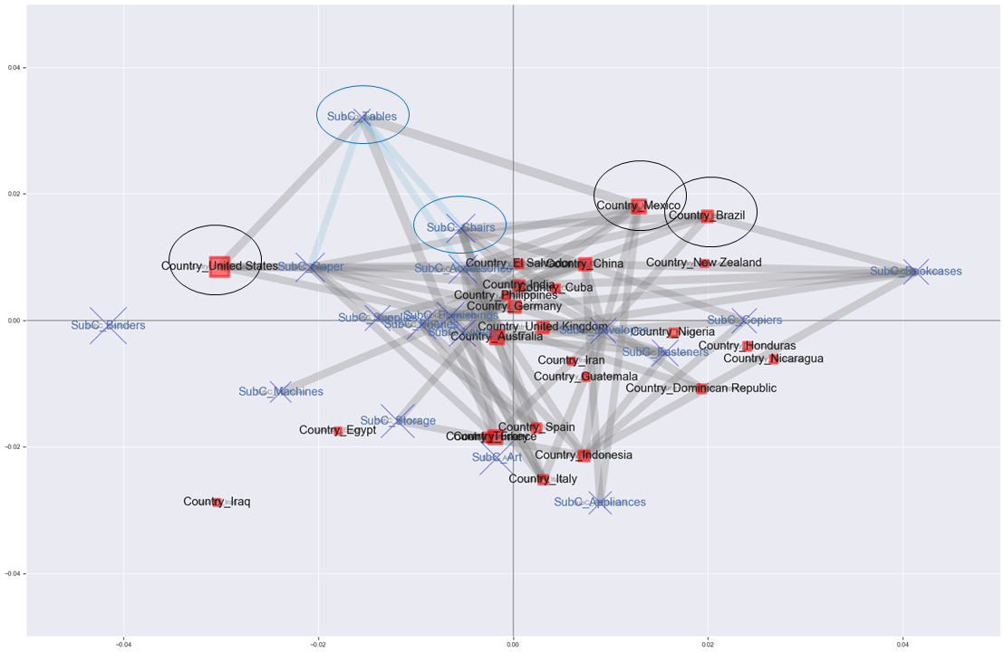
Burn
A diagram was created that reflected the results of the association analysis in the results of the correspondence analysis.
The gray edges represent the relationship between countries and product subcategories, and the light blue edges represent the relationships between product subcategories.
Only the edges with lift values of 1.6 or more (gray) and 1.5 or more (light blue) are drawn.
The red square and blue cross increase in proportion to the unique number of Customer IDs.
However, I'm not sure because it overlaps, so I'll zoom in on the center a little.
xlim=[-0.05,0.05]
ylim=[-0.05,0.05]
mca_association_plot(df_corre, df_label, rows, cols, new_labels2, strong_node_row=None, strong_node_col=None, xlim=xlim, ylim=ylim)
 I'm not sure even if I enlarge it (laughs).
But in the US, we have the most customers to buy, and we are in a position where Bindings tend to sell, but the edges are not connected, and we can see that Tables and Edge are connected.
It may be Bindings that stands out in terms of sales, but it seems that the percentage of customers who bought Tables in the United States is actually more than 1.6 times higher than the percentage of customers who bought Tables in all countries. I'm not sure.
I'm not sure even if I enlarge it (laughs).
But in the US, we have the most customers to buy, and we are in a position where Bindings tend to sell, but the edges are not connected, and we can see that Tables and Edge are connected.
It may be Bindings that stands out in terms of sales, but it seems that the percentage of customers who bought Tables in the United States is actually more than 1.6 times higher than the percentage of customers who bought Tables in all countries. I'm not sure.
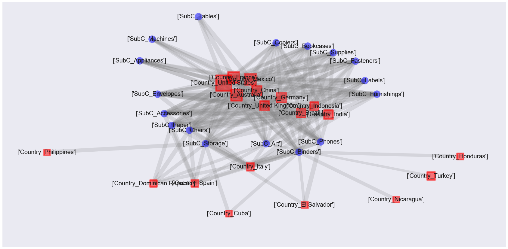
In order to reduce the number of nodes to be plotted, try plotting again only for items with a support rating of 0.05 or higher.
#Support 0.Use only 05 or more items
strong_single_product=list(set([[j for j in i][0] for i in frequent_itemsets['itemsets']]))
strong_single_product=le.inverse_transform(strong_single_product)
row_word = 'Country_'
strong_node_row = [v for i, v in enumerate(strong_single_product) if row_word in v]
strong_node_col = [v for i, v in enumerate(strong_single_product) if row_word not in v]

xlim=[-0.05,0.05]
ylim=[-0.05,0.05]
mca_association_plot(df_corre, df_label, rows, cols, new_labels2, strong_node_row=strong_node_row, strong_node_col=strong_node_col, xlim=xlim, ylim=ylim)
 After all, the edges are flying too much and it's hard to see ... If you forcibly interpret it ...
・ The tendency is considered to be different for the United States on the left, Germany / United Kingdom in the middle, Brazil / Mexico on the upper right, Spain / Italy on the bottom, etc. ・ The percentage of customers who purchased Tables in Mexico is more than 1.6 times higher than the percentage of customers who purchased Tables in all countries. ・ Brazil is a country with the same tendency as Mexico, so you may recommend Tables. ・ It can be said that many people buy a combination of Tables, Chairs, and Paper, so the United States may recommend Chairs more.
And? No, it's difficult to interpret. It may be easier to interpret if it is an analysis of each store in a certain country.
in conclusion
Attribute-specific feature extraction association plots were performed. However, it was quite difficult to interpret ... An approach similar to "Computer Statistics Vol. 29, No. 22" (https://www.jstage.jst.go.jp/browse/jscswabun/29/2/_contents/-char/ja) "Analysis and Visualization of Store Classification and Purchasing Trends by Sales Trends" may also provide meaningful analysis. Personally, I'm glad I practiced networkx.
that's all!