[PYTHON] Medical insurance premium EDA and regression problems
Overview
Since there is an opportunity to educate staff who do not have knowledge of machine learning at the company, we decided to make teaching materials for EDA, clustering, and regression problems using US medical insurance premium data. Dataset uses Kaggle's this The feel that I made roughly may seem a little difficult, so I will not use it for teaching materials Let's prepare a simpler one separately
--Implementation period: November 2020 --Environment: Google Colaboratory
data set
The structure of insurance.csv is as shown in the figure below. Charges indicating medical insurance premiums will be predicted by this regression
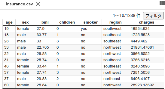
Post the description for each column Columns age: age of primary beneficiary sex: insurance contractor gender, female, male bmi: Body mass index, providing an understanding of body, weights that are relatively high or low relative to height, objective index of body weight (kg / m ^ 2) using the ratio of height to weight, ideally 18.5 to 24.9 children: Number of children covered by health insurance / Number of dependents smoker: Smoking region: the beneficiary's residential area in the US, northeast, southeast, southwest, northwest. charges: Individual medical costs billed by health insurance
EDA(Explanatory Data Analysis) Some words may be unfamiliar The process of confirming the structure of the data set to be analyzed and setting up a strategy first on how to analyze it (I think) Requires tool type, familiarity, and intuition Since the analysis method is different for each person, please keep the following for reference only.
First, open the file and check the contents and data for missing items.
import numpy as np
import pandas as pd
import os
from sklearn.preprocessing import LabelEncoder
import matplotlib.pyplot as plt
import seaborn as sns

df = pd.read_csv('insurance.csv')
#Display of Dataset
print(df.tail())
#Check for NaN
df.isnull().sum()
 You can see that there are no defects (lucky because it is a little troublesome if there is)
Since categorical data is included, quantify them with LabelEncoder
You can see that there are no defects (lucky because it is a little troublesome if there is)
Since categorical data is included, quantify them with LabelEncoder
#Category data encoding
# sex
le = LabelEncoder()
le.fit(df.sex.drop_duplicates())
df.sex = le.transform(df.sex)
# smoker or not
le.fit(df.smoker.drop_duplicates())
df.smoker = le.transform(df.smoker)
# region
le.fit(df.region.drop_duplicates())
df.region = le.transform(df.region)
#Display of Dataset
print(df.tail())
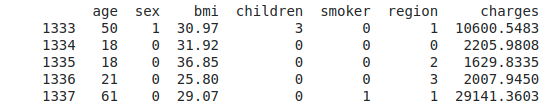 Replaced by an integer
Look at the overall correlation coefficient and hit the explanatory variables that affect charges
Replaced by an integer
Look at the overall correlation coefficient and hit the explanatory variables that affect charges
print(df.corr())
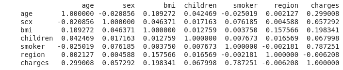 Smoker shows a very strong correlation at 0.787251
Next is the age of 0.299008, and I'm worried that the correlation coefficient of bmi (= weight / height ^ 2) indicating the degree of obesity is smaller than I expected.
However, it's a one-shot calculation with just ".corr ()", so I'm glad I used Python.
Smoker shows a very strong correlation at 0.787251
Next is the age of 0.299008, and I'm worried that the correlation coefficient of bmi (= weight / height ^ 2) indicating the degree of obesity is smaller than I expected.
However, it's a one-shot calculation with just ".corr ()", so I'm glad I used Python.
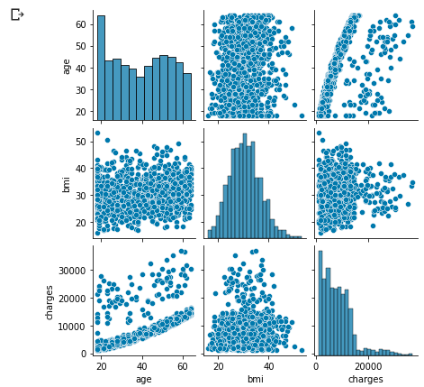
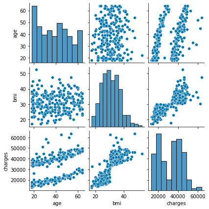
Display the entire distribution
sns.pairplot(df.loc[:, ['age', 'sex', 'bmi', 'children', 'smoker', 'region', 'charges']], height=2);
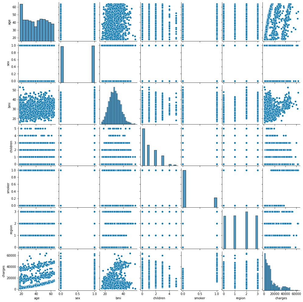 The characteristic distribution is shown below, so concentrate on age, bmi, smoker.
It seems that it can be divided into 3 groups, but analyze what caused it to be divided into 3 groups
The characteristic distribution is shown below, so concentrate on age, bmi, smoker.
It seems that it can be divided into 3 groups, but analyze what caused it to be divided into 3 groups
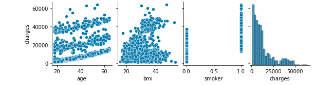 The age-charges distribution is very characteristic
Let's dig into the smoker that was highly correlated
The age-charges distribution is very characteristic
Let's dig into the smoker that was highly correlated
# smoker-Let's take a look at charges
sns.boxplot(x="smoker", y="charges", data=df)
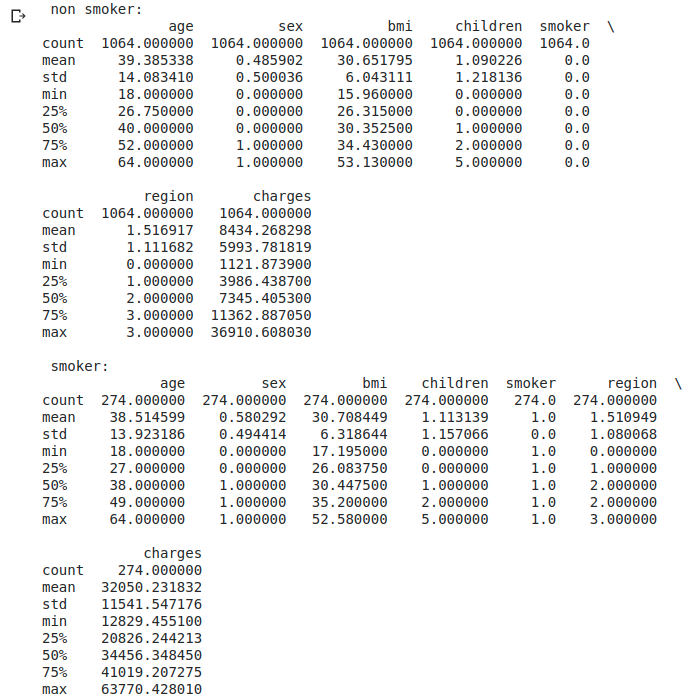
#Check with numbers
df_s0 = df[df['smoker'] == 0] #Non-smoker
df_s1 = df[df['smoker'] == 1] #smoker
pd.set_option('display.max_rows', 20)
pd.set_option('display.max_columns', None)
print(' non smoker:\n' + str(df_s0.describe()))
print('\n smoker:\n' + str(df_s1.describe()))
print('\n Medical insurance premiums for non-smokers' + str(df_s1['charges'].mean() / df_s0['charges'].mean()) + 'It takes twice as much.')
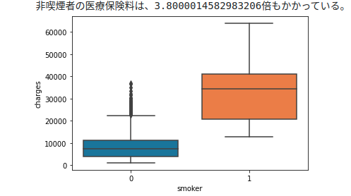
The boxplot shows that nonsmokers correspond to the high peaks to the left of the charges histogram.
Conversely, the smoker's orange can be said to be a collection of two mountains with low charges histograms.
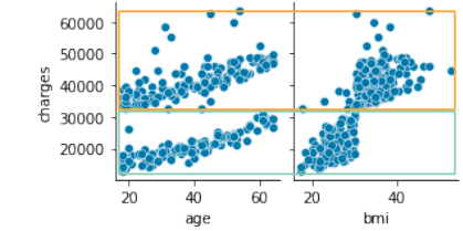
Check distribution only for non-smokers
sns.pairplot(df_s0.loc[:, ['age', 'bmi', 'charges']], height=2);
 The above-mentioned age-charges distribution could be separated
That characteristic distribution seems to have been influenced by smoking or not.
The above-mentioned age-charges distribution could be separated
That characteristic distribution seems to have been influenced by smoking or not.
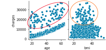 Even non-smokers go to the hospital at a constant rate regardless of age, so does the upper scatter of the age-charges distribution represent that?
It seems that this scatter and the scatter of the bmi-charges distribution are linked, so try clustering.
Even non-smokers go to the hospital at a constant rate regardless of age, so does the upper scatter of the age-charges distribution represent that?
It seems that this scatter and the scatter of the bmi-charges distribution are linked, so try clustering.
from sklearn.cluster import KMeans
#from sklearn.cluster import MiniBatchKMeans

df_wk = df_s0.drop(['sex', 'children', 'smoker', 'region'], axis=1)
kmeans_model = KMeans(n_clusters=2, random_state=1, init='k-means++', n_init=10, max_iter=300, tol=0.0001, algorithm='auto', verbose=0).fit(df_wk)
#kmeans_model = MiniBatchKMeans(n_clusters=2, random_state=0, max_iter=300,  batch_size=100, verbose=0).fit(df_wk)

df_wk['cluster'] = kmeans_model.labels_
labels = kmeans_model.labels_
print(labels.sum())
color_codes = {0:'r', 1:'g', 2:'b'}
colors = [color_codes[x] for x in labels]
ax1 = df_wk.plot.scatter(x='age', y='charges', c=colors)
ax1 = df_wk.plot.scatter(x='bmi', y='charges', c=colors)
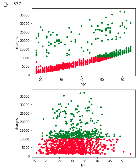 It's a pity that we couldn't separate them neatly, but it can be said that the scatter plots of the two distribution maps mentioned above correspond to each other.
However, I do not understand the reason why charges are high at all ages regardless of the size of BMI.
I haven't investigated children and region yet, and it seems that children are more related to bmi variability.
If you look at the distribution of non-smokers by children (= number of dependents), you can see the relationship between family composition and bmi.
It's a pity that we couldn't separate them neatly, but it can be said that the scatter plots of the two distribution maps mentioned above correspond to each other.
However, I do not understand the reason why charges are high at all ages regardless of the size of BMI.
I haven't investigated children and region yet, and it seems that children are more related to bmi variability.
If you look at the distribution of non-smokers by children (= number of dependents), you can see the relationship between family composition and bmi.
df_c0 = df_s0[df_s0['children'] == 0]  # children = 0
df_c1 = df_s0[df_s0['children'] == 1]  # children = 1
df_c2 = df_s0[df_s0['children'] == 2]  # children = 2
df_c3 = df_s0[df_s0['children'] == 3]  # children = 3
df_c4 = df_s0[df_s0['children'] == 4]  # children = 4
df_c5 = df_s0[df_s0['children'] == 5]  # children = 5
plt.figure(figsize=(12, 6))
plt.hist([df_c0['charges'], df_c1['charges'], df_c2['charges'], df_c3['charges'], df_c4['charges'], df_c5['charges']]
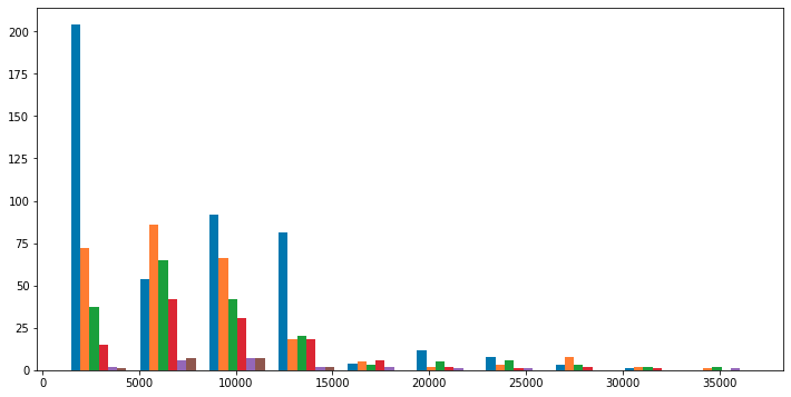
Looking at the histogram of charges> 15000, we can't see any features in charges and number of children After all, is it just purely "because even non-smokers go to the hospital at a certain rate regardless of age"? Let's test if bmi is normally distributed at charges> 15000
df_b0 = df_s0[df_s0['charges'] > 15000]  # children = 0
plt.hist([df_b0['bmi']])

import scipy.stats as stats
stats.probplot(df_b0['bmi'], dist="norm", plot=plt)
stats.shapiro(df_b0['bmi'])
(0.9842953681945801, 0.3445127308368683)
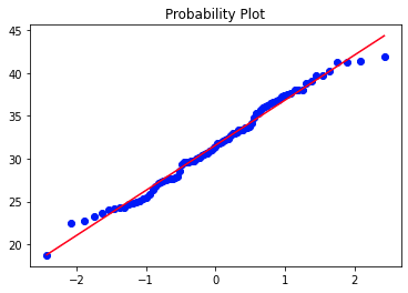 Histograms, QQ plots, and Shapiro-Wilk tests (p-value = 0.3445) show that it cannot be said that they are normally distributed.
After all, I didn't really understand the cause
Well, let's assume that the normal distribution naturally varies ...
Histograms, QQ plots, and Shapiro-Wilk tests (p-value = 0.3445) show that it cannot be said that they are normally distributed.
After all, I didn't really understand the cause
Well, let's assume that the normal distribution naturally varies ...
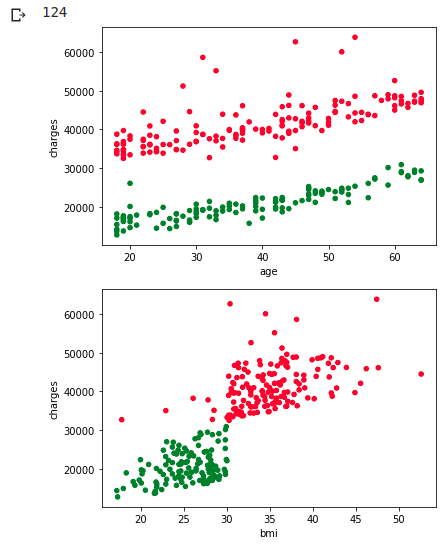
Now check the distribution only with smokers
sns.pairplot(df_s1.loc[:, ['age', 'bmi', 'charges']], height=2);
 Intuitively, it seems that age and bmi correspond as shown in the figure below.
 Try clustering as you would for a non-smoker
df_wk = df_s1.drop(['sex', 'children', 'smoker', 'region'], axis=1)
kmeans_model = KMeans(n_clusters=2, random_state=1, init='k-means++', n_init=10, max_iter=300, tol=0.0001, algorithm='auto', verbose=0).fit(df_wk)
df_wk['cluster'] = kmeans_model.labels_
labels = kmeans_model.labels_
print(labels.sum())
color_codes = {0:'r', 1:'g', 2:'b'}
colors = [color_codes[x] for x in labels]
ax1 = df_wk.plot.scatter(x='age', y='charges', c=colors)
ax1 = df_wk.plot.scatter(x='bmi', y='charges', c=colors)
 As I expected, this time I was able to separate it cleanly
EDA conclusion
People with high BMI have high medical insurance premiums regardless of smoking habits, but age does not matter (ear hurts ...) From smoker data, it was found that medical insurance premiums will rise further after bmi = 30. Since this boundary is too clear, there may be administrative restrictions such as forcibly adding expensive inspection items when it exceeds 30, for example.
sns.regplot(x="bmi", y="charges", data=df_wk)
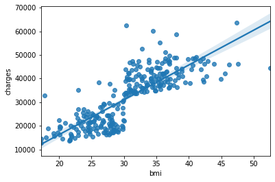 In other words, for example, it can be seen from this EDA that a regression line as shown above should not be drawn.
Simple regression, multiple regression problem
For non-smokers, try to predict the regression problem of charges Specifically, the difference in charges prediction accuracy between simple regression (age only) and multiple regression (age, bmi) is evaluated by RMSE. We will not use the clustering results, so we will leave the variability included.
from sklearn.model_selection import train_test_split
from sklearn.neighbors import KNeighborsClassifier
from sklearn.metrics import mean_squared_error
from sklearn import metrics
from sklearn import linear_model

cv_alphas = [0.01, 0.1, 1, 10, 100]     #Α for cross-validation
df_wk = df_s0.drop(['sex', 'children', 'smoker', 'region'], axis=1)

#Evaluation and plotting of Predict results
def regression_prid(clf_wk, df_wk, intSample=20, way='single'):
    arr_wk = df_wk.values[:intSample]
    arr_age, arr_agebmi, arr_charges = arr_wk[:,0], arr_wk[:,0:2], arr_wk[:,2]

    if way == 'single':
        arr_prid = clf_wk.predict(arr_age.reshape([intSample,1]))
        titel1='simple regression'
        titel2='RMSE(single) =\t'
    else:
        arr_prid = clf_wk.predict(arr_agebmi.reshape([intSample,2]))
        titel1='multiple regression'
        titel2='RMSE(multi) =\t'

    rmse = np.sqrt(mean_squared_error(arr_charges, arr_prid))
    print(titel2 + str(rmse))

    #plot
    arr_chart = df_wk.values[:intSample].reshape([intSample,3])
    arr_chart = np.hstack([arr_chart, arr_prid.reshape([intSample,1])])

    fig = plt.figure(figsize=(8, 5))
    ax = fig.add_subplot(1,1,1)
    ax.scatter(arr_chart[:,0],arr_chart[:,2], c='red')
    ax.scatter(arr_chart[:,0],arr_chart[:,3], c='blue')
    ax.set_title(titel1)
    ax.set_xlabel('age')
    ax.set_ylabel('charges')
    fig.show()
Simple regression by least squares method
clf = linear_model.LinearRegression()

#Simple regression problem
clf.fit(df_wk[['age']], df_wk['charges'])
regression_prid(clf, df_wk, 50, 'single')

#Multiple regression problem
clf.fit(df_wk[['age', 'bmi']], df_wk['charges'])
regression_prid(clf, df_wk, 50, 'multi')
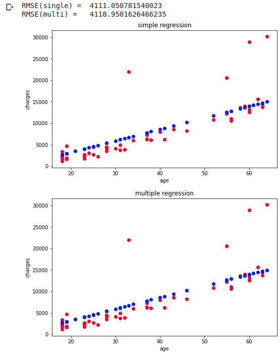
The top is the simple regression predicted by age and the bottom is the multiple regression predicted by age and bmi. RMSE is when predicted with 20 points, and simple regression is slightly more accurate. Since the original data is almost linear, the prediction is linear in both simple regression and multiple regression.
Regression by L2 regularization
Ridge RidgeCV By the way, CV stands for Closs Validation and cross validation. Googling for cross-validation details
cv_flag = True   # True:Cross-validation

if cv_flag:
    clf = linear_model.RidgeCV(alphas=cv_alphas ,cv=3, normalize=False)

    #Simple regression problem
    clf.fit(df_wk[['age']], df_wk['charges'])
    print("alpha =\t", clf.alpha_)
    regression_prid(clf, df_wk, 50, 'single')

    #Multiple regression problem
    clf.fit(df_wk[['age', 'bmi']], df_wk['charges'])
    print("alpha =\t", clf.alpha_)
    regression_prid(clf, df_wk, 50, 'multi')

else:
    clf = linear_model.Ridge(alpha=1.0)

    #Simple regression problem
    clf.fit(df_wk[['age']], df_wk['charges'])
    regression_prid(clf, df_wk, 50, 'single')

    #Multiple regression problem
    clf.fit(df_wk[['age', 'bmi']], df_wk['charges'])
    regression_prid(clf, df_wk, 50, 'multi')
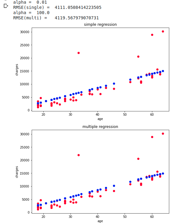
I tried to predict using cross-validation, but after all multiple regression is not better
RMSE does not change much without cross-validation After all, the charges are rising linearly, so I think that the accuracy difference due to the regression method has become difficult to come out.
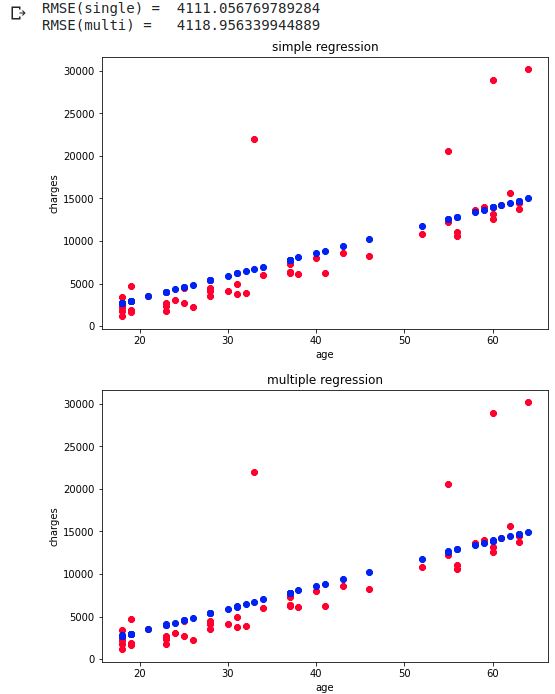
Regression by L1 regularization
Lasso LassoCV Omitted because it only replaces Ridge in the above code with Lasso RMSE was almost unchanged
Recommended Posts