[PYTHON] Contour maps in polar coordinates
Introduction
I will introduce how to draw contour maps in polar coordinate format with Python. I referred to official document of matplotlib, so please see that for details.
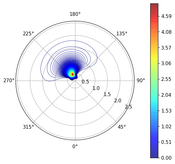
In this article, we will display the state of the ocean waves as an example of how to draw. Therefore, there are three variables: wave height, frequency, and wave direction. The circumferential direction of the contour map in polar coordinate format indicates the wave direction, the distance from the center indicates the frequency, and the color of the contour line indicates the wave height.
Main story
Preparation
First, import the module
import numpy as np
import pandas as pd
import matplotlib.pyplot as plt
import matplotlib.cm as cm
Next, import the data you want to display. In this article, I read the csv file prepared in advance. The file is 25 rows and 36 columns of data. The rows represent frequencies and the columns are wave oriented.
a = pd.read_csv("GA.csv",engine='python',header=None,skiprows=0)
GA =a.values
Creating polar contour maps
First, set the axis of the circumferential direction and the distance from the center.
It should be noted here that the wave direction of the imported data is 36 columns from 0 ° to 350 ° ([0,10,20, ,,,, 340,350]). However, if you want to display polar coordinates, you need to use 37 columns from 0 ° to 360 ° ([0,10,20, ,,,, 350,360]).
#Circumferential direction(Wave direction[rad])List creation
theta = 2 * np.pi/360*np.arange(0, 370, 10)
#Distance from the center(Wave frequency[rad/s])List creation
freq=2*np.pi*np.array([0.0445953, 0.0486315, 0.053033, 0.0578329, 0.0630672, 0.0687753, 0.075, 0.0817881, 0.0891906, 0.097263, 0.106066, 0.1156658, 0.1261345, 0.1375506, 0.15, 0.1635762, 0.1783811, 0.194526, 0.2121321,0.2313317, 0.252269, 0.2751013, 0.3000001, 0.3271524, 0.3567623])

X, Y = np.meshgrid(theta, freq)

#Create a 2D list with 25 rows and 37 columns * Note that 360 ° is reading the value of 0 °.
wavedata=[[float(GA[i,int((j)%36)])for j in range(37)] for i in range(25)]
Finally drawing. Since the maximum value of the 2D data to be displayed is 4.8, the max of np.linspace (0.00, 5.00, 501) is set to 5, and vmax = 5 is set in the same way. cmap is a color map. If you want to change the color, see matplotlib color sample.
v = np.linspace(0.00, 5.00, 501)
ctf=ax2.contour(X, Y, wavedata,levels=v,cmap=cm.jet,linewidths=0.5,vmax=5)
plt.colorbar(ctf, pad=0.1,orientation="vertical")#Orientation if you want the color bar to lie down="horizontal"
ax2.set_theta_zero_location("S")#Direction of 0 °. N in the north, S in the south, W in the west, E in the east
ax2.set_theta_direction(1)#In the case of clockwise-1, 1 for counterclockwise
ax2.set_rlabel_position(60)#Position of the axis of distance. The unit is deg.
plt.show()
That's it. Thank you for your hard work. If you have any mistakes or questions, please comment. Thank you.
Recommended Posts